Asymco

Asymmetric Intelligence

Covid-19 US Dashboard May 5th; Now with Deaths Data

Research

by

The Covid-19 case rates for 49 selected US States or Territories including deaths/day data. Note that the two curves are not for the same dates but are offset in time to start from 30 cases/day over a 7 day average and 5 deaths/day over a 7 day average
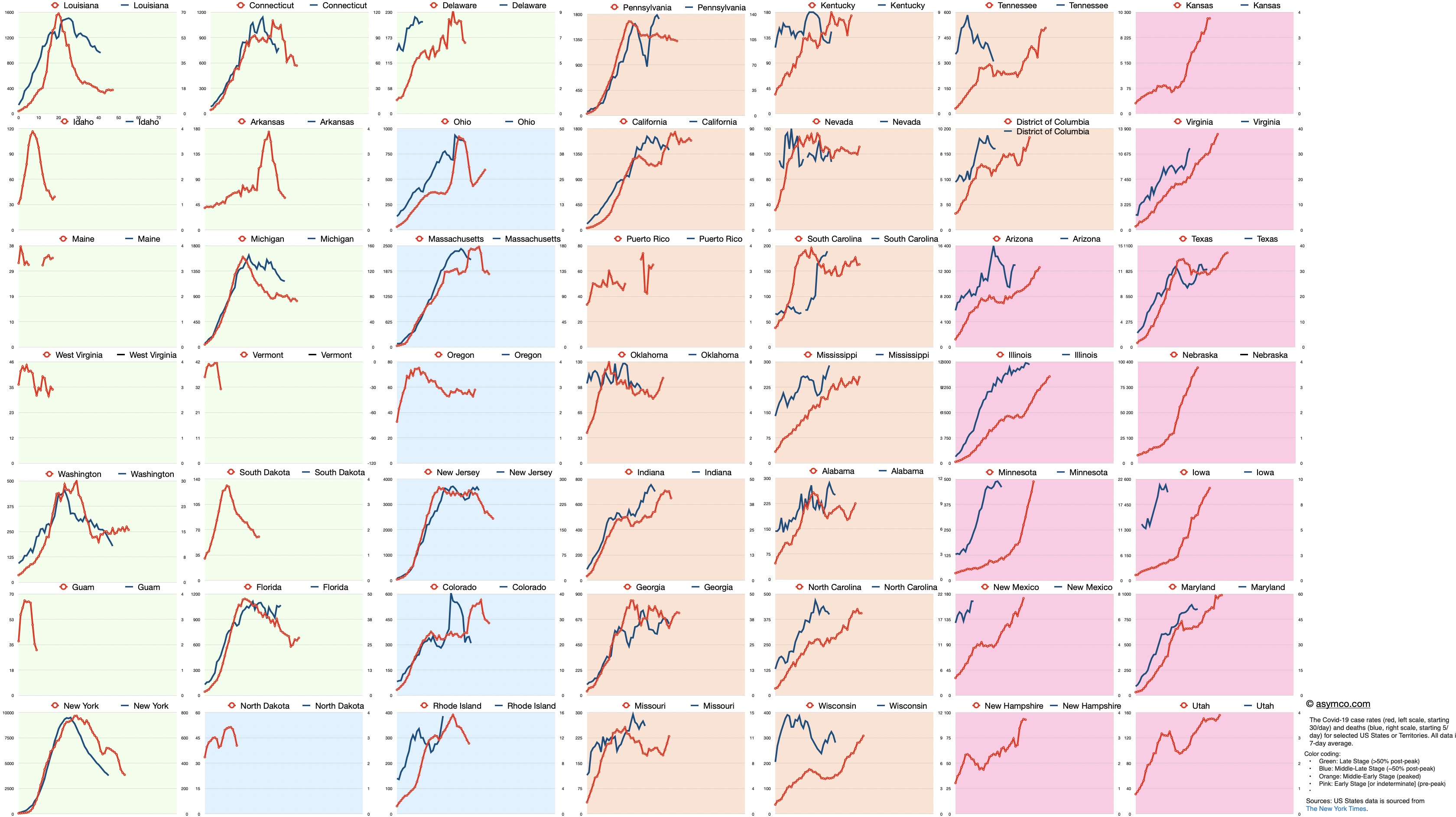
Red line is case rate in cases/day starting at 30 cases/day, left scale. Blue line is death rate in deaths/day starting at 5 deaths/day, right scale. All points are 7-day averages. Click on image for higher resolution or download.

Color coding: 

  • Green: Late Stage (>50% post-peak)
  • Blue: Middle-Late Stage (~50% post-peak)
  • Orange: Middle-Early Stage (peaked)
  • Pink: Early Stage [or indeterminate] (pre-peak)

US States data is sourced from The New York Times.


Subscribe to Asymco One for more in-depth analysis and commentary like this.

Asymco One gives you full access to our research, analysis, and commentary: Nota Bene, Research, the weekly Bulletin, the Asymetric podcast, and monthly Office Hours. Subscribe at asymco.com/one.

Posted by:


Comments

Leave a comment

Getting the form ready…