60 percent of Apple's sales are from products that did not exist three years ago
by Horace Dediu
This chart speaks for itself. Note the bottom two bands and the proportion of the total that they make up.
Also note the seasonality with the holiday spikes. This last quarter is not a holiday quarter. Now imagine what next quarter will look like on this chart.
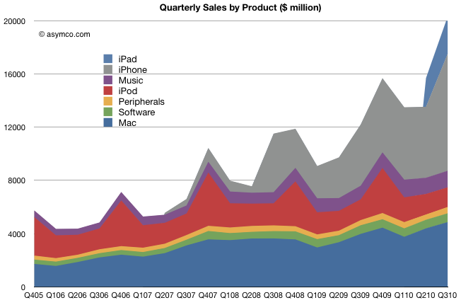
As a final note, think back to 2001 before the iPod. The the Blue, Green and Yellow bands were all that Apple had.
38 comments
David Chu ·
I find it interesting that Jobs stated on the conference call that they see one or two more strategic opportunities still in play I. Response to question about not returning dividends.
jecrawford ·
I assume that iPod touches are included in the iPod numbers?
I would like to see iOS devices all together as a more significant grouping.
Abhi Beckert ·
As far as I can remember, iPod touches are slightly more than 50% of the iPod sales.
Sälli ·
Apple's growth only seems to be accelerating, while on the other hand we have seen that it's P/E (especially ex cash) is at historically pretty low levels. It would be nice to see a visualization of these two data series together.
Macorange ·
Agreed, that would be a great visual representation of how much AAPL is currently undervalued.
David V. ·
@Abhi: That was true (just before the September refresh) wrt. unit counts; iPod touch is significantly more that 50% of iPod revenue and earnings however.
@PaulMaxime ·
If we have 275K activations/day over the quarter we get approx. 24M iOS activations.
If we subtract out 14M iPhones and 4M iPads, that leaves us with 6M iPod Touches.
Steve Kellman ·
Subtle vertical lines might also help to visualize the annual difference within each category. (Great info!)
David F ·
As a final note, think back to 2001 before the iPod. The the Orange band was all that Apple had.
Not quite true. There was also Red (software) and Purple (accessories).
@bogusjimmy ·
Is there a similar representation of MSFT's latest earnings anywhere?
El Aura ·
Wasn't the 275K only for the month of September? (I might be wrong though.)
fivetonsflax ·
Horace, how do you decide how to order the bands on this type of graph?
Visualization Nut Case ·
Nice. However, the quarterly areas are distorted by the stacked-line chart format. I would love to see these data as a stacked bar chart. Also, put the oldest products (Mac) at the bottom.
Steve ·
You should reverse the ordering of the categories (the vertical ordering) to better emphasize your point.
Peter Edstrom ·
Could this chart be sorted with the least changing units on the bottom? Music, peripherals, software are all small and relatively unchanging bits, but because of other parts that are changing, it looks like they are all over the board.
asloppygirl ·
Intersting....
Doug ·
What about apps, does that come under software? I would have thought that to be significant data which appears to be missing
Robin ·
Agreed - stacked charts like this convey the data much better when the relatively stable data series are at the bottom.
mcthenail ·
I'm with Steve and Peter Edstrom, and find your version of the chart annoying and difficult to read. It falsely implies that the constants in the chart (or the falling items) are rising, simply because new items are being added. That's bad graphics. Put the least volatile things on the bottom, the most volatile on the top. Then we get a sense of growth, and where it's coming from. Thanks.
Duncan ·
It would be great to see these various segments re-ordered to satisfy some curiosity, but the chart as configured indeed reflects the headline. Imagine if the iPhone and iPad segments remained on the bottom, but everything else was merged into gray and labeled 'other'. THAT'S the point of this entry.
DJ K ·
I agree. If you can arrange your graphics from the smallest to the largest, it would further emphasize you point. And, I know it a new and SMALL revenue, but Apple TV needs to be in there.
Not Duncan ·
(To Duncan) Even if everything else was merged to 'other', the gray 'other' should be positioned on the bottom. Then we clearly see the consistency of the gray while the new growth rises on the top. WTF.
Joshua ·
Would be good to see the same data but with the Mac line on the bottom (it has been increasing, but it gets lost in the data and may as well be flat). Software Peripherals and Music would be next, as they are fairly flat too. iPhone and iPad next, with iPod still on the top, as it is the most peaky seasonally.
What say you, Horace?
milosg ·
Impressive, Apple only created one new product in the last 3 years! But the one they created 3 and a half year ago represents 50% of their sales!
Abercrombie ·
As a statement to Apple's cumulated earnings, the chart is indeed impressive. Per individual product categories, not so much. If the graphs weren't stacked it would be apparent that the iPhone sales have peaked in 2008 and have now settled to a more sedate pace of growth. About the same is valid for the other product lines, with only the newest one (iPhone 4 and the iPad) enjoying the spurt which is characteristic to new tech.
However, here are important things to note and learn from:
Once they get a product category out, they secure a long-term steady income off it. This speaks to the quality of the products and services, of customer satisfaction, and of Apple's capability to reinvent the category and keep it relevant.
Secondly, they do well to look into creating new categories, periodically. Which in turn maintain a healthy flow and sustain each other. As a business ecosystem, it's a pleasure to watch. There are no sharp drops and end-of-lives here, only incremental improvements.
phoff ·
Headline is erroneous. The iPhone was releasde in January of 2007 (see graphic), which is more than 3 years ago. Title should read: "60 percent of Apple’s sales are from products that did not exist four years ago".
kevin ·
Jobs did say it was for the "past 30 days" which could mean Sep 18 to Oct 17, as well. Some people are also claiming that the number could include AppleTVs, though I doubt it.
But I think the estimate is in the ballpark - I'd say approx 5 - 6 million iPod touch sold.
j.a.duke ·
@phoff: The iPhone was announced in January 2007; It shipped in late June 2007 (24th or 25th), but effectively the title is accurate in that for the 3rd calendar quarter (4th fiscal) the iPhone was brand new three years ago.
kevin ·
Not sure what you mean by "peaked in 2008." What peaked? Not unit sales. Not even growth rate.
Compared to the first year only, the rate of growth has surely decreased as there is a much bigger base. BUT: Over the last 4 qtrs (FY10), Apple sold 40m iPhones. In FY09, Apple sold 20.7m iPhones. In FY08, Apple sold 11.6m iPhones. Doing the math, iPhone sales are accelerating year-over-year.
phoff ·
That's true, yet the graphic clearly shows that there are sales of the iPhone in Q107. Odd.
John ·
Not a fan of this kind of graphic in general, but the advantage of this format is that you can easily see what share the new products (and they are arranged by date with newest on the bottom) make up.
Another take-away: Apple is a hardware company.
asymco ·
Coming next week.
asymco ·
You're right. Much better if I do it your way. I will fix.
asymco ·
It's part of Music. Apple does not count gross sales (app price) as sales, they only count what's left after the developer cut (I am fairly certain of this as it was brought up in an early conference call, but I could be wrong).
Keep in mind that many apps are free.
asymco ·
The iPhone was announced in January 2007 but went on sale at the end of June 2007.
asymco ·
Sales start was end of June so there were sales for about 3 days including a weekend in Q2.
KenC ·
The graphic has changed, but the text has not, and so doesn't quite make as much sense. The bottom two bands are no longer iPhone and iPad, and the orange band, was Mac, and is no longer.
What is interesting to me, is Horace's note that the 3rd quarter, calendar year, not fiscal year, used to be a snoozer along with the 1st and 2nd quarters, for Apple. Just look at the 3rd quarter since 2008. That's when the 3rdQ started to be bigger than the Xmas quarter in the preceding year. That never happened before 2008. Now, the 3rdQ dominates the Xmas quarter of the prior year. I think the Back-to-School effect has really hit a tipping point. It seems to me that 2008 is when kids really started buying Macs for school, which also happens to be the year, the iPod touch was first included in Back-to-School promotions. The iPod touch is the Trojan Horse. I can't believe noone else has offered an iPod touch-like device until now. I just saw, Samsung is releasing an iPod touch competitor, finally.
Brett Miller ·
Makes you wonder what consumers will be buying from apple in another three years.
Brett Miller http://www.customsoftwarebypreston.com