Summary view of Apple's income statement [Updated]
by Horace Dediu
Since reporting on the 18th, I've mostly finished going over the the fourth quarter Apple data. Here is a quick summary of the articles that covered the financial and product performance:
| Subject | Article |
| Cash | Having added $20 billion last year, Apple’s cash growth suggests total could top $100 billion next year |
| Growth | Apple’s Growth Scorecard: 63% average earnings growth over 16 quarters |
| iPhone pricing | The end of exclusivity doesn’t change the price operators pay for the iPhone |
| Sales by product | 65% of Apple’s sales came from iOS powered devices |
| Next quarter’s estimates | Estimates for Apple’s second quarter earnings (ending March) |
| Share price/valuation | Is Apple a candidate for acquisition? |
| Margins and platform mix of profit | iOS enables 71% of Apple’s profits. Platform products power 93% of gross margin |
| Cannibalization | iPhone and iPad: Fine Young Cannibals? |
| Operational Expenses | $76 billion a year from a tableful of products |
That leaves one more: Summary view of cash flows.
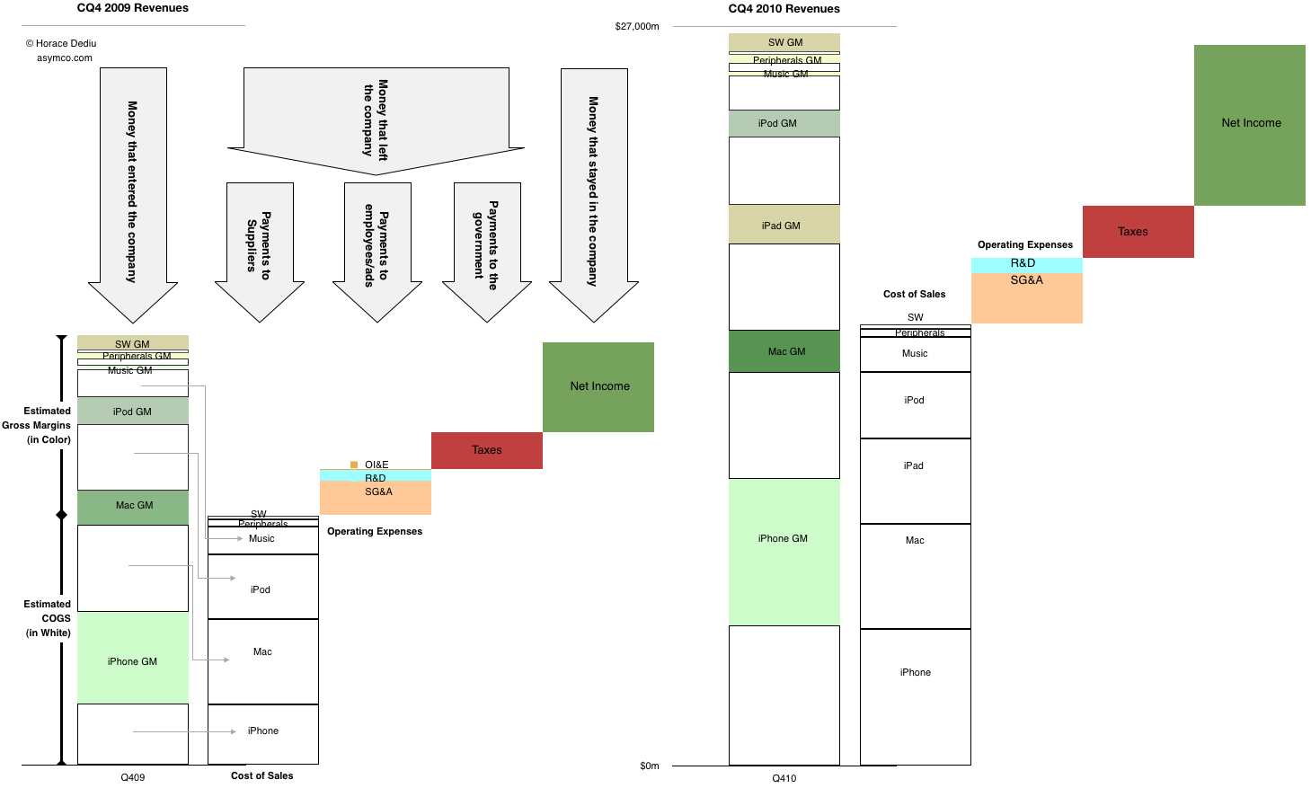
After introducing it last quarter, this is a chart that I'm trying to improve and use as a single snapshot of growth, product mix, profitability, cost structure and overall sales. The purist in me likes to see the chart clean but it can be a puzzle to some. So for the sake of explanation, this time I've added some annotations to the year-ago quarter.
The left half shows flows in the same quarter a year ago and the right side shows the flows in the fourth quarter just ended December 2010. You can see where sales came from, how much of each product's sales went to suppliers and how much was available to pay employees (and who got what). You can also see how much was paid in taxes and what was retained.
Please click on the figure (requires no scrolling when viewed on screens wider than 1464 pixels).
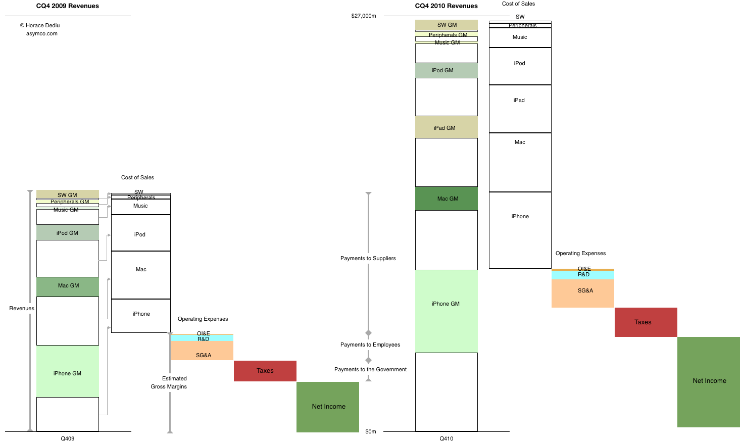
[Update] Alternate view using "waterfall".
22 comments
eyez00 ·
Brilliant chart. Pictures paint a '000 words. Many thanks.
pk de cville ·
Horace,
Edit required on number 9, number 9, number 9!
Thanks for your analyses!
Halex_Pereira ·
The explanation is perfect; now everything is clear.
Philip Elmer-DeWitt ·
One of my readers asks, where is iAds?
Guest ·
I guess what jumps out for me is how little is paid to employees. I suppose that's the advantage of volume (and the ability to maintain pretty high product margins). Normally a chart like this would make me worry if they are putting enough into R&D and Sales; but it otherwise appears as if Apple is doing well in these areas.
Joe_Winfield_IL ·
Keep in mind that Apple employees don't manufacture the devices. If Apple did their own fabrication, a huge pile of cash would be moved from suppliers to employees.
asymco ·
Great question. What do we pay those guys on the earnings call for?
asymco ·
I believe production salaries would still end up in cost of goods sold, though I might be wrong. COGS includes shipping, warranties, etc.
Steven Kan ·
^^ By the way, I don't mean that as a criticism. It's a very well-done chart, and does provide a clear picture.
asymco ·
That does make more sense.
Hap ·
Yes, carrying over the body's experience of gravity to visual display would make more 'sense.' It's very Mac-like to acknowledge how much we operate on metaphors rooted in physical reality.
Alan ·
I see the total for Q42010 revenues, but I don't see the corresponding label for 2009.
asymco ·
They are both the same scale. In the interest of keeping chart clutter to a minimum you can index off the same mark. (the 2010 figure is not total number but a reference point like a gridline).
asymco ·
I've updated with a second chart using the waterfall metaphor.
KenC ·
Yeah, it's a bit shocking to realize how much Apple revs grew year over year.
FalKirk ·
I love this site. Stephen Kan makes a suggestion. Nobody flames him. Nobody flames Asymco. Horace Dediu agrees with Stephen Kan and and adopts his suggestions. Everybody's courteous, respectful and helpful. It's a win for everyone.
I'll say it again. I love this site.
Kizedek ·
The number of employees that Apple actually has is by all accounts very low for the size (marketcap) of the company. Mostly the main campus in Cupertino; and then the stores, which are quite small stores.
Also, Apple seems to get very high revenue per square foot in its stores, the highest of just about any store chain on the planet, in any industry.
HTG ·
Yep, that's the correct accounting treatment for production salaries and wages... included in COGS...
HTG ·
I agree with FalKirk....
One thing Horace, and this is not a criticism, but could you also look at the cash flow statement disclosed by Apple in its 10-Qs... I note from the most recent one that Apple spent in Q1 $1.2 billion on property, plant and equipment... which included around $500m in land and buildings alone(!)
Further, its actual operational cash flow was $9.7 billion and the amount actually paid in tax was $826 million vs a provision of $1.9 billion in the income statement for Q1...
What your charts do very well is split up the income statement, but don't say much about what is happening with underlying cash flows...
I would be interested on your thoughts on Apple's cash flow statements as well.
Cheers
HTG
Alan ·
Got it. Clutter is definitely the enemy in this kind of chart. Would be great to have some kind of log scale in the background to be able to easily do growth comparisons in terms of multiples, especially with the new waterfall up format.
asymco ·
Yes, thanks for pointing this out. This is a view of the income statement not the cash flow. I changed the title to reflect this.
Kristian ·
Actually they do manufacture Macs. iOS devices are made by others as are most of the laptops.