Asymco

Asymmetric Intelligence

Horace Dediu Dirk Schmidt

  1. Game over

    Research · 235 comments

    In the "Race to a Billion" there is a graph showing Android reported activations and iOS cumulative unit sales alongside cumulative console sales. The contrast between mobile phone platforms and game consoles is striking, with an order of magnitude difference in consumption. The best performing console to date is the Wii with about 100 million units sold so far.

    [UPDATE: Thanks to Danny Nemer cumulative sales of Sony's PlayStation 2 (using production shipments from FY 2000-05 and recorded sales for FY 06-12) is 155.81 million units]

    However, that is an incomplete picture of the game platform business primarily because consoles are not the entirety of the business. Mobile (but dedicated) gaming platforms have been sold for some time.

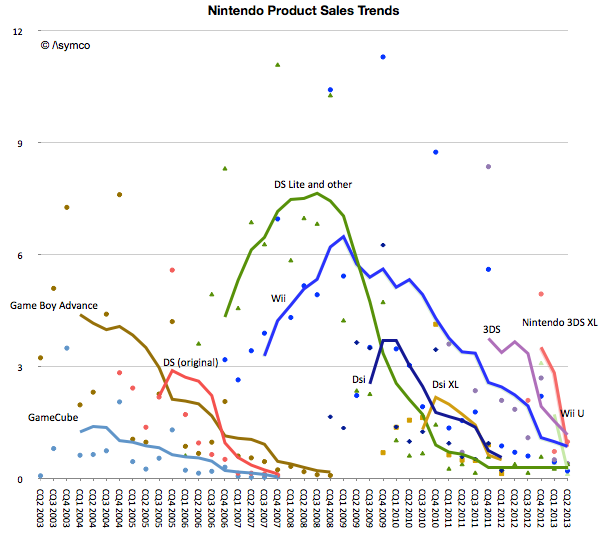
    To give a better picture of the game business we prepared the following graphs. The first shows Nintendo's product lines with actual unit shipments (shown as colored dots in millions of units per quarter) and the trend (shown as trailing twelve months' average trend lines).
    Screen Shot 2013-09-09 at 9-9-4.45.30 PM

    Note that fixed and mobile products are both shown on the same graph. The picture that emerges is that for Nintendo, its mobile platforms combined are more popular than its fixed consoles with a total of 186 million mobile devices sold since 2003.

    There is also a pattern of generational change. The GBA, DS and GameCube era was superseded by the DS Lite, DSi, Wii era. The Wii era (or generation) was significantly more popular than the GameCube generation. If there is a problem however, it seems to be that the new generation devices or consoles are not forming a new era. The Wii U and 3DS are not growing nearly to the level of the previous generations and have faded quickly.

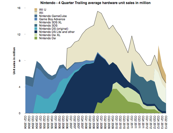
    To summarize, the unit volume graph for Nintendo is below. ((This is a smoothed graph showing what sales would have been if they had been evenly spread out over a 12 month period. The actual sales would total to the same area but would be much more seasonal and thus noisy.))
    Screen Shot 2013-09-10 at 9-10-10.25.23 AM

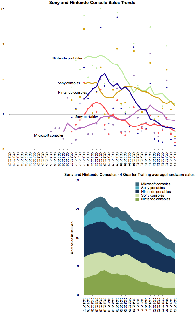
    To confirm that this is indeed disruption we should look at the pattern for another competitor in the console market: Sony. ((We would like to show the pattern for Microsoft but there is no regularly reported Xbox shipment data.))
    Screen Shot 2013-09-10 at 9-10-11.09.16 AM

    The graphs above combine both Nintendo portable/consoles and Sony portable/console sales. Note the similarity in patterns of growth. It's one thing to suggest that Nintendo consoles have "failed", it's another to show that Nintendo consoles and portables have failed, and yet another to show that two competitors in the games business seem to be failing in unison across all their product lines.  The cyclicality is also over a long period of time: The peak for the combined Sony/Nintendo was in 2008, five years ago.

    The chief criticism to the industry-wide view of decline is that there is a new generation of consoles right around the corner. This is the eighth generation of consoles which, it is presumed, will bring growth back to the industry.

    But the Nintendo 3DS, launched two years ago, was meant to kick off the eighth generation, and the PlayStation Vita was Sony's response. Then the Wii U was also billed as the successor to the Wii. They have so far failed to re-ignite growth. One might reply that they were merely appetizers and that the main  course of the next gen are the PS4 and Xbox One.

    Will they create growth again? Surely not for Nintendo, but I would argue that not for Sony or Microsoft either. There might be a burst of sales at launch as the hard core gamers upgrade, but they are unlikely to recruit new gamers the way the Wii did. In other words the PS4 and Xbox One are unlikely to win against non-consumption.

    That is where mobile is the clear winner. More people will hire mobile devices for their primary gaming activity.  And as mobile devices get inexorably better, they will be hired for use in the setting where consoles have been king: the living room.

    The implications are that Nintendo, Sony and Microsoft are beyond the point of no return in this industry. Gaming, as a business, cannot be sustained as a platform independent of a general purpose computer. Like other "applications" that used to have systems built around them conforming to their needs (( Applications such as word processing, financial calculation, media editing, music playback, etc.)) the dedicated-purpose solutions came to be absorbed into the general-purpose platforms. And the modern general purpose computer is the smartphone. (( One interesting question is why didn't the general purpose personal computer absorb console gaming. My answer is that personal computers could not conform to the experiences around the "10 foot" interface and still function well at their main jobs. In contrast, mobile devices through screen sharing have the ability to be much more malleable.))

    UPDATE: I added Microsoft console shipment data which became available after 2008.
  2. Measuring iOS as a gaming platform

    Research · 35 comments

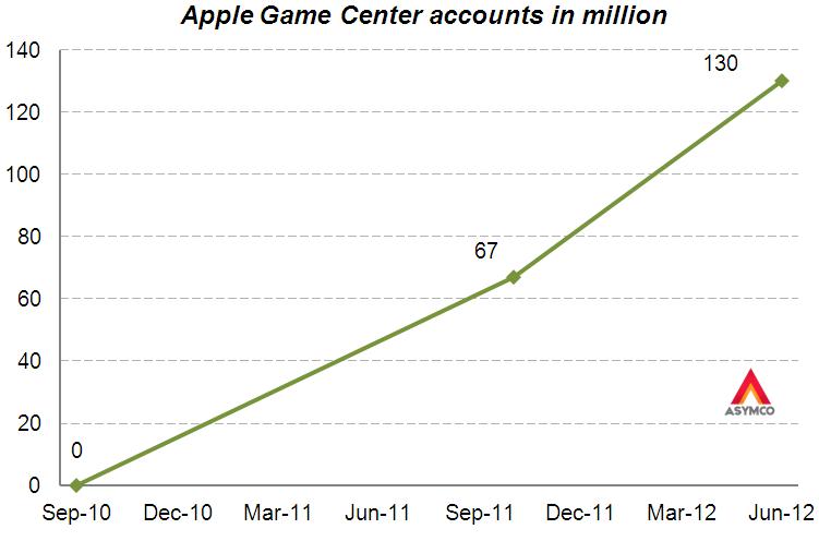
    At this year's WWDC Apple offered an update on Game Center accounts. The data we have so far is shown in the following graph.

    Before being acquired, another network, OpenFeint, announced 180 million iOS accounts in October 2011. Another figure to consider is the 40 million subscribers to Xbox Live (out of 66 million Xbox users). This subscriber base is paying for a service (about $1 billion per year) so it's not the same as the free Game Center model.

    Rather than being a revenue source, Game Center is designed to engage users and to capture usage information. It also lets us gauge gaming "consumption" on iOS devices. That itself allows us to contemplate it as a gaming platform vis-à-vis alternate platforms.

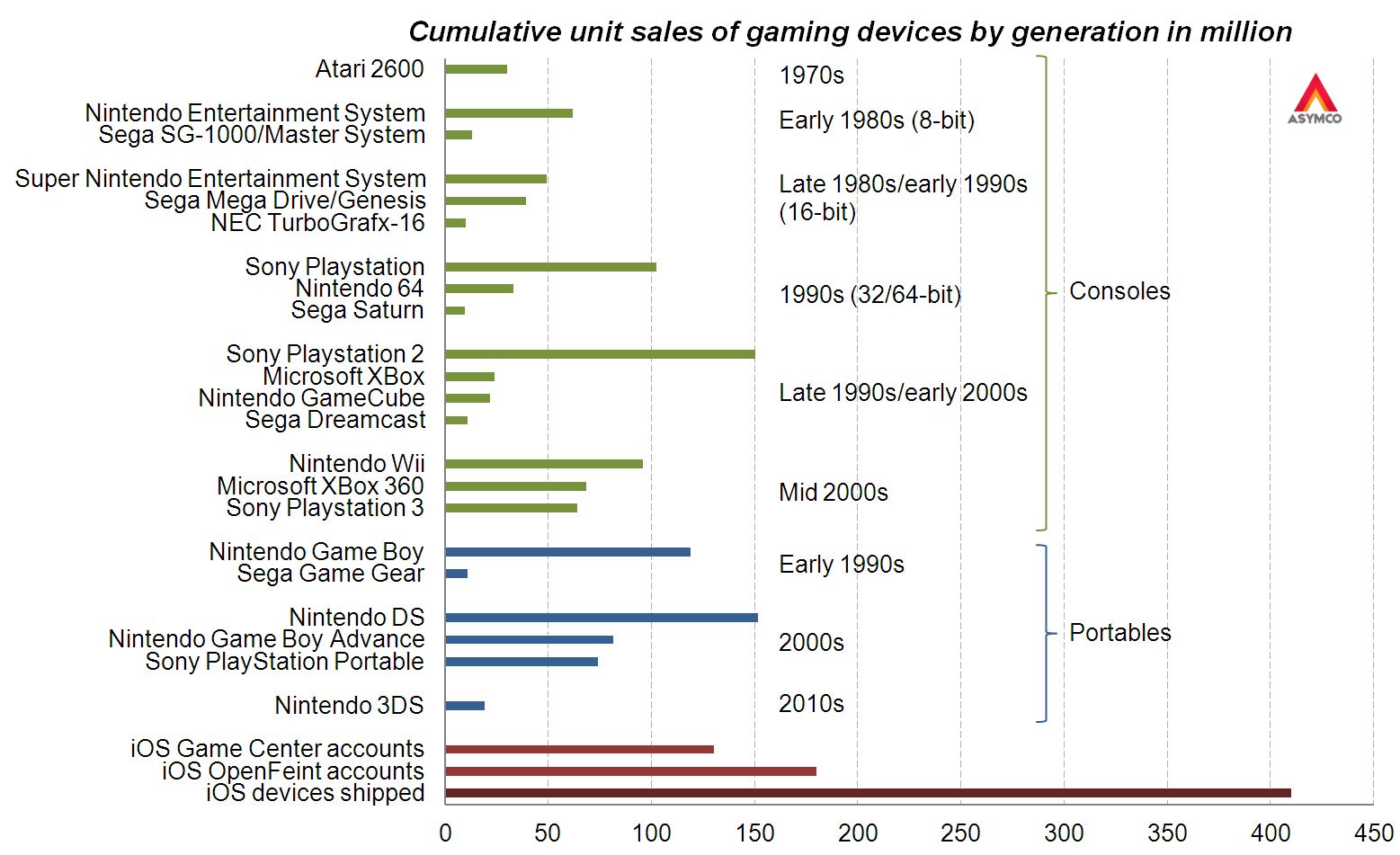
    To consider the figure as a proxy of penetration and engagement, the graphic below shows cumulative sales of gaming devices.[1]

    Here are some observations:

    • There is a pattern of turnover of market participants
    • Each console "generation" had a clear market leader
    • The best-selling gaming device was the Nintendo DS closely followed by the PlayStation 2 [2]
    • Considering the 130 million Game Center accounts, iOS is already the third largest gaming platform
    • Furthermore, considering the OpenFeint iOS figure of 180 million accounts announced in 2011, iOS has already surpassed the cumulative sales figures for the Nintendo DS
    • No gaming device has ever reached the 200 million mark
    • At the current growth rate the number of Game Center accounts will surpass 200 million before the year end

    Apple cites the number of games, downloads and payments to developers as evidence of ecosystem health and growth. The figure of Game Center accounts is yet another indicator. It shows growth in and of itself, but it also has the side effect of offering comparative measurement of performance. That measurement compares favorably with other game platforms.

    The economics are different but they always are when a disruption takes root.

    ---

    Notes:

    1. Based on reported cumulative sales (Wikipedia), excluding gaming devices with less than 10 million cumulative sales (excludes for example PlayStation Vita), excludes also “home computers” due to missing reported figures
    2. This Wikipedia article contradicts the previous.
  3. What retail is hired to do: Apple vs. IKEA

    Research · 123 comments

    “Within five years after discount retailing pioneer Korvette’s opened its first store in 1957, over a dozen copycat discounters had emerged. In contrast, the giant discount furniture retailer IKEA has never been copied. The company has been slowly rolling its stores out across the world for [close to 50] years; and yet nobody has copied IKEA.

    Why would this be? It’s not trade secrets or patents. Any competitor can walk through its stores, reverse engineer its products and copy its catalog. It can’t be that there is no money to be made: its owner Ingvar Kamprad is the third richest person in the world. And yet nobody has copied IKEA.

    Our sense is that the other furniture retailers have followed the positioning paradigm and defined their business in terms of product and customer categories, which are readily copied. Levitz Furniture, for example, sells low-cost furniture to low income people. Ethan Allen sells colonial furniture to wealthy people.

    IKEA, in contrast, has organized its business around a job to be done: “I need to furnish my apartment (or this room) today.”  When this realization occurs to people anywhere in the developed world, the word IKEA pops into their minds. IKEA is organized and integrated in a completely different way than any other furniture retailer in order to do this job as well as possible.”

    Integrating Around the Job to Be Done (Clayton Christensen, Harvard Business School; Scott Anthony, Innosight LLC, Scott Cook, Intuit; Taddy Hall, Advertising Research Council).

    IKEA is the world's leading furnishing retailer and an amazing success story. As Christensen points out the success is all the more perplexing because it seems perfectly defensible. Nobody has tried to duplicate or undermine IKEA.

    Positioned around a clear job-to-be-done it integrated design, manufacturing and distribution (including warehousing) as well as "big box" retailing as an experience.

    This may sound familiar.

    Apple's entry into retail depended on a clear job-to-be-done, design, carefully selected merchandise and retailing as an experience. Similar to IKEA, Apple also became a dominant player in its segment and even achieved seventeen times better performance than the average US retailer in terms of sales per square foot.

    At first glance they seem to be similar businesses in terms of strategy or "architecture" but how do the actual businesses stack up? Can we find data to support any claim of similarity.

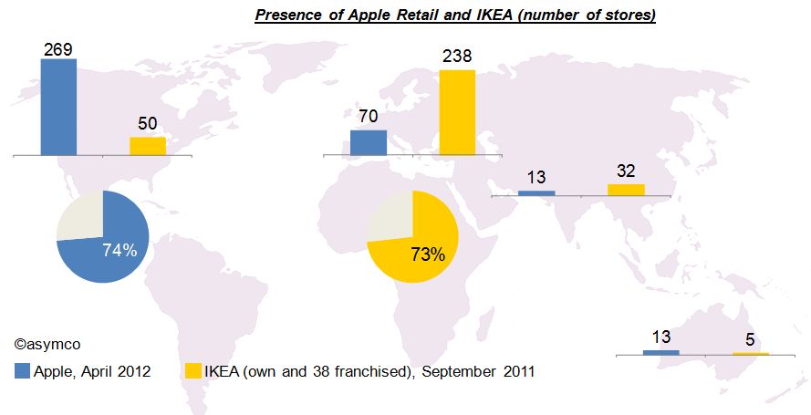
    Let’s first have a look at the geographic focus of both companies. The graphic below shows that Apple’s retail operations are focused on North America with 74% of its 365 stores in the USA and Canada. By contrast, and maybe as much based on its origin, 73% of IKEA's 325 stores are located in Europe[2].

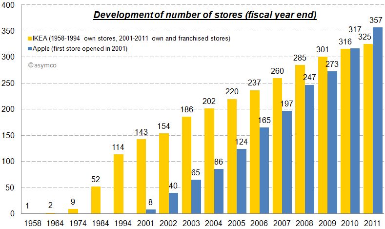
    Unlike Apple however, IKEA has grown much more slowly. IKEA’s first store was opened in 1958 and had 6,700 sqm (72,110 sqf). The first two Apple stores opened in May 2001. Since then the number of Apple stores grew significantly faster (CAGR: 46%) and surpassed the number of IKEA stores in 2010.

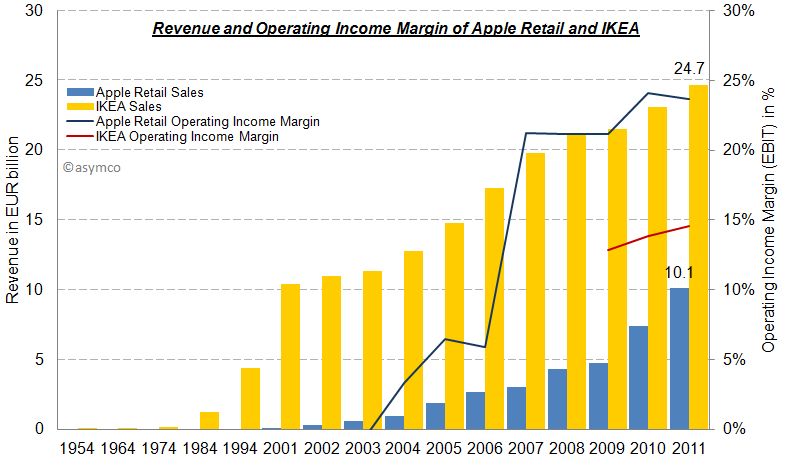
    The other difference is in sales growth. In 1954 IKEA’s revenue amounted to approximately $1 million but has grown steadily (note in chart below that first five bars represent decades). In contrast, Apple has grown more rapidly and is also more profitable in terms of margin.

    Part of the difference in growth is that Apple was able to subsidize its entry: Apple’s retail operations were loss making for the first three years while IKEA had to rely on financing from its own cash flows.

    Eventually, Apple retail became self sufficient and is now more profitable than IKEA. The following charts provides an overview of the economics of Apple’s retail operations and IKEA side-by-side:

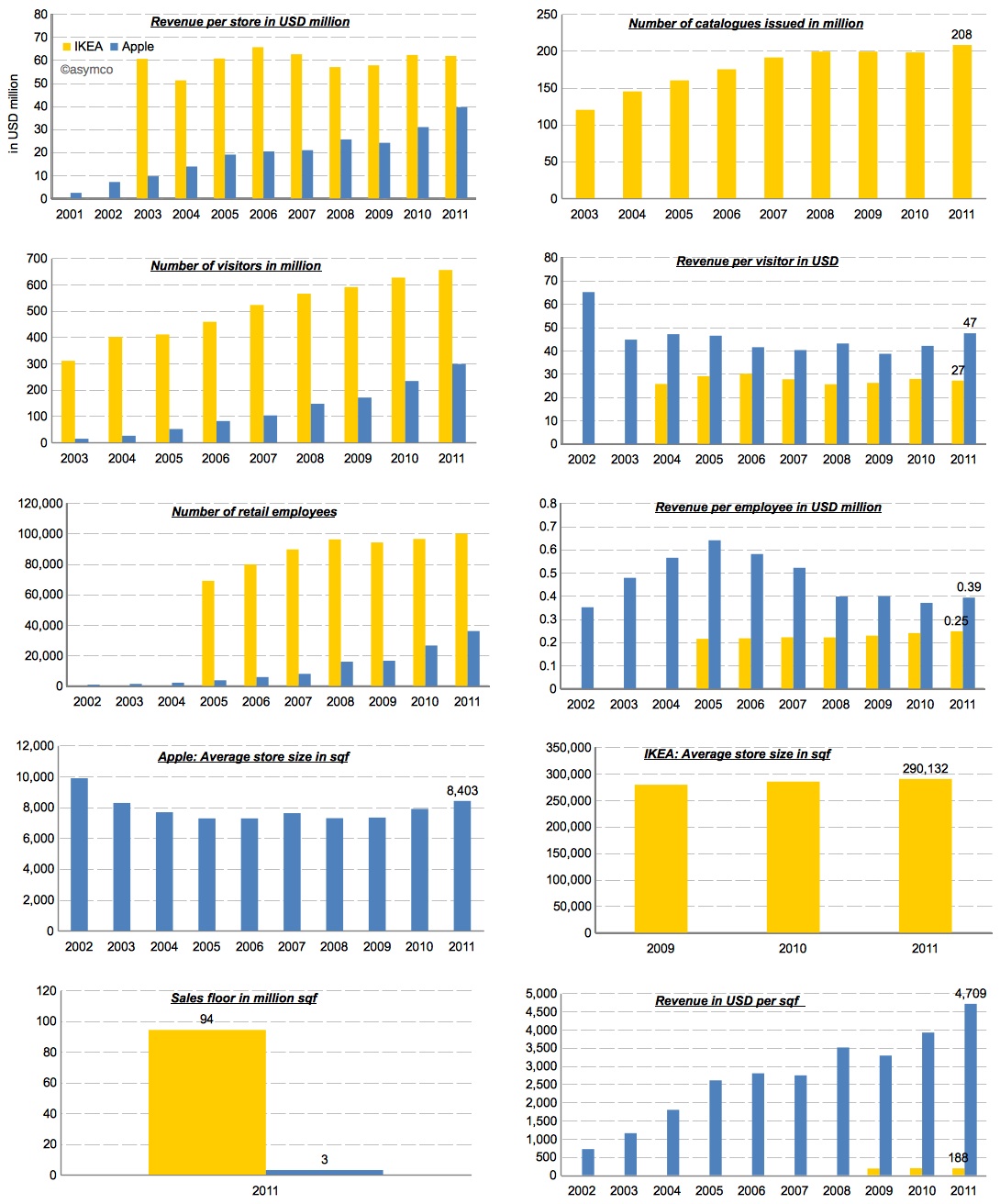
    While Apple’s revenue per store is still growing, IKEA’s business seems more mature and stable. This makes sense because furniture prices are stable and the number of products (SKUs) depends on available area per store which cannot grow. Apple on the other hand is limited only by traffic issues. Its products take little space and can even be stored off-site.

    Speaking of traffic, with 655 million visitors in 2011, IKEA had more than twice as many visitors in its stores compared to Apple. However, each visitor spent about $27, while Apple’s store visitors purchased for almost twice as much.

    The same story applies in employee productivity. IKEA has three times the number of retail employees, but Apple’s revenue per employee are 1.5x bigger than IKEA’s.

    The largest difference is in the efficiency of real estate. In terms of total sales area IKEA’s operations have more than 30 times the sales floor of Apple.

    As much as these numbers tell a story, they don't help us understand the cause of success. The two companies have completely different operations and their metrics seem at odds to one another. What works for one could never be applied to the other.

    The fact is that there is no magic economic formula for disruptive retail. For example, by measure of sales per square foot, IKEA would not even make the top 20 list of US retailers.

    However, there is one major thing they have in common: a clear formula for positioning your retail operations. Both operations are positioned around a job-to-be-done that has a high priority in people’s life. As mentioned in the opening quote, In IKEA’s case it is “I need to furnish my apartment (or this room) today” and in Apple's case Tim Cook said it best:

    “Our retail stores provide the best buying experience and the best customer service anywhere. And while that’s important for a buyer of a Macintosh, in some ways it’s even more important for a buyer of an iPad or an iPhone or another post-PC device because these devices are new to many people. There needs to be a place to discover them, to learn about them before they are purchased, and learn how to get the most out of them after they’re purchased.” Tim Cook, March 2012

    Apple offers a place where people can discover and get answers about technology without the pressure of making a purchase. The job is to simplify that which is complex for a price premium.

    IKEA offers a place where people can get exactly what they need exactly when they need it. The only downside is that "some assembly is required". In a way, their job is to introduce some complexity in exchange for convenience and a discount.

    In the end, they both get the job done and are amply rewarded for it.

    ---

    Notes:

    1. Including 13 in Russia.
    2. The acquisition of UK-based furniture retailer Habitat in 1992 is the only exception.
  4. The parable of Nintendo

    Research · 100 comments

    With the launch of the Wii console, Nintendo averted disaster. When the Wii launched in late 2006 Nintendo had been facing the simultaneous attack from the "seventh generation" Xbox 360 which launched a year earlier as well as the PlayStation 3, both of which set as their bases of competition 3D graphics at HD resolutions. Many wrote off the company and called the console market a two horse race.

    Then, in what seemed a desperate downward leap, the Wii was launched into a different trajectory. It addressed non-consumers with a new, more intuitive controller and standard resolution rather than competing for hardcore gamers with more power and richer graphics.

    Because the Wii was asymmetric and addressed non-consumption rather than trying to be a "better" console in what was becoming a horsepower race, Nintendo expanded the console market. Its innovation was interesting enough that many hard core gamers used the console in addition to a PS3 or Xbox and many non-gamers bought it as their first console.

    The result is that 95 million Wii's have been sold vs. 66 million Xbox 360's and 62 million PS3's.

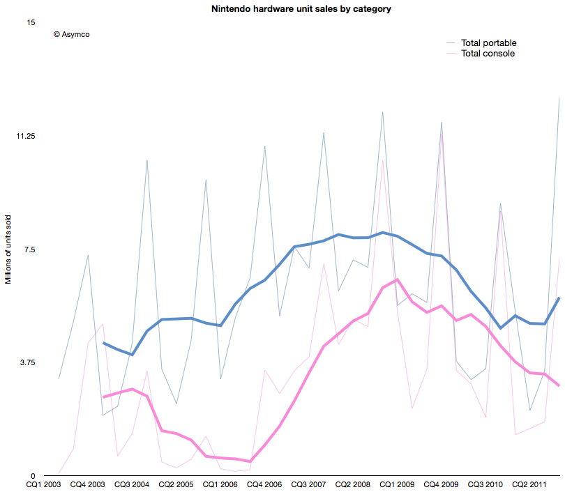
    The effect of the Wii introduction on Nintendo's console unit sales is shown below (pink line).

    The graph above shows that the growth from Wii has stopped. In fact, the console has been in decline since early 2009. Fortunately for Nintendo, the company also developed a mobile strategy. Learning from its Game Boy device, its DS series of portable game consoles allowed the company to diversify its portfolio. The graph also shows the total portable units sold in blue.

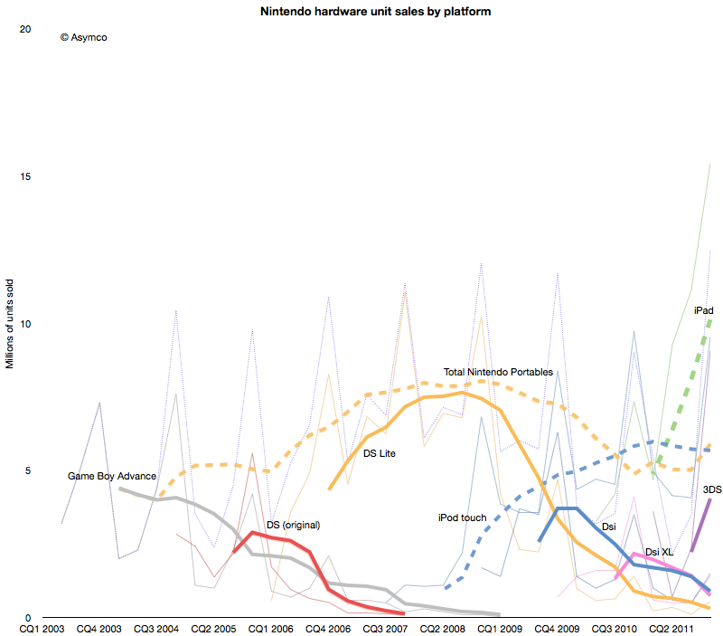
    However, this strategy has not been enough to protect the company from the disruptive effect of mobile computing. As the following chart shows, each new generation of portable from Nintendo has failed to break out of a general pattern of overall decline.


    Contrast the DS product patterns with the iPod touch and iPad--multi-purpose products whose game functionality is "good enough" but whose communications and general-purpose app catalogs are re-defining the basis of competition yet again.

    Nintendo bet on the 3DS to reboot the franchise. The 3DS product does show the characteristic initial spike in adoption but the level it launched at is far lower  than the level of the iPad. Nintendo has a big hill to climb to even recover the volumes it held in 2009. In contrast, the usurper Apple's volumes are doubling each year.

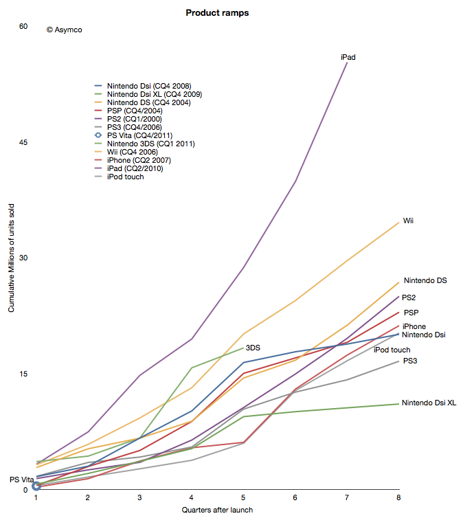
    When products are compared as "ramps" in terms of growth post-launch the story becomes even clearer.

    Although the iPhone and iPod touch ramped in similar ways[1] to the gaming platforms, iPad took an entirely different path. The 3DS benefited temporarily from a price cut but it seems to be returning to a well-worn trajectory.

    The data points a bleak picture for Nintendo. The Wii was a success due to its competitiveness vs. non-consumption of gaming. But another low end disruption took hold in 2007. Good enough games on phones and mobile computers are taking consumption away from dedicated consoles, both fixed and mobile.

    In addition, the rate at which game experiences are improving on iOS imply that they will overtake the "quality" of consoles in the not too distant future. Differences in distribution models also guarantee lower pricing for software for end users and enabling a far larger catalog of titles.[2]

    This may sound like another story of fortune gained and fortune lost. The inevitable "what goes up must come down" aphorism. We become used to this pattern and assume it to be axiomatic. But there are causes for each success and causes for each failure.

    The lesson here is that a company that disrupts does not necessarily survive. Long term survival depends on the ability for serial disruption. Serial disruption is an uncomfortable state for an organization to exist in. As the story above shows, disruptions are usually enabled by "desperate" necessity. Desperation is not something management is trained to aspire for.

    What management strives for is steady state satisfaction and predictability from intelligent planning.

    ---

    Notes:

    1. Though the iPhone ramp matched the consoles, the growth for the iPhone is persisting at 100% y/y five years into the product. This means it is outstripping all console installed bases by at least a factor of 2.
    2. The catalog is not only broad but deep in the sense that there are many new game concepts and experiments being tried. The app store is a vast testbed for game and entertainment ideas.
  5. You cannot buy innovation

    Research · 58 comments

    In a previous series of articles we discussed the capital Apple expends on equipment, real estate, leasehold improvements and data centers. Cost structure analysis reveals subtle shifts in strategy and the CapEx analysis demonstrates Apple's increasing integration into its supplier network and integration into the distribution and service infrastructure that sustains its ecosystems.

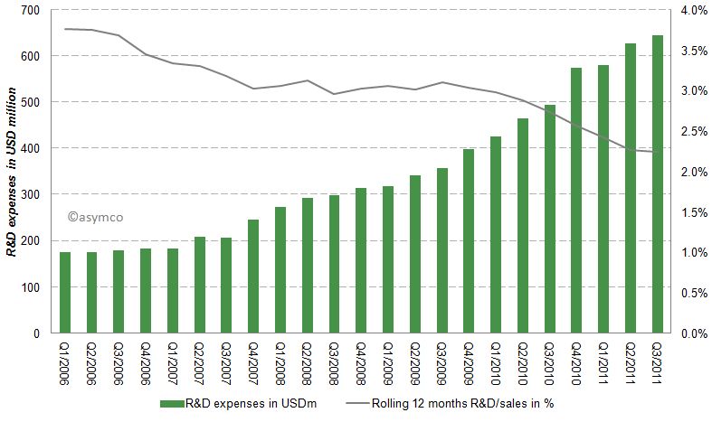
    Another form of investing (spending now, reaping benefits later) is the spending on research and development (R&D). Let’s have a look at Apple’s R&D expenses by quarter since Q1/2006.

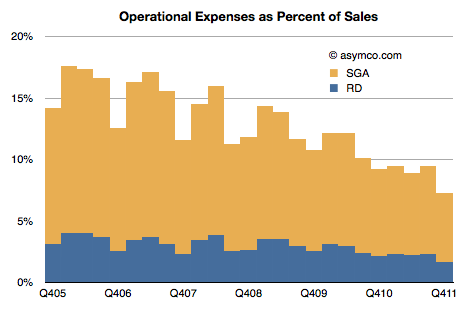
    Apples R&D expenses as percentage of sales have been declining from almost 4% to close to 2% in the last six years as shown in the following chart:

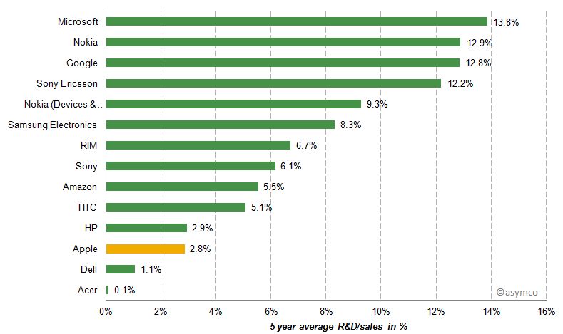
    While Apple's absolute R&D expenses have grown at an annual rate of 33% they have not kept up with the far higher sales growth rate. Apple's current rate of R&D expenditure is compared to a peer group [1] below.

    Apple's R&D/sales ratio is between Dell and HP, companies which do not develop their own software or hardware.

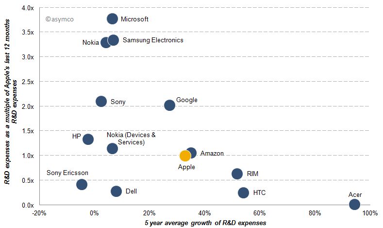
    Beside the absolute, relative to sales and relative to peers, another perspective is to measure relative growth. The following chart represents shows the 5 year average growth of R&D expenses and on the y-axis the size of last 12 months R&D expenses as a multiple of Apple's R&D costs [2].

    Acer's R&D expenses for example are almost non-existent compared to Apple, but have grown almost 100% per year while Microsoft’s last 12 months R&D expenses are almost 4x that of Apple's and have only grown slightly over the past five years. Google's R&D costs have grown at a similar rate compared to Apple, but remained double those of Apple’s throughout the last five years.

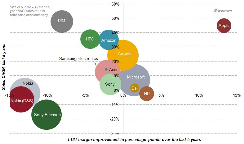
    Finally, we should look at the payoff from R&D spending over the last five years.  R&D growth should result in margin improvement, but does it? The following chart shows the relationship between spending (size of bubble), margin improvement (x-axis) and sales growth (y-axis).

    Of our sample, only three companies have achieved sales growth AND simultaneous margin improvement over the last five years. But while Microsoft and Dell have achieved sales growth and margin improvement slightly above zero, Apple has improved its bottom line by 13 percentage points and its top line by an average rate of 45%.

    In spite of Microsoft's, Google and Nokia's massive R&D growth, their returns from that investment have been meagre to negative in terms of margin and only Google showed appreciable sales growth.

    Discussion

    R&D expenditures on a stand-alone basis, in absolute or relative terms, do not correlate with disruptive growth. Essentially, you cannot buy innovation.

    In fact, sometimes it's nearly free. Most startups spend less on R&D than large companies do on stationery and yet the bulk of wealth creation has come from these tiny companies. The challenge is, in fact, that if you have resources you find ways of spending them (the quaint American cliche of 'cash burning a hole in your pocket'). The temptation is always there to fund a new initiative which bright people can always envision.

    Leadership in innovation is not the courage to spend but the courage to focus.

    “Focus is about saying 'No'. And the result of that focus is going to be some really great products where the total is much greater than the sum of the parts.”, Steve Jobs (1997)

    [1] Our set of peer companies as shown in previous posts but excluding LG, Lenovo and Motorola Mobility due to lack of data, but including Sony Ericsson and Nokia’s mobile phone division Devices & Services.

    [2] In this post “year” and “last 12 months” refers to the time frame from Q4/(year-1) year to Q3/year due to lack of published data regarding Q4/2011. Five year data runs from Q3/2006-Q3/2011.

    [3] A note on capitalized R&D: Most of the companies analyzed do not have capitalized R&D costs. Some have small capitalization, but so small that the inclusion would not change the decimal points of percentages. The only significant amount of capitalized R&D appeared in Amazon's earnings releases: capitalized R&D cost were USD 100 million in Q3/2011. The amortization of theses costs in included in Amazon's EBIT (Operating imcome).

  6. Apple's commoditization discount

    Research · 80 comments

    When asked where Apple's growth will come from, most analysts or observers will cite new products. As long as there are new products, then there is growth. Conversely, if there are no new products, then there will be no growth. This is such a commonly held belief that it's axiomatic: Apple is being valued based on short-term foreseeable growth.

    To be more precise, analysts value the wave of growth of every new product and heavily discount the post-growth phase assuming commoditization. There is no value assigned to Apple for extending market reach to the mass market.

    Consider: Analysts currently forecast an operating income (or EBIT) of $43.3bn for 2012 and $49.7bn for 2013. That implies growth of 28% in 2012 and 15% in 2013. These growth rates are modest in light of Apple's recent historic growth and especially 84% in 2011 on EBIT level. Much of this growth has been due to iPhone which quickly captured 4% market share in four years. To suggest 15% growth in 2013 is to suggest that Apple will not increase its phone market share by an appreciable amount. The implicit assumption in that growth figure alone is that Apple will remain a niche player.

    Bear in mind that 15% growth is so low as to be half the the growth in the Mac business and below the likely growth in the overall phone market. Considering the risk premium on equities, this growth forecast assumes essentially a no growth scenario. But even with no growth, Apple's cash flows are huge and thus they should add up to some significant present value. Since we know the value as reflected in the current price, we can work backwards to determine the discount rate being applied to those future flows. In other words, we can calculate how risky Apple's existing product cash flows are seen to be.

    Based on  assumptions originating from analysts' consensus, we can construct a simple model that will approximate the discount the stock market puts on Apple's future cash flows. Let's have a look at an adjusted Gordon or dividend discount valuation model on EBIT basis:

    Shares are valued based on the projected future cash flows of a company. Discounting EBIT with Weighted Average Cost of Capital and subtracting growth will yield enterprise value (= market capitalization - cash).

    Applying analysts’ assumption of close to zero growth to Apple's post 2012 EBIT means EBIT stays constant for 2013 and beyond. Let’s solve for the implied capital costs. Right away we can eliminate growth (g) as it equals zero. EBIT reflects operating cash flow since in a zero growth scenario CapEx will equal deprecation and there are no changes in net working capital. As Apple has no debt but a cash surplus, WACC will be equal to cost of equity[1].

    Solving for capital cost (WACC) with available analysts' EBIT estimates reveals a discount rate of 15%.

    But let’s remember that analysts have consistently and by a large margin missed Apple's financial performance. So let’s dial in a more aggressive estimate of around $56bn of EBIT for the fiscal year 2012. The discount rate goes up to 19% and implies an EBIT multiple of 5.3x.

    In other words, Apple's cash flows for a zero growth scenario are being discounted at a rate of 15% to 19%. This places the company in an extremely risky category of investment. It is certainly not something that can be categorized as a value stock.

    The discussions on this blog regarding Apple’s valuation have been insightful, but only danced around the triangle of price, earnings and growth. When the growth forecasts are considered vis-a-vis current pricing, the assumptions built into 'consensus' forecasts for Apple are condemnations of the company.

    They present a view of a company that is extremely vulnerable and can neither preserve its current cash flows nor find new sources of growth. It is, quite plainly, a company doomed to commoditization.

    ---

    Notes:

    1. Or one can even assume that cash has a positive effect lowering costs of equity (less indirect bankruptcy costs).
  7. Who is being reasonable now?

    Research · 49 comments

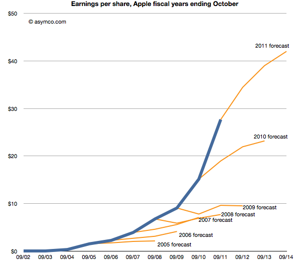
    Last week Horace wrote about the apparent "reasonableness" of analyst Apple estimates. He explained how the consensus for Apple's growth was always deeply pessimistic because its performance could be argued to be anomalous. It was just too good to be true. We reproduce the chart here:

    The estimates look like characteristic "tell-tales" of a company running strong into the wind.

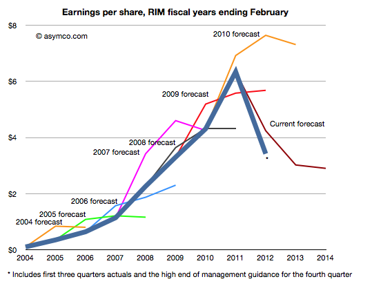
    This conservatism in the face of rapid growth sounds "reasonable" but is it always practiced? And what about the ability of this conservative strategy to predict dramatic changes in growth? To test, we started to look at the predictions for RIM. RIM has also enjoyed strong growth over a similar time frame as Apple. How did analysts predict its performance? The following chart was prepared using the same technique as the one for Apple[1].

    Surprisingly, the "tell-tales" look very different.[2] For every year we looked at the first year estimates were over-optimistic with a decline expected after one or two years. This pattern is remarkably consistent within the RIM data and remarkably inconsistent when compared to Apple.

    It's as if there was nothing in common with the methods used. This is perhaps appropriate, but the "quality" of predictions are not much better. With RIM they were too optimistic in the short term and too pessimistic in the medium term. With Apple they were far too pessimistic consistently.

    More worrisome, the 2010 forecast did not offer any hint of the dramatic decline which followed only a few months later. And after three quarters of really bad news, the consensus is still higher than what will likely happen (ensuring an uninterrupted string "misses").

    The study of these two companies' forecasts is a study in contrasts. We can say that the forecasting is disturbingly consistently inaccurate but we can also say that there seems to have been a bias of pessimism for Apple and optimism for RIM. We can only guess at the cause, but the consistency of bias points to something institutional.

    ---

    Notes:

    1. The three year forecast consensus (sourced from Bloomberg) was sampled one month following the end of each fiscal year. This should offer the analyst enough time digest the year passed and deeply contemplate the future.
    2. If we may stretch the analogy, these are indicative of an imminent stall.


  8. Growth and punishment: The vector space model

    Research · 21 comments

    After processing more than 1500 data points on the performance of thirteen technology companies, patterns are beginning to emerge. The steps so far:

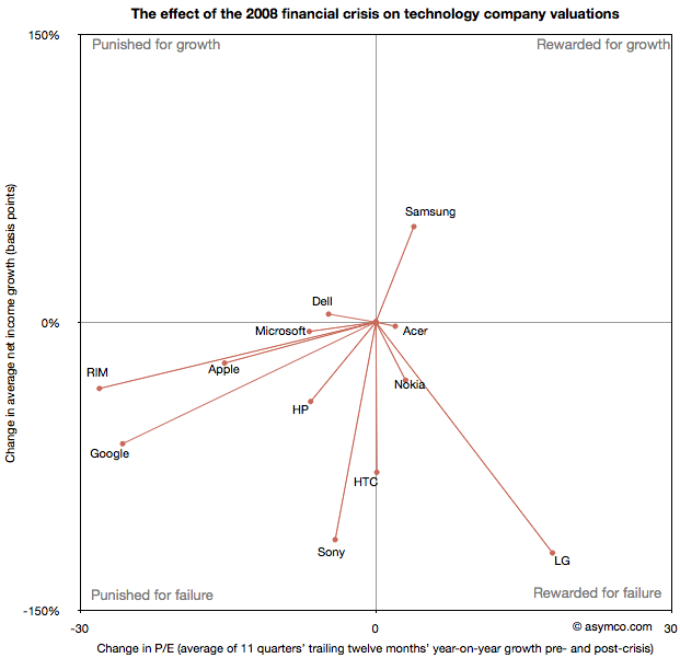
    The final step is to plot the changes in the relationship between pre- and post-crisis for the set of companies normalized to the same starting point and then classifying them: 

    The chart shows how the "average P/Es" changed after 9/30/2008 vs. how the companies performed during those periods. An evocative categorization is suggested for the four quadrants.

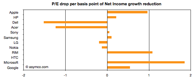
    One way to read the data would be as a degree of effect of the crisis. For example, in the case of HP, its P/E dropped by about 6.5 while its average growth decreased by 41 basis points giving an average of 0.16 drop in P/E for every basis point reduction in growth. That would be a fairly modest impact. In the case of HTC, the impact would be even less. The effect on P/E was zero even though growth dropped by about 78 basis points. At the same time the impact on Microsoft was severe with the P/E dropping as much as for HP even though its growth only moderated by 5 basis points.

    Therefore the "slope" (or angle in vector parlance) of each of the lines in the chart above may be interpreted as the severity of discount in value that the crisis invoked. Those values are shown the following chart:

    A strong bar on the right half of the chart implies severe impact, a bar around the middle implies minimal impact and a bar in the left represents an inverse relationship where the market priced in opposition to performance[1]. What should be considered along with this chart is the quality of earnings and consistency of performance (which are shown in the posts linked above.)

    Discussion

    As noted in a previous article, there are really only six companies which had strong separation between pre- and post-crisis valuations: Apple, HP, RIM, HTC, Microsoft and Google. They are also the companies which had strong P/E drops (except for HTC). As a group they are also the companies with the best growth stories historically. This is perhaps the reason for the drop. Basically, because these were strong companies they "had the most to lose". The market "punished" them more severely than the weaker companies because the weak had already been discounted.

    The other observation is that Apple and RIM are not treated particularly differently. The drops in P/E are at about 1 for every basis point drop in growth. This means that the the degree of value lost is about the same as a function of growth loss. Microsoft seems to have been the most affected. We can argue that it is perhaps weaker than the others strategically so this is reflected here, but I doubt it's weaker than RIM. Microsoft is also in contrast with Google which seems to have been given a lot of benefit of the doubt.

    Nonetheless, this framework offers some hints on how technology companies have been treated after the crisis. There is no rightness or wrongness about this treatment but it may indicate potential for significant reaction in the opposite direction if and when macroeconomic conditions improve. These vectors are, in a way, proxies for volatility or "beta" in terms of correlation to the overall market. The greater the beta, the more amplification to market movement; the greater the slope value

    As always, Apple is the canary in the coal mine as far as sentiment is concerned. What should be watched is the pricing reaction as Apple moves from a net reduction in growth to a net increase in growth. How will P/E react? The argument on this site so far has been that growth is exceptionally strong for Apple and it's not being reflected in the price. However, in this analysis we've stretched the time frame and did a longer retrospective. On this new time scale growth is not yet at the levels Apple enjoyed in the heady days of 2005/6. Perhaps this growth will return and when it does we'll get to see which way Apple's vector moves.

    ----

    Notes:

    1. An inverse relationship with value can happen for various logical reasons, for example that a company has volatile performance which is depending on anomalous events.
  9. Apple's P/E compression illustrated

    Research · 105 comments

    The reason we look at valuation is that it offers insight into how innovation is perceived. If a company is a successful innovator it usually creates vast wealth for its owners. However, the timing of that wealth creation depends greatly on its recognition by others. In other words, valuation lets you determine how recognizable innovation is. If your analysis tells you that a company is supremely innovative but nobody else recognizes this then you have an investable opportunity.

    So with that in mind we like to compare industry and innovation analysis with what "the market" thinks about Apple.

    The latest method we had in mind was to compare P/E (a measure of valuation) and Growth. We've shown before that they seem to be moving in different directions. That's not been news for over a year. What we will try to do now is to see if there is discernible change in the relationship before and after the financial crisis.

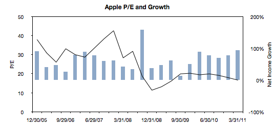
    The following chart is a simple representation of P/E (line chart with left scale) with Net Income growth super-imposed (bar chart with right scale.) We chose a time period of 22 quarters. 11 quarters after the crisis (i.e. quarters after the one ending in Sept. 2008) and 11 quarters before the crisis (quarter ending 12/20/05 through the one ending 6/30/08).

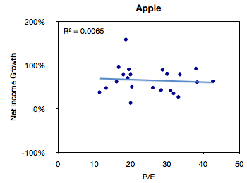
    We then plotted a scatter of all these pairs (P/E vs. Net Income Growth).


    The R-squared value simply shows that there is no correlation between these two variables, but this is not a surprise.

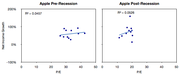
    The next step would be to compare the pre-and post-crisis data sets. The idea being to see if, and to what degree, there was influence from conditions beyond the control of the company.


    What seems to be happening is that the cluster of values did indeed move from the right (high P/E) to the left (low P/E) without much change in the growth.

    We can get an even better feel for this by measuring the "center of gravity" of the clusters and plotting how they shifted.

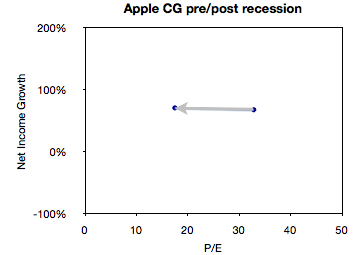
    This chart illustrates succinctly the phenomenon of "P/E compression" where P/E drops while growth continues.

    In the case of Apple, average growth actually increased slightly between the two sampling periods (from 68% to 71%) while the average P/E dropped from 32.8 to 17.5.

    What will follow over the next few weeks will be pair-wise comparisons of Apple and comparable companies along these metrics of P/E and Growth.