Correlating Innovation and Share Prices
Research #Industry #Theory · 12 comments
by Horace Dediu
In the last article on the P/E ratio vs. Growth for some of the largest companies, the question of PEG came up. PEG is the P/E over Growth and it's a good way to index valuation relative to growth. Usually Growth is measured as the forward twelve months consensus and a PEG of 1 is, as a rule of thumb, considered "fair value". However, forward growth is based on possibly inaccurate analyst consensus. If we instead look at historic growth, we have some actual performance to evaluate. Let's call this PEhG for P/E over historic Growth.
The following chart shows 30 large cap technology companies[1] and their five-year compound EPS growth vs. their current P/E multiples. If we draw a line at the PEhG of 1, i.e. when the P/E ratio is equal to the historic growth rate and split the pack into PEhG > 1 (overvalued)[2] and PehG < 1 (undervalued), we have the following split:
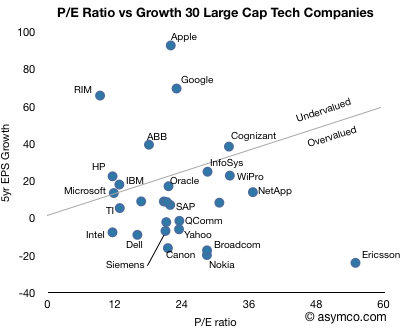
The chart makes for an interesting point of view over what the best positioned companies in the sector are doing and how business model innovation shows up as investment opportunity[2].
Apple, RIM, Google stand out for their business model innovation. Ericsson, Nokia, Yahoo and Dell show poor value for their lack of innovation. Microsoft, IBM, HP, TI and Oracle show in-line value for in-line or sustaining innovation.
[1] I omitted Baidu from the chart as it's off the scale: Growth is 151, P/E is 108. It would classify as undervalued. These are also not a complete set of all large caps. It's meant to be indicative.
[2] Notions of value are completely subjective. This does not constitute financial advice.
12 comments
Shiv ·
It would be interesting to see if one looked at historical P/E ratios and historical growth rates if the analysis would change. I think that it would avoid using past performance as a proxy for future expected performance and would let us know if the "market intelligence" as whole was telling us something that the analysts are missing out.
Gary Ribe ·
Just b/c of the huge cash balances and cash nature, wouldn't it be better to look at an ex-cash multiple or ev/ebitda to determine valuation.
tkr ·
You are completely correct. P/e multiples don't mean much, perhaps a little bit in an industry with comparatively little debt, but certainly the excess cash is very distorting (i.e., Apple & MS!). Unless you are look at an above-the-line multiple, this is very unconvincing, even if the point is correct.
--tkr
JonathanU ·
Agreed. However, as tkr astutely points out above, the premise still remains the same. To take into account the net cash or net debt positions of each company, merely move the dot for each company to the left if the company has net cash on the balance sheet, and to the right if the company has net debt.
So if you apply this to AAPL or GOOG or MSFT, you can see that each of these companies is indeed even more undervalued than the above chart would suggest, given each company has in excess of $30bn of cash etc. on the b/s.
JonathanU ·
Is there any reason for the outlier Ericsson? Looks a little odd to me...
Might take a look at it in the morning, unless someone beats me to it.
Johhny Ives ·
Where is Motorola?
Roman ·
Brilliant!
Love how Microsoft has PEhG = 1.00 precisely (I didn't notice that before)
Gary Ribe ·
I guess that was kind of my point. Particularly MSFT looks cheap at a 8.5x 2011 ex-cash PE.
Horace Dediu ·
Just removing cash from the P in the equation is not exactly correct. You need to measure not just earnings but cash flow as the denominator. So the correct ratio is Enterprise Value / FCF. It gets tricky if there are significant returns from the cash (which have to be removed.)
Nevertheless, I've done this for Apple in the past and the P/E is about 5 higher than the EV/FCF.
See: https://fnayeri-ulqtb.wpcomstaging.com/2010/05/11/apples-valuation...
(the P/E ex cash is shown relative to P/E)
It's tough to do this for every company since the FCF data is not published widely.
Horace Dediu ·
EPS growth for companies making losses cannot be measured. The companies covered are those that had consistent profits over a five year period.
JonathanU ·
Agreed. However, given the low interest rate environment we are in at present, the returns from holding cash is hardly material. Therefore subtracting the cash from P and ignoring the interest earned in the E is a pretty decent proxy for the real thing. Once interests rates go up though, it will throw a spanner in the works. But until then, it's probably good enough...
JonathanU ·
Oh and I think EV/EBITDA is probably better than EV/FCF as most companies don't report maintenance capex and growth capex respectively. Therefore the FCF figures won't be as useful to compare across companies, as fast growing businesses will likely have higher capex expenditures (and consequently lower FCF figures) which will distort the results.
There's a good reason most bankers love EBITDA, even if it has its downsides. It is probably the best metric to use to compare businesses with due to being above the capital structure, and being as 'clean' as possible, ie having less noise in the numbers re capex and working capital movements etc.