The discussion on why Apple is cheap was very useful. The debate brought into focus the possible causes for pessimism in the face of overwhelming evidence to the contrary. But maybe there is yet another explanation. The way the data was presented was as a difference between historic and projected growth rates. Is this the way analysts actually think?
Perhaps they don't project growth based on historic growth, but project earnings given historic earnings. In other words they don't look at the first derivative (change in earnings) but the shape of the actual data.
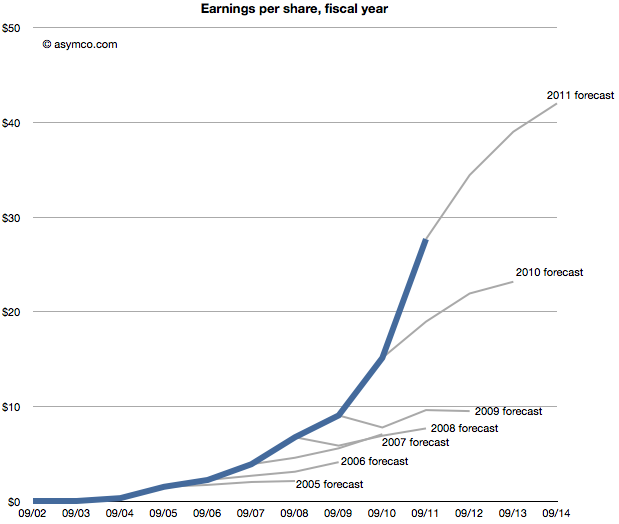
The following chart shows that data, i.e. forecasts as an extension of a sales trajectory. The blue area are actuals and the grey branches show projections at a given end of fiscal year.
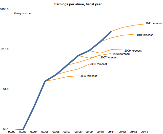
Seen this way, we can imagine how the projections can be considered "reasonable". Some appear to be linear extrapolations while others show up as the end of "S-curves".[2]
What none of them imply is exponential growth. But would forecasting exponential growth be considered reasonable? Clearly not since it's never been consensus. But disruptive companies do follow non-linear growth. In fact, every company that has gone from being small to being big (which is to say all large companies) went through non-linear growth phases. The "natural" shape of growth is exponential.
The failure is therefore not of reason but of failing to use a model that assumes acceleration of sales. I believe that institutional financial advisors are conditioned (or coerced) into assuming that nothing unreasonable ever happens. That seems like a completely flawed foundation to stand on.
---
Notes:
This post is inspired by the New York Times chart showing budget forecasts.
Imagine it's late 2005. Apple's fiscal year just ended and they reported their performance. You're an analyst whose job includes forecasting the company's performance for next year. This is a weighty responsibility. Your forecast will be blended with those of your peers and used as a "consensus" average. That consensus for the next year will be used to measure the current value of the shares in a ratio called the forward PEG or Price/Earnings/annual earnings Growth. You are supplying the earnings and hence growth forecast while the market offers a price. As a stock is meant to measure future earnings, your forecast is a crucial and frequently cited figure about whether a stock is priced fairly.
There is some comfort in knowing that there will be many others who will offer such a forecast and your contribution is thus not the only way investors can calibrate the price. However, you should think hard about what you are predicting as it also will reflect your skill in predicting such a visible company.
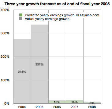
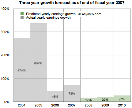
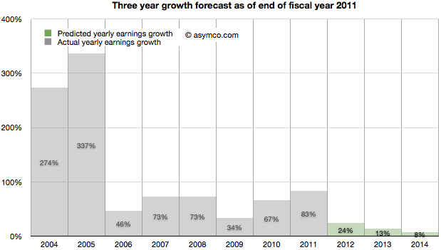
Apple just had a tremendous two years. 2004 and 2005 saw EPS grow at 274% and 337%. This is largely due to the runaway hit iPod. Given all that is known about the company, what will you put forward? While you're at it can you also forecast two years forward, namely provide a growth forecast for 2006, 2007 and 2008?
Here is what you and your cohorts publish as a consensus:
You go with a 13% growth for 2006, 15% for 2007 and 5% for 2008. The chances are, you reason, that the iPod will not carry the company's growth much longer. The competition is sprouting all over and Microsoft is rumored to be launching its own music player.
It makes sense to be conservative and offer a modest growth of 13%. At the same time you can rate the stock a buy as it is still growing. The stock just doubled in the last 12 months and the law of large numbers says that growth cannot last at the same rate as we've just seen.
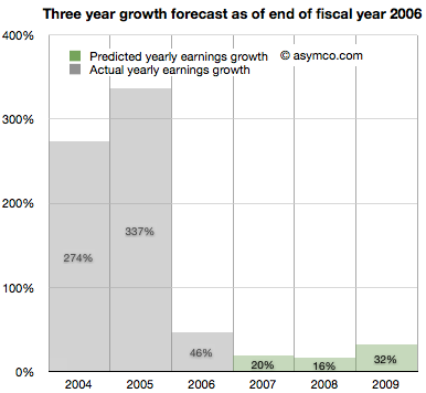
It's now late 2006. Apple just closed out another big year. Contrary to your forecast last year, the company grew at a rate of 46%, more than three times faster than you expected.
It turns out the iPod still has some legs and the company's Mac business seems to be growing. Looking forward you take your 15% growth for 2007 and increase it to 20% and suggest 16% for 2008 and 32% for 2009.
There are rumors of Apple getting into the phone business.
It's now late 2007. Apple just launched the iPhone and even though it was available in limited numbers on one carrier for one full quarter, the company still turned in an amazing 73%. Again more than three times faster growth than you forecast. What do you do about 2008?
It might make sense to increase the previous 16% estimate to 17% but since there is a real estate bubble brewing, the 32% growth for 2009 should come down to 22% and defer that growth out to 2010, dialing in 27%.
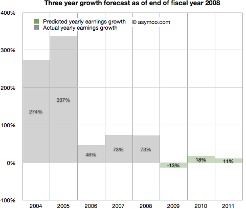
It's now late 2008. Apple closed out another huge year. 73% growth was once again more than triple your forecast of 17% growth. It's clear that the iPhone is a huge hit.
However, there is a credit crunch and talk of a huge recession, even depression looming. Apple is a luxury/premium brand and it is unlikely that those expensive products will sell well into these "macro headwinds". You predict a decline in the earnings of 13% in 2009, inline with many other tech stocks. You are optimistic however that 2010 will be a year of recovery and predict 18% increase from recession lows followed by a more reasonable 11% growth in 2011.
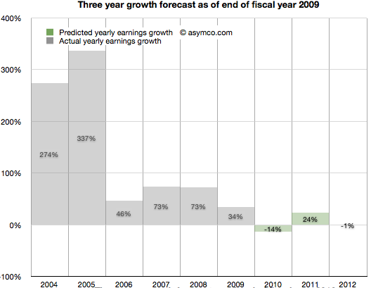
It's now late 2009. To everyone's surprise, Apple grew through the credit crisis. It turned in 34% growth (vs. your predicted 13% decline). The success is hard to believe but the iPhone had a lot to do with that. There are new competitors coming and the recession has proven resilient. With unemployment still high you predict 2010 will still be a tough year. You go with -14% growth for 2010 and postpone recovery out to 2011 with 24% "bounce". Longer term you see 2012 as a flat year, with Apple earnings shrinking slightly by 1%.
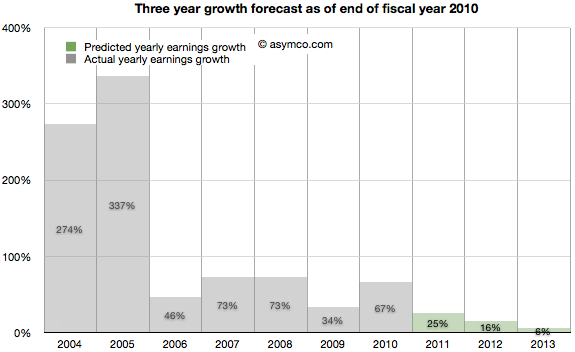
2010 ends with Apple achieving 67% growth. Shocking relative to a -14% growth forecast. But then again, Apple launched the iPad and who could have thought that was a hit? Apple achieved growth throughout the recession and it looks like it might keep going. Your 2011 forecast of 24% looks weak so you increase it to 25%. The 2012 decline thesis is abandoned in favor of 16% growth and, given the likely competition in smartphones, you tone down growth in 2013 to 6%.
It's November 2011. The company turned in 83% growth. It's more than three times faster than your forecast. Some people are suggesting that Apple may have a lot of headroom with the iPhone and iPad but the law of large numbers is what it is. The company became the largest by market cap in the world and Android is gaining huge market share. However, in deference to their strong recent performance you increase the 2012 forecast from 16% growth to 24% growth. 2013 goes from 6% to more than double: 13% and 2014 is when growth begins to slacken, though still a healthy 8%.
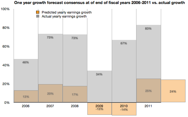
As the following chart shows, look ahead one year accuracy has not been all that great, but you are at least consistent. In any case, everything you based your decisions on showed remarkable consistency with consensus. You're just reflecting common sense.
Note:
Though the numbers are all real, the narrative is fictitious. I suspect however that the truth is actually stranger than this fiction.
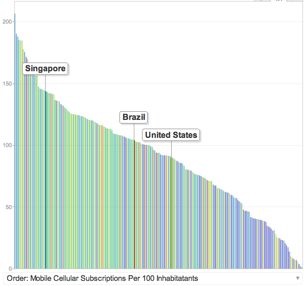
Tomi Ahonen has compiled a fascinating data set on 42 major countries' smartphone penetration rates. The compilation is based on Netsize Guide, Informa, Google and Ipsos data. It is a complex sample with multiple possible sources of error (read the post for the caveats.) However, this is a breakthrough. It's the first time I've seen this level of detail at a country level in the public domain.
I maintain visualizations of ITU data which shows overall mobile consumption and broadband consumption and penetration. In order to maintain a consistent basis of comparison, I prefer to use ITU's measure of consumption which is "subscriptions" rather than "population". The ITU derives this measure because mobile operators think of points of connection (subs) rather than people as the measure of consumption. This makes some sense because connections are what are monetized--not people.
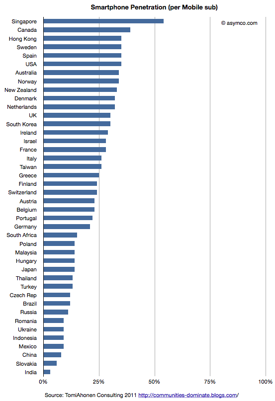
So the first piece of analysis is to show this measure of penetration (smartphones as a percent of subscriptions) for the 42 sampled countries.
This view shows which countries "lead" adoption in terms of penetration. It shows that the US is quite high in the ranking and the most penetrated "large" country.
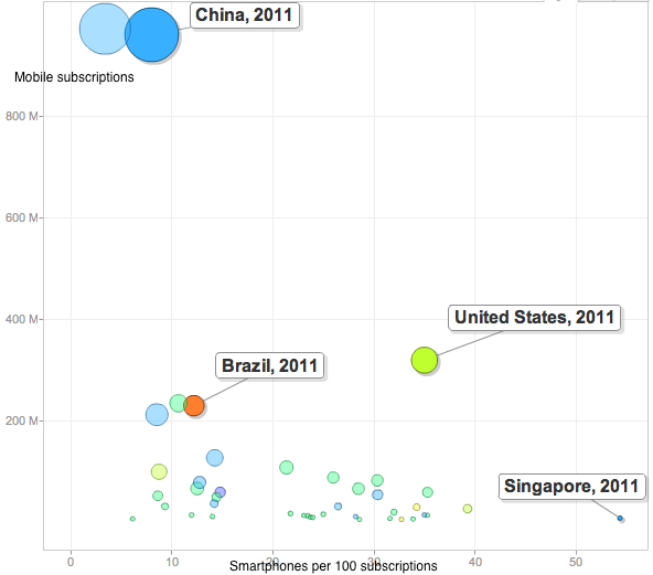
This is highlighted by the following chart which shows penetration of smartphones vs. total subscriptions with bubble size representing population size.
The US stands out from the inverse relationship between size of mobile population and smartphone penetration.
Part of this is due to the US having relatively low mobile penetration in general. It's below the median because multiple mobile phone use is uncommon.
But these bits of data are not the most interesting. In my opinion the following is:
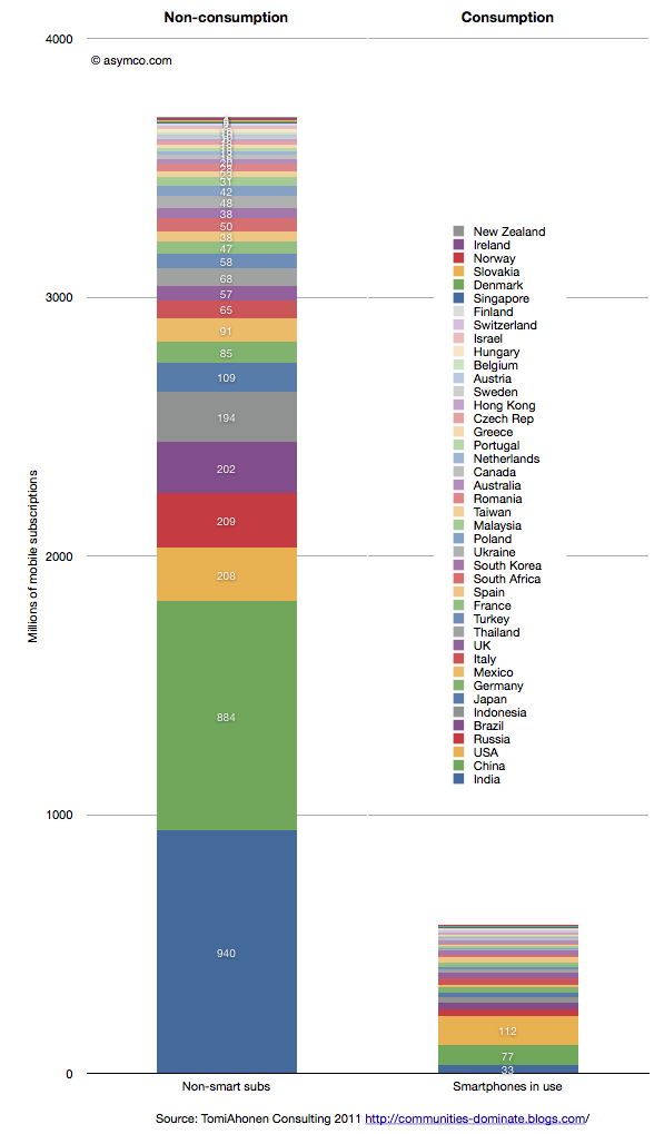
This last chart shows the total size of non-smart subscriptions vs. the total size of smartphones in use for the 42 countries listed in the legend.
There are 3.7 billion non-smart connections and 0.6 billion smartphones in use. Although not all of these 3.7 billion connections need to be enabled with a smartphone, the fact remains that there are six times as many non-consuming network connections that can still be addressed.
How and when this ocean of non-consumption will be converted to computing devices are the most obvious questions the data raises. Of the selected countries only 13.5% of the connections are "smart".
ITU data shows that at the end of 2010 there were 5.4 billion global subs. This survey was conducted more recently so the total is likely much higher (perhaps around 6 billion). The survey thus covers about 72% of the world. That implies that at least 90% of the market remains unserved.
Guessing the next Apple product has become the parlor game of choice for a whole generation of technology journalists and analysts. The premise of the game is that given a track record of breakthrough products, there is always another one just around the corner. Being the one to predict this next breakthrough product creates credibility and demonstrates the domain knowledge of the predictor. If the prediction fails to materialize there is consolation in dismissing the actual announced product as disappointing, unsophisticated or, worst of all, uninteresting.
Most often, these guesses are as much a reflection of the analyst as they are an analysis of the company. Too many predictions are designed to impress or demonstrate the imagination or knowledge of the predictor. They typically anticipate a giant leap of functionality, power or market re-structuring. They envision revolution not evolution; a cutting of the Gordian knot not a polishing of ugly rocks.
Yet nearly all of Apple's launches have been sustaining improvements in existing products, technologies or platforms. To name just a few:
The iPad is an evolution of the iPod touch
The iPod touch is an evolution of the iPhone
The iPhone uses OS X and Objective C from the Mac
OS X came from NeXT
The app store market model came out of the iTunes store
The iTunes store came from iTunes which came first to the Mac as a media sync tool for the iPod
etc.
John Gruber explained the process last spring as it relates to many of Apple's launches. Although the iPhone did introduce a new user input method and experience that takes consumption in a new direction, its building blocks were there for all to see for many years. The iPhone is a natural evolution of the computer with a handy little "Phone" app.
Likewise, the iPod came seemingly out of nowhere but by watching the original launch you see it as part of a "media hub" strategy that envisions the Mac as a personal server. The very products which ended up disrupting the Mac/PC began as extensions of their victims.
You can trace the DNA of almost all of Apple's products to previous products. If Apple did not have these foundations, the slow-motion revolutions would not have happened. Rather than a deliberate big bang, Apple's disruptions are the result of a discovery process. A test, iterate and improve loop. This is why they seem obvious after the launch but also why they seem to be such an anti-climax.
Therefore, the challenge of predicting Apple's next product should be tackled not only through an act of imagination but by carefully projecting the current products and understanding where they can evolve.
So it is that I approach the question of Apple's TV disruption. My working assumption about the next Apple TV is that it already exists. It's none other than the existing Apple TV, improved.
Here are the clues or hints I noted:
It uses iOS and the hardware from the devices that run it. It originally ran a PC architecture and shared a kernel with Macs.
It has been integrated with iTunes media stores (with the notable exception of the iTunes app store)
It has begun to introduce channels other than downloads (ESPN, Wall Street Journal) thus establishing its own distribution for traditional content
It is a global product, depending only on the Internet protocols and independent of the balkanized cable standards
Through AirPlay it is integrated with Macs and Apple devices.
Through display mirroring, iOS devices can use the TV as an external monitor and can even change their own behavior when doing so
This last point is intriguing. I have not seen discussion of this feature, but if using an iPad 2 or iPhone 4S with iOS 5 and an Apple TV with the latest software updates it's possible to have an iOS device become a controller for TV-based game experiences. Developers are already using the API. When using a pinball game with screen mirroring, the device becomes a controller while the action takes place on the big screen. Switching display mirroring off bring the action and control back onto the small screen. There are still problems with lag and the processors are over-taxed on high frame rates, but the APIs are already there for developers. (I could also mention the potential of new a Bluetooth standard for better wireless response).
What these signals point to is Apple defining the TV as an iOS portfolio product. This means integration with iTunes, including an app store. This, in turn, means unleashing developer/creative talent through new monetization opportunities. This means new user experiences in discovery. This means FaceTime-like communication through the TV. This means many other things but mostly it means that the TV will be a platform product.
The only challenge is a (currently lacking) smooth interface. Perhaps that's where voice comes into the picture. But whether that is built-in at the next rev of the product or not is not the story. The story is going to be the sustaining improvement in the original Apple TV. A wonderfully asymmetric product begging to be ignored. A product that because of its apparent lack of success, effectively hides all its secrets in plain sight.
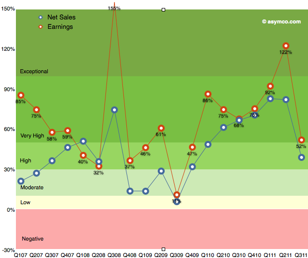
As the chart below shows, the last quarter (third calendar, fourth fiscal 2011) was slow with only 52% earnings growth. The discussion centered on the (surprisingly) disruptive effect of the iPhone transition. Surprising since most analysts, myself included, were lulled into thinking that the portfolio of iPhones and their wider distribution would create a smoother sales pattern vis-a-vis the more cyclical pattern seen in the first three years of production.
The second quarter was surprisingly strong and the third was surprisingly weak. So how do we estimate the fourth?
We have the pent-up demand for the new iPhone, we have the dynamics of holiday spending and we have a question mark on pattern of growth for the iPad. I'll discuss each assumption in turn:
The first assumption remains that iPhone growth is approximately 100% for the full year. Last calendar year there were 47.5 million iPhones sold. A 100% growth would imply about 95 million for this year. So far 56 million were sold. To reach a doubling then 39 million would need to ship in Q4.
Another approach is to look at quarterly growth rates. Thus far, we've had 113%, 142% and 21% for the first three quarters. To reach an average of 100% for the year then the fourth quarter would need about 120% or 36 million units.
36 to 39 million would be a good bounding range if there were no other mitigating factors. The information published so far shows no particular problems with either production or access to markets so I'm going to go with 35.7 million.
The second major assumption relates to the iPad. The iPad has been a challenge to predict since launch. Not only is it a new category but it comes with a different launch cycle than the iPhone and has significant constraints on production. There have been only two quarters where we could measure y/y growth: 182.8% in Q2 and 165.6% in Q3. I was initially tempted to dial in 150% for Q4 but the question of transition comes up. The first iPad model grew well into the holiday quarter but dropped dramatically into the first as it went through the transition to the iPad 2.
Are we going to see the transition effect earlier this year? I'm being cautious and suggesting only 100% iPad growth or 14.6 million units this quarter. This is still a very challenging product to forecast.
So here are my fourth calendar quarter forecasts (with y/y growth in parentheses):
iPhone units: 35.7 million (120%)
Macs: 5.2 million (27%)
iPads: 14.7 million (100%)
iPods: 13.6 million (-30%)
Music (incl. app) rev. growth: 22%
Peripherals rev. growth: 25%
Software rev. growth: 25%
Total revenues: $44.6 billion (growth: 67%)
GM: 42.0%
EPS: $12.3 (91%)
This earnings value would imply a trailing twelve months' EPS of about 33.5. At $390/share the P/E would be 11.6. Cash and equivalents may increase to $90 billion.
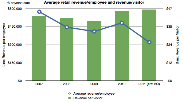
Apple publishes data about its "retail segment" which ifoAppleStore.com catalogs. Here are some statistics I was able to compute from the data:
The stores generate over $100k per employee per quarter. In 2010, revenue was $481,000 per employee. This year the average is around $320k excluding the fourth quarter. In 2009 the average revenue for the technology sector was $388k/yr. A retailer like JC Penney generates about $124k of revenue per year per employee.
The revenue per visit is around $45. There are well over 250 million visits per year (222 million for first three quarters of 2011).
The combination of these two metrics are shown in the following chart:
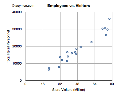
The number of employees has grown in proportion to the number of visits. There is one employee for every 2,500 visits/quarter. The following chart shows the relationship between retail personnel and store visitors on a quarterly basis.
Assuming an employee works for 360 hours per quarter, the average employee sees 6 visitors per hour or one every 10 minutes.
As that visitor generates more than $45 of revenue, an Apple store employee creates sales at the rate of about $278/hour.
Before diving into the answer to the question in the title, there is some new data to digest.
The latest from comScore shows consistency with the previous months of smartphone growth in the US.
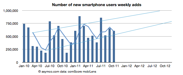
The growth rate was 607k/wk new-to-smartphone users. This is slightly down from 654k/wk for the previous month but up significantly from 450k/wk the year before.
The penetration of smartphones reached 38.5% (non-smartphones are at 62%)
The penetration should reach 50% before September 2012 with about 1.2% being converted every month.
The following chart shows the weekly add rate with a three-period moving average:
This chart is important in that it should first show signs of inflection in growth. That does not seem to be happening yet.
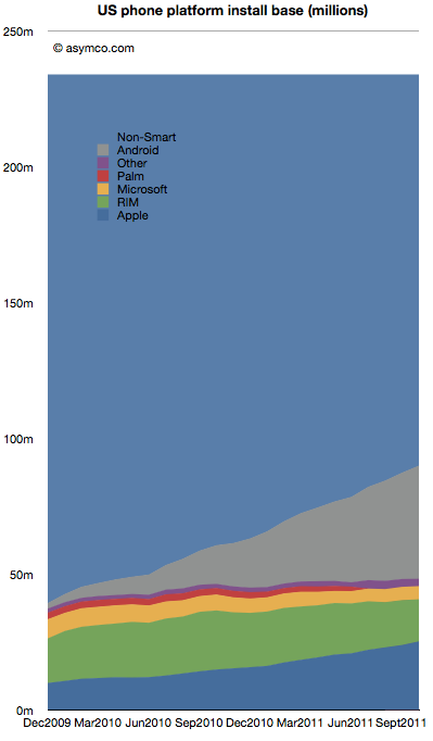
The installed base by platforms is shown below:
Android is estimated to have grown to 41.7 million users in the US, adding 2.5 million users in the last month. Android is adding half of Microsoft's entire US mobile base every month.
RIM BlackBerry lost one million users in October. RIM's slide has accelerated again with over 3.7 million leaving the platform in the last six month. With 15.5 million subscribers, RIM has fewer users in the US today than it did in late 2009.
iPhone gained 1.34 million. Installed share increased slightly to 28% from 27.4% the previous month. There are now over 25 million iPhone users (above age 13) in the US.
Windows Mobile/Phone had no perceptible change (-34k) indicating perhaps that the losses in Windows Mobile are being erased by gains in Windows Phone. Microsoft's platform stopped losing significant users six months ago. Whereas the bleeding has been stopped, overall number of users remains at a rather poor 5 million or 5.4% share.
"Other" which includes Symbian and WebOS lost another 184k users to reach only 2.7 million users.
There are still 144 million smartphone non-consumers.
Android and iPhone now make up nearly three quarters of all smartphone ownership in the US. That's a total of 67 million users. With no sign of slowing, the chances are that there are at least 100 million users still remaining to convert. Sounds like an attractive target. But that target is shrinking fast. The rates of adoption signal saturation of most likely buyers will happen toward the end of next year.
At least 25 million new Android users will be gained and at least 10 million new iPhone users will be created in the next 12 months. That's 35% of remaining non-consumption. Assuming some acceleration, it's not hard to see 50% being claimed by the two entrenched incumbents.
This leads to an interesting positioning question. Is Windows Phone destined to compete with consumption or non-consumption? If traction is not forthcoming in the next 12 months, that leaves a very difficult last 50 million available as non-consumers. They are more difficult as they will be late adopters and perhaps more price sensitive and less motivated by features.
Windows Phone still has quite a bit of opportunity outside the US, but in the US (and in Europe which is not much different) the competition will increasingly be with rival incumbencies not with non-consumption. As the custodians of the Windows franchise, Microsoft should be well aware of the inherent difficulties with competing with installed platforms.
It has no price and hence there are no ways markets can signal demand or value creation. Furthermore, Android is not being offered to users like the iPhone. Android's "customers" are phone vendors who package the software with additional value-added hardware and sell the combination to operators or distributors who then package it further with services and offer the total to end users.
So obviously, comparisons between Android and iPhone center on instances of Android used in real products and the "market performance" of Android therefore relies on these proxies for Android — the aggregate sum of products that have some form of Android in use.
I wrote this in response to a very short brief: "We're looking for an editorial piece that comes down on either side of the debate of iPhone vs. Android". The challenge I saw was on the approach to the question of "iPhone vs. Android". I chose to measure value creation by the means available to shareholders.
In last week's discussion of Apple's (historically low) valuation, comments arose that perhaps the company's discount is not unique. Can we look at comparable companies and determine whether the relationship between growth, size and valuation are consistent?
The challenge is in finding "comparable" companies. Apple is characterized by being large in terms of market capitalization, highly profitable, in the technology sector and growing relatively quickly. One can find a cohort of companies with each of these characteristics but not all.
Here is an attempt at looking at the largest companies by Market Capitalization (the so-called Mega-caps) to spot patterns of valuation. Some of the companies in the top 20 mega-caps were technology companies so I thought I'd highlight them. I then also added a few of the top 20 technology companies by capitalization to create a larger sample.
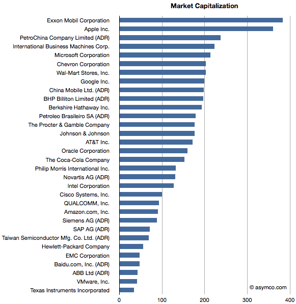
The group I settled on is shown in the list below ranked by market cap.
Companies below $130 Billion in market cap (i.e. below Novartis) are in the top 20 technology list but not in the top 20 overall list.
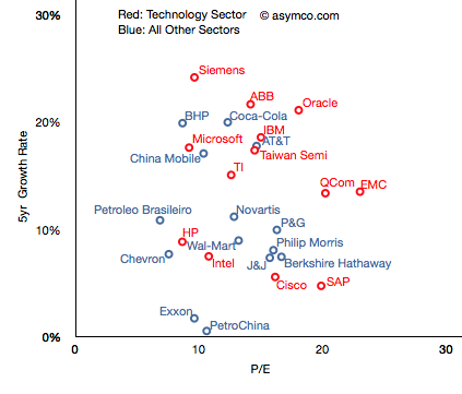
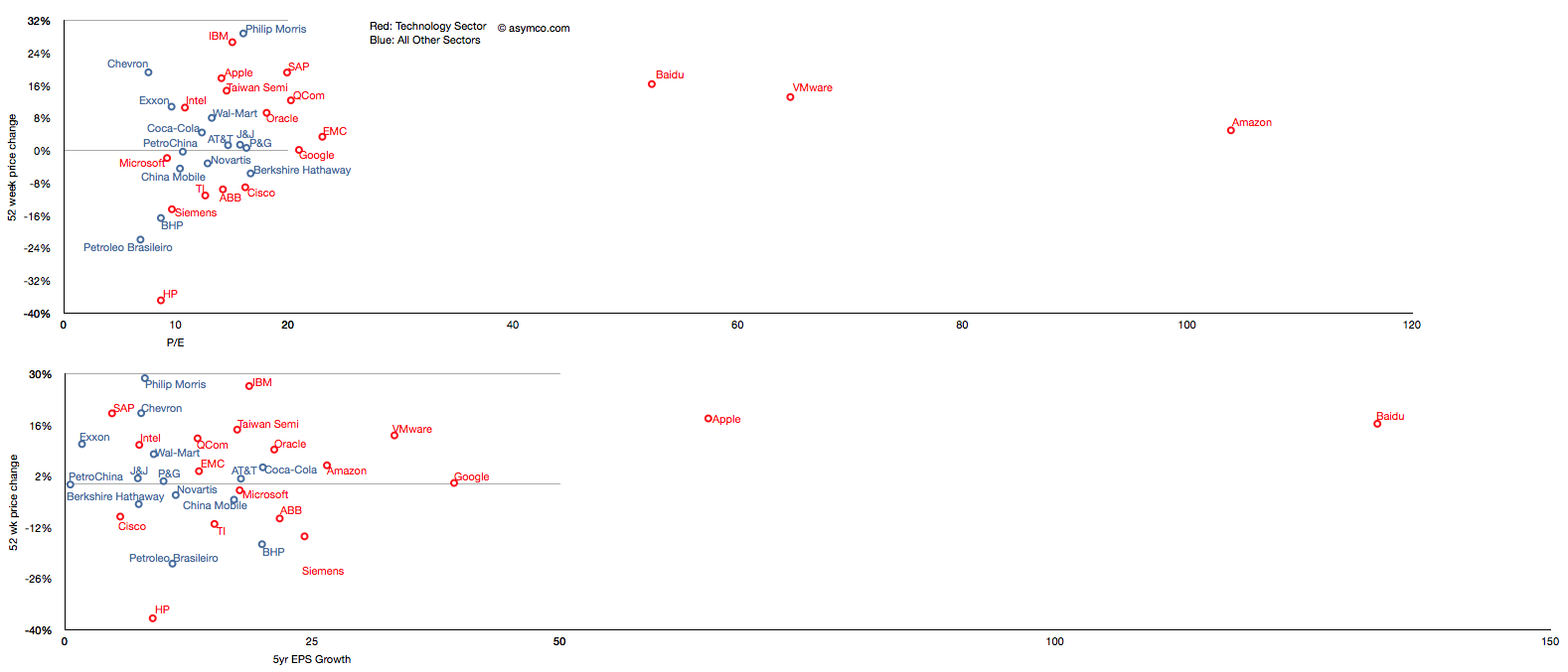
I then plotted the P/E rate vs. 5 year Growth Rate for these companies, separating the tech sector by color (Red):
The pattern is not encouraging. It appears that there is no correlation. Perhaps the technology companies are, as a group, further up and to the right, but overall they are equally unobservant of growth.
For example, SAP has grown less than 5% in five years and yet enjoys a P/E of 20 whereas Microsoft has grown 18% and has a P/E of less than 10. The non-technology sector companies are similarly broken. Berkshire Hathaway, a conglomerate, is rewarded for slow growth and China Mobile is punished for relative high growth.
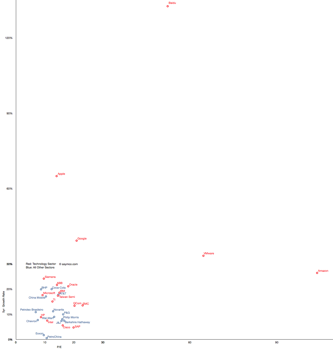
But you'll notice that some companies are not on this chart. That's because they are outliers. Their growth or P/E are so far out of this cluster that the would make it impossible to discern individual performance. The complete "top 20" picture is shown in the following chart which will require either a large display or a lot of scrolling (1300x1364 pixels):
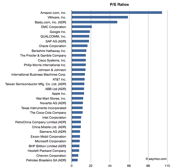
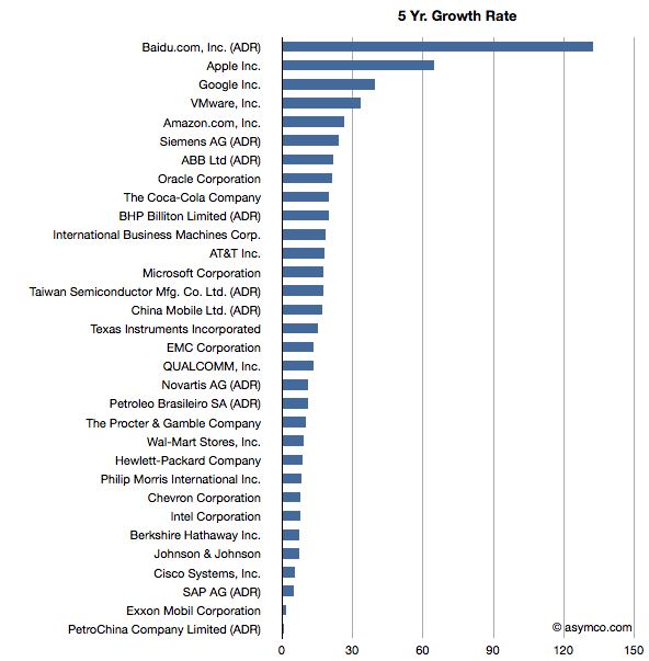
With this level of detail, we can see how distinct some companies are. Not only from a correlation point of view but from a cluster of peers. The outliers are Amazon, Baidu, VMware, Google and Apple.
These outliers can be seen also in ranking of P/E and Growth:
Baidu has grown earnings by 132 percent while creating a market cap of $47 billion and has a P/E of 52. Amazon has grown by 26% while having a total value of $90 billion and a P/E of 104. VMware is "only" a $40 billion market cap company with a 5yr EPS growth of 33% and a P/E of 64. Finally, Google has returned a 39% growth rate, a market cap of about $200 billion and a P/E of 21 and Apple brings up the rear of P/E with 14 but with the second largest market cap of $360 billion and the second largest growth of 65%.
What this analysis shows is that the market does not have any "rule" of rewarding growth with a high P/E. If anything, the outlier analysis shows that there are significant anomalous valuations that cannot be explained by growth data.
---
Note: I've also tried to observe correlation between recent share price change and growth and recent price growth and long-term earnings growth.
Similar anomalies and lack of correlation can be observed.
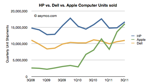
HP's CEO Meg Whitman admitted that, when iPads are included, Apple will overtake HP as the world's leader in computer shipments.
“We need to improve our game and our products to take over the leadership position. Apple could go past HP in 2012. We will try to become the champion in 2013.
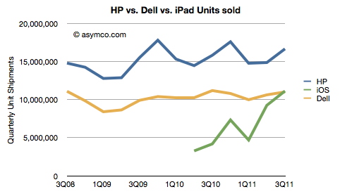
When the quarterly shipment data is seen as a chart the doubt of this happening disappears:
Note that the combined iPad+Mac has already overtaken Dell. In fact, the iPad alone overtook Dell in Q3 and might overtake HP in two quarters.
The iPad is growing at an average of 170% y/y (average of two quarters) while the Windows PC market is growing at an average of 1.9% over the same period (source: Gartner, company reports). The
Placing the iPad in the "competitor" category is an important admission for a PC company. Categorization choices make all the difference when thinking about strategy. The new tablet product may not appear at first glance to be competitive with the current definition of a PC (though it might very well be a personal computer.) But definitions tend to evolve. Categories are abstractly defined. The original PC was certainly not competitive with Mainframe computers and perhaps it still isn't. But that does not mean that usage (and hence value capture) did not migrate. Most people today would say a PC is a "real computer" and the Mainframe is simply an old computer.
Whitman notes that the iPad is not the only computer people use and most have a PC as well. That may be true as it was true when the PC was new. Most companies that supplied PCs to workers maintained large computers for "mission critical" applications like accounting and engineering. The two technologies lived side-by-side for many years. In fact, in the beginning there was a thriving market for software and hardware that would allow PCs to be used as terminals to access central computers. It wasn't until PC servers and server software like that from Novell and networking from 3COM became commonplace that mainframes and minis began to fade.
So in practice, there was no big bang start to the post mainframe era. The evolution of the PC went through stages. It was an isolated local computer, a client-server solution and then finally a web-enabled communication product on its way to ubiquity. But the era did change.
So if history serves as a guide, the displacement of the PC won't come from a direct substitution but a more sinister and hard-to-predict subversion through new applications and a re-definition of what a PC is. The driving forces are not just volumes but new input methods, new user interfaces, new jobs to be done, new software and many innovative companies working within an ecosystem.
If there is one difference today it's that things are happening a lot faster. A transition that took a decade is happening in three years today, even though the entire market is orders of magnitude bigger.
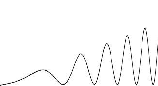
When I visualize the cycle time of technology change, I see it as the waveform to the left: as cycle time decreases (i.e. frequency increases), the opportunity (amplitude) also increases.
Andy Zaky at Bullish Cross wrote a great post on Apple’s valuation, showing the deep discount of Apple's earnings vs. an average company. It essentially states that Apple's money is not green.
Felix Salmon took it forward by enumerating a few explanations that might be used for the despondent valuation. None are successful arguments, but that should not be a surprise.
To understand the phenomenon a bit more precisely, I maintain and think about these charts:
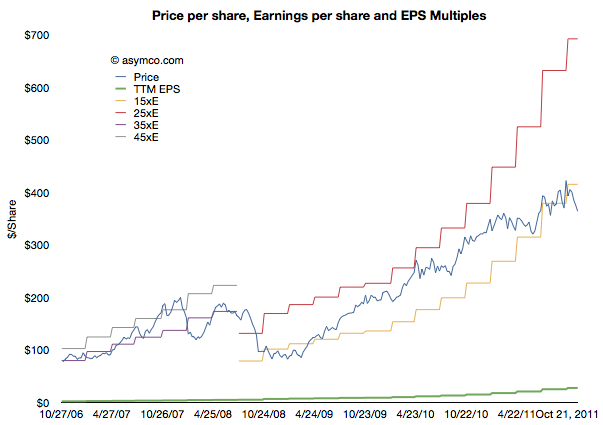
This shows Apple's share price ("P" in blue) and its earnings per share ("E" in green). In addition there are multiples of the earnings in "bands". The first band is 35xE to 45xE which bounded the price during the period of 2006 through most of 2008. The second band is 15xE to 25xE which bounded the price since then. The data is updated weekly so it is current as of last Friday.
Illustrating it this way shows how the stock is seen as representing different companies at different times. The 2006 era (iPod) Apple was seen as a high growth, dynamic company with loads of headroom for growth. The current (iOS) Apple is seen as a slow growth, fairly static company with most forecasts showing 20% growth potential.
Note that the price has dropped outside the current band for the first time since the great recession. It is still below 15xE today. Perhaps a new band is forming.
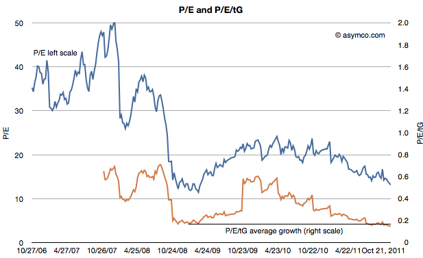
The second chart shows the P/E on its own (in blue) but with a second measure where the P/E is divided further by the average trailing twelve months' growth (P/E/tG). This is a variation on the P/E/G (aka PEG ratio) where instead of (mostly wrongly) estimated future growth I use actual growth history--hence the t for trailing. The P/E/tG is a way to normalize P/E as a function of growth and hence a more appropriate index of value potential.
I added a horizontal line to the chart to show the minimum value P/E/tG reached during the recession (0.17 in January 2009). As you can see, the P/E/tG is now lower than at that time (0.15). It implies a deeper discount for the company's earnings growth than during the time when the world faced economic contraction.[1]
Note also the trend of that line as it shows a steady linear path toward zero.
Of course, it cannot reach zero unless Apple files for bankruptcy. But until it does file, the line can only reach zero asymptotically as E/tG increases. Which is a relief, I suppose, as it means the rate at which P/E/tG drops will decrease. This implies that as earnings growth persists, the drop in price will have to moderate.
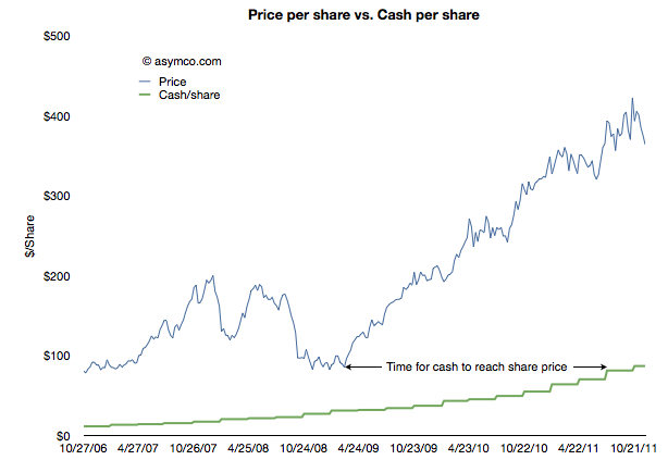
The other threshold to keep an eye out for is when Apple's share price will reach its cash per share. That's the point when investors will consider the company to be a net value destroyer. If you performed that analysis in January 2009, and you were accurate about earnings forecasting, the answer would be well before today. See the following chart:
In other words, in January 2009 the stock was trading at a price (<$80/share) below the current cash per share (>$85/share). It took Apple 18 months to grow its cash to reflect the price set on the company. Had the stock not risen then the company would today be trading below book value.
The amazing thing is that today the valuation structure (P/E/tG) is even worse than in it was January 2009. An interesting exercise would be to project how long it would take for the cash to increase to the current share price.[2]
I imagine this time interval should have a name. How about the time to boil: the time for growth pressure to become sufficiently high to exceed disbelief that growth can happen.
---
Notes:
Note that the low values were placed on the company after the crisis took hold, not as an anticipation of contraction. See the behavior of the index during the summer of 2008 as the credit crisis was unfolding.
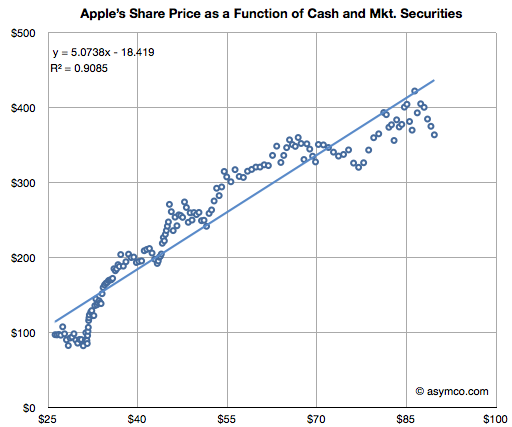
This analysis is consistent with the analysis that Apple is not valued on earnings or earnings growth but on its balance sheet. The ratio of Price/Cash has been fairly constant but if it breaks down (as it has been--see below) then we need to assume a new dynamic is in place.