Asymco

Asymmetric Intelligence

Research

  1. Predictions for 2012

    Research · 54 comments

    I have none to offer.

    It may sound strange to hear me say that I don't make predictions even though I often talk about how things will change and even provide some forecasts. The difference is one of degrees. A prediction to me is a very specific, time-sensitive and materially valuable recommendation. An observation about the future is an imprecise, intuitive hunch based on pattern recognition. It's mushy. It's theoretical. It's the difference between saying a company is great and recommending to buy its stock with a price target in a time frame.

    But it gets even weirder.

    One of the recurring themes in Apple analysis has been that independent analysts, as a group, have been, on average, more accurate in quarterly forecasting than highly paid Wall Street Analysts. Many have asked why.  I believe that the answer is because independent analysts are theorists who make observations while professionals are data gatherers who make predictions.

    First, we should understand the reasons why each group does what it does.  Wall Street sell side analysts are rewarded for making Buy/Sell recommendations that cause clients to retain the services of the firm they work for. They are not paid to be accurate with specific forecasts in fundamentals. They are paid to predict how stocks move. The objective is not to be accurate in the quarterly but to support the "call" or prediction. The disconnect from accuracy comes in trying to sustain the call with a "conservative" forecast.

    For example,  an analyst with a "Buy" recommendation (and a prediction in the form of a price target) thinks Apple could ship 30 million iPhones this quarter and generate EPS of $10. But he also thinks the stock looks cheap even if they only ship 28 million iPhones and report EPS of $8.50. In this scenario he's incentivized to publish the lower (less accurate) number. That way he supports his prediction. By dampening expectations, the stock rises on the "surprise".

    Because an analyst sells predictions, he self-censors what he believes.

    Contrast that with the motivation of an independent analyst (aka blogger). His motivation is to (presumably) gain a reputation of accuracy and insight. He sells his reputation as a keen observer. Precise predictions or recommendations can turn out wrong quite often. Getting caught with these errors exposes the independent to instant negative feedback. The risk is far greater than the  opportunity.

    So here is the difference: Analysts have an incentive to put forth a version of the future that supports their call on the stock. Bloggers have an incentive to put forth the most accurate version of the future. By taking the prediction out of the picture, accuracy in describing the future improves.

    So I don't have any predictions or recommendations. I just hope to help you see patterns that lead you to making your own predictions.

  2. Estimating iPhone sales in the US during Q4

    Research · 53 comments

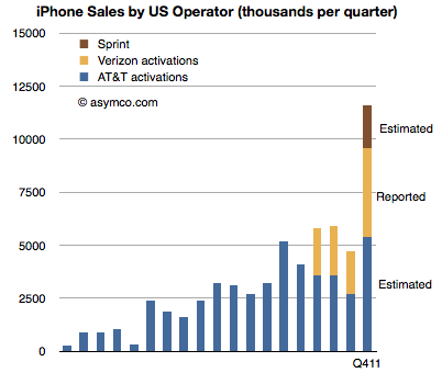
    Verizon has been the first source of data on iPhone sales for Q4. They reported 4.2 million iPhones sold. The first quarter of Verizon iPhone sales had 2.2 million units, followed 2.3 million in Q2 and 2 million in Q3. The total for the calendar year came at 10.7 million.

    The total for AT&T during the first three quarters has been 9.9 million. If we assume the same 2x sequential increase in Q4 relative to Q3 as observed by Verizon we obtain an estimate of 5.4 million iPhone for AT&T.[1]

    The quarter also saw the addition of Sprint to the US iPhone distribution network. Sprint is rumored to have committed to buy 30.5 million iPhones over the next four years. My estimate for the first year was 7 million, placing first quarter sell-in at about 2 million.

    An approximate total for Q4 US iPhone activations results in 11.6 million. The following chart illustrates these estimates:

    Notes:

    1. AT&T reported that smartphone sales during October and November totaled over 6 million units. Assuming only 2 million for December and a 70% iPhone mix yields 5.6 million units.
  3. Apple's commoditization discount

    Research · 80 comments

    When asked where Apple's growth will come from, most analysts or observers will cite new products. As long as there are new products, then there is growth. Conversely, if there are no new products, then there will be no growth. This is such a commonly held belief that it's axiomatic: Apple is being valued based on short-term foreseeable growth.

    To be more precise, analysts value the wave of growth of every new product and heavily discount the post-growth phase assuming commoditization. There is no value assigned to Apple for extending market reach to the mass market.

    Consider: Analysts currently forecast an operating income (or EBIT) of $43.3bn for 2012 and $49.7bn for 2013. That implies growth of 28% in 2012 and 15% in 2013. These growth rates are modest in light of Apple's recent historic growth and especially 84% in 2011 on EBIT level. Much of this growth has been due to iPhone which quickly captured 4% market share in four years. To suggest 15% growth in 2013 is to suggest that Apple will not increase its phone market share by an appreciable amount. The implicit assumption in that growth figure alone is that Apple will remain a niche player.

    Bear in mind that 15% growth is so low as to be half the the growth in the Mac business and below the likely growth in the overall phone market. Considering the risk premium on equities, this growth forecast assumes essentially a no growth scenario. But even with no growth, Apple's cash flows are huge and thus they should add up to some significant present value. Since we know the value as reflected in the current price, we can work backwards to determine the discount rate being applied to those future flows. In other words, we can calculate how risky Apple's existing product cash flows are seen to be.

    Based on  assumptions originating from analysts' consensus, we can construct a simple model that will approximate the discount the stock market puts on Apple's future cash flows. Let's have a look at an adjusted Gordon or dividend discount valuation model on EBIT basis:

    Shares are valued based on the projected future cash flows of a company. Discounting EBIT with Weighted Average Cost of Capital and subtracting growth will yield enterprise value (= market capitalization - cash).

    Applying analysts’ assumption of close to zero growth to Apple's post 2012 EBIT means EBIT stays constant for 2013 and beyond. Let’s solve for the implied capital costs. Right away we can eliminate growth (g) as it equals zero. EBIT reflects operating cash flow since in a zero growth scenario CapEx will equal deprecation and there are no changes in net working capital. As Apple has no debt but a cash surplus, WACC will be equal to cost of equity[1].

    Solving for capital cost (WACC) with available analysts' EBIT estimates reveals a discount rate of 15%.

    But let’s remember that analysts have consistently and by a large margin missed Apple's financial performance. So let’s dial in a more aggressive estimate of around $56bn of EBIT for the fiscal year 2012. The discount rate goes up to 19% and implies an EBIT multiple of 5.3x.

    In other words, Apple's cash flows for a zero growth scenario are being discounted at a rate of 15% to 19%. This places the company in an extremely risky category of investment. It is certainly not something that can be categorized as a value stock.

    The discussions on this blog regarding Apple’s valuation have been insightful, but only danced around the triangle of price, earnings and growth. When the growth forecasts are considered vis-a-vis current pricing, the assumptions built into 'consensus' forecasts for Apple are condemnations of the company.

    They present a view of a company that is extremely vulnerable and can neither preserve its current cash flows nor find new sources of growth. It is, quite plainly, a company doomed to commoditization.

    ---

    Notes:

    1. Or one can even assume that cash has a positive effect lowering costs of equity (less indirect bankruptcy costs).
  4. Interactive Apple Analyst Data

    Research · 31 comments

    As the quarter is now at an end, it's time to once again review the performance of Apple's most highly paid observers. The data set linked includes published quarterly forecasts starting quarter ending June 2008 to quarter ending September 2011. Thanks to Philip Elmer-Dewitt who collected and processed the data over several years.

    Apple Analyst Data | asymco. (Requires Flash)

    As with previous interactive data sets, this is based on Motion Charts "gadget" in Google Docs. Try selecting the Motion Charts tab at the bottom of the page and hit the play button.

    The way this is set up now is that the origin (0,0) represents actual performance (labeled as "Oppenheimer"). Every bubble is an analyst's performance measured as a distance from actual. The further the location of a bubble from origin, the worse the error. Placement above zero (or to the right) indicates over-estimation for Revenues (and EPS). Placement below zero (or to the left) indicates under-estimation. Color of bubble represents affiliation (professional or amateur). Size of bubble is iPhone unit error.

    You can change the axes, chart type (tabs in upper right), size, colors, and track individual analysts' performance (by checking a name checkbox). Or just download the data and analyze on your own by selecting from the Data tab.

  5. The curious case of slowing US growth for Android

    Research · 155 comments

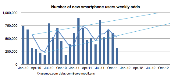
    The latest data from comScore MobiLens is showing an uncharacteristic slowing in smartphone growth. In the survey period ending November, the number of smartphone users in the US was 91.4 million. This is equivalent to 39.1% penetration, an increase of 0.6% (i.e. up from 38.5% in the last period.)

    The growth is equivalent to 1.4 million new smartphone users (i.e. users who switched from a non-smart device for the first time.) The problem is that this is half the growth of the previous period. The following chart shows the growth as the weekly add rate.

    As you can see, the growth has fallen to a level not seen since 2010. The cause may be seasonal as last November was also a slow month. I added a three month moving average which shows that although there seems to be seasonality, the last period did not show the peak of previous periods.

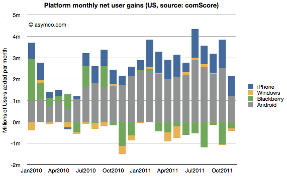
    To better understand what happened, I looked at the performance by platform. The following chart shows the net user gains by platform.

    What appears immediately is that Android growth was the primary cause of a change in the pattern. The iPhone grew slightly more slowly sequentially but the difference between November and previous periods is not great (941k adds vs. an average of 904k over the previous 12 months.) BlackBerry moderated its losses and Windows is quite a small influence on the market.

    Android gain was 1.2 million vs a trailing twelve months' average of 2.24 million. Android's slowing in the US is significant.

    We also have access to additional data from Google themselves. We had an update that showed that by late November there were 200 million Android devices activated. We also had an update from mid October of 190 million activations. That makes the increase in activations of at least 10 million during the same period that comScore was measuring the US.

    comScore's increase in Android users of 1.2 million then becomes even more interesting. It implies that the US consumers were responsible for no more than 12% of Android activations in the November time frame.

    Furthermore we can derive from comScore's data the total devices in use in the US by platform: the figure for Android is 42.9 million (46.9% of 91.4 million smartphones in use). By the end of November, the total activations from Android adds up to about 204 million. Excluding some devices which may be out of use, we can estimate that about 20% of all active Android phones are in use in the US. Conversely 80% of Android devices are in use outside the US.

    This means that the US share of Android activations is decreasing. From a cumulative average of 20% to a recent 12%.

    So the mystery of what caused the slowing in Android (and hence in all smartphones) in the US remains. Seasonal effects would affect all platforms equally and that is not the case. I'm not comfortable ascribing a cause until we hear more evidence and the pattern is more established. But something does seem to be happening.

    [Update: The source data is available here. Note:  multiple tabs.]

  6. Discerning Apple's international product positioning through the big Mac index

    Research · 31 comments

    Thanks to all those who contributed to the big Mac index there is a substantial amount of pricing data available in one location.

    The analysis that I hoped to perform on the data was to see if Apple was pricing specific products differently in international markets. It was prompted by some apparently anomalous pricing of the iPhone 4S in Brazil.

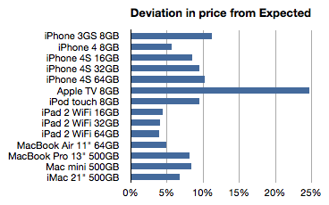
    To summarize, the idea is to calculate the "expected" price of an Apple product by taking the untaxed US price and adding duties and tariffs and taxes to determine what that product "should" cost in another country. Then taking the difference between this "expected" price and the actual price to determine if Apple is using pricing to signal in a particular market.

    The analysis basically eliminates the effect of government on price and leaves currency and actual pricing signals from Apple as variables.

    The analysis is not simple because there are many obscure tax rules. Some products are taxed differently in the same country. I have not completed the country-level analysis but have been able to see some averages over the countries reported (total of 45 reports.)

    The following chart shows the average deviation from "Expected" as a percent:

    Here are some potential interpretations of this data:

    • The more a product deviates from expectation (e.g. the Apple TV) the more it's likely to be targeted to the US or potentially has advantages of scale in the US
    • The less of a deviation (nearer to zero, e.g. iPads) the more the international market is interesting to Apple. They are essentially signaling that those products are targeted at wide distribution.

    If we take this train of thought it takes us to these conclusions:

    1. The Apple TV is being "subsidized" in the US. The price is so low there probably because it is benefiting from content sales. This is a compelling argument and it might suggest a strategy for Apple TV closer to that of Amazon's Kindle than to any of the telecom or computing products Apple sells. This may have significant implications in the pricing of any future "TV" product from Apple.
    2. The iPhone 3GS seems to be a US-targeted product. Anecdotal  evidence shows that the product is not particularly strong selling in international markets. Apple is seemingly not trying to stoke demand with discounting.
    3. The iPhone as a brand is not tuned to compete on price globally. Indeed, the iPhone 4S is the most "overpriced" product and seems to be premium priced vs. iPhone 4. The iPod touch is also something of a prima donna when it comes to pricing.
    4. In contrast to the iPhone, the iPad is being positioned through pricing for broad global distribution. This is undoubtedly due to their unlocked nature but there might be some other penetration tactics at play here.
    5. Macs in general are not priced aggressively internationally. However the Air does seem to be positioned for volume growth (while the mini is not.)

    Admittedly, these are quite aggressive conclusions given the limited data. What gives me some confidence in these conclusions is additional circumstantial data. The demand for some products is clearly higher outside the US than others. I believe and this data seems to support the notion that the overall strategy for the iPhone, iPad, Mac and iPod is being tuned for the international markets with some precision.

  7. The TV store

    Research · 72 comments

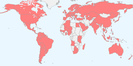
    The following map shows the countries where iTunes Apps are available.

    It represents 123 countries. It also shows where the iPhone is currently available.

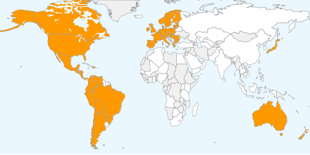
    The following map shows the countries where iTunes music can be purchased.

    The countries in white are countries where apps are available but music isn't. There are 51 countries where you can buy music and 72 where you can buy apps but not music.

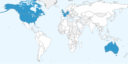
    The following map shows the countries where iTunes TV shows can be purchased.

    As in the previous chart, the countries in white are those where apps are available but TV shows aren't. There are six countries where you can buy TV shows and 117 countries where you can buy apps but not music.

    The data is here (along with a widget which lets you generate the maps--if there are errors, please correct them and let me know).

    Digital music (as iTunes defines it) started expanding outside the United States in 2004 and managed to reach these 50 other countries in seven years. TV shows took a much slower route. Not only has there been a limited selection of countries in six years of expansion but even in the US, the programs available are a tiny subset of what is being produced.

    Is the TV business going to expand digital distribution at the glacial rate of music or not at all? In either case, the distribution of Apps as a digital medium is positively viral.

  8. Who is being reasonable now?

    Research · 49 comments

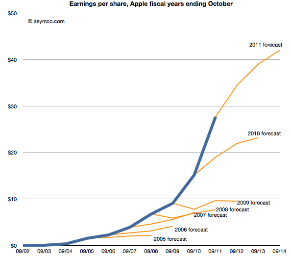
    Last week Horace wrote about the apparent "reasonableness" of analyst Apple estimates. He explained how the consensus for Apple's growth was always deeply pessimistic because its performance could be argued to be anomalous. It was just too good to be true. We reproduce the chart here:

    The estimates look like characteristic "tell-tales" of a company running strong into the wind.

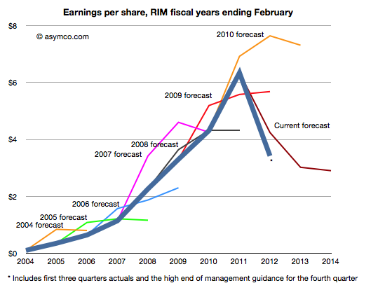
    This conservatism in the face of rapid growth sounds "reasonable" but is it always practiced? And what about the ability of this conservative strategy to predict dramatic changes in growth? To test, we started to look at the predictions for RIM. RIM has also enjoyed strong growth over a similar time frame as Apple. How did analysts predict its performance? The following chart was prepared using the same technique as the one for Apple[1].

    Surprisingly, the "tell-tales" look very different.[2] For every year we looked at the first year estimates were over-optimistic with a decline expected after one or two years. This pattern is remarkably consistent within the RIM data and remarkably inconsistent when compared to Apple.

    It's as if there was nothing in common with the methods used. This is perhaps appropriate, but the "quality" of predictions are not much better. With RIM they were too optimistic in the short term and too pessimistic in the medium term. With Apple they were far too pessimistic consistently.

    More worrisome, the 2010 forecast did not offer any hint of the dramatic decline which followed only a few months later. And after three quarters of really bad news, the consensus is still higher than what will likely happen (ensuring an uninterrupted string "misses").

    The study of these two companies' forecasts is a study in contrasts. We can say that the forecasting is disturbingly consistently inaccurate but we can also say that there seems to have been a bias of pessimism for Apple and optimism for RIM. We can only guess at the cause, but the consistency of bias points to something institutional.

    ---

    Notes:

    1. The three year forecast consensus (sourced from Bloomberg) was sampled one month following the end of each fiscal year. This should offer the analyst enough time digest the year passed and deeply contemplate the future.
    2. If we may stretch the analogy, these are indicative of an imminent stall.


  9. How many Android phones have been activated? (Updated)

    Research · 86 comments

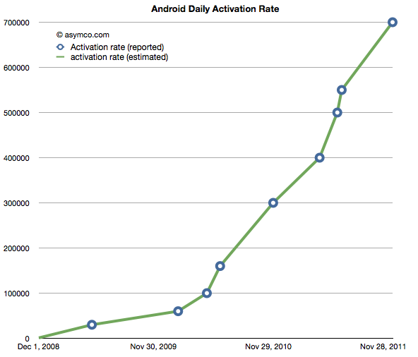
    The following chart shows the reported (circled points) and estimated (lines) for Android activations. The resolution of the sampling is every seven days.

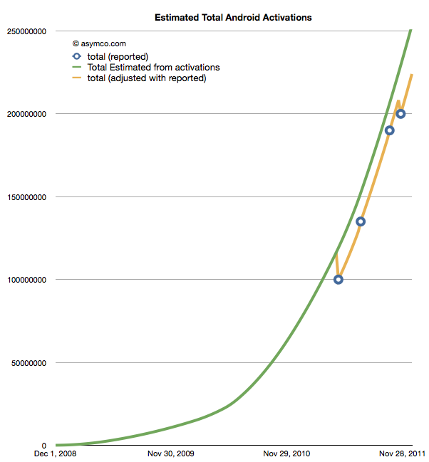
    If we take these estimates and then compile a cumulative total of activations we get the green line in the chart below.

    The wrinkle in the picture is that Google also occasionally reports cumulative estimates of total Android shipped. They are shown as the blue circles in the chart above. There is some room for error as the cumulative totals may not be reported the same day they happen and the assumptions in the activation rates may not be reflecting occasional slowing.

    However that leads to a problem. By adjusting for the reported totals we get the orange line. The trouble with it is that it has these improbable "kinks" where the total is adjusted down, something that is not happening in reality. It's a kludge we need to make estimates fit reality. Normally, this is something we can sweep under the carpet, but with the size of the market, the errors creep up to tens of millions of unitis.

    The first downward adjustment would have been 19 million in May. Today, the difference between the green line and the orange is about 25 million.

    So the best we can say right now is that there have been between 224 and 253 million Android devices activated to date. Why Google does not report this data regularly and consistently remains a mystery.

    Update: The data used in the charts above is available as a Google Docs spreadsheet here.

  10. The big Mac (and iPad and iPhone) index (Updated)

    Research · 94 comments

    Apple's products are globally consistent. They sell the same exact[1] product in all countries. An unlocked iPhone is the same everywhere. It makes the products "liquid" in that they can be easily bought and sold across borders.

    However, laws do not permit the import and friction-free trading of electronic products. In addition to regulations there are duties levied and there are sales or consumption taxes levied on the purchase.

    However, knowing the retail price of an Apple product in a particular location, and knowing the tax and duties levied, can we work out if the price is consistent?

    Here is an example:

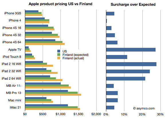
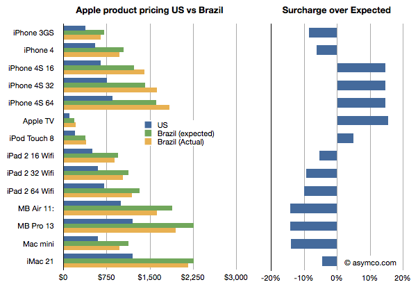
    I illustrated the price of a basket of Apple products in the US online Apple store in blue and the same products in the Finnish online Apple store where the prices were converted to US dollars in yellow. I also calculated what the price in Finland "should" be if the products were sold with the known VAT of 23% added. I called this "Finland (expected)" price and it's shown in green.

    I then took the difference between the "expected" and actual prices as a fraction of the expected and called that the "surcharge". The surcharge can be interpreted as "how much more does a buyer in a different country pay over the price in the US (excluding US sales tax) plus VAT and duties."

    What the chart shows is that not all Apple products are treated equally by Apple. In this particular case Apple TV and the iPad are "overpriced" significantly. Interestingly, the iPhones are nearly what would be "expected" price.

    It gets curiouser when comparing with other countries. In this case I compare the same basket in Brazil.

    Here the story is reversed. The iPads are cheaper than one would expect while the iPhones, especially the 4S, are more expensive, though not by as much as the iPads are in Finland.

    Why is this?

    I don't know. These prices are set by Apple though they may be influenced by operator deals they have locally or other terms. It would require local knowledge of the market to solve this.

    What would also be instructive, I believe, is to collect data from many more countries. If you are living in another country, you can help by providing the following data: For each of the products in this list,

    iPhone 3GS
    iPhone 4
    iPhone 4S 16
    iPhone 4S 32
    iPhone 4S 64
    Apple TV
    iPod Touch 8
    iPad 2 16 Wifi
    iPad 2 32 Wifi
    iPad 2 64 Wifi
    MB Air 11:
    MB Pro 13
    Mac mini
    iMac 21

    provide the retail prices (preferably from an online store) and the local VAT or duty that is expected for electronic products (enter data here.) You can provide the prices in local currency. We can then try to put a global picture together and understand what affects price differences across borders[2][3].

    Update: You can view and enter data in the spreadsheet here.

    Notes:

    1. There are minor differences like power adapters but they are not materially more expensive to produce.
    2. See also The Big Mac index.
    3. Thanks to Paulo Silva for supplying the prices from Brazil and asking the pertinent questions.
  11. The parable of RIM

    Research · 154 comments

    Here are the highlights from RIM's latest quarter:

    • 14.1 million BlackBerry smartphones shipped, 13 million sold through
    • 150k PlayBook shipped with sell-through slightly higher. 800k PlayBooks shipped so far.
    • BlackBerry subscriber base up to 75 million
    • High growth cited for U.K., France, South Africa, Mexico and Argentina, Indonesia, Saudi Arabia and South Africa. RIM is the #1 smartphone vendor in the Latin America and Caribbean region. Sales outside the US, UK and Canada were 61% of revenues. US is now 20% of sales, UK 11%.
    • Hardware growth outside the US was 56%
    • There are 630 carriers
    • 50k apps in App World with 5 million downloads per day
    • Forecasting 11 to 12 million smartphones next quarter

    Given the channel fill with a new product, the device business was marginal at best. The company obtained -1% growth y/y in units but 31% sequential growth from a transitional quarter. The average selling price (inclusive of service revenues) is $354 and about $280 excluding service revenues. I estimate that operating margins have dropped to about 11%. Not a good story, but one we have been warned to expect.

    But a crucial new twist to the story is that RIM announced that they don't expect new BlackBerry 10 devices until late next year. That came as a surprise and the stock sold off significantly, valuing the company at well below book value.

    Stepping back, the biggest surprise is that the company seems to have had no plan for sustaining itself.

    Let me explain.

    If you go back to 2005 or so the world of smartphones was a mix of modular OSs and integrated platforms, much as it is today.  Not unlike Android today, Windows Mobile was successful in licensing to dozens of vendors who in turn released hundreds of products. Symbian also was licensed but most volumes came from Nokia and they held the lion's share. Then there was the BlackBerry integrated solution which worked smoothly and had devoted fans who upgraded every chance they had and operators who were joyous at the new ARPU. There was also PalmOS as offered by PalmSource trying to be a "third horse" and unseat stodgy old Microsoft.

    It was into that fray that both Apple and Google jumped. Google acquired Android in 2005 and Apple was busy polishing a version of OS X that would became iOS. In three and two years respectively these platforms would be in the market.

    Regardless of the actions of rivals, all competitors must have faced the same questions in 2005: As technology was changing rapidly and as they all had access to component roadmaps, what is the best technology approach to this market? Should they embrace certain innovations to sustain their business trajectory? RIM had a tightly integrated software, hardware and service offering. What could make it better? Nokia was also basing its products on a more loosely integrated offering (nominally it was modular, but only just). It saw the writing on the wall and began developing a Linux variant (Maemo) as a potential candidate to replace Symbian. Microsoft was basing its solution of a modular approach. Windows CE was ok as a kernel but they had layers on top which were optimized around stylus-based user experiences (analogous to mouse actions). Could it take on a rich computing experience?

    There were many experience candidates. Stylus, keypad, keyboard all had adherents. There was a lot of hesitation. After the iPhone launched with capacitive (finger) touch, resetting user expectations, it still took a year for many of the vendors to re-consider their technology plans. The weakest changed first.

    Microsoft felt the pain quickest. They also had the least to lose since revenues from Windows Mobile were paltry. By 2008 internally they turned 90 degrees. They embarked on re-building their user experience and orphaning the Windows Mobile ecosystem and many of the vendor relationships they had built. Palm dropped PalmOS and built WebOS internally quite quickly. They licensed Windows Mobile as a stop-gap. Around the same time Nokia doubled down on Maemo and joined with Intel to form MeeGo. They did not orphan Symbian though and kept trying to adapt it to the new experiences and input methods.

    But RIM did nothing. Almost nothing. They were the healthiest competitor. They felt no pain from iPhone's entry. The platform they had built was still growing and they were tweaking it constantly. There were always improvements to point to but fundamentally the code was limited. It was very difficult to adapt it to touch input and the first attempts at a touch UI were embarrassing. But there were no signs of a new platform that reflected the Unix-like competition.

    As I pointed out in an earlier post, Unix-like operating systems were having their revenge. To a computer scientist the future of mobile computing would mirror that of personal computing in terms of architecture. The foundations of the early smartphones were built on constraints that were disappearing while being unable to accommodate new input methods. In other words, the early efforts were optimized around those constraints and sub-optimal for rich user experiences. They had to be. There were limited processors, memories and screens and battery life.

    It turned out that all the early mobile operating systems were unsuitable for the advances in technology that came after 2007. Companies which were able to adapt or embrace Unix-like operating systems in a mobile context gained the ability to grow with the new input methods. The sooner they "pulled the trigger" on the shift, the better off they were. This is in fact what enabled entrants to gain footholds. Entrants entered with Unix-like OSs straight away while incumbents had to justify changing and the more successful they were the harder it was to justify changing.

    RIM had trouble justifying this change. It waited until 2010 to finally acquire the QNX asset that would offer them a stronger software foundation.  It still had to adapt this acquisition and it looks like it won't be done until at least 2012, seven years after they should have started. And this should be seen as a sustaining technological change. A new OS is not a disruptive technology to what is already a mobile computer.

    However, delays like these can be fatal. We see the impact on Microsoft who was earliest to push the reset button in 2008. It still took two years to rebuild Windows Mobile into Windows Phone and is now still struggling to regain lost share (less than 2% today). We see the impact on Nokia which was unable to affect a transition to MeeGo due to a litany of issues and had to throw in the towel on self-determination. We see the impact on Palm which lost its independence as WebOS was a bit too little too late.

    These companies had the right technical strategies but suffered from execution and business architecture issues. RIM is years late in embracing what appears to be a sustaining improvement.

    But whenever you see what appears to be a coordinated effort by companies to fail simultaneously you have to ask if the change they struggle with is really sustaining or disruptive. The pattern makes me suspicious that what RIM, Microsoft, Palm and Nokia faced was more than a failure to embrace a sustaining improvement. I suspect that the failure is evidence of tectonic shifting of business models.