Asymco

Asymmetric Intelligence

Latest from Asymco

  1. Take the money and run

    Research · 26 comments

    In August 2007, during the HD format wars between HD-DVD and Blu-ray format, Toshiba offered Paramount and Dreamworks $150 million to produce HD versions of their movies exclusively as HD-DVD.[1]

    This type of deal is equivalent to an "advance" offered to a book author. The DVD manufacturer pays studios up-front cash for the right to make its DVDs. From an accounting point of view this is treated as an advance that the manufacturer recovers by selling the DVDs back to the studio's video division in the same way a publisher earns back the advance it gives an author.

    In this case, the payment was so large and the sales of HD-DVDs so small that Toshiba was unlikely to earn back the entire advance. The way the deal made any sense for Toshiba was that it was exclusive: the studios could not continue to release their movies in Blu-ray. The deal was done explicitly to hobble a competitor and create "critical mass" of content for its own format.

    But then in March 2008, Toshiba threw in the towel and abandoned the HD-DVD format. The way the deal worked, the studios got to keep almost all of the $150 million. They then re-released all their movies in the Blu-ray format. The only "cost" to the $150 million windfall was that there was a nine month delay in the eventual release to Blu-ray--a small price to pay for an emergent format without a large install base.[2]

    Platform owners go to great lengths to ensure "content" for their platform. They will, essentially, finance an ecosystem when there are barriers to entry or when competing ecosystems are far more lucrative.

    This scenario for movies is being played again with Netflix, Hulu and other distributors who need to fill their pipelines. Netflix's content acquisition costs are exploding and putting the whole company's future in doubt.

    But this scenario is also being played out with app developers. Most recently, news broke that developers are receiving payments from Microsoft for Windows Phone ports of popular apps. In mobile platforms, apps are the new content and developers are the new studios.  It's also a practice that is not without precedent[3].

    This is as it should be. The value of the platform lies mainly in what is built on top of it just like a foundation is not much use without a house on it. However, the practice of "priming the pump" with cash payments for porting is not ideal. Like spiffs, those who receive payments may become used to it and withhold development if there is no payment. Also, those who did not get payment offers may feel shunned and retaliate in kind. Those who receive payment may become cynical about it and may not put in the extra effort (or, more probably, outsource) to make the work spectacular.

    Or, like Paramount, they may just take the money and run if/when the platform fails.

    ---

    Notes:

    1. Source: The Hollywood Economist 2.0: The Hidden Financial Reality Behind the Movies by Edward Jay Epstein.
    2. Paramount made $250 million more from three "replication output" deals: $50 million from Toshiba for agreeing to release Titanic on DVD in time for Christmas sales, $150 million from Panasonic for agreeing to allow them to take over video replication from Thompson, and $50 million from the law firm Ziffrin, Brittenham and Circuit City stores for agreeing to support the DIVX format. Paramount got to keep the money even though DIVX never launched.
    3. Although it's never been reported that Apple pays developers for building iOS apps, some developers do benefit from promotional placement and visibility during launch events and from early access to devices or SDKs under development.
  2. Half of US iPhones are repeat purchases

    Research · 46 comments

    Canaccord Genuity analyst Mike Walkley writes in a note to clients today. “In fact, we believe iPhones are outselling all other smartphones combined at Sprint and AT&T and selling at roughly equal volume to all Android smartphones at Verizon.”

    via iPhone Tops Sales Charts at Each of Its U.S. Carriers - John Paczkowski - Mobile - AllThingsD.

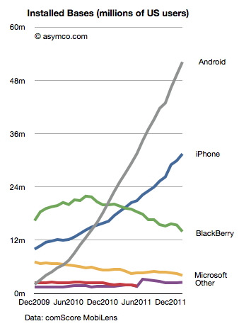
    That's useful data. Mainly because we can use it in combination with comScore data that tracks a different market measure. comScore's MobiLens service tracks US mobile installed base. By measuring the difference between their stats one month to the next, one can measure the gain in a particular platform.

    Comparing that gain with the sell-through rate in the same period can yield a figure for the number of units sold as upgrades vs. those sold to new users.

    The latest comScore data (period ending February) shows that Android added 2.87 million users to its base while iPhone added 1.52 million. If we assume that Android sold a minimal number of replacements (due to the limited time in use of bulk of units) and round up to 3 million for February, and if we assume that Apple sells as many iPhones as Android (which is what Walkley suggests) then we can conclude that in the US roughly half the iPhones are bought as replacements for existing iPhones.

    Extrapolating this to global markets may be risky but already we can begin to form a picture of how the iPhone franchise is becoming an annuity-based business.

    Apple likes to point out that "half of Mac buyers are first time buyers." In the case of the iPhone perhaps they could also say "half of iPhone buyers are repeat customers." At this stage in the platform, that's a powerful statement. If the repeat customer rate is high then it suggests strong loyalty but it also may suggest poor competitive position vs. non-consumption or alternate platforms. If the repeat customer rate is very low it may suggest competition vs. non-consumption but it may also suggest low loyalty. It all depends on the overall growth in the market and size of installed base.

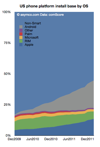
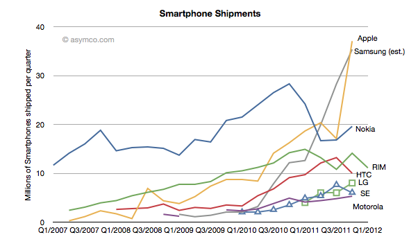
    The following chart shows the overall market growth and the position of the various platforms within that growth.

    Note the time scale is slightly more than two years. This suggests that the vast bulk of Android units in use (grey area) consists of first use units. New purchases are going to first time buyers. In contrast, the shrinking RIM total implies extremely low sales as the age of the base is far older than the time scale. iPhone base is both growing and being upgraded.

    As we reach 50% penetration of smartphones, platform churn will become a significant component of market performance. The loyalty and "stickiness" of Android will begin to be tested. Current surveys show reasonably good satisfaction ratings for Android phones (around 60%) while iPhone's are even higher. But let's keep in mind that RIM's satisfaction and the loyalty of their customers was exceptionally high a few years ago. The rate of evaporation of goodwill toward the brand is breathtaking.

    The longer term test of mobile platform performance will be in the recurring purchase rates. Loyalty must be earned and preserved. I.e. "You come for the product, you stay for the ecosystem."

    So far, the iPhone seems to be getting a passing grade while Android has yet to face the test.

  3. 5by5 | The Critical Path #32: Mockumentary

    Podcast · 22 comments

    Horace talks again with Dan Abrams about film budgeting, Kickstarter, pre-production, location, technology for production, and a surprise announcement. We also discuss the project-oriented nature of movie production vis-a-vis "pipelined" product development, the history of studios and how they evolved, Pixar and much. much more.

    via 5by5 | The Critical Path #32: Mockumentary.

    Show Notes and Links:

    1. Roger Corman blog post
    2. The False Profit Kickstarter page
    3. Discussion of the film by Bill Torgerson, another CP guest
    4. Steven Bach and the history of United Artists "Final Cut"
    5. Steven Bach on Wikipedia
    6. Technology drivers for the Impressionist era

    This was quite a fun show.

  4. Weighing the share of value created

    Research · 24 comments

    Philip Elmer-Dewitt published a table from Piper Jaffray's Gene Munster which has some interesting details. Munster has taken a four year "tech sector" view of value creation (and destruction) and tried to see if there is a bound on the value Apple can continue to capture. This "share of value" is one of many approaches to bounding an opportunity. You could consider "share of wallet" by measuring disposable income, or "share of eyeballs" by measuring screen time available or even "share of GDP".

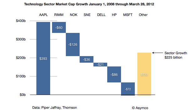
    The attractive part of the share of value of industry is that we have an implicit way to see winners and losers, or the transfer of wealth from one group to another. I charted the data published as follows:

    Seen in this context, Apple generated nearly as much value[1] as RIM, Nokia, Sony, Dell, HP and Microsoft destroyed. The rest of the sector generated $233 billion of value but if it were not for Apple, the tech sector would have declined by $168 billion.

    As a result, Apple went from being 5.6% of the value of the sector to being nearly 17%. The argument goes that its share of value could still increase further even if the overall sector does not. At 30% of current total value, Apple would be valued above $1 trillion.

    My observation is that the conservation of value exhibited in this data is not the entire story. What is gained by Apple should be more than what is lost by others. The disruption under way has had victims but the net value created should be more than what they lost. The iPhone and iPad should be competing with non-consumption, bringing new value into the sector from other sectors or from non-productive capital. Perhaps they are and the losses by the cohort arrayed above are incidental, but there is likely to be a blend of competition and new market growth.

    Does the analysis satisfy?

    Perhaps. It's one more perspective into the puzzle. Growth rates, market sizes, technology improvements, brand and satisfaction analysis as well as jobs to be done are all offering perspective views. I would say there is consistency in the data but they should all be weighed with vigilance.

    ---

    Notes:

    1. Market cap is the perceived net present value of all future cash flows discounted to the present for a publicly traded company and hence defines the value created by the firm. It's measured by markets so there is room for error but it's the best measure available and has historically been accurate over long periods.
  5. The role of capital [1]

    Research · 19 comments

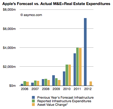
    At the end of 2011 Apple's net property, plant and equipment (PP&E) was $7.8 billion. This reflects $12.34 billion gross PP&E net accumulated depreciation and amortization of $4.5 billion. The depreciation and amortization increased by a total of $533 million and the gross PP&E increased by only $572 million. I say "only" because in the previous quarter PP&E increased by $1.42 billion. If we assume that this growth is equivalent to capital expenditures for the quarter, it's also a very small amount given the company's stated intentions to spend $7.1 billion during the fiscal year.

    The gap is illustrated in the following chart:

    The blue bar in the 2012 year represents the company's stated intentions (from the 10K). The Yellow bar in 2012 is what has been spent so far as measured by the change in reported asset values. Given that the company has been exceeding their targets lately, one should expect the yellow bar to reach as high as $8 billion after another three quarters.

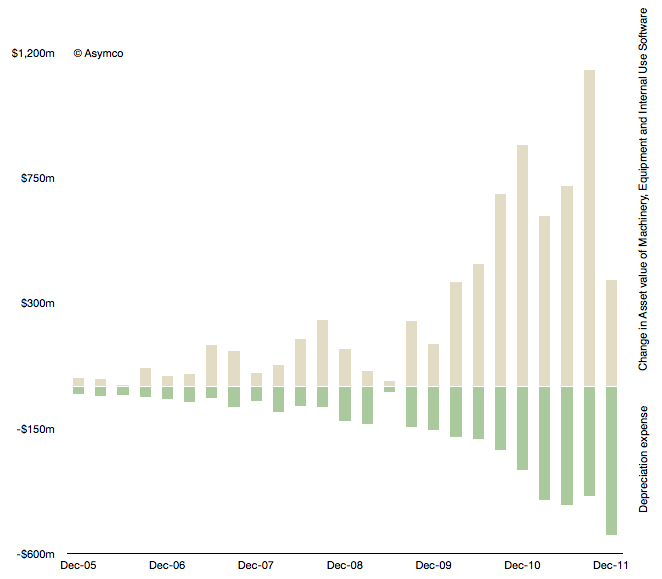
    Another view into this data is provided by the following chart.

    The beige bars represent the quarterly change in asset value and the green bars are the depreciation expenses for the same quarter. This view also shows a significant slowing in spending.

    In the past I showed that CapEx, especially spending on machinery, equipment and internal-use software correlates with iOS device production during the next quarter. It's not a relationship that helps much in quarterly predictions due to the elastic nature of product transitions. There were quarters when spending and output were de-coupled, for example spending in March and June 09 quarters was far lower than one would expect for the 3GS launch quarters that followed.

    We will have to keep an eye on the change in asset value to be reported for CQ1 to see how the spending ramps up during the year. At this time the company needs to spend at least $6.5 billion in three quarters or over $2 billion per quarter to meet its target for the fiscal year (ending October this year). We have to see whether and why Q1 (fiscal) was too low.

    This discussion is also affected by the discussion on Apple's other balance sheet item: cash and cash equivalents. The magnitude of its assets is staggering: $100 billion in cash, $7.8 billion in PP&E, $3.47 billion in acquired intangible assets (mainly patents), and $896 in Goodwill (acquisitions). With this much "capital" the company does not make use of any debt facilities.

    In this regard Apple is also an apparent anomaly. As it gets subtracted out of indexes because it weighs too much or skews "reality" so Apple and its balance sheet is causing a warp in "time-space" of capital markets. The traditional relationship between financiers and operating companies assumed some form of symbiosis but as the credit crisis has shown some have not kept their part of the implied bargain.

    So we have to ask yet another unsettling question: what is the value of capital markets when their products are commoditized by relatively unsophisticated CFOs?

    ---

    Notes:

    1. This is the material accompanying the third case discussion at Asymconf. Participants are encouraged to read it at the material linked before the show.
  6. Android Economics

    Research · 87 comments

    Charles Arthur, writing for The Guardian, has noted that court filings seem to be revealing Google's Android revenues. If this is the case, we have a significant breakthrough in understanding the economics of Android and the overall mobile platform strategy of Google.

    The new data is a reference to a settlement offer Google made to Oracle of $2.8 million and 0.515% of Android revenues on an ongoing basis. The key assumption to make this data useful is that the $2.8 million offer represents 0.515% of revenues to date.

    In other words, that revenues from 2008 to end of 2011 multiplied by 0.00515 results in $2.8 million. That implies that revenues from 2008 to 2011 were $544 million.

    I think that's a fair assumption. I don't see why Google would offer a higher or lower royalty rate for years 2008 through 2011 than for years after 2011. The offer would seem to be 0.0515% in the future as well as retroactively in the past.

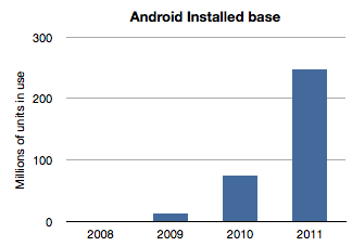
    If we work with this assumption then the next question is how to distribute this $544 million over the four years 2008 through 2011? The installed base of Android has grown exponentially and it would seem logical to assume that revenues have followed in a similar pattern. Here is a chart of installed base given activation data supplied by Google.

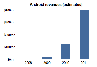
    If we assume revenues were distributed the same way we would get something like this:

    The sum of the bars in this chart equals $544 million and the ramp is approximately the same as the installed base. The relationship between the first graph and the second is a multiple equivalent to the revenue per device.

    Therefore a second assumption is that revenue per device remained fairly constant. In this model the revenue comes out to be about $1.70 per device per year. It's possible that rev/dev/yr. is increasing as Google services are discovered by users. It's also possible that the rev/dev/yr. is decreasing as later adopters are less likely to engage as early users. I just don't know how to adjust this value so by leaving it at the average, I can avoid introducing more assumptions.

    Now we can stop and look at this figure and do a test. Does $1.70 make sense as a device revenue for Android? Google had spoken about targeting $10/device/yr. but we have no indication that they are nearly at that level. If they did achieve that level, with an installed base of 300 million, Google could be collecting $3 billion a year in Android income. Are they getting it?

    As of October, Google mentioned that it had a $2.5 billion "mobile run rate". But we know that this figure is not only from Android. Mobile includes all mobile devices and services including those running inside iOS, Symbian, BlackBerry, Windows Phone, etc.  They could be counting ads on all mobile browsers as well as ads running inside all apps on all platforms. Furthermore, Google also testified that iOS accounts for two thirds of their mobile search revenues[1].

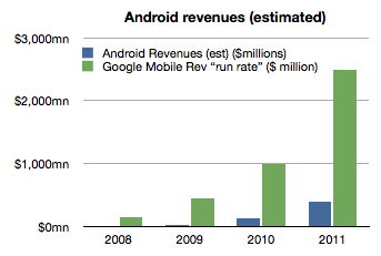
    Adding run rate to the Android revenue chart results in the following:

    So the step is to take the "run rate" figure of $2.5 billion and assume, as Charles Arthur did, that iOS income is what is left after taking out the Android part[2]. I also noted that Google previously mentioned a run rate of $1 billion and I will assign that run rate to 2010 and $2.5b to all of 2011. Since we know the number of iOS devices in use for years 2010 and 2011 we can calculate Google's revenues per iOS device in use.

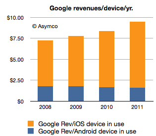
    If we thus combine all the data we know (revenues derived from settlement offer, units in use, run rate and iOS installed base) we get the following revenue profile:

    This shows a positive trend for Google: revenues per smartphone per year is increasing. However, the growth is coming from non-Android devices which means mostly iOS. Revenues per device for Android is probably declining.

    The story for iOS revenues however is not all rosy for Google. Google has to pay for that revenue. The mechanism is a payment that Google makes to Apple for the prominent and default placement of Google search on Safari.

    We don't know the terms of the arrangement but if we assume $2/device Google needs to shave $2 from the top of the chart above with that money going to Apple (attached as iPhone/iPad service revenues.)[3]

    That still leaves a healthy $8.33 in 2011 as operating income from mobile with $1.70 or so coming from Android.

    However, to make this operating income into bottom line profit, we have to extract the R&D and SG&A associated with mobile at Google. This would be, therefore, Andy Rubin's yearly budget.

    Andy Rubin has stated in the past that Android is profitable. That is certainly believable. The budget would have to be about $400 million/year in 2011.

    Charles Arthur concluded that Google obtains four times more revenue from iOS than from Android. My estimates indicate that in 2011 the revenue ratio was closer to 5 but if we subtract the cost of those sales in the form of payments to Apple then the ratio could well be four to one.

    Many of these figures begin to "hang together" as we balance assumptions about costs, revenues and statements made in public. There is a consistency within a comfortable margin of error. If that is the case, then the economics of Android begins to take shape.

    My take is that it's not a bad business. But it's also not a great one. As long as there is exponential growth in units, Android will improve its position inside Google relative to iOS. But from Google's perspective, iOS is today a bigger business. And iOS is not standing still. It's growing not only in terms of units but in revenue per unit.

    Strategically, and historically Android was never one thing. P&L considerations were not the only (or even at all) factors in investment for Google. Having a hedge against hegemony of potential rivals, having a means to learn and develop new business and having a role in defining the post-PC computing paradigm are all probably bigger considerations than profitability.

    So in terms of returns, Android is sustainable. However, in relative terms the value created leaves much to be desired. Whereas Android generates $1.70/device/year and thus an Android device with a two year life generates about $3.5 to Google over its life, Apple obtained $576.3 for each iOS device it sold in 2011[4]. The economics of Android are nothing like the economics of iOS.

    ---

    Notes:

    1. This figure is also not conclusive as search is not the only form of revenue on a mobile device but it does imply that Android is not the majority of Google's mobile revenues.
    2. Clearly this is overstating iOS as the non-Android income is broken up between several platforms. We can only say that iOS is the vast majority of non-Android income.
    3. Assuming a $2/device payment model means Google paid $312 million to Apple in 2011 and $171 million in 2010. This would go toward boosting Apple's revenue per iOS device. Naturally, if this distribution cost is higher or would be subject to re-negotiation then it could vary widely.
    4. The iOS figure includes accessories and licensing of trademarks but excludes income from App Store, iTunes music, movies, TV shows, iBooks, greeting cards or textbooks.
  7. RIM to give up

    Research · 78 comments

    RIM’s CEO, Thorsten Heins was quoted as saying, “We plan to refocus on the enterprise business and capitalize on our leading position in this segment. We believe that BlackBerry cannot succeed if we tried to be everybody’s darling and all things to all people. Therefore, we plan to build on our strength.”

    via RIM to give up most consumer markets | Ubergizmo.

    RIM's latest quarterly results show a continuation of the decline in sales that began in Q1 2011.

    Here are the highlights:

    • Smartphone units declined 26% y/y and 21% sequentially. Over a four year period the company still shows a positive growth of 20% compounded, though that is far below industry average
    • The smartphone revenues were down 29% y/y and 23% sequentially.
    • Including service revenues, the revenue per smartphone dropped to $346, a drop of 4%.
    • I estimate the phone operating margin to be less than 5%. The company swung to a net negative operating margin due to write-downs of tablet inventory but the phone business managed to break even.
    • Operating income from phone operations dropped to the lowest level in five years.
    • The company is still generating cash flow and has a cash reserve of over $2 billion.

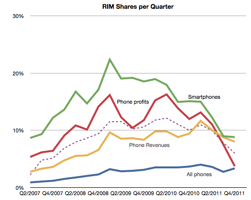
    Seen in isolation, the company is clearly struggling but does not seem to be on its last legs. But no company should be seen in isolation. As part of a competitive market, the company is in far worse shape. The following chart shows the AMP index which measures relative performance through a blend of market shares.

    This chart does not include the latest quarterly data but if it did it would be sure to show a continuing decline. The AMP index actually shows RIM peaking in Q1 2009, well before the volumes peaked.

    It's within this context that we need to evaluate the new CEO's strategic shift. In the quote above we have the first significant strategic departure and split from the past. Should it inspire hope or despair?

    The idea of focus has huge benefits. Focus and the art of saying no are keys to greatness. However, you only succeed if you focus on the right thing. "Enterprise" is not the right thing. It's not a valid target. Enterprise support is a feature, not a product. I don't mean that as opinion, but as a point of fact. Focus on a set of customers whose only characteristic is a job description is missing the whole point of focus.

    Focus needs to be positioned on a job a brand needs to be hired to do. The idea should be to solve an open problem which is either too complex or too uneconomical for anyone else to solve. Corporate buyers have problems to solve but the BlackBerry no longer offers unique or defensible solutions. Furthermore, corporate buyers are themselves being dis-intermediated from the computing purchase decision. Sometimes this process is called "consumerization" but it is more plainly explained as "commoditization". The selection of tools for workers by a group that claims to understand their needs better than they do is an archaic concept.

    This was true even in 2005 when RIM began targeting consumers. It was then that they saw the writing on the wall--that their enterprise business was being commoditized. All of RIM's growth since has been in consumer segments. By abandoning that trajectory RIM is effectively giving up on growth. And giving up on growth is simply giving up.

  8. Top-down vs. bottom-up: Which market analysis method is appropriate when disruption is knocking

    Research · 29 comments

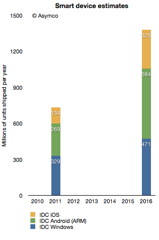
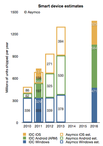
    In terms of platforms, IDC expects a relatively dramatic shift between 2011 and 2016, with the once-dominant Windows on x86 platform, consisting of PCs running the Windows operating system on any x86-compatible CPU, slipping from a leading 35.9% share in 2011 down to 25.1% in 2016. The number of Android-based devices running on ARM CPUs, on the other hand, will grow modestly from 29.4% share in 2011 to a market-leading 31.1% share in 2016. Meanwhile, iOS-based devices will grow from 14.6% share in 2011 to 17.3% in 2016.

    Via: IDC - Press Release - prUS23398412

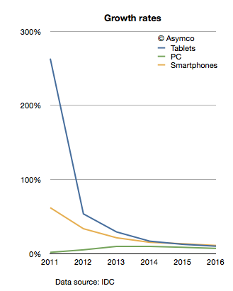
    The company provides a stacked bar chart (follow link above) to illustrate their view of the market. I took the data they included and measured the implied growth rates for the product categories:

    IDC is implying that in four years the tablet market will be growing at 10%, the Smartphone market will grow at 11% and the PC category will grow at 11%. In other words, five years from now the PC market is expected to grow faster than the tablet market and just as fast as the smartphone market!

    What's more remarkable is that this situation is not going to happen in four years. The slowdown in growth is actually expected much sooner. The growth rates two years from now are expected to be: Tablets 17%, Smartphones 15% and PC 10%. IDC is unequivocal: by 2014 the good times will come to an end to the post-PC challengers. These growth rates would be catastrophic for share prices and the value propositions of the new platforms to developers, partners and consumers.

    What's more, these growth rates are striking not only because they predict a collapse in the value of most market challengers but that they also predict a strongly resilient PC market. How can we test this forecast?

    I tried to reconcile this doomsday scenario with what is known about the components making up the data. I.e. what "bottom-up" data is IDC using? In the quote above, IDC offers some insight into this market participant data. Based on the category and share data they published it's possible to infer the following:

    Bearing in mind that neither iOS nor Android existed five years ago, we can observe they are bigger together than the PC market. And yet, IDC predicts a compounded average yearly growth rate of 16.7% in Android, 19.4% in iOS and 7.5% in Windows between today and 2016.

    In aggregate, IDC forecasts that in the next five years Android will not manage to double and that iOS will only increase by a factor of 2.4. Is this believable?

    I try to stay away from long term forecasts, but I do maintain a short term forecast based on recent growth data. My forecasts for this year and next year are shown below.

    I super-imposed my short-term forecast (outline bars) on IDC's long term forecast (solid bars) and a several differences become apparent.

    First, my 2013 forecast is nearly the same as IDC's 2016 forecast. To see why we need to look at each platform separately.

    Perhaps we might (with difficulty) agree on Microsoft's potential. I believe Windows 8 will have a catalyzing effect and that Microsoft will begin to see its platform grow again. However, my expectations are modest. To increase Windows sales rate by 100 million units/yr between 2013 and 2016 is possible but ambitious.

    The real problem is that our Android and iOS forecasts are outside any zone of possible agreement. Maybe there is a difference in what we measure. For a hint, we seem to disagree on the number of Android devices shipped in 2011. I used Google's own reports of activations to work out the yearly shipment estimates. Perhaps IDC is including versions of Android that are not Google sanctioned.

    We also disagree on the 2011 iOS figures. I obtained 156 from Apple's own reports. Again, perhaps the difference is the inclusion of the iPod in my case.

    Nevertheless, the difference in the long term cannot be accounted for only through these categorization differences. I would put the cause of the difference down to the methods used in forecasting. As can be seen from the first chart above, IDC's growth rate reductions are extraordinarily steep. Perhaps the approach used by IDC was to forecast the overall market growth and then assignment of shares to participants. This can be called the "top-down" approach. In contrast, my approach is to forecast growth rates based on recent growth rates and moderating these rates gradually. This can be called the "bottom-up" approach.

    My experience and all the data I've ever collected about historic disruptions tell me that the entrants tend to win these types of paradigm shifts. They win through a vast expansion of consumption and the recruitment of non-consumers. Markets tend to experience vast shifts in composition. If we believe this to be true then the bottom-up approach focused on entrants is likely to be more effective vis-a-vis the top-down approach of projecting steady state markets and the implicit assumption of incumbent share preservation.

  9. Apple at $600. Who knew?

    Research · 90 comments

    Apple's share price has increased rapidly in the last few weeks. The rise to $600 was swift and broke the pattern of slow growth the the stock was able to obtain over the past few years. The level, however, shouldn't have been a complete surprise.

    I think Apple is going to $600...It's really not that complicated. Apple has a number of key drivers in its business model which have yet to be properly priced into the stock because I think it's very cheap at this level.

    -Stephen Coleman, chief investment officer at Daedalus Capital

    This prediction was made October 26, 2007. On that date Apple's share price closed at $184.7. It may have seemed like a bold bet, but as Coleman noted, the reason why it would reach $600 was easy to spot.

    The real story on how I get to that valuation doesn't even involve the sale of (the Leopard operating system) or the growth in the Mac business. How I get there is through the iPhone itself.

    What was not easy to tell was when it would reach $600. Back in October 2007 the stock had a P/E ratio of 48. It's PEG(trailing) was 0.65, and cash per share was $17. Sales were $6.6 billion for the quarter and earnings were 98c/share. If an analyst were to take those ratios and apply a forecast of sales five years hence, the $600 price would have been reached much sooner: Sales had tripled by 2010 and earnings had tripled by 2009. In contrast, the stock took until 2012 to triple.

    The delay of one or two years is perhaps reflecting the risk involved in investing. Namely, you can predict outcomes but not their timing.

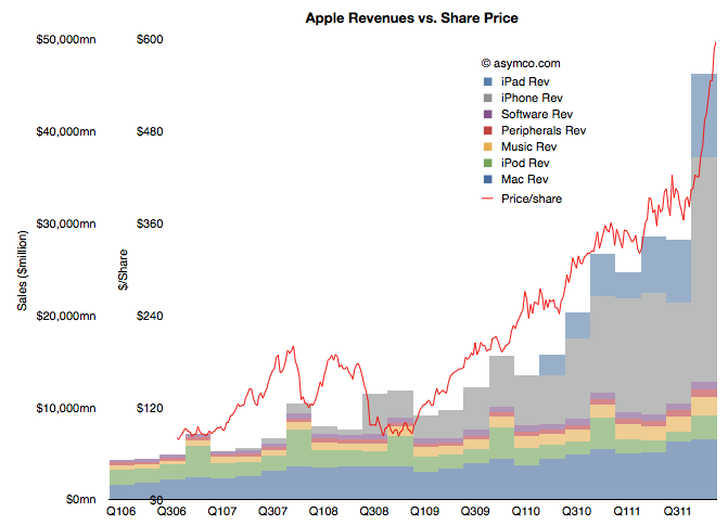
    But still, we have to return to the question of why the stock has rallied in the past few weeks. There has been no new information about the company since it reported earnings and any product launches (e.g. new iPad) or increased distribution (China) are completely predictable.  Curiously, the market did not react until late in the quarter. The following chart shows the phenomenon.

    (Note the two scales on the left: inner is share price, outer is net sales)

    It shows the share price as a line superimposed on the sales chart with stacked product revenues. The recent rise can be attributed to the rise in revenues/earnings from the fourth quarter. But why would a stock react in March to data from six months earlier (and published two months earlier).

    Classical market theory suggests that markets anticipate and "discount" the future. Efficient markets supposedly react to all available information and do so instantly. If that was the case, the chart above would show the red line shifted significantly to the left.

    What we are observing is market inefficiency.

    Inefficiency implies that perception of reality is not the same as reality. It happens when people are reluctant to believe the truth. It's also implies that with $15 billion being "bet" on the share price every day, each one of those bets is misinformed!

    The cause of this divergence between reality and perception is that disruptions are divergent from perceptions. A disruptive company always "leads" its valuation. There is cognitive delay for the vast bulk of observers. You can then argue that for those, like Mr. Coleman, that don't suffer this delay, there will be profit.