Gartner published its estimates for "PC" shipments during the fourth quarter. As I've done in the past, I combined their estimates with known shipments from Apple and separated Apple's performance from the Windows-based market.
I also take into consideration the iPad as a potential competitor for computing purchases. Apple will report fourth quarter results including Mac and iPad shipments in less than two weeks but I am using my own estimates until then.
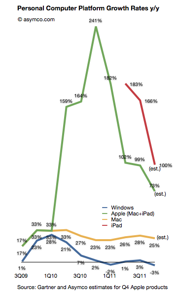
Here is how the platforms grew over the last few quarters (all figures are global):
The Gartner data implies a 3% decline in the size of the Windows PC market during the last quarter. This is the fourth quarter of disappointing Windows performance. If you observe the pattern for the Mac vis-a-vis Windows there is a similarity in the overall cycle but a divergence in terms of growth. The "spread" between Windows and Mac OS X is increasing and has reached an all-time high of 28 points.
But the more interesting story is that the decline in Windows seems to be coincident with the growth in the iPad. The green (Mac + iPad) shows the effect of the new category while the red line (iPad only) shows that growth in isolation (year-on-year).
Coincidence?
Ever since the iPad launched the hypothesis that it has an impact on PC has been hanging in the air. Most analysts (including Gartner) argued that there was no effect from iPad and that the problems with Windows were all due to one-time circumstances. We hear the same about the last quarter with floods in Thailand being blamed.
However, in the latest quarter Gartner began suggesting that "consumers' attention was diverted toward other product categories, especially smartphones and media tablets."
One wonders if these "media tablets" are not PCs and yet they negatively affect the purchase of PCs whether they are indeed competing with PCs.
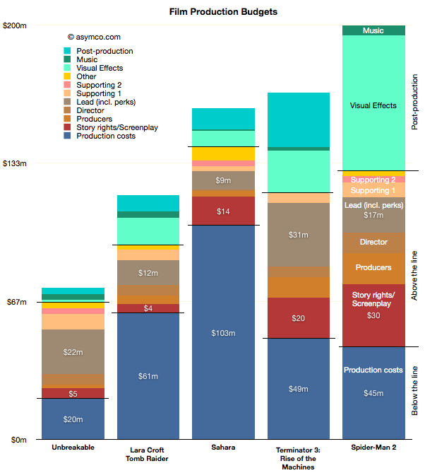
Continuing their discussion of the creative side of Hollywood accounting, Dan and Horace take a look at the way income from movies is distributed and why no movies ever make money. The observations sharpen focus on the over-arching influence distribution has on the creative process.
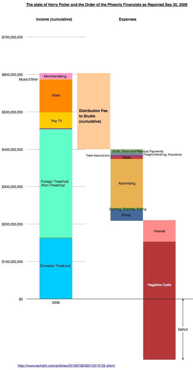
The following chart is a visualization designed to accompany the podcast:
Compensation based on "Net income" depends on there being a surplus rather than deficit. The problem is that the Fees and claims on income increase as they are defined as a percent of total income so the goal of break-even is a moving target.
The Negative Costs are approximated by the production costs as discussed and visualized in the previous podcast here.
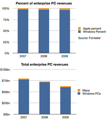
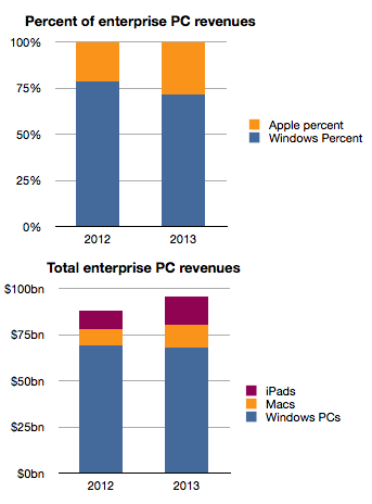
Historically, Apple's sales to business and government buyers of personal computers have been, in a word, minuscule. To put a number on it, Forrester published data where the estimated value of those sales in 2007 were 2.8%. A figure lower than Apple's overall market share of PCs in that time frame.
Things did not improve much in the years following. The following chart shows the split between Windows and Mac OS X for the value of enterprise computers sold in 2007 through 2009.
Apple's share of value went from 2.8% to 3.7%, an increase of 1 point of share, but one which in real terms was not very valuable because the overall market declined due to recession. Revenues for Apple were basically flat at around $2 billion each year as shown in the second chart.
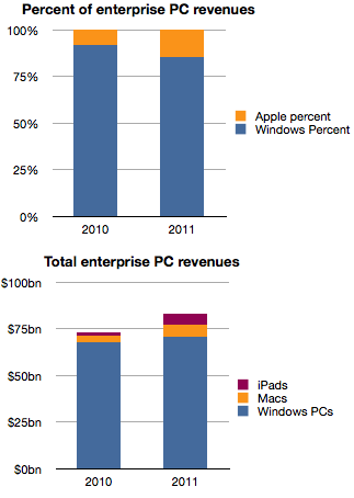
However, the situation changed very rapidly in the last two years.
Apple's share of enterprise revenues doubled from 3.7% to 7.8% in 2010 and nearly doubled again to 14.6% last year. A large part of that acceleration was due to the iPad which generated an estimated 6 billion in sales in 2011, triple what Macs were grossing in 2007.
Forrester goes further and estimates the same data for the next two years.
The estimate seems to be an extrapolation of the last two years which may or may not happen and we should treat it with caution.
However, if the pattern emerges as an extension of the near past, Apple's position in the market at nearly 30% share next year would be a sea change. It may challenge for the top spot among all vendors to the sector.
It's been said many times that "if only Apple put more emphasis" on Enterprise sales, imagine how much more growth they would obtain. However, I believe that this reversal of fortune did not come about from paying more attention but rather from paying less attention to Enterprise.
Enterprise buyers are demanding customers. They have highly specific requirements and ask vendors to conform to multiple layers of dependencies. As a result, enterprise vendors (led by Microsoft) have done all they could to make their software and hardware conformable to these needs. For decades this was the modus operandi and, due to the early adopter nature of businesses in personal computing, the resulting product was passed on to consumers as the "standard". Consumers accepted it as it was better than having no computers at all.
The problem is that customers, especially demanding ones, don't realize that a new basis of performance might be more beneficial. Apple and mobile devices in general presented this "low-end" alternative not in response to requirements from business but in response to requirements from consumers who had been much more eager in the last decade to adopt new technologies with fewer strings attached. All the security, conformability and legacy issues of the early business adopters turned them into late adopters as technology shifted.
So a company focused on an asymmetric market led with new solutions to problems that enterprises did not think they had. Mobility was something few IT managers asked for and was granted begrudgingly to only those "most valuable" who needed it due to cost and security considerations. As Apple willfully ignored these Enterprise needs it, paradoxically, created exactly what they needed.
It pried entry into the most difficult of markets by not even wanting to enter.
In thinking about how this market will evolve, I hear about "consumerization" and cost reduction as benefits and justification of this shift. But fundamentally, what is happening is a classic low end disruption. Enterprises increased their demands beyond what the users in those enterprises could absorb. Instead of ultra-secure, locked-down and immobile computing, users were looking for flexibility, agility and mobility. That's what Apple was listening to.
Apple's best strategy today would be to persist on this trajectory and listen to the under-served consumer rather than the over-served and over-demanding IT manager.
Data on Q4 performance is starting to trickle in. Last week Motorola, as part of a profit warning, revealed their Q4 smartphone shipments were 5.3 million. RIM had reported 14.1 million units (quarter ending November). HTC has also warned that their shipments of smartphones (and tablets) totaled 10 million. Samsung provided guidance on overall sales but since they don't report data on smartphone (or phone) sales, the estimates are ranging between 32 and 35 million.
Many have forecast Apple's performance but there are many other companies which are not easily estimated (Sony Ericsson, LG, Nokia, ZTE, Others.) But rather than dwelling on the specific quarter, we can make some long-range estimates of performance based on the historic data.
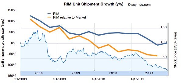
One method I use is to look at patterns of growth. Growth is the first derivative of market performance and it sometimes shows patterns which the performance itself does not. Consider the following chart showing the growth pattern for RIM.
The blue line shows the absolute year-on-year quarterly growth based on reported numbers of smartphones shipped. I've also shown the growth "relative to market" which is unit growth with market growth subtracted. This orange line represents how much faster (or slower) the company is growing relative to the market. If the orange line is above zero, the company gained share. If it's below zero, it lost share.
I also overlaid the performance of the share price (right scale).
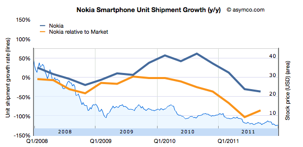
Now compare that with another long-term incumbent in the smartphone market, Nokia.
Bearing in mind that the scales are identical, Nokia's relative performance has been negative since early 2008. Persistent negative smartphone performance relative to market growth causes persistent loss in share price.
What about other, more recent competitors?
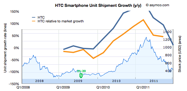
HTC is not a recent entrant in smartphones, and has gone through a phase of growth with Windows Mobile in the 2000's. This is its pattern of growth (and its share price).
Keeping the scale for growth consistent with the other companies leads to a bit of clipping but the pattern of rise and fall also seems correlated to share price performance.
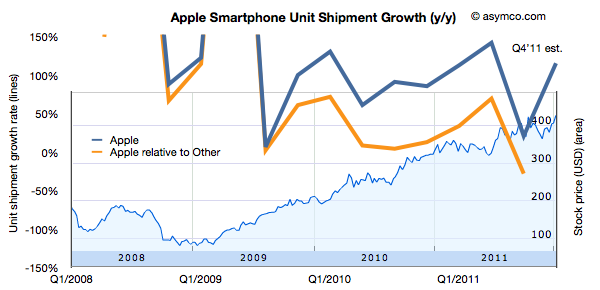
Finally, the following is the same analysis applied Apple.
Again, keeping the growth scale consistent leads to some clipping, but the pattern remains observable.
What seems to be rewarded to various degrees is consistency in growth of smartphones for companies which are primarily engaged in the market. However, failure to grow is punished with severe share price declines.
Being able to forecast smartphone growth seems to be useful, at least in the time frame of one or two years.
It may sound strange to hear me say that I don't make predictions even though I often talk about how things will change and even provide some forecasts. The difference is one of degrees. A prediction to me is a very specific, time-sensitive and materially valuable recommendation. An observation about the future is an imprecise, intuitive hunch based on pattern recognition. It's mushy. It's theoretical. It's the difference between saying a company is great and recommending to buy its stock with a price target in a time frame.
But it gets even weirder.
One of the recurring themes in Apple analysis has been that independent analysts, as a group, have been, on average, more accurate in quarterly forecasting than highly paid Wall Street Analysts. Many have asked why. I believe that the answer is because independent analysts are theorists who make observations while professionals are data gatherers who make predictions.
First, we should understand the reasons why each group does what it does. Wall Street sell side analysts are rewarded for making Buy/Sell recommendations that cause clients to retain the services of the firm they work for. They are not paid to be accurate with specific forecasts in fundamentals. They are paid to predict how stocks move. The objective is not to be accurate in the quarterly but to support the "call" or prediction. The disconnect from accuracy comes in trying to sustain the call with a "conservative" forecast.
For example, an analyst with a "Buy" recommendation (and a prediction in the form of a price target) thinks Apple could ship 30 million iPhones this quarter and generate EPS of $10. But he also thinks the stock looks cheap even if they only ship 28 million iPhones and report EPS of $8.50. In this scenario he's incentivized to publish the lower (less accurate) number. That way he supports his prediction. By dampening expectations, the stock rises on the "surprise".
Because an analyst sells predictions, he self-censors what he believes.
Contrast that with the motivation of an independent analyst (aka blogger). His motivation is to (presumably) gain a reputation of accuracy and insight. He sells his reputation as a keen observer. Precise predictions or recommendations can turn out wrong quite often. Getting caught with these errors exposes the independent to instant negative feedback. The risk is far greater than the opportunity.
So here is the difference: Analysts have an incentive to put forth a version of the future that supports their call on the stock. Bloggers have an incentive to put forth the most accurate version of the future. By taking the prediction out of the picture, accuracy in describing the future improves.
So I don't have any predictions or recommendations. I just hope to help you see patterns that lead you to making your own predictions.
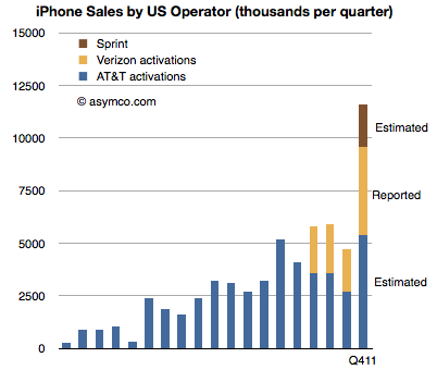
Verizon has been the first source of data on iPhone sales for Q4. They reported 4.2 million iPhones sold. The first quarter of Verizon iPhone sales had 2.2 million units, followed 2.3 million in Q2 and 2 million in Q3. The total for the calendar year came at 10.7 million.
The total for AT&T during the first three quarters has been 9.9 million. If we assume the same 2x sequential increase in Q4 relative to Q3 as observed by Verizon we obtain an estimate of 5.4 million iPhone for AT&T.[1]
The quarter also saw the addition of Sprint to the US iPhone distribution network. Sprint is rumored to have committed to buy 30.5 million iPhones over the next four years. My estimate for the first year was 7 million, placing first quarter sell-in at about 2 million.
An approximate total for Q4 US iPhone activations results in 11.6 million. The following chart illustrates these estimates:
Notes:
AT&T reported that smartphone sales during October and November totaled over 6 million units. Assuming only 2 million for December and a 70% iPhone mix yields 5.6 million units.
When asked where Apple's growth will come from, most analysts or observers will cite new products. As long as there are new products, then there is growth. Conversely, if there are no new products, then there will be no growth. This is such a commonly held belief that it's axiomatic: Apple is being valued based on short-term foreseeable growth.
To be more precise, analysts value the wave of growth of every new product and heavily discount the post-growth phase assuming commoditization. There is no value assigned to Apple for extending market reach to the mass market.
Consider: Analysts currently forecast an operating income (or EBIT) of $43.3bn for 2012 and $49.7bn for 2013. That implies growth of 28% in 2012 and 15% in 2013. These growth rates are modest in light of Apple's recent historic growth and especially 84% in 2011 on EBIT level. Much of this growth has been due to iPhone which quickly captured 4% market share in four years. To suggest 15% growth in 2013 is to suggest that Apple will not increase its phone market share by an appreciable amount. The implicit assumption in that growth figure alone is that Apple will remain a niche player.
Bear in mind that 15% growth is so low as to be half the the growth in the Mac business and below the likely growth in the overall phone market. Considering the risk premium on equities, this growth forecast assumes essentially a no growth scenario. But even with no growth, Apple's cash flows are huge and thus they should add up to some significant present value. Since we know the value as reflected in the current price, we can work backwards to determine the discount rate being applied to those future flows. In other words, we can calculate how risky Apple's existing product cash flows are seen to be.
Based on assumptions originating from analysts' consensus, we can construct a simple model that will approximate the discount the stock market puts on Apple's future cash flows. Let's have a look at an adjusted Gordon or dividend discount valuation model on EBIT basis:
Shares are valued based on the projected future cash flows of a company. Discounting EBIT with Weighted Average Cost of Capital and subtracting growth will yield enterprise value (= market capitalization - cash).
Applying analysts’ assumption of close to zero growth to Apple's post 2012 EBIT means EBIT stays constant for 2013 and beyond. Let’s solve for the implied capital costs. Right away we can eliminate growth (g) as it equals zero. EBIT reflects operating cash flow since in a zero growth scenario CapEx will equal deprecation and there are no changes in net working capital. As Apple has no debt but a cash surplus, WACC will be equal to cost of equity[1].
Solving for capital cost (WACC) with available analysts' EBIT estimates reveals a discount rate of 15%.
But let’s remember that analysts have consistently and by a large margin missed Apple's financial performance. So let’s dial in a more aggressive estimate of around $56bn of EBIT for the fiscal year 2012. The discount rate goes up to 19% and implies an EBIT multiple of 5.3x.
In other words, Apple's cash flows for a zero growth scenario are being discounted at a rate of 15% to 19%. This places the company in an extremely risky category of investment. It is certainly not something that can be categorized as a value stock.
The discussions on this blog regarding Apple’s valuation have been insightful, but only danced around the triangle of price, earnings and growth. When the growth forecasts are considered vis-a-vis current pricing, the assumptions built into 'consensus' forecasts for Apple are condemnations of the company.
They present a view of a company that is extremely vulnerable and can neither preserve its current cash flows nor find new sources of growth. It is, quite plainly, a company doomed to commoditization.
---
Notes:
Or one can even assume that cash has a positive effect lowering costs of equity (less indirect bankruptcy costs).
As the quarter is now at an end, it's time to once again review the performance of Apple's most highly paid observers. The data set linked includes published quarterly forecasts starting quarter ending June 2008 to quarter ending September 2011. Thanks to Philip Elmer-Dewitt who collected and processed the data over several years.
As with previous interactive data sets, this is based on Motion Charts "gadget" in Google Docs. Try selecting the Motion Charts tab at the bottom of the page and hit the play button.
The way this is set up now is that the origin (0,0) represents actual performance (labeled as "Oppenheimer"). Every bubble is an analyst's performance measured as a distance from actual. The further the location of a bubble from origin, the worse the error. Placement above zero (or to the right) indicates over-estimation for Revenues (and EPS). Placement below zero (or to the left) indicates under-estimation. Color of bubble represents affiliation (professional or amateur). Size of bubble is iPhone unit error.
You can change the axes, chart type (tabs in upper right), size, colors, and track individual analysts' performance (by checking a name checkbox). Or just download the data and analyze on your own by selecting from the Data tab.
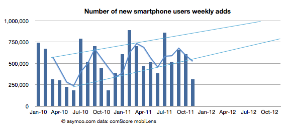
The latest data from comScore MobiLens is showing an uncharacteristic slowing in smartphone growth. In the survey period ending November, the number of smartphone users in the US was 91.4 million. This is equivalent to 39.1% penetration, an increase of 0.6% (i.e. up from 38.5% in the last period.)
The growth is equivalent to 1.4 million new smartphone users (i.e. users who switched from a non-smart device for the first time.) The problem is that this is half the growth of the previous period. The following chart shows the growth as the weekly add rate.
As you can see, the growth has fallen to a level not seen since 2010. The cause may be seasonal as last November was also a slow month. I added a three month moving average which shows that although there seems to be seasonality, the last period did not show the peak of previous periods.
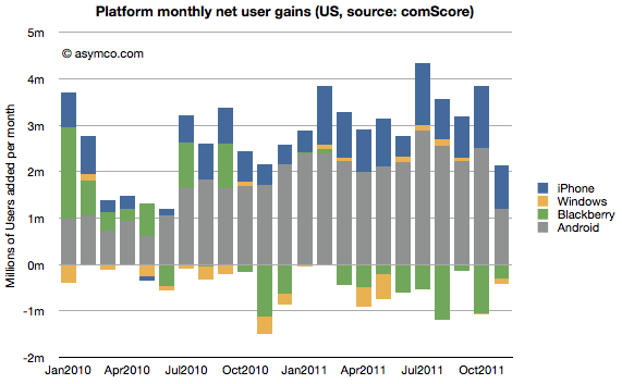
To better understand what happened, I looked at the performance by platform. The following chart shows the net user gains by platform.
What appears immediately is that Android growth was the primary cause of a change in the pattern. The iPhone grew slightly more slowly sequentially but the difference between November and previous periods is not great (941k adds vs. an average of 904k over the previous 12 months.) BlackBerry moderated its losses and Windows is quite a small influence on the market.
Android gain was 1.2 million vs a trailing twelve months' average of 2.24 million. Android's slowing in the US is significant.
We also have access to additional data from Google themselves. We had an update that showed that by late November there were 200 million Android devices activated. We also had an update from mid October of 190 million activations. That makes the increase in activations of at least 10 million during the same period that comScore was measuring the US.
comScore's increase in Android users of 1.2 million then becomes even more interesting. It implies that the US consumers were responsible for no more than 12% of Android activations in the November time frame.
Furthermore we can derive from comScore's data the total devices in use in the US by platform: the figure for Android is 42.9 million (46.9% of 91.4 million smartphones in use). By the end of November, the total activations from Android adds up to about 204 million. Excluding some devices which may be out of use, we can estimate that about 20% of all active Android phones are in use in the US. Conversely 80% of Android devices are in use outside the US.
This means that the US share of Android activations is decreasing. From a cumulative average of 20% to a recent 12%.
So the mystery of what caused the slowing in Android (and hence in all smartphones) in the US remains. Seasonal effects would affect all platforms equally and that is not the case. I'm not comfortable ascribing a cause until we hear more evidence and the pattern is more established. But something does seem to be happening.
[Update: The source data is available here. Note: multiple tabs.]
In this episode I talk with Bob Moesta, a pioneer of Job To be Done research. We go over the theory and process of understanding what products are really hired to do and ask why this understanding is so hard to come by.
In a discussion rich with examples from multiple industries Bob illustrates how marketing, design and engineering are all dancing around the question of how product should be developed.
Could the universally accepted compartmentalization of corporate functions be a root cause of product failure?