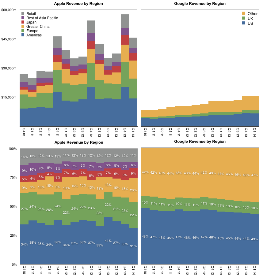
Three years ago Apple's Greater China Q1 sales were $2.22 billion or 9% of total. This year they were $9.29 billion ((Including China retail, revenues reached "almost $10 billion")) or 20% of total. Over this time frame the growth in China was about 320%. The second fastest growing reporting segment was Japan with growth of 187%. Europe was third with 70% and Americas fourth with 53.5%. Rest of Asia/Pacific had the smallest increase of only 4.1%.
A graph showing both the absolute and relative sales levels for the reporting regions is shown below.
As overall sales have increased significantly, the revenues from the Americas and Retail combined (as most stores are in the US) ((60% of all Apple stores are in the US)) went from 51% in Q1 2011 to 42% in Q1 2014. The 11 point increase in share for China can be thus seen as mostly at the expense of the US. As Americas did not decline more appropriate statement would be that China captured much of the growth of the last three years.
Note that I also included Google's revenue split ((Excludes discontinued operations, namely Motorola)) in the graph above. This is partly to calibrate Apple's mix and to understand if the expansion outside the US is mirrored by other companies.
Google, in particular, is largely absent from the Chinese market and the only regional detail we have for their revenues is the US, UK and Other. That leaves an analysis of the dependency of each company on the US market.
Google's US revenue percentage did drop from 47% to 43% but it's worth noting that not only is the drop slower than Apple's, the overall dependency of Google on the US for revenues is higher than Apple's.
A surprising observation as Apple's concentration of users, measured as market share for various products, is likely to be higher in the US than Google's distribution of users.
Put another way, Google is broadly popular world-wide (except for search in China, Korea and Russia) but its customers and hence profitability are highly concentrated.
In an intuitive way, the message may have gotten through to the average person, but I don't think professional observers and managers of technology have quite grasped what he meant.
It's not a glib throw-away marketing phrase. I can imagine many other, more evocative ways of saying that Apple blends the hard and the soft; the heart and mind, if you will.
His choice of words makes me believe that he meant it as a fundamental blending of two disparate and considered-opposite concepts, rather like yin-yang: things which do not naturally mix but which are complementary, interconnected, interdependent, and give rise to each other.
This interaction however is not well understood and even more rarely exploited. The reason they don't mix well in business in particular is that individuals are typically not trained in both. Our education systems (from where these phrases originate) are unwilling or incapable of providing us with a grounding in both, so individuals tend to absorb only one or the other.
But it turns out that the interaction between these nominal opposites have determined our world to date and will continue to determine our fate. A cursory review of history shows that the "soft", perceptive and feeling-based disciplines always combined with the analytical and judgmental to create a future which neither could create alone.
I note how Apple uses this combination to an advantage and have also used this methodology myself to understand and sense the future. Taking this method further, I would like to share it with others. I would like to recognize some faint but powerful patterns and bare some of the more audacious conclusions of my analysis.
It's a small gathering where we are inviting the most enlightened thinkers of the future of computing to lead us into its next age, and perhaps, tentatively, the next era of civilization. ((We'll also answer the questions of where tablets are going, and where they will takes us, what is the future of apparel computing, what does intimate computing mean and who will benefit and who won't.))
Horace and Moisés catch up on a few weeks of topics, from Apple earnings to iPad discontinuity to ecosystem disparity to followup on ComiXology. Why would you ask a freshwater fish what it's like to live in the open sea?
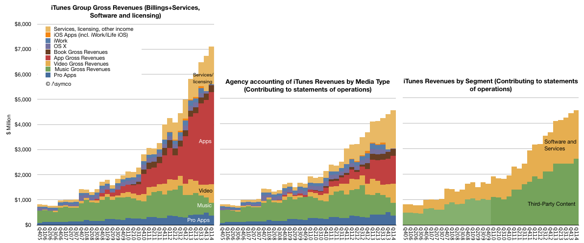
"Not getting the cloud" means that in the last 12 months Apple obtained:
800 million iTunes users and
an estimated 450 million iCloud users spending
$3 billion/yr for end-user services plus
$4.7 billion/yr for licensing and other income which includes
more than $1 billion/yr paid by Google for traffic through Apple devices and
$13 billion/yr in app transactions of which
$9 billion/yr was paid to developers and
$3.9 billion/yr was retained as operating budget and profit for the App Store. In addition,
$2.7 billion/yr in music download sales and
more than $1 billion/yr in Apple TV (aka Apple's Kindle) and video sales and
$1 billion/yr in eBooks sold
In summary, iTunes, Software and Services has been growing between 30% and 40% for four years and is on its way to $30 billion/yr in transactions and sales for 2014.
This is what can be deduced from a reading of Apple's financial statements of operations. If there are comparable details for companies which do get the cloud, I'll be happy to tally the comparison so we can calibrate this failure.
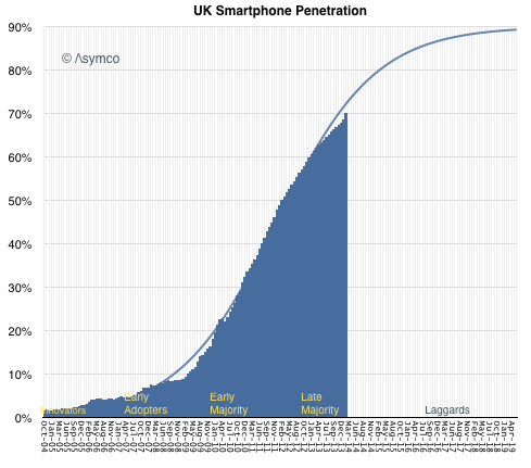
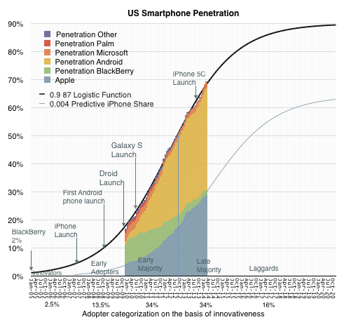
In How close to saturation is the smartphone I highlighted that the US is not nearly saturated at 68.8% penetration at the end of March. Since the US is not the highest penetrated, one may wonder whether other "developed" countries are far further along.
There is no data on all the countries in the world on the same resolution as that in the US, but thanks to Charles Arthur, Kantar shared data on the UK and we can have a clear trajectory for that country.
The most recent data for UK was as of February 2014 when penetration was 70%.
In February the US figure was 68.2%, so the US is 1.8% behind in penetration. The equivalent picture of the US is below:
Not a significant difference. Both markets are in the "late majority" phase of growth and well before the lagging adopters join.
Note that I took a crack at forecasting both the US and the UK penetration given the significant amount of data we have so far. The asymptotic penetration value I chose was 90%. If the pattern holds then there is growth in both markets (and by proxy the developed world) well into 2018.
The US is not the market where penetration is highest. However, it is the largest market where we have reliable penetration data (from at least two sources) and the one where penetration is near the top of the range.
The graph showing the US ranked against others as of a year ago is here. The US was cited at 56.4% at the time. I keep track of comScore's data and it showed 58.2% at the end of March and 55.3% at the end of January, making the figure very believable.
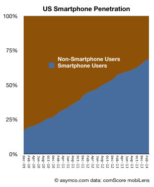
The most recent data from comScore shows penetration at 68.8%. In order to understand what the limits of that growth could be it's important to see the longer-term pattern. It would show whether there is a clear point of inflection and thus a predictable "saturation" around an asymptotic value.
The following graph shows the percentage of smartphone users/non-users since late 2009.
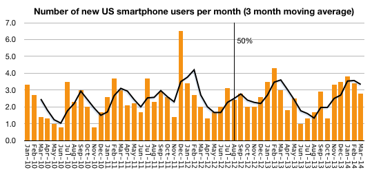
The following graph shows the rate at which users are being added to the smartphone ranks (measured as new users per month.)
To summarize, the conversion of users from non-smart to smartphone usage is fairly constant. The March '14 period saw 2.8 million new-to-smartphone users. the March '13 period saw 3.0 million, the March '12 period saw 2.0 million and March '11 saw 3.0 million. There is no discernible slowing of adoption.
Note that I added a trailing three period average in new users which fluctuates somewhat predictably due to seasonality. Finally, note that the figure of 50% penetration was reached almost two years ago and no noticeable change of adoption has happened since. Cellular phone ownership in the US is still rising (though very slowly) and it now about 90%.
The only conclusion is that even at the current 68.8% penetration, we are not anywhere near "saturation" of smartphone users in the US, and the US is a leader among "developed markets" so there is little to suggest that saturation has happened anywhere with significant populations.
iPad sales were unexpectedly slow in Q1. Tim Cook explained it as follows:
iPad sales came in at the high end of our expectations, but we realized they were below analysts' estimates and I would like to proactively address why we think there was a difference. We believe almost all of the difference can be explained by two factors.
First, in the March quarter last year we significantly increased iPad channel inventory, while this year we significantly reduced it.
Second, we ended the December quarter last year with a substantial backlog of iPad mini that was subsequently shipped in the March quarter whereas we ended the December quarter this year near supply demand balance.
We continue to believe that the tablet market will surpass the PC market in size within the next few years, and we believe that Apple will be a major beneficiary of this trend.
Tim Cook went on to say "over two-thirds of people registering an iPad in the last six months were new to iPad"
In a later discussion, Luca Maestri said:
As Tim explained earlier, our iPad results and the comparison to the March quarter last year were heavily influenced by channel inventory changes. Specifically, this year we sold 16.4 million iPad into our channel and sold through almost 17.5 million, reducing our channel inventory by 1.1 million units.
Last year, we sold over 19.4 million iPads into our channels and sold through 18 million, and therefore increased channel inventory by 1.4 million units. As a result, the year-over-year sell through decline was only 3% compared to the sell-in decline of 16%.
We exit the March quarter with 5.1 million of iPad channel inventory which left us within our target range of four to six weeks. iPad continues to lead all other tablet by far in terms of user engagement, size of ecosystem, customer satisfaction and e-commerce.
In a later Q&A:
Steven Milunovich - UBS Securities: Tim, I understand that the iPad is not as weak as it appears on a sell-through basis, but still it's relatively flat over the last year in terms of sell-through. What are your thoughts in terms of why that is and can that accelerate with Office on the iPad going forward?
Tim Cook - CEO: It's a good question. Let's talk about iPad a little more than we did in the comments.
When I backup from iPad, here is what I see. It absolutely has been the fastest growing product in Apple's history, and it's been the only product that we've ever made that was instantly a hit in three of our key markets, from consumer to business including the enterprise and education.
And so, if you really look at it in just four years after we launched the very first iPad, we've sold over 210 million, which is more than we or I think anyone thought was possible at that period of time. It's interesting to note that that's almost twice as many iPhones that we'd sold in a comparable period of time, and over seven times as many iPods as we'd sold in the period of time.
So, I think it's important to kind of to put that in perspective. We've come a long way very, very quickly. Looking at it by market a bit, which I think is important. I think Luca mentioned a little bit of this in his comments. In the education market in the U.S., we have a 95% share. So the focus in education is on penetration, is on getting more schools to buy and my belief is the match has been lit, and it's very clear to the educators that have studied it is that student achievement is higher with iPad in the classroom than without it. So I'm confident we've got a really great start in education far beyond the U.S. now. This is happening in many, many parts of the world.
In the enterprise market, we're seeing virtually all, 98% of the Fortune 500, they're using iPad. We're seeing – according to Good Technology who looks at activations of tablets – the latest data we have from them is that 91% of the activations of tablets in enterprise were iPads. So this is also an astonishing number and many of those enterprises are writing apps that are key proprietary apps for running that business, and this is great for that company because they're more productive as a result of that. So once again, just like in education in a way, what we have to do in enterprise is focus on penetration, it has to be deeper and broader.
But in terms of having people begin the process, beginning writing apps, we're doing a pretty good job of that. In the retail market, if you look at the U.S. as a proxy, the NPD numbers for March just came out a few days ago and we had 46% share and embedded in that 46%, there's a lot of things in there that I personally wouldn't put in the same category as iPad, and that are weighing the share down. It's certainly a market we wouldn't play in and in a type of product you would never see an Apple brand on. So, we feel like we're doing well there.
Office; I believe does help. It's very unclear to say how much. I believe if it would have been done earlier, it would have been even better for Microsoft frankly, there is a lots of alternatives out there from a productivity point of view, some of which we brought to the market, some of which many, many innovative companies have brought. But I do see that Office is still a very key franchise in the enterprise, in particular. I think having it on iPad is good, and I wholeheartedly welcome Microsoft to the App Store to sell Office. Our customers are clearly responding in a good way that it's available. So, I do think it helps us particularly in the enterprise area.
The other things you look at on iPad that are just blow away its customer [satisfaction], is 98 [percent]. There is almost nothing in the world with a 98% customer sat and the intention-to-buy numbers look good with two-thirds of the people planning to buy a tablet or planning to buy an iPad. The usage numbers are off the chart, far and exceeding Android tablets, four times the web traffic of all Android tablets combined.
So, when I backup from all of these, I feel great. That doesn't mean that every quarter, every 90 days is going to be a number that everybody is thrilled with. But what it means to me is that the trend over time – over the arc of time, that things look very, very good, that iPad has a great future. And of course the thing that drives us more than any of this are the next iPads if you will, the things that are in the pipeline, the things that we can do to make the product even better, and there is no shortage of work going in on that nor any shortage of ideas.
So when I backup from all of this, I can't help but still be extremely excited about where we are. I think we did a reasonable job of explaining what we think the disconnect was between what we had expected, which we hit it at the high end of our expectation and the street's view of this one. I believe the vast majority of it is that first thing was just channel inventory that maybe we should have been even clearer on last quarter to take into account. But I'm very bullish on iPad.
That's quite a long set of explanations for was essentially was a flat quarter for the iPad. I can't add more to this, but I do want to focus on the bold part of the quote above. "But what it means to me is the trend over time – over the arc of time, that things look very, very good".
How can we see the long arc of time?
The tool I've used for this is the measure of penetration. Historically products which become "mainstream" or widely adopted follow an S-curve during that adoption. The curve is remarkably predictable given a limited set of points. I've discussed how the adoption of smartphones is predictable in the US, EU5 (( And UK specifically and several broader global regions)) and how even particular platforms might be predictable in the context of rates of adoption.
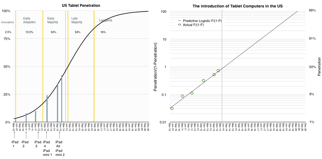
We are fortunate that data also exists for tablets. The Pew Research Center's Internet & American Life Project has published a short history of tablet adoption in the US. I've plotted this data and imposed an S-curve on the data which fits it rather closely.
The results are shown below:
In the graph on the left, the blue bars represent actual measurements of penetration (18+) while the black curve represents a best fit for the adoption rate.
Note that I've added the launch dates of all the iPad models and sectioned the curve into adopter categorization on the basis of their willingness to adopt.
I've also drawn a dotted line on the point where we are in the present.
In the graph on the right I've also duplicated the data using the transform of penetration to log scale penetration/(1-penetration). This shows the relative fit of the data in a more visually comfortable way.
The usual caveats apply:
This is US only
These are adults only
The iPad is not the only competing product
Nevertheless, this is a fairly strong proxy for the market. First, because the US has been leading adoption of almost all consumer product categories in history. Second because adults are a representative sample of users and third because iPad is market share leader.
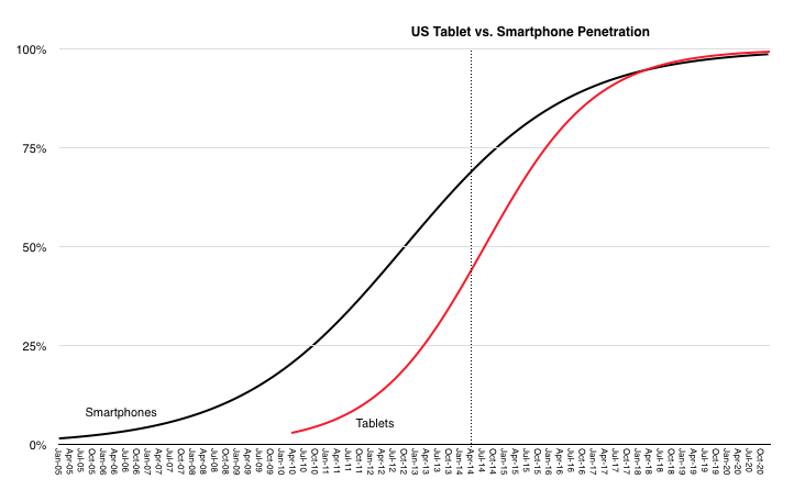
What the penetration data shows is an extremely rapid rate of penetration. In comparison with the smartphone, the tablet is rising much faster. This is shown below:
They are likely to saturate at around the same time but the tablet started much later.
So how does this explain the slowing iPad sales?
It's possible that saturation for tablets could come well below 100% and that we are on a different curve than the model above. However, the ubiquity of the product and broadness of appeal, even within non-consumer (i.e. education and enterprise) makes it difficult to reconcile. In addition, the penetration data is self-evident. It's improbable that penetration goes to 42% as it just did, and then stops suddenly. These decelerations of adoption have been observed historically but they are usually explained by cataclysms such as wars and economic contractions, neither of which are affecting the US right now. If a product solves an important "job to be done" then it gets adopted in a predictable way by a given population.
The anecdotal evidence provided by the company and others coupled with the survey data collected for the population of US users implies that the iPad is solving numerous important jobs and is therefore continuing on a predictable trajectory and that a discontinuity has not occurred.
Management started by saying the iPad sales volume was not surprising to them and that they have not changed their long-term expectations. The penetration data seems to support their confidence.
In the postmodern computing world that we live in, the measure of success isn't revenue or profit or units sold but the number of users that an ecosystem can attract. Therefore the monthly active user (MAU) unit of performance seems to be in vogue right now. E.g.:
Facebook claims Messenger has more than 200 million MAUs
WhatsApp has 500 million MAUs, 48 million of whom are in India
Line last month announced that it had 400 million users (active or not)
WeChat claimed 355 million MAUs
Viber claims 105 million MAUs
Startups are aggregating these millions of MAUs in order to obtain valuations for raising capital ((It's been said that it's difficult to get funded with only 10 million MAUs)) and the faster the growth in MAUs the more "successful" the company is considered.
When companies are acquired it's common to take the transaction value and divide it by MAUs to get an idea of "what an user is worth". This is because there are no revenues to measure and MAUs are taken as a proxy. However, the process by which a MAU becomes a dollar of profit is, to put it kindly, circuitous.
For most (all?) it's not yet clear how it happens especially since not all MAUs are created equal and MAU loyalties can change rapidly and if we added all the projected revenues each MAU will contribute to each app on her device we might reach some absurdity. In actuality, today, for the companies listed above, there are no revenues at all directly from their services.
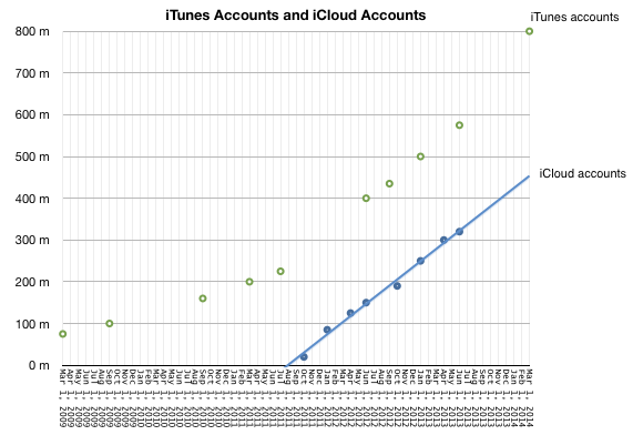
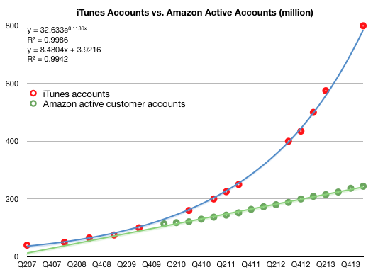
In violation of this convention, there are some companies which manage to obtain revenues from their users. Two such are Apple and Amazon. In the last quarter Apple reported having 800 million iTunes accounts. ((adding, for some unknown reason, that most of them have credit cards.)) These aren't MAUs since the activity level is not noted, but we do know how much is spent on iTunes and services. In addition, Amazon cites 244 million active customer accounts representing accounts which generated purchases within the last 12 months.
This allows us to compare Apple and Amazon in terms of accounts, revenue per account, and, via some analysis, even profitability per account.
The following graphs tell this story. First, the total number of accounts:
Note that I added trend lines to both graphs and their formulas.
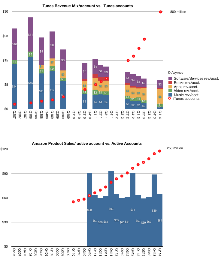
The following are the revenue per account for iTunes (further broken into estimated iTunes segment revenues per account.) and for Amazon. Note that the vertical scales are different.
This view shows just how different the economic value of users can be. In the case of Apple, it's growing its user base at (literally) exponential rates. The revenues per user does, understandably, decline. This is because new/later users don't spend as much as early users. There might be some stability toward the later stages of adoption in revenue per user. The other point about iTunes data is how the mix of revenues has shifted from music to Apps and Services pointing out how users can be migrated across revenue sources over time.
In the case of Amazon it's growing its user base at a linear rate (note equation). The revenue per account remains very steady however.
Broadly speaking, it would seem logical that the speed of user growth has an effect on the quality of those users. This relationship should guide further thinking about the quality of hundreds of millions of users acquired within a few months.
Apple's user growth is a function of expanding its device portfolio and distribution. Apple has shown that there are limits this type of growth. Achieving 830 million or so iOS device sales within 7 years is an amazing feat and one can forgive not having achieved billions more since they managed to obtain significant hardware and service/content revenues from most of them and that those who reached higher figures more quickly didn't manage the same revenue per user.
Amazon's user growth is a function of expanding its logistics and merchandise mix. This is also not easy to do globally. Arguably, Amazon cannot scale in the exponential rates seen by Apple or the other MAU aggregators because it has to depend on trucks and roads and regulators to complete most of its sales.
I suppose, in conclusion, that there is no "right" or "wrong" business model for a user base. Both Apple and Amazon are doing well in building their customer bases and creating loyalties which will serve them well in the future. However whereas there is no right or wrong revenue structure per user, it seems to me that there ought to be some such structure. In most cases this remains a matter of faith rather than reason.
“Innovation” is one of those words that, through casual overuse, has come to signify a wide array of distinct concepts – in some sense, the word is literally losing definition, like an out-of-focus photograph that manages to become blurrier every time you look at it.
These days, anytime anyone does something vaguely new, or a new feature gets added to some gadget or other, the innovation word gets flung about. Indeed, the word is used with the same reckless abandon as those other favourites of jargon-loving MBA types, “solutions” and “disruption”, rendering it increasingly meaningless.
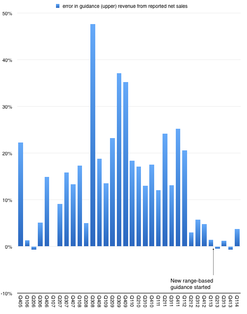
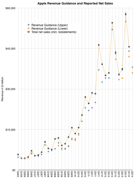
After n quarters of predictability, Apple surprised with sales performance that was 3.74% above the top of their guidance. This may not seem significant but since instituting a new range-bound guidance method in Q1 of last year the company reported revenue within about 1% of the top of the range.
This is in stark contrast to the wide variance in prior years. The following graph shows the "error" in guidance as the percent difference between reported sales and guidance ((Upper end of range in quarters where a range was given.)).
So prior to last quarter we were lulled into thinking that guidance was very nearly perfectly predicting the company. As I tweeted, it took the "sport" out of trying to do any forecasting. All an analyst had to do is tweak the main product growth figures to hit the sales target and then subtract the (generously provided) operating expenses and (also provided) tax rate to get the earnings. Only unknown to getting to an estimate of EPS was how many shares would still be outstanding. ((The company itself would not know shares outstanding as their buying was opportunistic during the quarter.))
Knowing Apple also means that average selling prices are also very rigidly set in stone so the degrees of freedom in analysis were becoming highly constrained.
But just when you think you spotted a pattern, it changes. The company surprised with performance outside the band. The following graph shows the estimate ranges it has given and the actual revenues delivered. ((Next quarter is also pencilled in.))
So what happened?
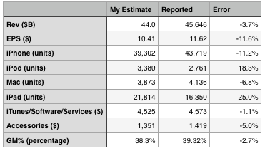
The answer seems to be better iPhone performance. The following table shows my expectations, which were tuned to return revenues exactly at the top of the guidance range.
On product shipments/sales I underestimated the iPhone and Mac and overestimated the iPad and iPod. I estimated iTunes accurately and underestimated accessories by 5%. I also generally got the blend of margins fairly close, being 1 point too low on gross margin.
The bottom line was that the Revenue and Earnings surprise could be accounted for through a significant outperformance on iPhone which offset a less significant underperformance on the iPad.
The iPhone grew sales by 14% which more than offset a drop of 13% in iPad sales and was enough to allow net sales to grow by 5%. Since the company guided nearly flat growth, that 5% was a big surprise.
Now one could ask whether 14% growth in the iPhone revenues is a meaningful change in the long-term evolution of the category. This is a difficult question. The way the iPhone is positioned makes it a great success in the premium segment of the market but it does not place it in competition with the perhaps 80% of the market which seems to be defined by a lower price point.
However let's not forget that pricing is correlative to the market but it may not be causal. Purchase decisions are complex and price is one aspect of that decision. But there are many others. Availability, channels, service, brand all play parts. The error of many analysts is to conclude that price and price alone is causal to behavior. That may be so with commodities, but let us not forget that these products and their uses are newly created and how value is perceived has been changing rapidly. Buyers follow a learning curve in terms of discovering the uses and value of products. These learning curves can be modeled and usually show several years (sometimes decades) for most populations between early and late adoption.
We don't know where the iPhone is on the learning curve for any particular region and that means we can still be surprised by how it grows.
In Part 1 of a look at Google's future I showed that Google's revenues have been highly correlated with the population of Internet users in the markets it serves. If there were a causal relationship between population of users and revenue growth then the company would face a growth inflection point when that population becomes half penetrated.
In Significant Digits Episode 1 (Part 1) I showed data which suggests that the inflection point will come in 2016. Essentially the argument is that Google's growth is ultimately limited by the population of users and that itself is a predictable number. I also used the example of the PC and smartphone penetration curves to show how the perception of the fortunes of companies whose revenues are based on those technologies were affected by inflections in their respective adoptions.
However, correlation is not causation. These users we count are not the customers who pay for Google's services. Users (or usage) is therefore only a proxy. It may be a good proxy and intuitively it makes sense that it's a driver of growth but fundamentally the company lives on a stream of revenues paid by advertisers ((This is true to date and certainly it could change but hints of how that might change are still not visible to me)). In order to really evaluate the opportunity we need to "follow the money" and track down where it comes from.
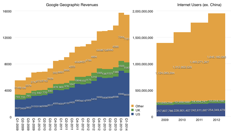
We don't have visibility into the exact sources of these revenues but we have a top-level geographic segmentation (shown below.)
The data shows that in the most recent quarter 53% of Google's revenues came from the US and UK. Five years ago the proportion was 61%. Clearly then about 10% of the mix shifted to non US/UK.
If we exclude China, US and UK, in 2009 there were 1.07 billion Internet consumers. By 2012 there were 1.59 billion users in those same territories. The growth is therefore almost 50%, and this excludes 2013. The corresponding growth in the US/UK was 15%. We should also note that in the same time frame, there were almost a billion Android activations but the number of new users in the US ((as measured in comScore)) was only about 70 million (or 7%).
It's therefore clear that whereas the population of Internet users and the ways they might access Google exploded in the last five years, Google revenues have come disproportionately from US/UK consumers. Or, at least from US/UK advertisers, which we are assuming are primarily targeting local users.
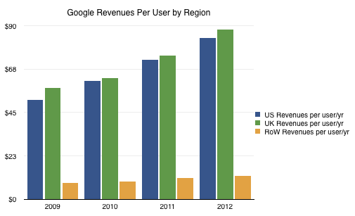
The result is the following revenue per user per year based on where the users reside:
The disproportionate weight of US/UK income and the low growth of income from rest-of-world vs. the far faster growth of usage outside the US/UK means that the toughest nut for Google to crack is not penetration but emerging market monetization.
The disparity is enormous. US/UK revenue is on average $86/user/yr (2012) and rising. The rest of the world only manages $12/user/yr. That Rest Of World includes many wealthy countries such as all of Europe and Japan. So the problem for Google is that it has an order of magnitude less income per user in the part of the internet which remains unpenetrated and the trends show that they are not narrowing the gap. ((The ratio between average US/UK and RoW revenue per user/yr was 6 in 2009, 7 in 2010, 7 in 2011 and 7 in 2012))
Google's R&D efforts seem to be oriented around creating consumption (Making it Rain) but the problem is that the quality of that consumption and the indigenous sources of income are unaddressed. These problems are structural and based on social constructs which don't change at the pace of technology adoption.