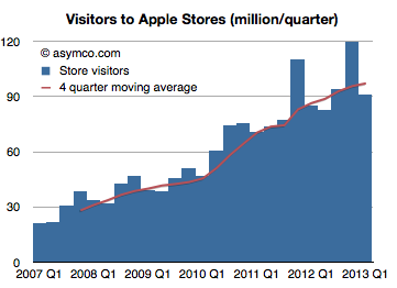
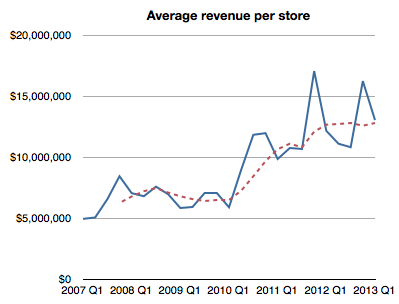
In the US, on a sales per square foot basis, Apple retail continues to perform twice as well as Tiffany & Co., the second best retailer, and three times as well as lululemon athletica, the third best retailer.
The latest quarter showed a 7% growth in visitors and a new record revenue of $57.6 per visitor.
As a result, the average revenue per Apple store per quarter reached $13 million, the highest level for a non-holiday quarter.
Here are some additional metrics:
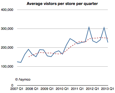
Average visitors per store has steadied to 250,000 per store per quarter (average for trailing 12 months). This is a quantum increase from about 170,000 per store per quarter in the twelve months ending Q1 2010. The reason for this might be the increase in floor space of newer stores and the renovation of older stores. The new store throughput rate might be an upper bound due to fire regulations.
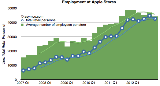
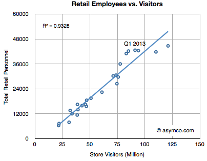
Employment has steadied at about 110 per store. This is a remarkable increase from less than half this level in 2007.
Hiring remains closely correlated with visits with visitors per employee per quarter holding to slightly more than 2000.
Profit per visitor also holding steady at about $12/quarter.
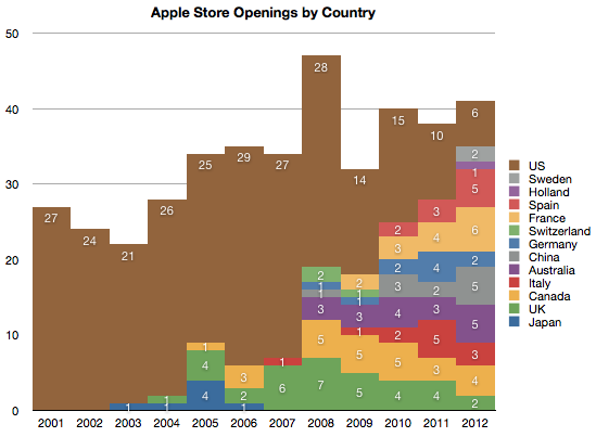
Retail performance remains constrained by store size (hence maximum number of visitors) and the number of stores. The strategy seems to be expanding US stores while opening new stores outside the US.
That would allow growth in visitors and hence in achieving the primary purpose of the stores: maintaining the brand's relationship with customers.
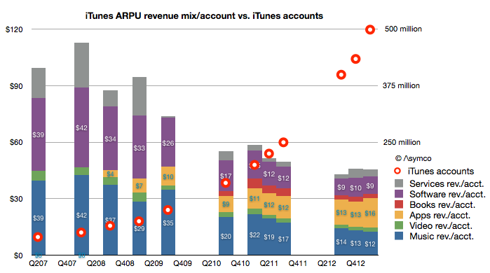
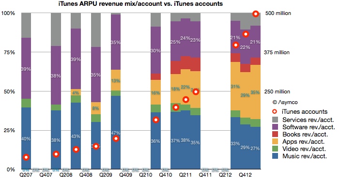
My estimate of last quarter's iTunes gross revenues suggested a spending rate of $40 per iTunes account. It would make sense to consider how that figure changed over time. The following graph shows the pattern:
You can read each bar in the graph as the total "ARPU" or average revenue per iTunes user[1].
I overlaid a graph showing the total number of accounts as reported by Apple to the (retroactively) estimated revenue structure. Account totals are measured with the right axis and ARPU with the left. Note that I also broke down each component of iTunes as currently defined (Music, Video, Apps, Books, Software and Services.)[2]
The time frame covered is from Q2 2007, or the quarter prior to the iPhone launch. A few patterns emerge:
When there were no iOS devices (and hence no iOS apps) the revenues of iTunes consisted mostly of music sales. Those revenues were, on a per account basis, roughly comparable with Apple's Software revenues.
As iOS devices proliferated, the number of accounts (and users) grew. They doubled in the first two years (2007 to 2009) and doubled again in the following year (2010) and doubled again the following year (2011) and doubled again in the following 18 months. This rate of growth was accompanied by a reduction in the iTunes ARPU of about 50% (from $99 to about $45).
The reduction in ARPU has moderated in the last few quarters. ARPU fell 10% from $50 to $45 during the last doubling of accounts (from 225 million iTunes accounts to 500 million accounts.) In contrast ARPU fell 20% from $74 to $58 during the penultimate doubling (from 100 million to 200 million)
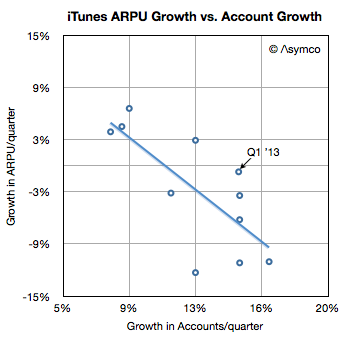
However, growth in accounts is broadly inversely proportional to growth in ARPU. In other words, the faster the growth in users the faster the decline in ARPU. The recent moderation in ARPU erosion is also coupled to a moderation in user growth (most recent doubling took 18 months vs. 12 months for previous doubling.) This is as would be expected as a broader, later user base tends to consume less than a narrow, early base. This can be seen in the following scatter plot:
When seen as a percent of mix, Apps have grown to be the largest component of iTunes spending. Apps have 35% "share of wallet" while music has dropped steadily from 40% to 27% (or $39 to $12/yr.) This is shown in the following graph.
As apps have grown to consume more and more of users' time it stands to reason that they should consume more and more of users' wallets.
And as accounts reach one billion, we can begin to think about the disruptive impact on other media types. Whereas video, books and music are targeted to smaller user bases, apps are broadly consumed. Developers like Rovio or Supercell can offer their products to billions while TV producers can only hope for millions. Apps are becoming the universal medium for entertainment and iTunes the universal distributor.
Talent is catching on to this faster than those who manage and distribute their work. The inevitable result will be a mass migration of talent away from the established content industries. Old media won't fade due to a loss of users. It will fade due to a loss of talent.
--
Notes:
An account is not necessarily a user so perhaps more appropriately the acronym should be ARPA (average revenue per account). Unfortunately that acronym is taken.
The complete model is available for purchase through Asymco Store.
In the latest quarter the iTunes top line grew by 32%. Additional newly reported items:
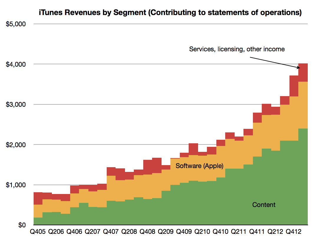
Quarterly revenues topped $4 billion (a new high) and the company suggests that this rate is maintainable by stating it has a “$16 billion annual run rate”. The pattern of revenues is shown below.
The content portion of iTunes revenues was $2.4 billion, up from $2.1 billion sequentially. Growth into Q1 is not unusual as many holiday iTunes gift cards are redeemed during January.
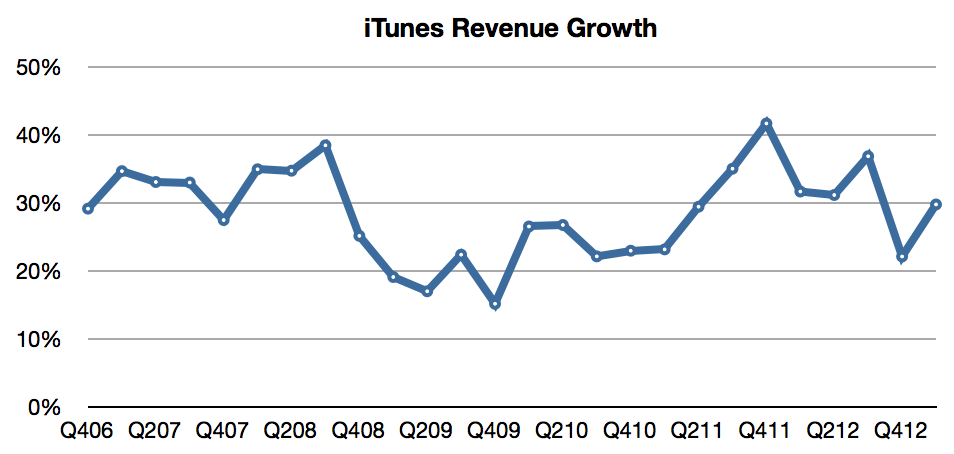
Revenue growth has been surprisingly steady, averaging 29%/quarter for more than six years.
Music is now available in 119 countries.
The Music catalog now consists of 35 million songs.
Movies are available in 109 countries. 60,000 titles are offered.
iBookstores are present in 155 countries offering 1.75 million iBooks.
There are iTunes App Stores in 155 countries whose residents make up about 90% of the world’s population.
iOS developers have created more than 850,000 iOS apps, including 350,000 made for the iPad.
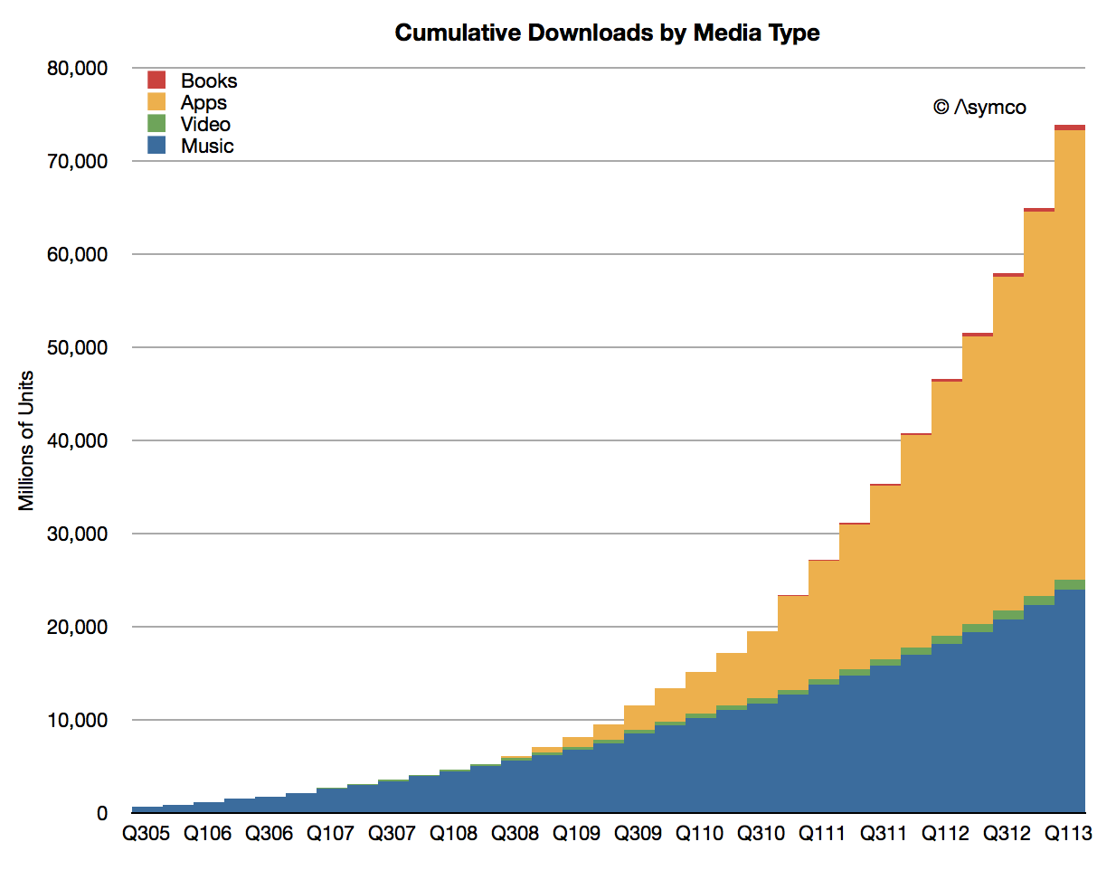
Cumulative app downloads have surpassed 45 billion and are on track to reach 50 billion at time of writing (estimated to be reached mid May).
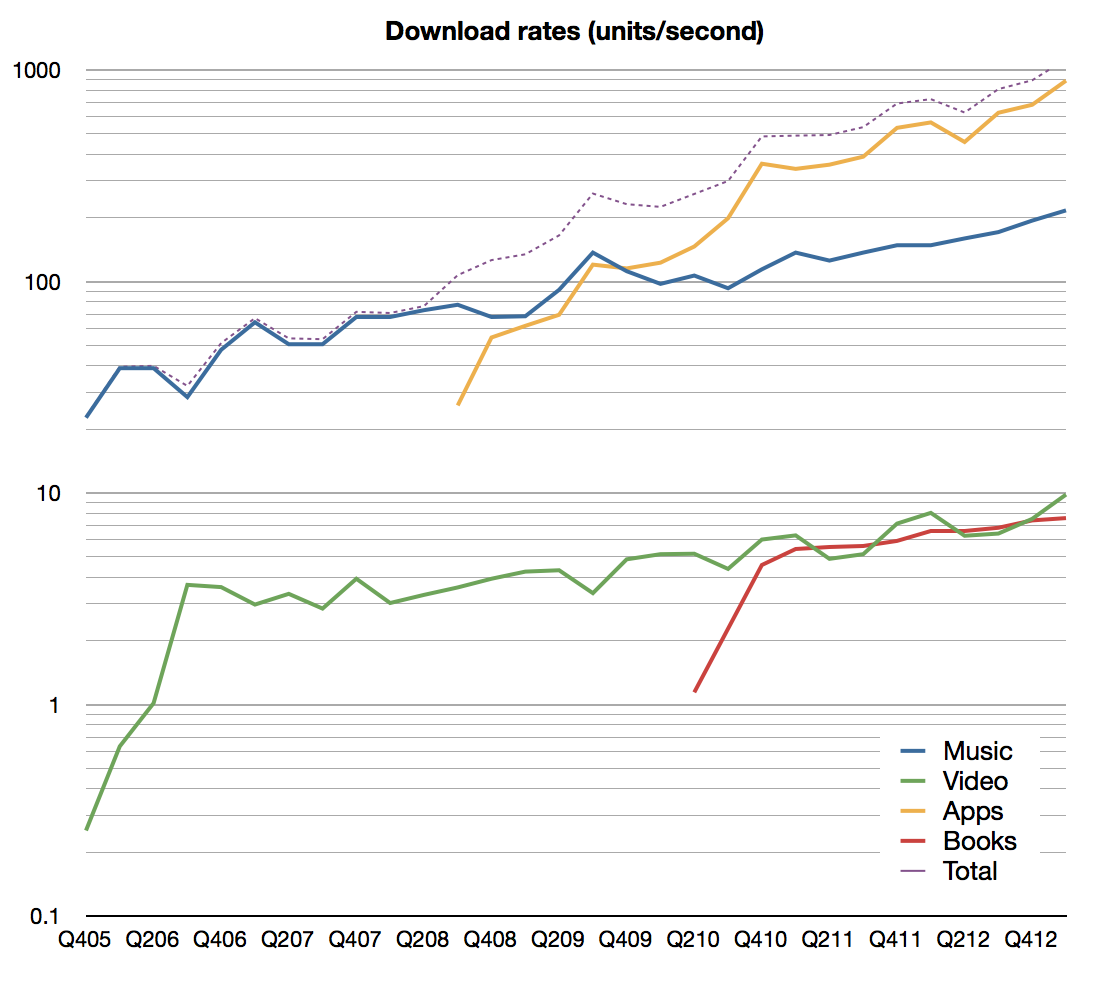
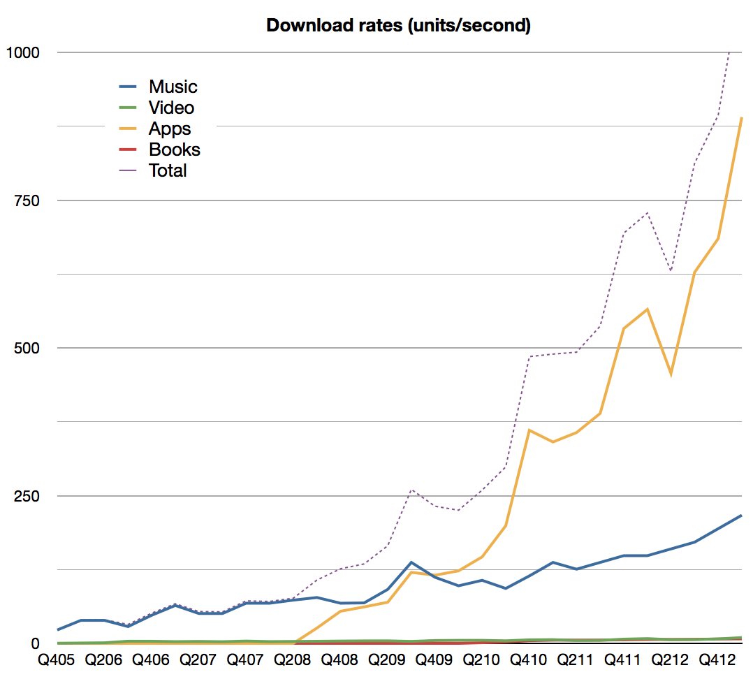
The company reports that over 800 apps are downloaded per second. Including all media, the download rate is now above 1000 items per second. Estimated download rates by media types are shown below (note: first graph is plotted on a log scale):
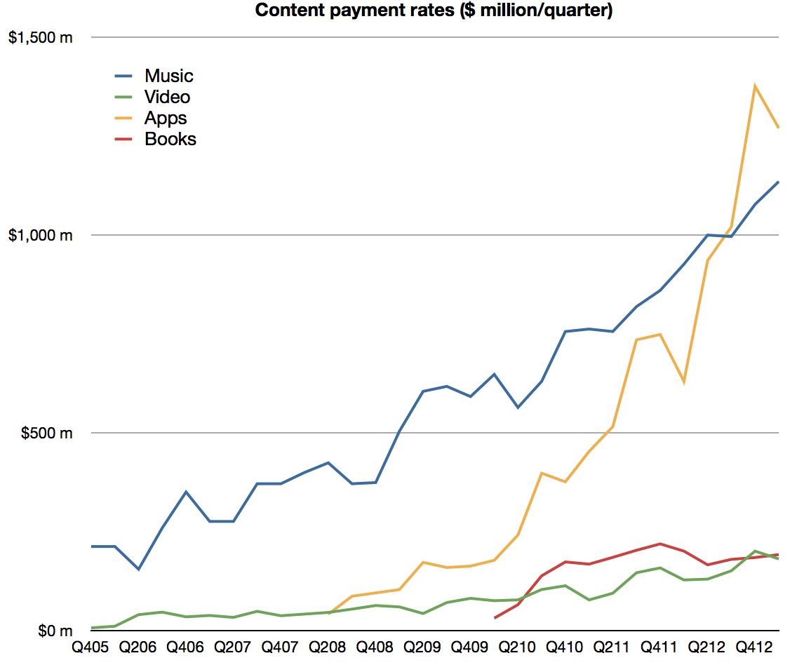
App developers have been paid over $9 billion for their sales through the App Store including $4.5 billion in the most recent four quarters. I estimate the split between media types as follows:
Canalys estimates that sales from iTunes App Store accounted for 74% of all app sales worldwide in the March quarter.
iOS app revenues more than doubled year-over-year.
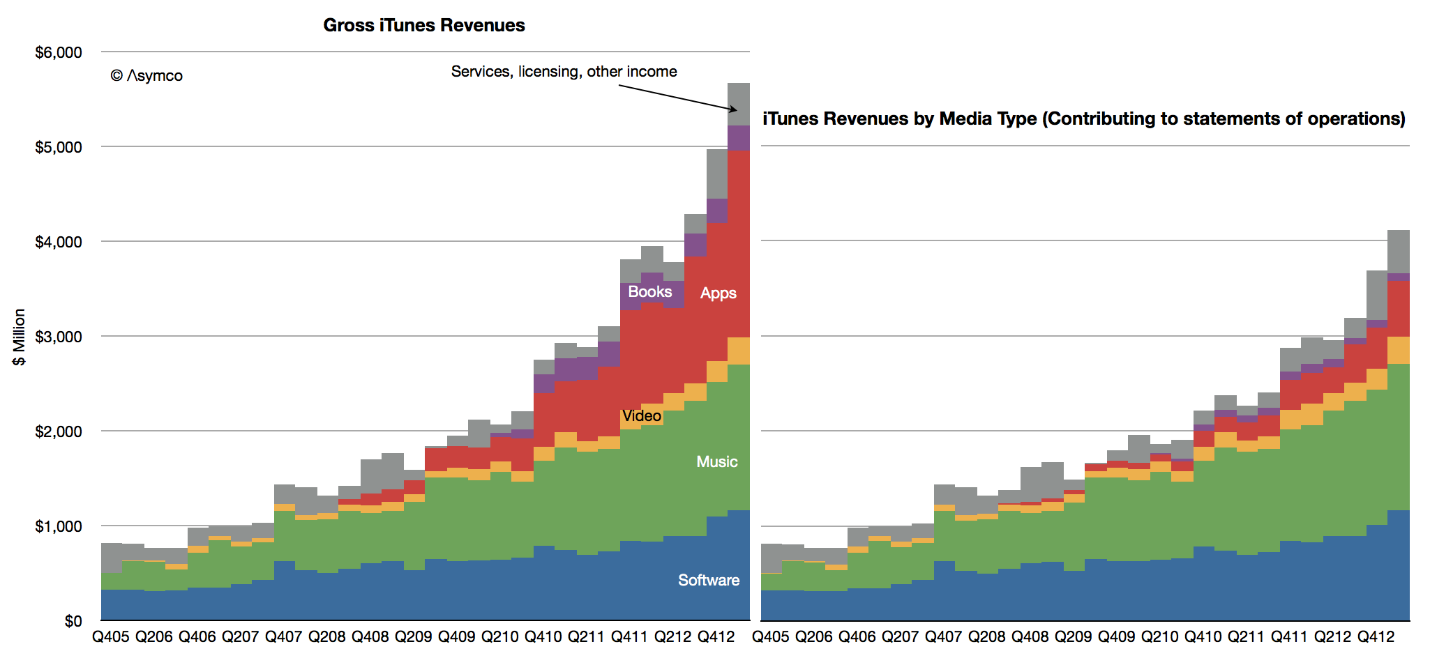
Including all (gross[1]) content revenues, the sales rate is now nearly $5 billion per quarter ($4.94 billion). Including services, the iTunes consolidated business cleared over $5.5 billion.
In March Apple reported that they have 500 million iTunes so one way to think about the iTunes business is to say that iTunes users purchase content and services at the rate of about $40 per year.[2]
Bless them.
---
Notes:
"For third-party applications sold through the App Store and Mac App Store and certain digital content sold through the iTunes Store, the Company does not determine the selling price of the products and is not the primary obligor to the customer. Therefore, the Company accounts for such sales on a net basis by recognizing in net sales only the commission it retains from each sale. The portion of the gross amount billed to customers that is remitted by the Company to third-party app developers and certain digital content owners is not reflected in the Company’s Consolidated Statements of Operations." From Apple SEC filing 10-K, October 2012.
Apple users spend about $1/day for each Apple device in use making the iTunes franchise an incremental 11% marginal revenue source (assuming one device/user.)
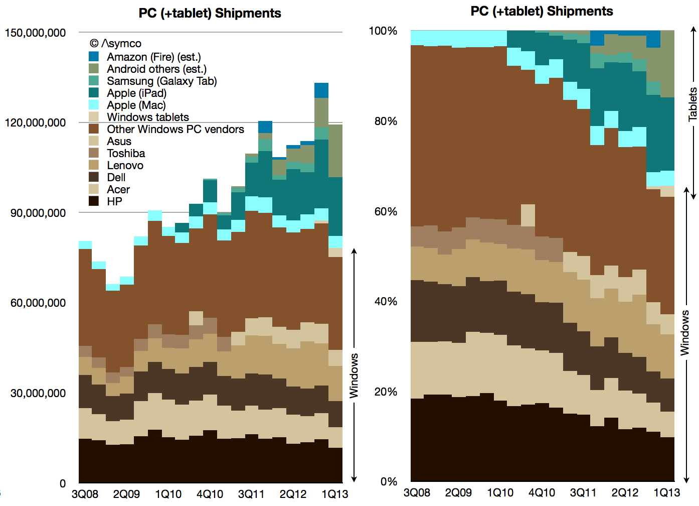
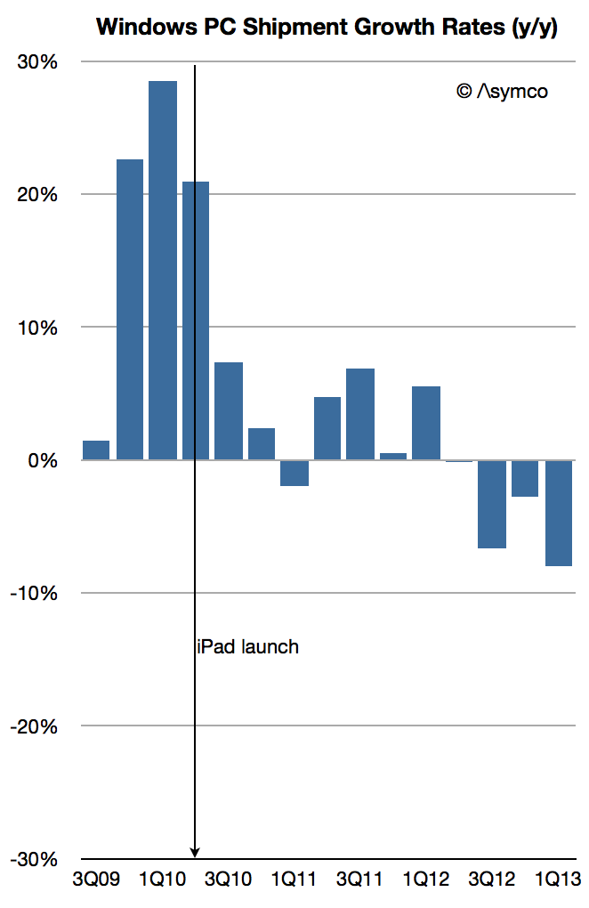
According to Strategy Analytics 3 million Windows-based tablets shipped in Q1. That is not inconsequential. It would add 4% to the total Windows-based computers and reduce the decline in Windows PC growth to -8% (from -11%). You can see the effect of those units on share in the following graphs.
Note the "boundary layer" of pale blue Macs between the brown-hued Windows and the green-hued tablets.
Including tablets of all kinds, here is the market share growth in Windows PCs.
As the post-PC disruption evolves, Microsoft has made an effort to shift its business model. I discussed this some time ago and there remain quite a few questions about the sustainability of the strategy.
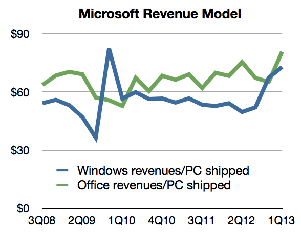
However, there might already be evidence that it's working. The clue is in the growth in Windows revenues at a time when PC shipments (at least traditional ones) are declining rapidly. Some of that might be due to deferrals and software assurance revenues which are insensitive to shipments. However some have to be due to the Surface.
Remember that Surface launched with an RT version priced starting at $499 (which did not sell well) but received a boost in Q1 with the Pro version priced at $899 to $999. If we assume a 80:20 mix of Pro to RT and an average price of $950 for the Pro and $550 for RT, 3 million units would generate at least $2.5 billion in gross revenues. Accounting for retail margins of 20%, Microsoft could still be recognizing $2 billion in revenues. That's a significant portion of $5.7 billion in Windows revenue.
We can back into this figure from another direction: Prior to Surface launch, the Windows revenue per PC shipped (combining Microsoft's revenues and Gartner's estimates) was about $50. After the Surface Pro shipped the revenue climbed to $73/PC.
Assuming the same pre-Surface revenue/PC and given the shipment figures for Q1 we would get about $3.7 billion for Windows. The difference to actual revenues is about $2 billion.
So the extrapolation of Windows royalties approach yields $2 billion in Surface sales and the Price x Units estimate also yields $ 2billion. It would suggest that Surface has had a significant impact already: More than a third of Windows revenues depend on it.
[UPDATE: I've been informed that not all the Windows tablet sales reported by Strategy Analytics are Surface products. As many as 1 million might not be. That would reduce the revenues as calculated to about $1.4 billion. In addition, not all Windows revenues are current with much of that deferred. Actual revenues were $4.6 billion. With both of these adjustments considered, the impact of Surface might be only 30%.)
iTunes (including software and services) revenues in Q1 topped $4 billion and were 30% higher than (re-stated) 2012 Q1 revenues. Accompanying this revenue figure were additional data points from the company:
Cumulative app downloads have surpassed 45 billion
Payments to developers reached a cumulative total of $9 billion
Payments to developers were $4.5 billion in most recent four quarters
Now paying $1 billion to developers every quarter
800 apps are downloaded every second
iOS app revenues doubled since year-ago quarter
App Store accounted for 74% of all app sales in the quarter (citing Canalys)
App stores reach customers in 155 countries (850k Apps, 350k iPad apps)
iTunes music downloads are available in 119 countries (35 million songs)
Movies are sold in 109 countries (60k titles)
iBookstore is available in 155 countries (1.75 million titles)
This data allows for a few inferences:
Nearly 70 million apps are downloaded every day
The average revenue per game is about 23 cents
Gross app revenues are about $16 million per day (of which 11 million is paid to developers.)
Gross iTunes revenues were $5.4 billion last quarter of which I estimate:
…App revenues were $1.6 billion
…Music revenues were $2.2 billion
…Video revenues were $287 million
…Book revenues were $312 million
…Apple's software generated $1 billion
In addition, I estimate that Services generated $100 million
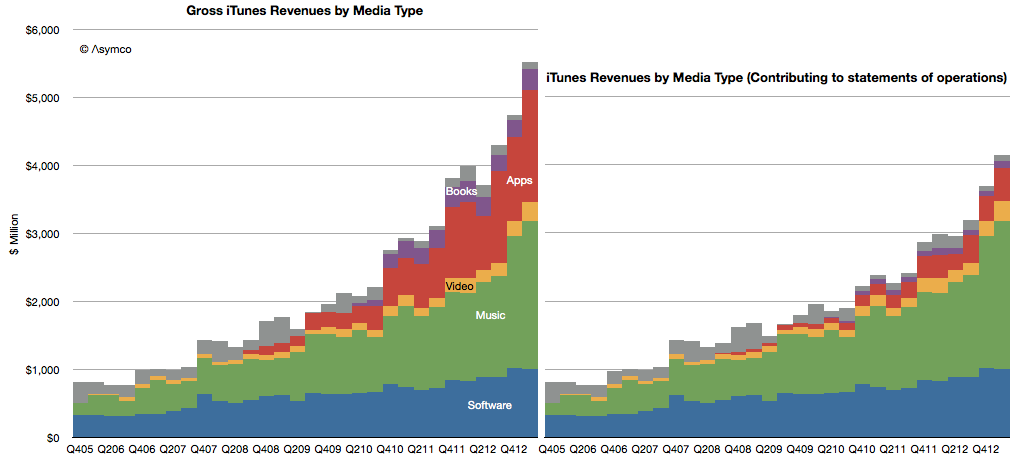
Note that there is a difference between the amounts transacted through the store and what the company reports. The difference is shown in the following graph
To mark it's 10th year, I wrote a segment for Billboard Magazine describing what iTunes has become. I suppose it's easy to become numb to these numbers, but there is perhaps one way to look at iTunes that is still compelling:
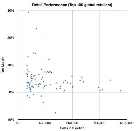
Selling $20 billion a year would put iTunes in the top 20 US retailers and top 50 Global retailers.
In the March quarter, our gross margin was 37.5%. It was at the low end of our range. We had a few items that on balance resulted in us reporting at the low end. They included mix, in particular, selling more iPads than we had planned, including getting iPad mini into our four- to six-week channel inventory range, some changes in our service policiesthat required us to make provisions for prior quarter sales, and we had some unfavorable adjustments.
- Peter Oppenheimer, Apple CFO, FQ2 2013 Earnings Conference Call
[my emphasis]
Thanks to Philip Elmer DeWitt for bringing this quote to my attention in the comments to Margin Call 2.
I was curious about the "changes in service policies" and what that might have meant, especially since they seem to have been retroactive (provisions for prior quarter sales).
Accruals for product warranty for the three months ended March 30, 2013 include $414 million associated with product sales in prior fiscal periods reflecting the impact of changes to certain of the Company’s service policies and other estimated warranty costs. Of this amount, $224 million is associated with product sales in the first quarter of 2013, and the remainder is associated with product sales in 2012.
- Apple 10Q, Note 6, Page 17, second paragraph.
These service policy changes were made around April 1st and were in response to editorials in the People's Daily, the official paper of the Chinese Communist Party. Though seen as a PR issue, their impact goes beyond the company's image. Changes in warranty policy implies setting aside some of the revenues as an expense, increasing the cost of sales and reducing margins.
The 10Q says that $190 million of the additional warranty set-aside was for prior quarters and that $224 million was for the March quarter.
If we were to subtract the $190 million from the cost of sales the gross margin would increase from 37.50% to 37.93% and if we subtract the full $414 million the gross margin would increase to 38.44%.
The calculations are shown in the following table:
Sales
Cost of Sales
Gross margin
Q1
$43,603
$27,254
37.50%
Q1 adjusted for change in service policies in 2012
$43,603
$27,064
37.93%
Q1 adjusted for change in service policies in 2012 and 2013
$43,603
$26,840
38.44%
If we read 2012 and 2013 as meaning fiscal years then the entire $414 amount is for prior periods (i.e. not for the current quarter) and the gross margin for Q1, excluding one-time items, would be nearly 1 percentage point higher than reported.
The effect of the change in policy would have been very difficult to anticipate when estimating the gross margin, even for Apple's own team three months ago.
It's also important to note that this does not say much about the supposed effect of competitive pressures on Apple's margins. 38.44% gross margin is not as good as last year's, but they're pretty good.
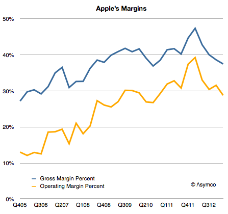
I expected Apple's margins to improve last quarter. They didn't and so the question I needed to answer is why. Here is a history of Apple's gross margin and operating margin as reported since late 2005:
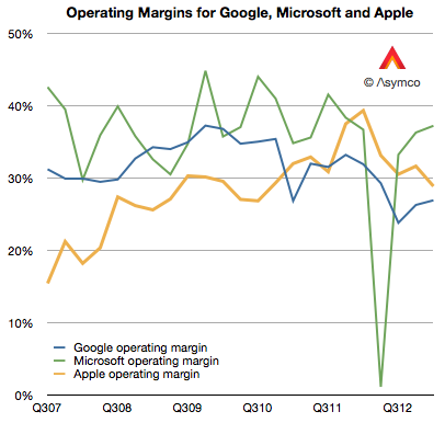
For a company selling hardware these are extraordinarily high margins. They are higher than those of Google and have narrowed the gap with Microsoft, neither of which has a high proportion of hardware sales:
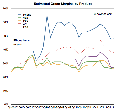
But they are not growing and the reason is to be found in the reason they grew in the first place: because of proportion of iPhones making up the total sales.
As a reminder, the iPhone is a uniquely profitable product. I estimate that it obtains about 50% gross margins. The history of these estimates is shown below:
It remains in stark contrast to the margins Apple obtains for its other products. Much of that is due to the pricing power of the product as shown below:
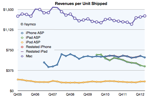
Notice that even after the launch of the iPhone 5 and the persistence of two previous generations of iPhones (and their lowered pricing) has barely put pressure on pricing.
Contrast that with the iPad. As its breadth of offerings increases, it causes a lower price per unit. The iPhone is now at $613 per unit, even with two older generation products available. (The lowest price was in Q2 2012 when the average price was $608.) The iPad is at $449 per unit, down from $662 at launch three years earlier.
So overall, margin is a function of three things:
Price changes: iPhone had a small reduction (from $635 to $613) but the iPad has had a moderate reduction in price (from $531 to $449).
Cost of components: This is reflected in product-line gross margins which can only be estimated. Compared to last year I estimate that iPhone gross margin dropped from 58% to 48%. iPad margins also fell from about 38% to 27%. The reasons were given by management as "Last year, our business benefited from …a more favorable foreign currency environment, and historically low costs."
Mix of high and low margin products. The iPhone units grew at 7% but the iPad units grew by 65%. A year ago iPhones were 58% of revenues and this year they were 53%. The iPads were 17% and now they are 20%.
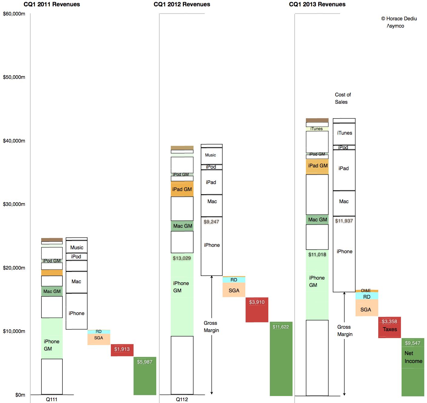
The result is seen in this one graph showing the allocation of revenues and margins by product:
So what is surprising? My expectations were met in terms of iPhone units (and exceeded in terms of iPad units). The mix was also something that falls out of the unit expectations. The pricing is also not surprising.
My guess is that the largest contribution to the "reduction of margin" is the increased cost of components. Note that the graph implies that even though iPhone revenues were nearly flat at 3% growth, the cost of those revenues went up by 29%! In addition, the iPad revenues grew 40% while costs went up 65%.
Unit pricing (and implicitly competitive pressure) is still not the primary cause of the reduction in Apple's margins. Indeed, the curious thing is that margins are now at levels seen for most of 2009 and 2010, a time when the iPhone (and iPad) were seen as near monopolies in their respective categories.
I repeat what I’ve mentioned before: The iPhone is primarily hired as a premium network service salesman. It receives a “commission” for selling a premium service in the form of a premium price. Because it’s so good at it, the premium is quite high.
The original post on the hiring of the iPhone by operators was anchored in data about the revenue per unit (or price) that the product was able to obtain. The remarkable resilience in the exceptionally high average price showed that the iPhone was still getting a premium for moving users to higher levels of spending on network services.
The evidence was circumstantial however: By knowing the price and knowing it was far higher than competing products and knowing that much of it was paid by the operator and not the consumer (at least not up-front) implied that it was the iPhone, and only the iPhone, that was hired as a network service sales tool.
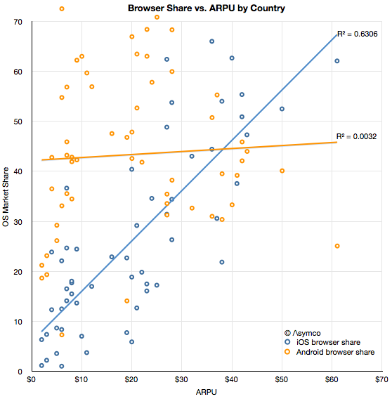
Now we have more evidence thanks to Ben Thompson (@monkbent). I illustrate the data here as an x-y scatterplot.
The data consists of ARPU (Average Revenue per User) ITU data from 2010 for 60 countries combined with browser share data on a country-level from the current period (sourced from StatCounter).
The first observation is that there is a modest correlation between iOS usage and ARPU. It may not be particularly interesting by itself but it is interesting when compared with the lack of correlation between Android usage and ARPU.
The presumption behind smartphone usage is that it leads to more browsing which leads to more network usage which in turn, leads to more network revenues and, finally, more network investment. If there is no additional browsing then there is a far smaller economic incentive to network operators to invest in infrastructure. It is this link between usage and revenues which I hypothesize drives operators to carry, subsidize and promote the iPhone. And the resilience of this link indicates that it still works.
The ASP data seems to support this hypothesis and so does the ARPU data. The more iOS is in relative use, the higher the network revenue per user. Correlation is not causation, but when combined with data about Android, we can also say that the presence of the primary iOS alternative does not lead to more revenue. In other words, if a lot of iOS is present then revenues are higher and if there is little iOS present then revenues are not higher.
I'm not suggesting that Android users use less bandwidth—the share data is after all relative—but rather that Android use itself does not seem coupled to paying more (or less) for service.
If there is something to be concluded it's that not all usage is created equal. The data regarding how apps and ads are consumed is consistent with a qualitative difference between iOS and Android. This data is more of the same.
It's something of a cliché to say that audiences vary in terms of quality, but that does not make it less true. Indeed, network operators depend on it being true. And so does Apple.
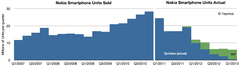
The following graph shows the history of smartphone volume shipments from Nokia.
Lumia sales have increased to 5.6 million units last quarter. Up from 4.4 during the previous quarter. Symbian devices have nearly disappeared from the market with only 0.5 million shipped.
This puts an end to Symbian sales after over a decade since sales start and two years after it was declared that sales would end.
The bad news remains that smart devices as defined by Nokia are still not profitable. If volumes grow it's possible that the cost structure (without further cuts) can be sustained and perhaps the business will get its footing.
The level of 6 million units/quarter is about where HTC and RIM are today but only half of what ZTE and Huawei are probably shipping. As a hardware business it might work, barely. It certainly helps to have $250 million as platform support payments from Microsoft.
As a platform it's still a very long haul for Windows Phone. Even if we assume a nominal $15 revenue/ Windows Phone license and ignore the kickback, at this level of sales the platform generates less income than what Microsoft gets from licensing IP to Android vendors.
The Windows PC market is contracting. The market data has been showing unit shipment declining for some time with the latest quarter having perhaps the steepest decline for two decades.
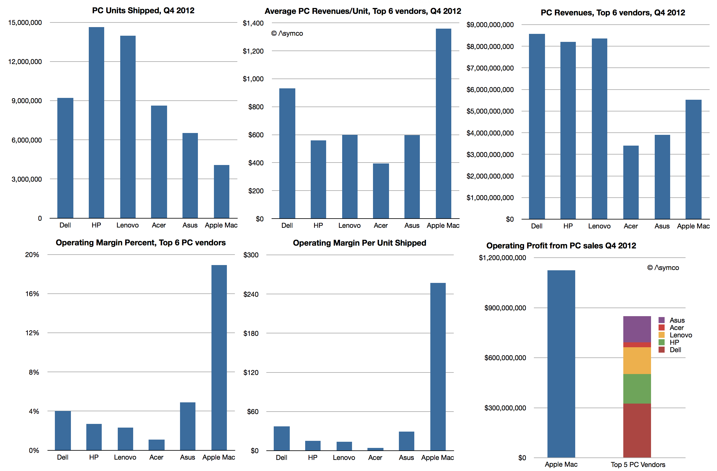
What remains undocumented however is how the market looks when considering economic value. A more complete picture would be to show revenues, average selling price (or revenue/unit), operating margins/unit and percent of profit capture.
The data is not beyond reach however. It involves combining the shipment estimates from e.g. Gartner with financial reports from the companies themselves. Some analysis is required to estimate margins but they are also not hard to obtain (e.g. from third parties.)
So here is a view of the market for the fourth quarter 2012:
The only inference I made was with respect to Apple's margins for the Mac. These are based on deriving a gross margin of 26% and adding an estimate of the SG&A and R&D "overhead" of 7.1% of sales, a figure which applies to the entire company. This yield an operating margin of 18.9%.
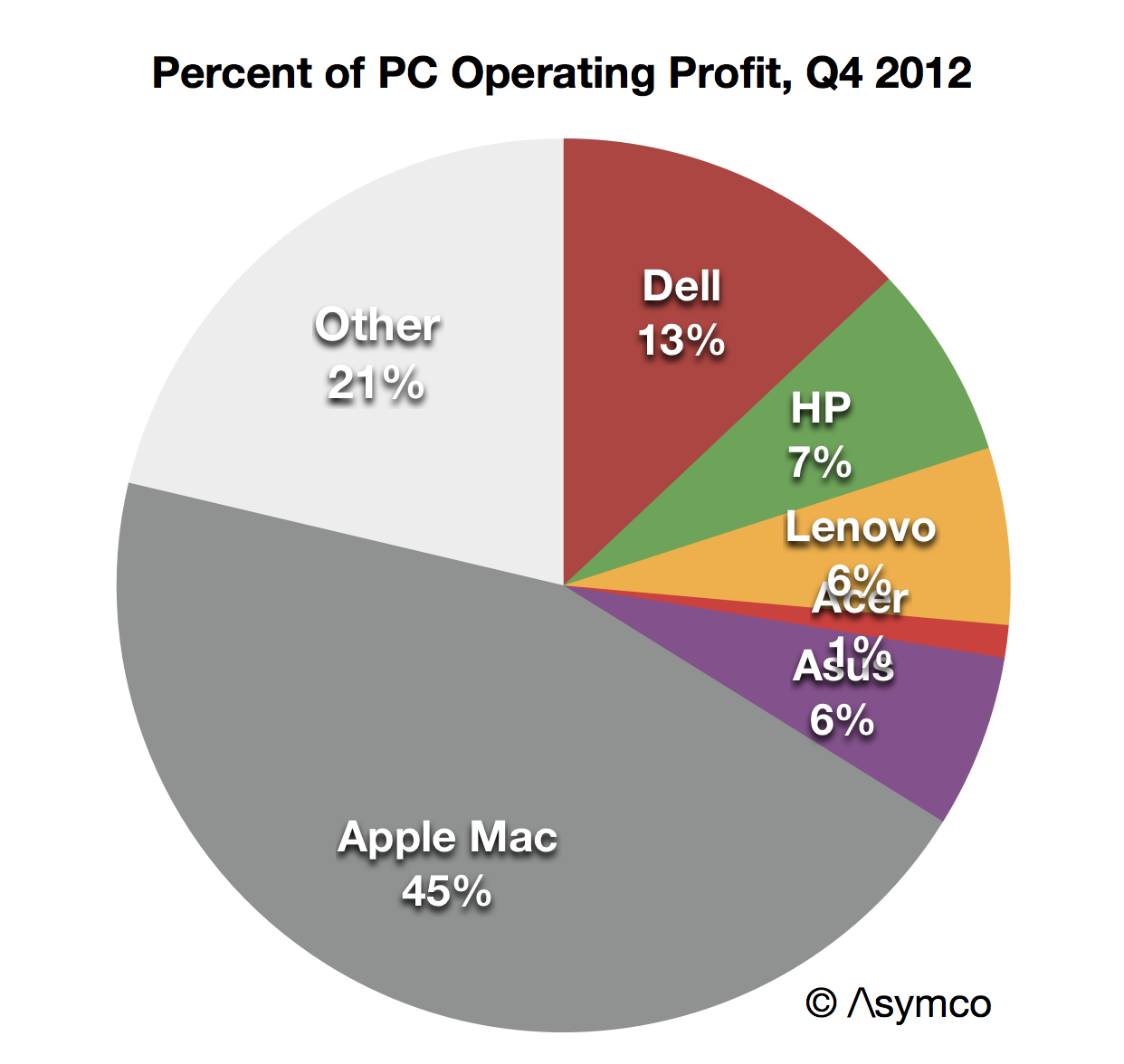
If this estimate is considered then the operating profits from PC operations imply that Apple generates more profit than all the top 5 PC vendors combined.
Assuming further that "other" vendors have the same profitability ratio as the top 5 combined yields a figure of 45% "profit capture of PC market" for Apple. This is not as good as its performance in the phone market, where Apple has about 72%, but it's not bad.
The real problem for the PC vendors is not that they have such low margins–they've had low margins for decades. It's that the volumes which "made up for" low margins are disappearing. Apple is not immune to a gradual erosion of Mac volumes, but they have positioned themselves for growth with devices and content commerce and services. They have essentially "escaped" PCs and indeed caused the need to escape in the first place.
The problem is what could the others do? It seems all they can do is depend on Microsoft getting their strategy right.
Thanks to @jtk0621 via twitter I was able to obtain a quarterly view into Samsung's SG&A expenditures by cost category.
The value of this data is in being able to understand why Samsung SG&A as a percent of sales remains fairly constant. To recap, the discrepancy with Samsung's SG&A is that it has grown in proportion to rapidly rising sales. Normally, when sales grow, SG&A grows but when sales grow very rapidly, SG&A grows a bit more slowly since it's primarily a function of headcount and hiring is necessarily organic and hence slower as a process.
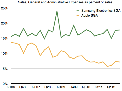
The contrast is shown in the following comparison between Apple's SG&A and Samsung's SG&A as a percent of sales. [For more detail on Samsung revenue composition see: The Cost of Selling Galaxies].
Apple's SG&A has declined as a percent of sales, as one would expect, but Samsung's hasn't.
I have hypothesized that the reason for this might be in the practice of "outsourcing" many marketing functions. As Samsung expands promotional efforts, it does so partially by hiring people but even more so by farming out a lot more work. In this way, if and when sales subside, it can pare costs. This practice ensures that it's not exposed to a huge cost structure that is hard to control. The downside to this approach might be obtaining "quality" marketing as oversight is still depending on inside teams who still have limited resources.
To test this hypothesis, I looked at the types of costs it reports and divided them into two categories:
Category 1 are what might be considered "internal" costs which are in function of employees or operations. These costs are:
Salaries
Retirement Benefits
Commissions
Depreciation
Amortization
Freight
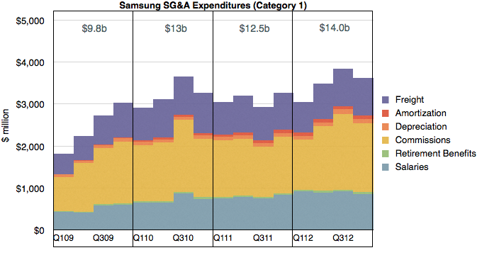
I graphed these costs over time below:
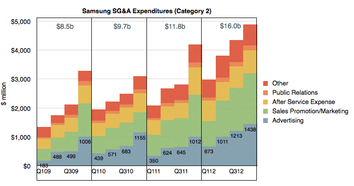
Category 2 costs are those which can be "outsourced" and are in function of budget items. These are:
Advertising
Sales Promotion/Marketing
After Service Expense
Public Relations
Other
I graphed Category 2 costs below:
In both cases I created year-sized buckets summarizing these expenditure categories.
It becomes apparent at first glance that through the period shown (2009 through 2012) Category 2 costs grew much more rapidly than Category 1. In 2009 Category 2 were less than 1 but the order was reversed in 2012. On a yearly basis Category 2 nearly doubled while Category 1 grew by about 40%.
When seen in this context, the hypothesis is proven. The growth in Samsung SG&A has been driven by a vast expansion of primarily Advertising and Sales Promotions.
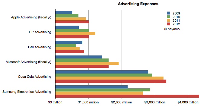
It's hard to get an appreciation of the scale involved due to the lack of comparable SG&A category reporting from other companies. What we do have however is that US companies typically report their advertising spending on a yearly basis.
So taking only the Advertising figure from Samsung Electronics, we can get the following comparison with Apple, HP, Dell, Microsoft and Coca Cola.
In this context we can see that while both Apple and Samsung grew their advertising almost at the same rate, doubling their budgets during the last four years, Samsung Electronics has a far higher ad budget. More than four times higher, actually.
Regarding Sales Promotions however, the comparison is far harder to make. I haven't any way to guess how much Apple spends relative to the $5.3 billion Samsung spent.