Asymco

Asymmetric Intelligence

Horace Dediu

  1. Songs, Books and Apps: What do the three media types tell us about the future of consumption?

    Research · 30 comments

    The 200+ million iOS devices have caused 14 billion apps to be downloaded in less than three years. The iTunes music store caused 15 billion songs to be downloaded over a 7 year period.

    The two media download totals are shown in the following chart:
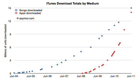
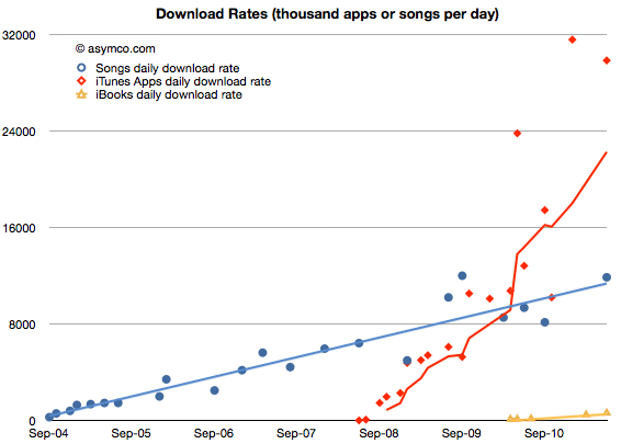
    About 9 months ago I predicted that Apps would overtake song downloads. I was off on the timing by a few months. The app download rate slowed down in the last few months. However, the crossover point is imminent. The song download rate is running at about 12 million per day while the app download rate is at about 30 million per day (the iBook download rate is still growing but is only at half a million per day). The following chart shows the three media types and their download rates over time.
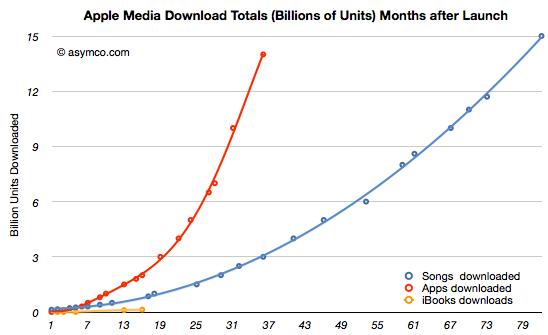
    Although it took about 35 months for Apps to reach 14 billion downloads, the equivalent time for the Songs was about 80 months. You can see the different "ramp rates" (cumulative totals indexed to the same starting date) for the three media on the following chart.
    Given the large numbers involved, a better view might be had looking at a log scale chart of the same data:
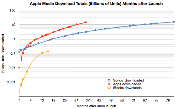
    What I would point out is the emerging pattern that the three media ramps are separated by about an order of magnitude. In other words songs are 10x more downloaded than books (at a given point in the life of the media store) while apps are 10x more downloaded than songs. You would see this pattern emerge within the log chart as the three lines run parallel and equidistant.

    Obviously, apps are going to be more popular than songs since many are free. And obviously songs are going to be more popular than books because many are much cheaper.

    But painting this picture with price is only a rough sketch. The ways that these media are consumed (and consumable) fills in the details. The amount of energy needed to enjoy each varies greatly. The "digestibility" of the material is different. In a way, these are the same factors which are drawing consumption toward tweeting, blogging and browsing and away from paper based media.

    The new technologies are allowing consumption to conform more closely to people's lives. They are like clothes that fit a bit better and are more comfortable. They may not look as good as formal attire, but in the end casual always wins.
  2. Peak RIM

    Research · 37 comments

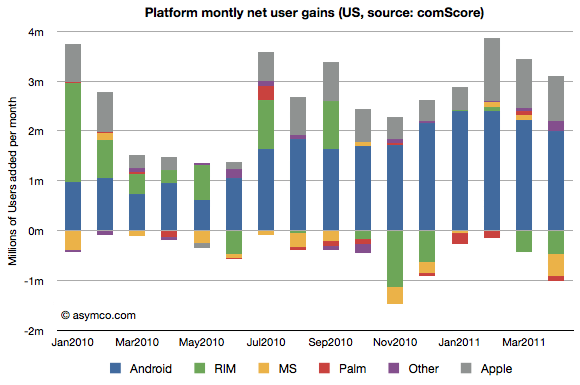
    In their monthly survey update on US phone usage, comScore reported that by the end of April 74.6 million people in the U.S. owned smartphones. In the same period a year ago only 48.1 million did. The percent of smartphone users out of total phone users has reached 32%.

    The following data points can also be deduced:

    • 2.1 million or 474k people/week became smartphone users during April.
    • 62% of smartphones in use in the US are either Android or iOS. The sum a year ago was 37%.
    • There are about 20 million iPhone users and 27 million Android users in the US today. A year ago there were 12 and 6 million respectively.
    • RIM's US user base peaked at 22 million in Sept 2010. It is now 19 million and dropping.
    • Usage of Microsoft mobile operating systems in the US is in steady decline dropping from 7 to 5 million users in one year.
    • During April 475,000 people abandoned their Blackberries.
    • Android and iOS gained 3 million users in April. One million switched from other smartphones and 2 million switched from non-smartphones.

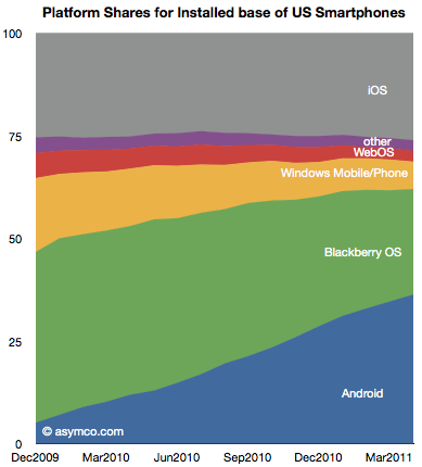
    The following chart shows the evolution of installed base share of platforms among users of smartphones in the US.

    The impressive share gains for Android are apparently at the expense of RIM and Microsoft. Over the period shown, Android gained 25 million users while RIM gained only about 2.8 million.

    Although perhaps comforting to see some growth overall, the situation for RIM is more grim than that. During the first half of the period (December 2009 to August 2010) RIM had gained 4.6 million users. During the second half (Sept 2010 to April 2011) RIM lost 1.8 million users.

    The net user gains and losses for the various platforms is shown in the following chart:

    Note how RIM (green bars) went from being a consistent net usage gainer to a consistent net usage loser during this 16 month period. In addition, note how Microsoft's platforms (yellow bars) have had a very poor showing with very small gains during four months and moderate losses during the others. The losses in usage even increased after the release of Windows Phone late last year suggesting no traction whatsoever for Windows Phone.

    The other point to be made is that if we assume smartphone users remain smartphone users, then those platform losses are gains by other platforms. In other words, the areas less than zero in the chart above represent smartphone "churn" or switching between platforms (As a percent of all smartphone users that number represents 1.35%.) That number is far lower than the total smartphone gains, so it's safe to say that most of the iOS and Android gains were at the expense of feature phones rather than other smartphones. And since iOS share is consistent (and supplies are constrained), few if any Android gains are at the expense of iOS.

    There are many interesting patterns to observe in the data, but I think the most evocative is the erosion of Blackberry usage. If the Blackberry peaked, and a follower platform not yet in sight, the question is how long will RIM survive?

  3. Does the phone market forgive failure?

    Research · 59 comments

    One of the details of Nokia's warning which did not get a lot of attention was the mention that profitability for the current quarter could not be guaranteed. That is to say that Nokia may make a loss, perhaps for the first time in more than a decade.

    This may not be that newsworthy except for the strange fact that as far as I've been able to observe, any company in the mobile phone market that ended up losing money has never recovered its standing in terms of share or profit (i.e. AMP index value has never recovered).

    Here is a list companies that have "hit the rocks" in terms of mobile phone profitability and their fates (in no particular order).

    1. Alcatel of France. Sold its brand and operations to TCL Communications of China in 2004.
    2. Siemens of Germany. Exited in 2005 through acquisition by BenQ of Taiwan.
    3. BenQ of Taiwan. Mobile devices division declared bankruptcy in 2006.
    4. Ericsson of Sweden. Exited by merging with Sony in 2001 even though third in volume share the prior year.
    5. Sony of Japan.  Joined with Ericsson to form Sony Ericsson in 2001. Held less than 1% share prior to merger.
    6. Motorola of the United States. Even though once the largest vendors, after a period of severe distress, Motorola spun off Motorola Mobility. Market value shows long-term viability still a concern.
    7. Casio of Japan. Merged with NEC and Hitachi in 2010.
    8. NEC of Japan. Merged phone units with Casio and Hitachi in 2010.
    9. Hitachi of Japan. Merged phone units with NEC and Casio in 2010.
    10. Fujitsu of Japan. Merged with Toshiba in 2010. Held 15 percent of Japanese market prior to merger.
    11. Toshiba of Japan. Merged with Fujitsu in 2010. Held 4% share in Japan.
    12. Palm of the United States. Sold to HP in 2010.
    13. Handspring of the United States. Sold to Palm in 2003.

    That makes 13 large phone brands that, in less than a decade, have either exited or lost independence after suffering crises of profitability.

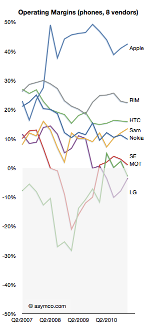
    As the following chart shows, at this time Motorola, Sony Ericsson and LG are still operating but have been dipping into the red.

    The three suffered severe volume contractions in feature phones and have no differentiation in software or platform products which makes their position precarious.

    This cursory survey shows that it's difficult to be optimistic once a company reaches a point of crisis. It's a curious outcome given that the market is so vast and growth is so robust.

    But the fact is that because of the technology cycle time, rapid business model evolution and fairly low barriers to entry, there is great rivalry between competitors. Profitability is the canary in the coal mine. It causes a brand to be tarnished in the eyes of distributors who, because of sales cycle times, are extremely sensitive to obsolete inventory. A loss maker is seen as a maker of damaged goods.

    It then turns off the tap of incentives, promotions and hence visibility in the eyes of consumers. It's a vicious cycle from which few (if any) can recover. Past greatness offers no succor.

    And so, with Nokia about to join the list of loss-makers it's only natural to question its fate as an independent company.

  4. Is Nokia worth less than Skype?

    Research · 57 comments

    Yesterday Nokia warned that its guidance for the quarter and the year were "no longer valid." The surprise to me is that management was surprised. In February I warned that even if Nokia could fool consumers into buying products whose platform was publicly executed, distributors and operators would not likely go along with the deception. Pricing collapse is the proof of a channel breakdown.

    That seemed predictable. What I struggled with was how Nokia itself could present such an optimistic forecast. Absent any explanation, Nokia's forecast of robust sales for Symbian products into the near future belies a failure of understanding of the dynamics of platforms and especially the impact of destruction of trust and brand value that commenced in February. Distress is a slippery slope and it does not model well in a spreadsheet. It takes a leap of non-linear faith to predict the piling-on effect on the up- and the down-side.

    Faith in the company's guidance meant that the market reacted to the bad news by discounting Nokia down to a market cap of $26.7 billion. One analyst even cut his target price down to $4/share, 57% of yesterday's close. How can this fair? What is Nokia's phone business worth?

    Here's a quick sum-of-the-parts analysis. After yesterday's hair cut Nokia's overall enterprise value is about $20 billion. The Navteq part of the business (purchased for $8.1 billion in 2008) could get a value of $3 billion (based on about 3x sales) and the value of Nokia Siemens networks could be at $6b (less than 0.5x sales). That makes Nokia's phone business worth about $11 billion.

    An alternative view based on "the Motorola case study" $4 target price would imply an overall enterprise value of $11 billion. This either makes Navteq and NSN worthless and Phones worth $11 or it makes the phone business worth a lot less than $10 billion. Perhaps less than $8.5 billion which is what Microsoft paid for Skype. Should we be shocked? Nobody would argue that Nokia is worth more than Facebook so who's to say that Skype or Twitter aren't more valuable than a device company in crisis?

    I don't try to predict the market's behavior, nevertheless, the markets are now very skeptical that there is much in Nokia to salvage. It's perhaps unfair and illogical but this is the end game of disruption. It ends much more suddenly than it begins. It's the consequence of nobody noticing the beginning that makes the end so shocking.

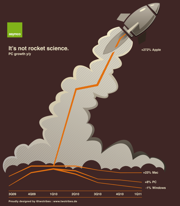
  5. Announcing the Asymco Store and the first Asymco T-shirt

    Research · 26 comments

    In celebration of one year of Asymco.com, the Asymco store is now open.

    Home - Asymco Store

    I am extremely grateful to Michael Burgstahler of Two Tribes design for leadership in creating the first t-shirt design:

    Based in the home town of Mercedes Benz and Porsche, Two Tribes has been in the creativity business for 18 years with clients like Ricoh, State Bank of Baden-Württemberg, Bosch and Siemens. They even built an app "Favorelli" and opened a little shop for home decoration.

    This masterpiece, along with a logo only version is available now.

  6. Is RIM's management the cause of its failure?

    Research · 62 comments

    "Jim and Mike brought the company to where it is ... which is part of the biggest problem they're facing," said Charter Equity analyst Ed Snyder, who has covered RIM since its public listing in 1997, two years before the BlackBerry was launched.

    "They're stuck in the past. They know what worked and keep playing that card and it's not working any more, and they don't seem to have any ideas," he said.

    via BAY STREET-As RIM struggles, talk of a change at top surfaces | Reuters.

    In the case of Apple, the departure of the founder is considered a grave threat to the continuing success of the company.

    In the case of RIM and Microsoft, the continued tenure of the founders is considered a grave threat to the success of the company.

    Clearly, the theory that founders of successful companies can assure continuing success is flawed. Coupled to that implied causality is that departure of founders is always a problem.

    Both are reflections of the idea that companies are predominantly successful (or fail) because of the skill (or incompetence) of a small group of individuals.

    What the idea fails to explain is why companies fail (or succeed) as a cohort. RIM's troubles are similar to Microsoft and to Nokia's. Did they conspire or collude to fail simultaneously? Historically, incumbents fail simultaneously, regardless of who's in charge.

    And what about the problem that a company goes from success to failure (and vice-versa) while the same management is in charge. The "smart manager" theory of company success is as pervasive as the "stupid manager" theory of company failure. The perplexing thing is that while both of these theories are applied within the lifetime of a company, the management does not change.

  7. Microsoft has received five times more income from Android than from Windows Phone

    Research · 197 comments

    Microsoft gets $5 for every HTC phone running Android, according to Citi analyst Walter Pritchard, who released a big report on Microsoft this morning.

    Microsoft is getting that money thanks to a patent settlement with HTC over intellectual property infringement.

    Microsoft is suing other Android phone makers, and it's looking for $7.50 to $12.50 per device, says Pritchard.

    HTC Pays Microsoft $5 Per Android Phone, Says Citi.

    A rough estimate of the number of HTC Android devices shipped is 30 million. If HTC paid $5 per unit to Microsoft, that adds up to $150 million Android revenues for Microsoft.

    Microsoft has admitted selling 2 million Windows Phone licenses (though not devices.) Estimating that the license fee is $15/WP phone, that makes Windows Phone revenues to date $30 million.

    So Microsoft has received five times more income from Android than from Windows Phone.

    Looking forward and assuming that Microsoft can receive this type of settlement from about half of the Android license takers, then the prospects of a windfall from Android dwarf the expected income from Windows Phone.

    Google's Android seems the best thing that could have happened to Microsoft's mobile efforts, ever.

    I could also calculate how the Android license income could be further funneled to Nokia (via their current agreement with Microsoft) for promotion of its phones. Thus, an Android licensee could reduce his margins in order to promote a competitor's products.

  8. A new mobile phone market index

    Research · 90 comments

    Measurements of "share" are abundant. There is journalistic value in summarizing performance in a single figure of "share" but it usually is a very limiting view. For example in the global mobile phone market there are at least the following measurements available:

    1. Share of all handset units sold
    2. Share of installed based of handsets (penetration)
    3. Share of smartphones
    4. Share of mobile computers
    5. Share of value (revenues) captured
    6. Share of profits
    7. Share of platforms
    8. Share within a given platform
    9. Share by regions/countries/geographies/demographics

    One could go on. So performance in a market can only be measured if you know to what end is that measure applied. Are you trying to determine current performance or are you assuming that the future will be different and trying to figure out what that future will look like?

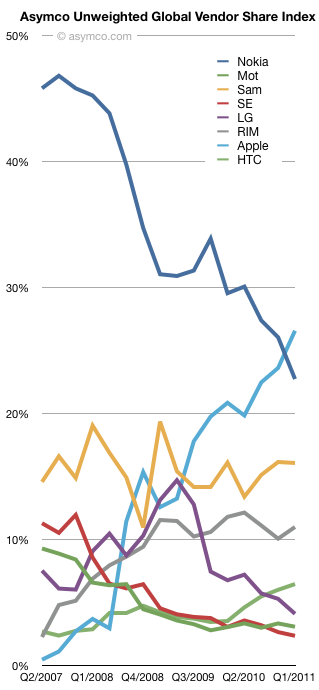
    There is no good answer. It depends. But at least we can combine more than one share value into a summary. Mark Hernandez suggested that I put forward a "composite index" to measure vendor performance. I am willing to give it a try. The first iteration can be an unweighted average of four "shares":

    1. Share of all handset units sold (global)
    2. Share of smartphones
    3. Share of value (revenues)
    4. Share of profits

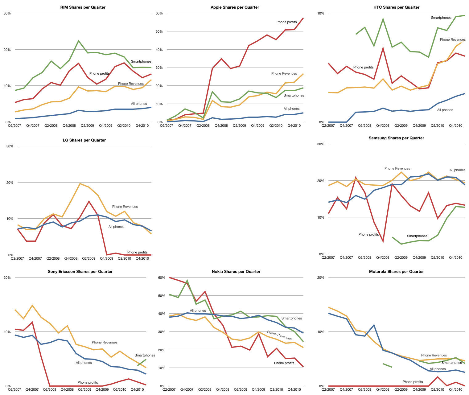
    The raw data for each share is shown in the following charts (note change of vertical scale: each gridline represents 10%).

    Note that the vendors are arranged in a particular way: top row are entrants, bottom row are incumbents with late incumbents from Korea arranged in the middle.

    Taking the average of each of the lines above, the unweighted share index (Units, Smartphones, Value and Profit) is shown below:

    Over the time period since Apple's entry in the market, the index shows interesting patterns:

    • Apple and Nokia trading places
    • Relative stability for Samsung
    • A leveling off for RIM
    • The Peaking for LG
    • Very tightly coupled declines for Motorola and Sony Ericsson
    • Gradual improvement in HTC

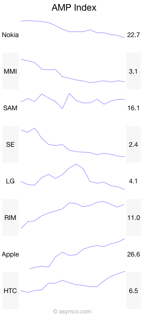
    And here it is in sparklines:

    Like many indices, this is a generalization that measures a section of reality. The value is in its use as a benchmark. If nothing else, it has journalistic value. I'm open to suggestions on how to improve it. Perhaps some form of weighting would be useful. Also, if anyone can suggest good name for it, it might be easier to communicate.

  9. A disruption is not sufficiently described by the success of some. Others must fail.

    Research · 46 comments

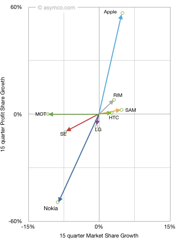
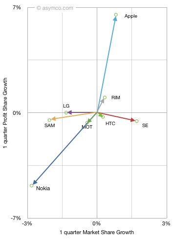
    Last fall I introduced the "vector space" model of visualizing vendor performance. It shows performance along two dimensions: market share growth vs. profit share growth for a set of competitors.

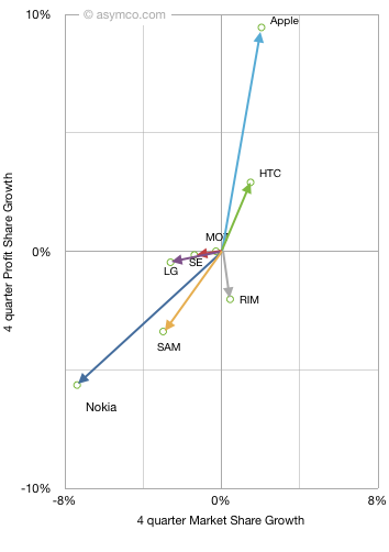
    When introduced, I chose a long time frame (15 quarters) to see the long-term pattern. This quarter I add two more time frames: year-on-year and sequential. This allows a view of how market change is itself changing. The three diagrams are shown below (note difference in scales)

    One way to interpret this is movement toward the upper right is positive while movement down or to the left is negative. A deeper meaning can be obtained from noting that the vector sum or "net" of vertical and horizontal data points should be zero (i.e. the gains in share should be at the expense of losses in share). In terms of phone market share the "net" is not zero as "others" are excluded, but the difference is visually not perceivable.

    Since we're dealing with share, one way to interpret the data is that "improvement" in one's position is offset by the "decline" in another's. We cannot ascribe the benefit of a vendor directly to the loss of another but overall net gainers are offset by net losers.

    By tracking this position change over time we can see if there is a set of consistent winners and a set of consistent losers. The pattern does show that:

    • Smartphone vendors grow consistently
    • Apple in particular has consistent growth with profit growth faster than share growth
    • Nokia in particular has consistent decline with profit decline faster than share decline
    • RIM shows profitability concern in the near term. In particular vs. HTC
    • Samsung shows some near term share loss, probably due to unbranded vendors
    • It's very rare to have a company lose market share while gaining profit share or to gain market share and lose profit share. This implies that in this market one does not trade off volume for profit.

    The correlation between profit and volume growth is very telling. As is the consistent clustering of winners and losers. This analysis demonstrates the shift in the industry is not a short term phenomenon but a disruptive changing of the guard. If history is any guide, this change is not going to be undone.


  10. Why the phone market is resilient to low-end disruption

    Research · 10 comments

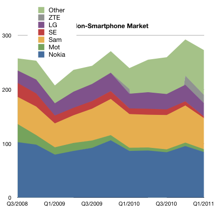
    The phone market excluding smartphones is not growing. Over a three year period it grew at 2% compounded.

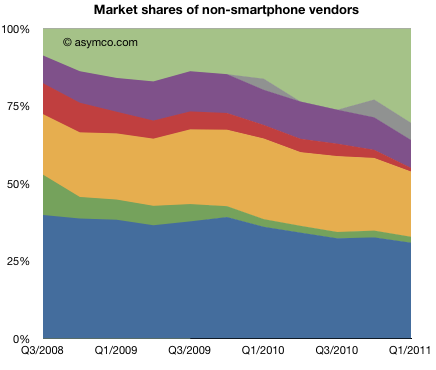
    The following chart show the make-up of the market by vendor.

    Since it is not expanding rapidly, share over time has a lot more meaning.

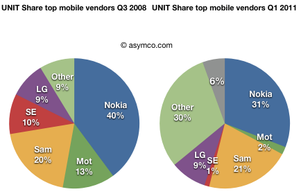
    The change in share over the last few years (since Q3 2008) is shown in the following two pie charts:

    Although many will argue that the non-smart market is one of great opportunity, the historic data shows that the market is not vibrant:

    • It's growing slowly if at all
    • Prices are falling as buyers find nothing of value in new products
    • There are fewer branded competitors (from 5 to 3)
    • There is increasing "white label" or unbranded volume growth (from less than 10% to over 30% share in three years)

    Although low end entries (in this case the unbranded new vendors) can signal disruptive potential, that potential is unlikely to manifest itself in voice-oriented products. Low-end disruptions take hold when markets are overshooting the expectations of the majority of buyers and incumbents are motivated to exit.

    However, if we consider all phones as a single market, then there is vast under-performance in the high end--something another set of entrants have taken advantage of and something neither the incumbents nor the low-end entrants are motivated or capable of pursuing.

    The phone market is not being disrupted because of the low end entrants. Nokia and Samsung are motivated to compete for those customers. It's being disrupted because the new market of mobile computing is completely asymmetric.