Asymco

Asymmetric Intelligence

Research

  1. Trading Places: How Apple climbed into the Top Tier

    Research · 22 comments

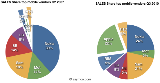
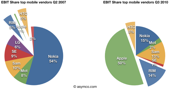
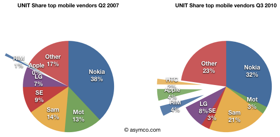
    Apple reached fourth place in ranking of top phone vendors by units sold. I guess that makes it a "top tier" vendor.

    So how did it get there?

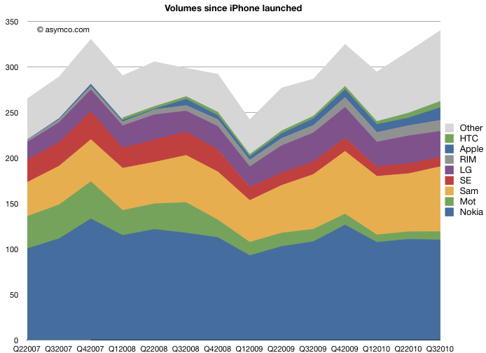
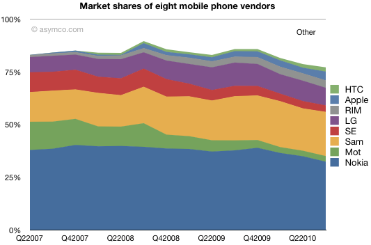
    Here is a chart showing how market share evolved since the quarter when iPhone launched:

    Units sold and shares.

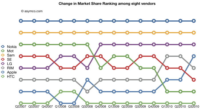
    The chart shows how this cohort of eight vendors has fared over the past 3.25 years. The squeeze on Motorola and Sony Ericsson is plainly evident. What's harder to tell is how the tiny players in the smartphone place fare in the ranking of "top tier".

    Here are the same vendors with their position in the volume leader league table over time:

    Lots of interesting patterns here which I'll leave to the reader to interpret.

  2. iPhone share of all phones sold is now above 4% and continuing to rise

    Research · 22 comments

    I am dead serious. I am now convinced that we have enough data to determine for a fact that Apple will not only see a dramatic decline in quarter-on-quarter sales in units of the iPhone this January-March quarter (which is the predictable pattern and no surprise) but that we will also see a decline in iPhone market share against at least HTC and Blackberry;  that would be demoralizing news in itself. I know now that the numbers are clearly stacking up so, that the annual sales level of iPhone units, will result in a decline in iPhone annual market share in 2010.

    via Communities Dominate Brands: iPhone in Memoriam: A History from its Peak Moment of Success. But who copied whom?.

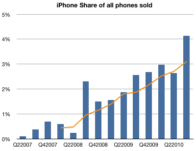
    Contrary to the loud and emphatic proclamations above, the data shows that the iPhone's market share gains have been steady.

    The following chart shows iPhone market share by quarter with a 4-quarter moving average. Total market size is reported by IDC.

  3. Apple trading even with the S&P 500

    Research · 7 comments

    From the Apple 10K:

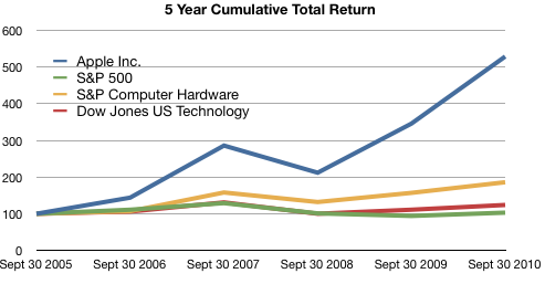
    The following graph shows a five−year comparison of cumulative total shareholder return, calculated on a dividend reinvested basis, for the Company, the S&P 500 Composite Index, the S&P Computer Hardware Index, and the Dow Jones U.S. Technology Index. The graph assumes $100 was invested in each of the [securities].

    In other words, if you had invested $100 in the S&P 500 in September 2005, you would have $103 now. If you invested $100 in Apple in September 2005, you would have $529 now.

    Apple investors should rejoice!

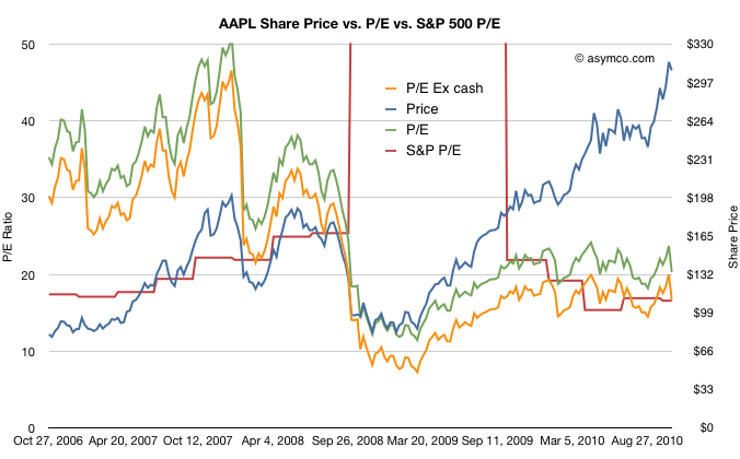
    However, in terms of reward for earnings, consider the following graph:

    The red line represents the S&P 500 P/E ratio and the green and orange lines represent Apple's P/E ratios depending on whether you include cash in the price.

    The reward to investors Apple does not seem so appealing anymore.

    Although Apple received a premium valuation to the S&P prior to October 2008, it has traded at a discount or in-line with the S&P since then.

    Another way of putting it is that the P/E ratio for large companies has returned to pre-recession levels. The P/E ratio for Apple has not.

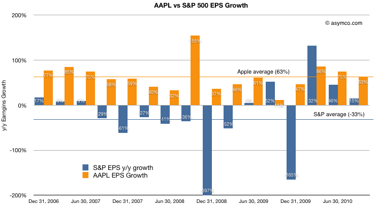
    For a final point, a comparison of earnings growth (which should correlate to the P/Es) above shows that while the S&P is given a similar valuation to Apple, growth has been decidedly less spectacular.

    Apple's average growth over the period shown was 63% (shown as the orange line) while the S&P has grown at an average of -33%. Nevertheless the market has chosen to reward the two assets with the same multiples valuing their future growth in earnings roughly the same.

    At least they are equivalent. For much of 2009 and early 2010, Apple was considered to have a far less promising future than the average large American company.

  4. Turley Muller: Warranty Expense Crimps Apple's Margins in 4Q10

    Research · 3 comments

    If estimated warranty expense had remained constant in absolute dollar terms ($150M), GM would have been 38.4% vs 36.9%. If If estimated warranty expense had remained constant in as a percentage of revenue (1%), GM would have been 130bps higher at 38.2%.

    via Financial Alchemist: Warranty Expense Crimps Apple's Margins in 4Q10.

    Muller spots the culprit in the margin drop. He notes that this is money set aside and may have been in anticipation of returns of the iPhone 4 due to antennagate. Note how in 3Q cost of claims was 155 and accruals were 157, about a 1:1 ratio whereas in 4Q costs were 286 and accruals were 457 about 1:1.6.

    It's possible that if the costs this quarter do not materialize then we could see a margin upside surprise.

    (Contrast this insight with today's large scale sell-off in shares due to mass media repetition of earnings guidance from the conference call as shocking "news." See also evidence of unlawful trading behavior here.)

  5. LG continues to lose money in mobile phones

    Research · 4 comments

    LG saw its profit fall apart today as its summer results were hurt by its weakness in phones. Its profit plunged 99 percent, down from $805.6 million a year ago to $6.7 million. The Korean company was dragged down by its mobile group, which had a record loss of $270 million. The company's total phone shipments also dropped, going down 10 percent from year to year at 28.4 million.

    via LG profit collapses based on shrinking phone sales | Electronista.

    Q3 numbers show that LG had a drop in ASP as well. The unit numbers are down sequentially from 30.6 million in Q2.

  6. Re-framing the dichotomies: Open/Closed vs. Integrated/Fragmented

    Research · 31 comments

    Google likes to market itself as "Open" in contrast to "Closed" alternatives.

    Apple likes to market itself as "Integrated" in contrast to "Fragmented" alternatives.

    These dichotomies are judgmental and meant to portray "us=good" vs. "them=evil". Neither gets to the point of how the two companies are structuring their businesses relative to the mobile computing value chains and clouds the judgement of observers.

    I propose using a more informative and less judgmental distinction. It's a division defined clearly by Clayton Christensen in his classic "The Innovator's Solution" from 2003.

    He introduced the concept of interdependent vs modular systems.

    Interdependent systems have linkages between elements ranging from product components to the members of a product value chain. Essentially, the pieces communicate or interface via non-public or non-licensed protocols and have only specific partners (e.g. the iPod and iTunes).

    Modular product architectures, on the other hand, are similar to the concept of plug-and-play and resemble building blocks, consisting of standardized interfaces, enabling parts to be easily swapped in and out and multiple suppliers or partners to compete.

    Neither of these architectures is "good" or "bad". They are natural ways to organize according to what business model or point in the evolution of a technology you are at.

    Interdependent architectures are the only way to rapidly and competitively improve the performance of not-good-enough systems. Modular architectures are the only way to squeeze profitability from more-than-good-enough commoditized technology.

    Interdependent systems often lead to higher performance than modular systems because the system is optimized. Engineers can iterate more rapidly to squeeze the maximum performance from sub-systems by connecting them in ways that makes the best complete solution. In contrast, modular systems often lead to lower costs because there are a greater number of suppliers, since interfaces are standardized and pieces can be swapped in and out.

    Interdependency is often required to raise the performance of a new solution. In contrast, modularity is required to lower the cost of an overserving solution.

    Continued interdependency often drives the performance of that solution beyond that which the target market is willing to pay for. The target market then frequently turns to modular solutions which, at that point, often offer good enough performance along with modularity-driven advantages such as lower cost, convenience, or other benefits.

    So the question is not whether one is better than the other but when either one should be used.

    Modular architectures are often the solution when interdependent architectures prove too costly. Interdependent architectures are the solution when modular architectures are not good enough or can't solve new jobs that users discover they need to solve.

    Apple's value systems, priorities and processes are all tuned to interdependent architectures. Google's value systems, business models and competencies are all tuned to modular architectures.

    Apple solves the problems of new markets, Google solve the problems of over-served markets.

    So the winning[1] strategy depends on detecting where a product lies in its march up the performance trajectory. Before it's good enough, interdependent systems win. After it's good enough, modular architecture wins.

    So where is the smartphone on its evolution? If it's still early days, iPhone will keep growing. If it's saturating and improvements are neither valued nor used, then it's time for a modular approach.

    Place your bets now according to your vision.

    ---

    By winning, I mean capturing the bulk of the profits in the industry.
  7. Motorola ships 3.8 million smartphones

    Research · 6 comments

    Sales from its handset business climbed 20 percent to $2 billion last quarter, helping to narrow its loss to $43 million from $216 million a year earlier. The division had an operating profit, excluding some charges, of $3 million. Motorola said it shipped 3.8 million smartphones last quarter.

    via Motorola Profit Tops Estimates on Rising Sales of Droid Phones - Bloomberg.

    Motorola shipped a total of 9.1 million phones. This is down 33% from the year-ago quarter's 13.6 million units but up 10% sequentially from 8.3 million last quarter.

    I'll summarize the top tier vendors' unit volumes, sales value, price and profitability in a few days.

  8. Wall Street's Infinite Loop: How AAPL is valued

    Research · 30 comments

    In the previous article discussing the growth scorecard, I left open the question of how Apple's growth is reflected in its share price.

    The approach to answering this question is to show how the share price correlates to that growth. The challenge for analysts has been that the company switched from subscription to current accounting for the iPhone (the largest component in its income statement). As they re-stated income and thus earnings, any historic review of P/E or other multiples of Earnings have to also be re-computed.

    So this is what I've done:

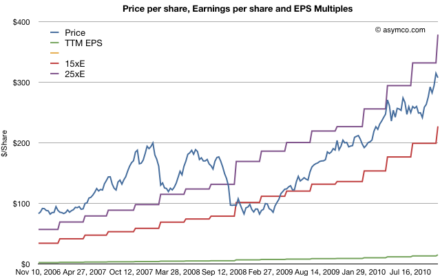
    The first chart shows Apple's price per share (blue) vs. its trailing twelve months earnings (green) and multiples of those earnings (15x and 25x).

    The chart shows how Apple was priced well above 25 P/E before October 2008 and has remained within the 15 to 25 multiple bands since the winter of 2008/2009. This seems fairly reasonable and the stock's rise is a cause of celebration for many, but a cause for concern for some. Is this rise in price matching a rise in value?

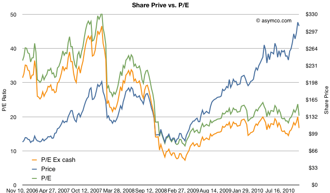
    To answer, we need a way to look at the valuation of Apple. One way is to plot the P/E ratio over time. That would show how the market perceives the value of the company (i.e. how many years' worth of earnings is built into the price) The chart below does that.

    I took the additional steps of plotting the P/E excluding cash from the price to show "P/E Ex cash" in the orange colored line and I also copied the Share price line from the first chart on this one for contrast.

    What the P/E analysis shows is that as the stock rose, it's P/E ratio fell. This means that the "valuation" of the company is quite a bit lower now than it was in 2006 and 2007. In fact, as a multiple of profitability, Apple's stock is nearly half as valuable now as before the recession.

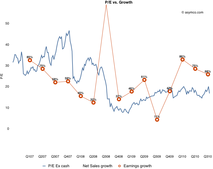
    Since valuation is usually correlated with growth, (P/E is often compared in a ratio with Growth) we need to see whether the P/E in the chart above matches the actual growth of earnings. Fortunately we have just measured growth with the scorecard.  Here are the two charts together:

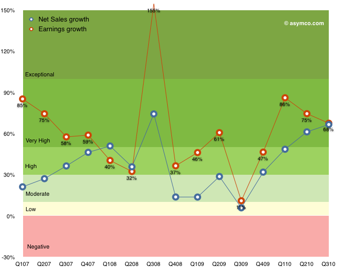
    What this shows is that while earnings growth did slow down in the lead-up to recession (with the hugely anomalous 3G launch spiking growth to 155% in Q308 causing the year-later plunge to 11%), growth picked up again in the depths of recession and has moved back to pre-recession levels. The only difference is that the multiple assigned to the stock has remained near recession lows. This is visualized by the blue line being mostly above the red line pre-crash and usually under it post-crash.

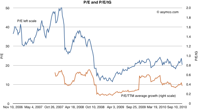
    To put a finer point on this, I plot the ratio of P/E and trailing growth (P/E/tG) in the brown line below:

    It shows that as a measure of valuation with respect to growth, Apple is trending down. A P/E/tG ratio of 0.4 and closer to 0.2 if we exclude cash shows very weak confidence.

    The only conclusion I can draw is that the market does not believe that Apple has significant growth opportunities. A P/E of 20 with consistent 70% growth is, to be blunt, damnation. For comparison, Amazon just reported 16% growth in earnings and was rewarded with a P/E of 68.

    Amazon notwithstanding, is Apple an anomaly? Is the disconnect between earnings growth and the stock price unique to Apple or does it apply to most other equities? Is pessimism about Apple a symptom of pessimism in general? I will suggest a way to answer this in a future article.

  9. Apple's Growth Scorecard

    Research · 14 comments

    Every quarter I try to score growth by top, bottom and product lines. As unforeseen growth is the only driver creating shareholder value, it's of paramount importance to measuring a company's performance.

    For Apple, the analysis is fairly straight-forward. There are relatively few product lines (seven including the iPad). I measure y/y sales growth and try to form a picture that is easy on the eyes and mind.

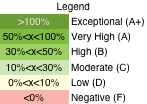
    The method I'm using now is color coding growth for each line according to the legend to the left.

    The table that follows shows each product plus the Net Sales and Earnings lines according to this color coding. I also added an average column for reference.

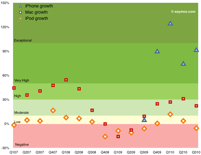
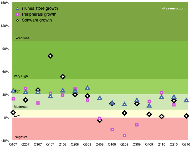
    The following graphs show the same data with color coding for the rates as they change over time. I broke the data into three charts: Top/Bottom lines, Hardware Products, Other Products.

    Discussion

    Hopefully this representation describes the company's growth without requiring too much explanation. Earnings growth, which determines ultimate value created is near all-time highs, well into the "Very High" (A) growth band. Apple have recovered from the Moderate-to-High (B/C) bands during the recession and are near the levels of 2007 when the company was trading at a P/E of 50 (today's P/E for Apple is 20). Sales growth broadly followed earnings growth.

    Within the products, the iPhone again shows exceptional performance. The growth during the first five quarters was (literally) off the scale (above 150%--see table for actuals). The average quarterly y/y growth has been 234%! Last quarter's 92% growth is very near the 100% threshold for exponential growth. This after three years in the market.

    The Mac growth is Moderate (B) and that may be because it was not a launch quarter for portables. The Mac underwent Very High (grade of A) growth for a period of 2008. The iPod shows weakness. The product has been in a Low-to-Negative  (D to F) band of growth since the iPhone launched. Clearly a mature product line but one which has been largely subsumed into the iPhone and iPad. The iPod touch is increasingly a large proportion of the iPod line.

    The non-hardware product lines are Low-to-Moderate growth products. The Peripherals business tracks very closely to the Mac business and dipped negative during the recession.

    Overall, the growth scorecard is in the "Very High" category, or a grade of "A", mostly driven by the iPhone and iPad. Whether this growth will be reflected in the share price is a question reserved for a future discussion.

  10. Sony shares up on speculation of Apple interest

    Research · 28 comments

    TOKYO (Reuters) - Shares of Sony Corp rose nearly 3 percent on Tuesday as traders cited media reports speculating that the Japanese electronics maker could be a potential acquisition target of Apple Inc.

    via Sony shares up on speculation of Apple interest - Yahoo! Finance.

    There's a sucker born every minute. That phrase, (erroneously) attributed to a major benefactor of my Alma Mater, continues to ring true today.

    Although Steve Jobs once admired Sony, the company today contains nothing of value to Apple. A disruptor is unlikely to buy the company he just disrupted. Would Sony have bought Westinghouse? Would WalMart have bought Sears? Would Microsoft have bought IBM in the 1990's?

    When considering an acquisition the chances are that the asset being purchased is going to ask a premium price. So the buyer has to answer this question: what is it about the asset that makes it worth more than the market price?

    There are three (and only three) sources of value that a buyer can buy:

    1. The resources (intellectual, physical, contracts, channels or employees)
    2. The processes (the algorithm of how those resources are put to use)
    3. The business model (the way the assets and processes and applied to create profits).

    A company like Sony has some resources but its processes and business model are obsolete. Should Apple pay a premium for Sony's assets? I don't see a reason why.