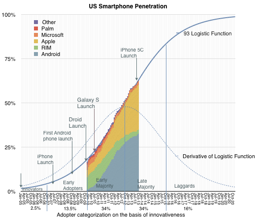
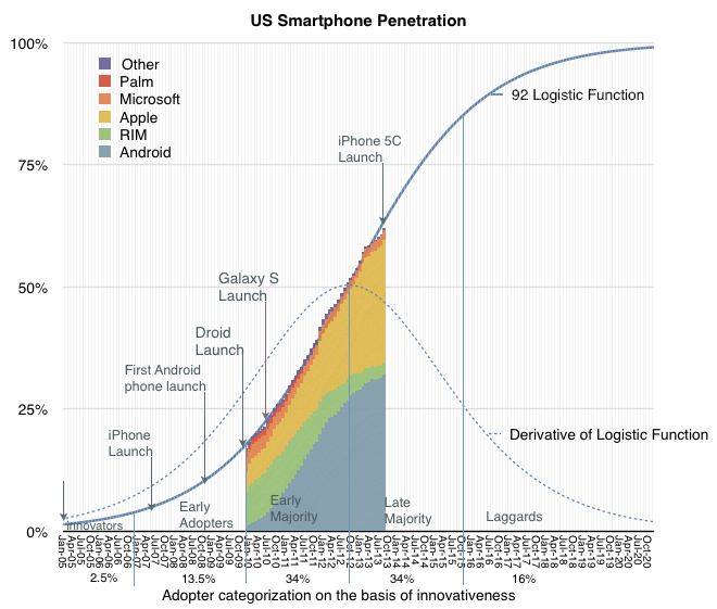
The latest comScore US smartphone survey showing three months' ending October data has been released and there were no surprises. Smartphone penetration grew to 62.5% representing 149.2 million users. I made a slight adjustment to the predictive logistic function parameters (p1 = 93, p2 = 22.5).
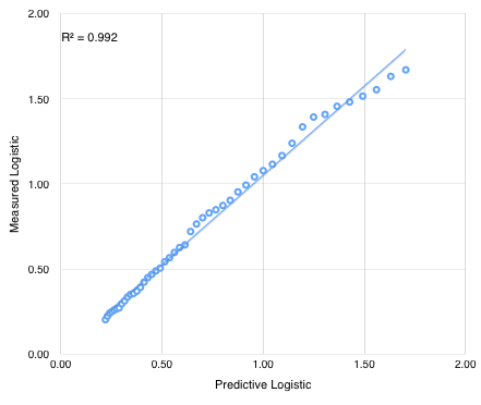
The correlation between predictive and actual logistic function (P/(1-P)) is shown below.
90% penetration (P/(1-P) = 9.23) is now expected by December 2016 when about 230 million users will be using smartphones in the US.
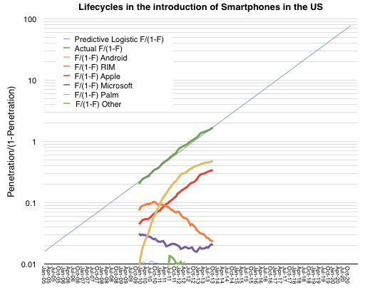
Individual platforms adoption curves are shown as colored areas above and as lines on a logistic plot below:
The parallel behavior of iPhone and the overall market remains unchanged.
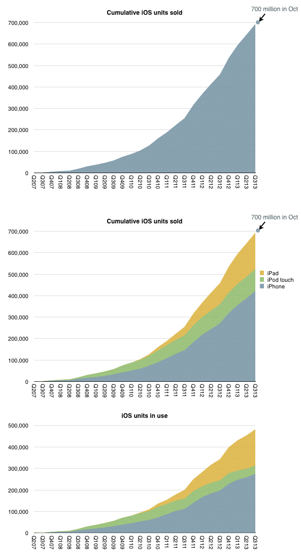
iOS unit sales crossed over 700 million units last month. That is a significant milestone but the total number of units in use is likely to be lower. My estimate based on device replacement assumptions is that about 500 million are still in use.
The estimated break-down of units sold and in use by device type is shown below:
When I looked at the penetration of iPhones in the US (as a part of smartphones in total) the surprising pattern was that it followed a logistic curve (while other platforms didn't.) If this is indicative of a particular learning process to be observed in the market, then can we extend the logistic growth pattern to iOS overall?
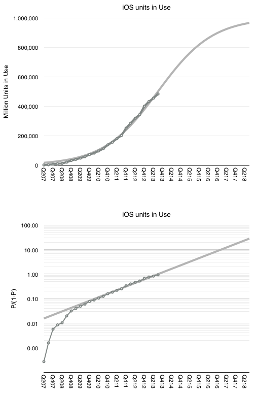
I tried it with the assumption that at 500 million, iOS is at the half-way point in its growth. This assumption comes from growth being near an inflection point. It could be that iOS might accelerate further in which case peak penetration could be higher than 1 billion, but might take longer to reach.
The 500 million as 50% penetration point assumption fits the model as shown below.
The fit is pretty good for the period after the iPhone 3G launched. This assumption would therefore imply (nearly) one billion iOS devices in use by the end of 2018.
Note that this does not mean one billion iOS users. The attach rate for iOS devices per user could well reach 2 by then placing total user base at 500 million. Note that this size of audience is very nearly the existing total Apple audience already (counting iTunes/iCloud accounts).
This means that we already have "existence proof" that Apple can reach half-a-billion users. Apple does not need to discover a large new set of non-consumers. The idea of 1 billion iOS devices is simply the projection that each current user could some day use two devices.
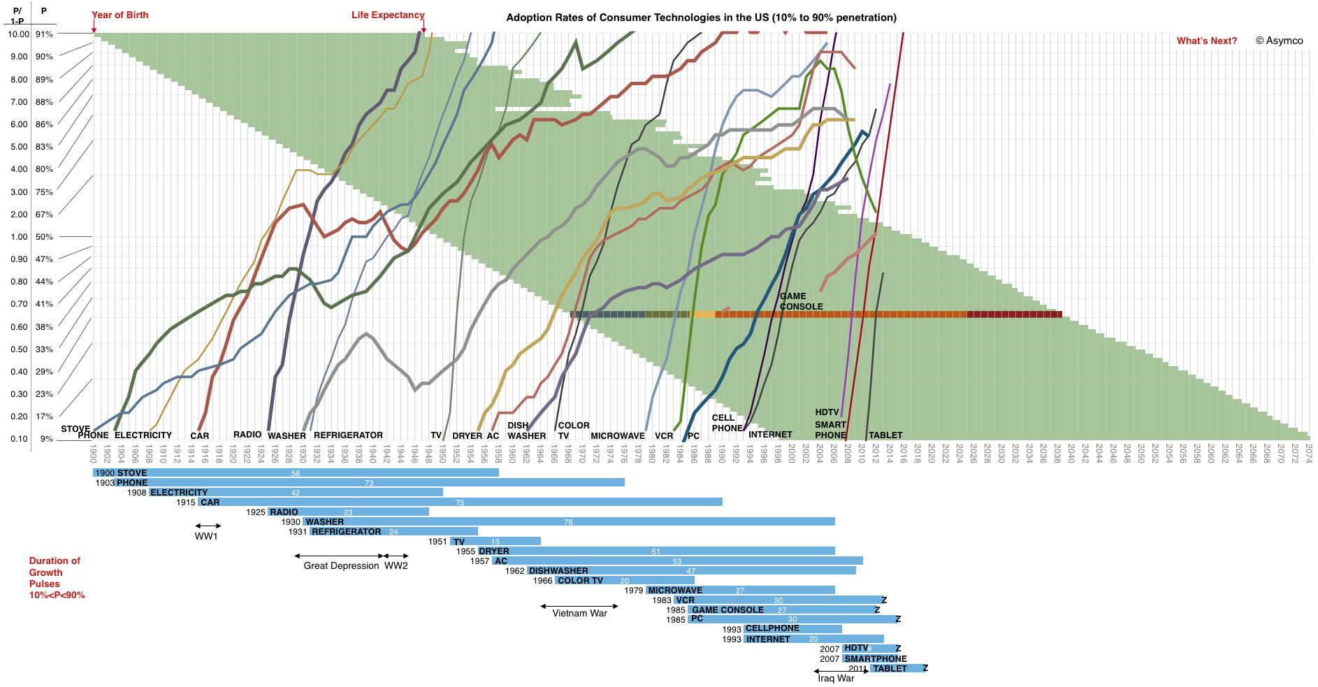
The adoption of smartphones in the US is on track for reaching 90% of the available audience by August 2016. This is a mere eight years after smartphones reached 10% penetration. As far as technologies go, that's pretty fast. To get an idea of how rapid, I plotted a few other technologies and the time they took to grow within the US market.
A few things to note:
The time scale has a yearly resolution spanning 1900 to 2074
The penetration scale is logarithmic and shows the ratio of Penetration/(1-Penetration) allowing a linear view of logistic growth.
The blue bars summarize the growth pulses and give a starting year and duration in years.
Note some traumatic events are marked on the time frame. They partly explain innovation gaps or decreases in adoption.
The life expectancy of Americans born from 1900 to 1998 is also shown as green bars. This allows the reader to trace which technologies emerged during the lifetimes of people they might have living memories of. I overlaid one specific lifetime beginning in 1968 and color coded with Childhood, Adolescence, Higher Education, Work live and Retirement as a guide. You can note how the PC emerged when that person would have been in college.
Some technologies have not yet saturated and may never do so. They are marked with a "Z" on the bar graph. It might be instructive to understand why.
You'll also note that the time frame does not end today but that the technology curves do. The time frame includes the expected lifespan of someone born in 1998.
What will they see?
There is a lack of visibility or certainty among observers that anything worthy of inclusion on this graph will ever emerge.
And yet, when glancing at this graph, it would seem that the addressable market, the rate of introduction of new technologies and the speed of adoption have all increased. The area to the right of 2013 looks inviting to a plot of many lines.
Indeed, for the canvas to remain blank would be the riskiest of bets.
I've been writing about Apple's capital intensive operations for some time. The difficulty has always been in explaining the scale involved. I've compared the spending to that of Samsung, Microsoft, Google, Intel and Amazon. But these numbers still can't be easily grasped. You can't point to any comparable objects when you try to explain the figure. I struggle to create a less abstract notion than that of a "sea of tooling and servers."
Instead, I've used the analogy of US aircraft carriers. Historically, Nimitz class aircraft carriers have cost a less than $5 billion. The USS Ronald Reagan, christened in 2001, cost $4.5 billion. Therefore I was comfortable saying that Apple spends the equivalent of about one Nimitz class aircraft carrier every six months (and that the Navy takes about six years to put it together.)
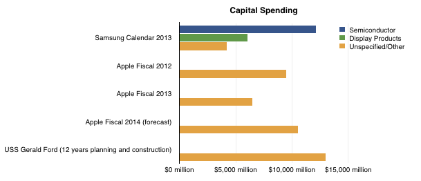
Unfortunately, costs for aircraft carriers have gone up. The USS Gerald Ford will take about $13 billion to complete. That places Apple and Samsung capital spending in the following context:
Note however that planning and construction for the latest aircraft carrier takes 12 years, rather than the 12 months spending schedule for the companies shown. Note also that Apple's spending is unspecified and included several categories while Samsung's categories are partially specified.
Due to this inflation in aircraft carrier costs, my denomination of capex is beginning to be strained. Nevertheless, the question of what Apple spends $10 billion a year remains knowing what that could buy the Navy (or Samsung.)
Apple has sold 700 million iOS devices. Google claims one billion Android device activations. Microsoft has about 1.5 billion Windows users and Facebook about 1.19 billion. LinkedIn has 259 million users and Twitter has 232 million. Amazon has 215 active account holders and PayPal 137 million.
Markets place a value on these users implicitly when company shares are priced. For example, Twitter whose users are worth about $110 or FaceBook's $98 and LinkedIn at $93.
This consistency suggests a universally accepted value per social media user but what is the value of an ecosystem user? Apple, Google, Microsoft and even Amazon aspire to enable ecosystems which should be seen are more valuable than mere communities. Ecosystems enable a higher level of economic activity because they are unbounded by the medium itself. Any number of media can be created. Or so the theory goes.
If we could determine a value for an ecosystem user we could test it against the going value of a social media user. Fortunately we have enough data to do so.
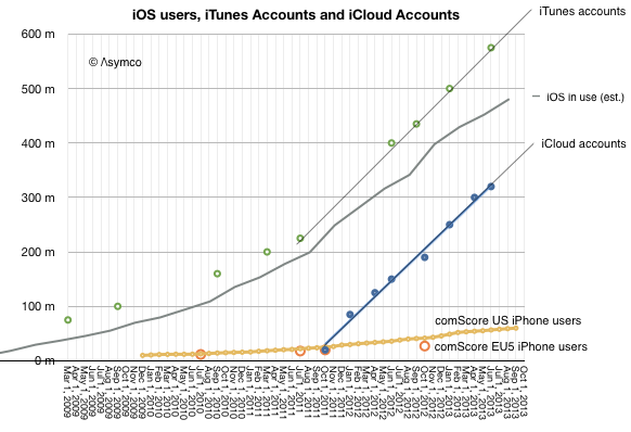
The total number of iOS devices sold per quarter allows us to measure the install base of device users. With some assumptions regarding the retirement and attrition rate we can get the following history:
Since the total number of iTunes accounts is updated with some regularity I've added it to the graph. I've also shown on the same graph the total number of iCloud accounts. For calibration, I included survey data showing the number of iPhone users in two regions (US and EU5).
These combined graphs give us an upper bound of active users (iTunes accounts) and a lower bound (iCloud) calibrating our device-based estimate. The regional iPhone data offers some additional test on growth.
The result is "about 500 million" ((482 million by my count but with quite a bit of margin of error)) with a growth of about 11 million per month.
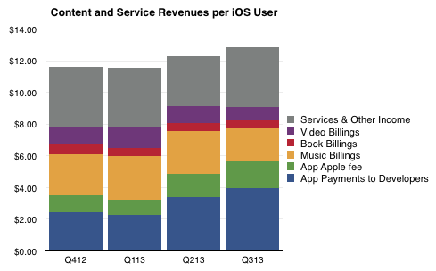
So if we know with some confidence that there are about 500 million active users as part of the iOS ecosystem, how do we know how much value they generate? The answer is in the consolidated iTunes revenues as reported by Apple: $4.26 billion/quarter. With some attention to the reported media retail and purchases, the following picture of the average iOS user's quarterly spending emerges:
The bottom line is that in the last 12 months the average iOS user contributed about $48/yr to the ecosystem via Apple's own properties. They also bought the device and paid for cellular service in most cases. They may also have engaged in quite a bit of browsing and online purchases which fed other ecosystems. But as far as Apple is concerned, it transacted about $48 per user.
As Twitter revenues last year were $317 million, the Twitter user today generates about $1.36 of revenue per year or one thirty-fifth of what an iOS user generates through iTunes and iCloud alone. And note that the number of iOS users is about twice that of Twitter.
Of course one could argue that the iOS user's participation is not profitable for Apple. It does obtain massive cash flow from iTunes which finances its fashionable data centers and bandwidth but it does not presume to value itself primarily through this revenue.
Or at least the market doesn't think so. We don't hear much about how Apple is worth so many dollars per user. ((I suppose the corollary to this is that Apple users are disloyal or fickle or fleeting, and quite contrary to observed behavior.))
The paradox is that while the device which enables this commerce is where Apple guides the consumer's perception of value, markets discount devices and bid up services. In other words, users continue to pay for the devices which delight them enough to participate in services (especially the monthly billable kind) but markets walk right by these shiny baubles and and shower money on services which have negligible sales and even fewer profits. There must be some serious misdirection going on here. The question is who's being fooled.
All theoretical and empirical diffusion studies agree that an innovation diffuses along a S-shaped trajectory. Indeed, the S-shaped pattern of diffusion appears to be a basic anthropologic phenomenon.
This observation dates as far back as 1895 when the French sociologist Gabriel Tarde first described the process of social change by an imitative "group-think" mechanism and a S-shaped pattern. ((Tarde was probably influenced by mathematician Pierre François Verhulst who first published the logistic function in 1845)) In 1983 Everett Rogers, developed a more complete four stage model of the innovation decision process consisting of: (1) knowledge, (2) persuasion, (3) decision and implementation, and (4) confirmation.
Consequently, Rogers divided the population of potential adopters according to their adoption date and categorized them in terms of their standard deviation from the mean adoption date. He presented extensive empirical evidence to suggest a symmetric bell shaped curve for the distribution of adopters over time. This curve matches in shape the first derivative of the logistic growth and substitution curve as shown below.
In the graph above I applied the Rogers adopter characterization to the data we have on the adoption of smartphones in the US. The latest data covering September is included.
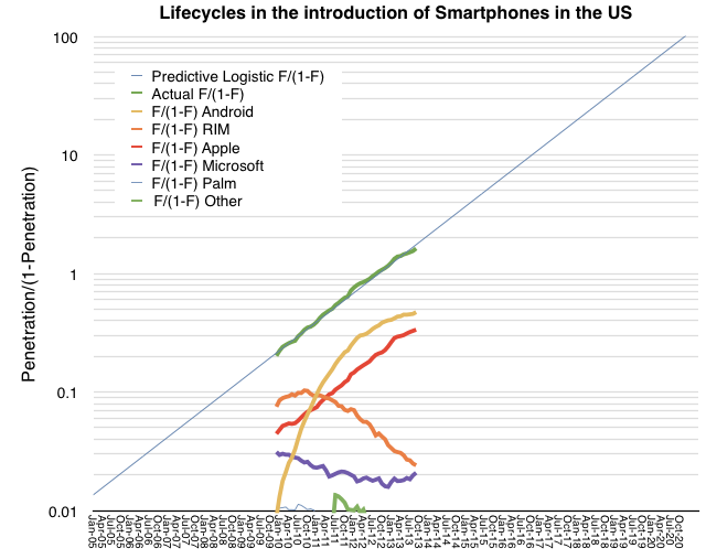
The fact that smartphones in the US follow the theory is exciting, but what can we conclude about the adoption of specific platforms? There has been quite a bit of turnover in the leadership of the market in the first half of the time frame given. You can see this more clearly in the following fractional market share transformation.
Note that, with the exception of the iPhone, if each platform is studied individually, it would not follow a logistic (i.e. linear) pattern even though, as a whole, the technology does.
This then is the big puzzle: while we might be able to predict how smartphones will diffuse into society, we can't seem to predict how any single firm will fare. This means that an investor cannot make a credible "bet" on the technology ((Indeed investors often get burned when new technologies emerge. While the technology booms, individual firms supplying it often fail. See the history of transportation, communication, computing and energy.)). If they choose a single company as proxy, chances are they will lose. If they bet on a basket of companies then, again, chances are they will lose. There is usually one unforeseeably clear winner.
Before we get further into the question of picking winners or predicting the future division of share among rivals, we should understand the underlying causes for this pattern of adoption.
Rogers concluded that the learning behavior of individuals is the underlying cause of the symmetry of the diffusion process.
At the beginning, when an individual is confronted with a new (learning) situation they make many mistakes. These mistakes are gradually reduced (by learning) over time because more and more information is received and acts as a stimulus. The gain in learning per trial is proportional to the product of the amount already learned and the amount remaining to be learned before the limit of learning is reached.
Arnulf Grübler ((The Rise and Fall of Infrastructures, Physica-Verlag 1990)) explains:
This is exactly equivalent to the F(1-F) transformation of the logistic curve. It should be emphasized that these properties of the learning process were found in real learning situations and are confirmed by a large number of laboratory and field experiments. Thus each adoption of an innovation in a social system is equivalent to a learning trial by an individual. Thus, the symmetric diffusion pattern results from the way messages about an innovation are emitted and processed by social learning.
So these observers of the process assign learning behavior as the cause for adoption of a technology. Can the learning behavior be applied to individual platforms? It's tempting.
The hypothesis would go as follows: adopters are not only processing messages about the new technology but they are also trying different platforms as they enter and as they upgrade their phones. If we see platform choice as a learning process then if one platform has a natural advantage, it settles into a dominant position as users "learn" of its advantage. Conversely, if no platform has an advantage then platform "churn" repeats as rivals gain/lose positions of leverage in the market.
The pattern shown so far seems to point to Apple's iPhone having a logistic pattern indicating that it might be benefiting from a learning pattern. The alternative platforms may simply be jockeying for temporary advantage.
It's an interesting hypothesis. To be developed further we need to answer what any learnable advantage might be. I suspect it has to do with the ability to solve unmet and unarticulated needs. In other words, that the winning product solves a set of "jobs to be done" which are difficult to pin down and are perceived rather than defined.
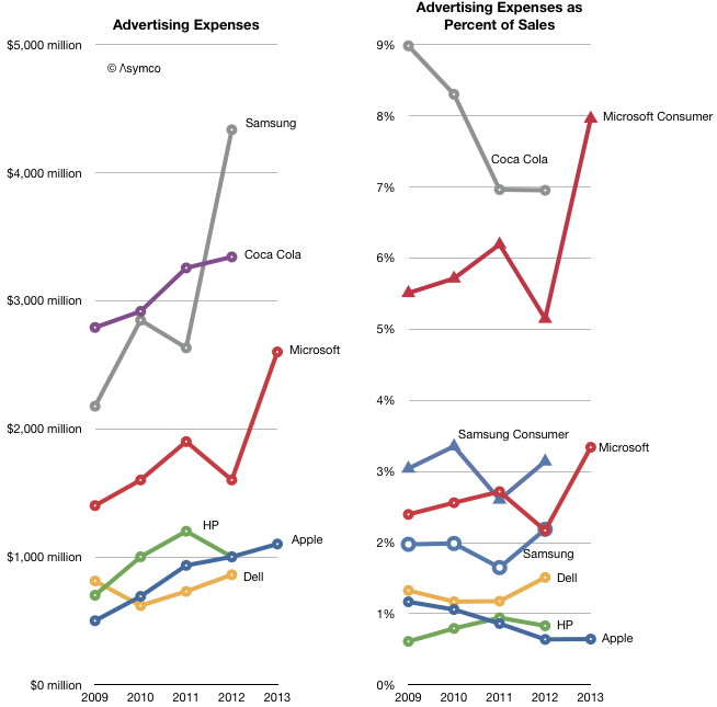
Microsoft spent $2.6 billion for Advertising in the fiscal year ended June. Apple spent $1.1 billion in its fiscal year ended October.
Other companies will report their full year ad spending later but their previous years' spending is shown below.
I added a second graph showing the percent of sales that each ad budget represents. Note that Coca Cola retains the crown as the most prolific advertiser when it comes to budgeting. ((Think of it as 7 percent of every Coke purchase going to pay for the ad that presumably got you to buy it.))
However, Microsoft is climbing into a region of 3 to 5% of sales. What's even more striking is that we can isolate the revenues which are actually being targeted by the ads: consumers. Microsoft's Business and Server and Tools divisions may have some ad budget but it's likely to be much smaller than the Windows, Entertainment and Online divisions.
When the ad budget is measured as a percent of consumer sales, Microsoft suddenly looks like the biggest spender overtaking even Coca-Cola. ((Note that Samsung can also be similarly split into consumer vs. total.)) I don't know what to make of this. It seems extraordinary that Microsoft needs the same level of effort to sell software (and some hardware) as Coca Cola does to sell soft drinks. Coca Cola spends heavily to preserve brand value for what is essentially a commodity product. Is this the way to read Microsoft's marketing?
It's also interesting that Apple spends the least (nearly) in absolute terms and fractionally less (one twelfth) in relative terms. This is in contrast to the alternatives above. The stronger, more differentiated the product, the less it needs to be propped up by the ad.
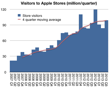
In fiscal 2013 there were 395 million visits to Apple retail stores. In 2012 there were 372 million.
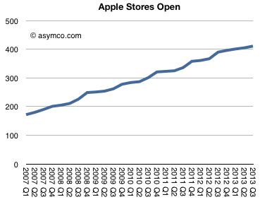
The difference is approximately the population of Australia. This was in addition to the population of the US and Canada already passing through. Although this is a fun way to think about total traffic, it does not reflect performance of the stores themselves since new stores are always being opened. 21 new stores in 2013, to be precise.
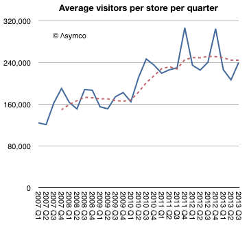
The better benchmark should be the number of visitors per store.
This shows that, except for seasonal peaks, the visitors per store per quarter has been a fairly steady 240k since mid-2010. What's more, this rate was also remarkably steady at around 160k/store/quarter from 2007 to 2010.
So what caused this quantum jump (("Quantum leap" is often used to mean "giant leap" but in the original usage it meant a specific, discrete jump)) in traffic? Was it due to a re-design of the stores? Was it a change in product mix? Or was it due to a change in staffing rules?
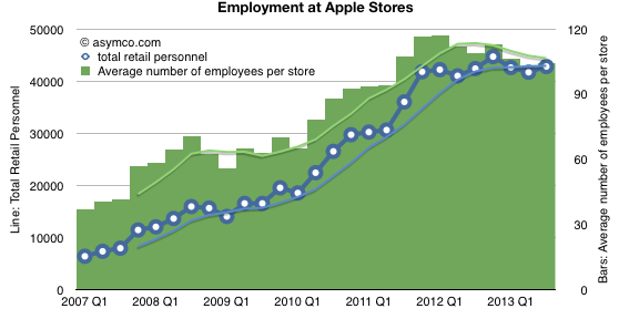
I think we can rule out staffing changes. The data shows that staffing ramps with visitors and there was no specific "quantum" increase in employment (on a per-store basis or otherwise).
Re-design as a cause has some more merit. On one hand, we have seen bigger stores opening and many more flagship stores. We have also seen specific renovations of existing stores. We have also seen re-designs where the layout was changed to allow for more traffic. The only problem with this as a cause for the quantum leap is that these changes are constantly under-way and have been for some time. It's hard to point to a specific "big bang" redesign across the board in early 2010 as possibly a cause.
That leaves product. Here we have a clear suspect. The iPad launched exactly at the point in time when the visitor count leaped. In my opinion this is the best explanation.
Let's remember also the comment from Ron Johnson at the time of the iPad launch. He said that it was as if the stores were designed for a product like the iPad. In other words, the iPad is something that needs to be discovered with a retail experience. You can sense this when you visit the stores and the placement of the iPads within.
It all points to a something more profound: that the stores are brand ambassadors. Apple products create a purchase decision by speaking directly to the users. For the type of product Apple makes, that conversation can only happen face-to-face. The place where this meeting happens is the store.
Apple's latest product launch (new OSX, iPads, Macs and iWork/iLife) came with a change in pricing for software. OS X and iWork and iLife and updates are now made available free on new Macs and, in the case of the suites, on iOS devices as well.
Recall also that iOS updates are now free as well and that OS X had been reduced in price from about $129 to $29 with Snow Leopard in August 2009 and to $19 with Mountain Lion in July 2012. The iSuites have also dropped in price over time so the pattern of evaporating software prices is long-running.
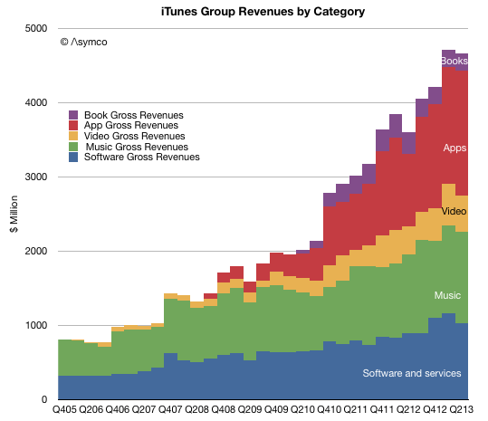
But how fast and what is the impact? The historic performance Apple's Software business is not easily determined since it was always blended with additional businesses. Until September of last year, Software was reported as part of "Software and Services" and since then as part of "iTunes, Software and Services." Some assumptions allow the following picture to be drawn:
One additional wrinkle to the Apple software story is that OS X and iWork/iLife are not all the software titles available. Apple's software includes Pro apps as well as the non-free OS X server. The non-free software US prices are:
Aperture: $79.99
Final Cut Pro: $299.99
Motion: $49.99
Compressor: $49.99
Logic Pro X: $199.99
MainStage 3: $29.99
OS X Server: $19.99
Apple Remote Desktop: $79.99
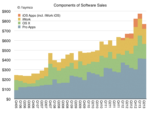
Given that and additional assumptions can lead to the following picture of the components of Apple's Software sales (in $ million/quarter).
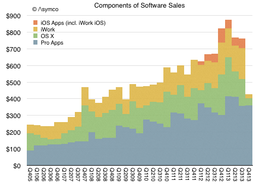
Given this picture of the software business and the change in pricing, here is my forecast for the third and fourth quarters (in $ million/quarter):
The foregone revenues could be as much as $450 million from what would have been received with existing pricing model.
So the question that naturally arises is whether this is "worth it". Whether by offering free software hardware or service revenues rise.
Perhaps. Certainly service revenue in the form of iCloud might rise with more usage of iWork and iLife. But I don't think that this is the calculus underlying the decision. Remember that Apple does not have a Profit/Loss accountability. It's not necessary (and perhaps not even preferred) that a division balances costs and revenues. ((The graphs in this post (and the preceding 1900 on this blog) were created using Numbers.))
Fundamentally Apple remains a systems company where software is a key element in its definition of value. That is not changing. What is changing instead is the bundling of application software with the systems software and the system itself. The presence of iWork and hassle-free updating of that suite (and the same for the OS) means that utilization rates will increase.
I believe the logic for Apple is that usage of the products determines their value and therefore placing powerful software in the hands of more users means they will value the entire system more. This leads to the notion of greater "stickiness" or "lock-in" but also to higher satisfaction and loyalty, rate of upgrades and even more third party purchases and yet more usage.
This is the virtuous cycle platform custodians seek to engender. This is what Apple is trying to build and the transition of apps into the system bundle is part of this re-enforcement.
One wonders how long before Apple's approach becomes the norm for other platforms.
Using logistic curves to measure diffusion of innovations is a powerful method of analysis. However there are limits to what can be learned. The methodology helps in understanding how quickly a pervasive technology is adopted. It assumes that the technology "fills all available space" within a market. It therefore also assumes that whatever problems the technology solves are universal problems.
Put another way, if a technology is not universally useful, it tends to peak before a market saturates. This "universality" condition is in evidence when observing that pervasive technologies are adopted not only by all members of one national market but also all nations and through all means of government and regulation. In other words that the jobs that the technologies are hired to do are so important that they bulldoze any and all obstacles placed in the path of adoption.
The only difference is one of timing. Some regions are quicker than others. Institutionalized obstacles essentially defer rather than deter adoption. They impede rather than block.
And I am pretty sure that smartphones solve universal needs and their adoption will be nearly 100%. They also have fairly low impedance given the speed of adoption (50% penetration in most large markets seems to come in less than 5 years.)
That's the story for the technology, but how value is captured is another story.
Who captures and how it's captured are questions of commerce not economics. They are informed by competitive advantage and business models. The puzzle seems to be that individual companies don't capture value in the patterns of Logistic curves. Or at least I don't think they do.
Consider the graph below.
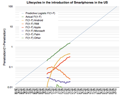
It shows the transformation of a logistic curve into a linear representation. It's a log-scale graph of fractional shares of smartphones in general (Blue/green Lines) and individual platforms in the US.
The individual platforms are shown as (Platform x share of all phones/share of all others). This is a "logistic substitution trajectory". ((Fisher and Pry, 1971, proposed a similar model to study the replacement of old by new technologies. The basic assumptions of the Fisher-Pry model are: (1) The substitution process is competitive. (2) Once substitution by the new technology has progressed as far as a few percent (i.e., "lock-in"), it will proceed until a complete takeover occurs. (3) the rate of fractional substitution F1 is proportional to the remaining substitution 1- F1 possible. Source: Grübler, The Rise and Fall of Infrastructures Physica-Verlag 1990.))
The problem is that whereas the overall category (smartphones) reaches saturation, it's not at all clear that any individual platform does. At least from the data we have so far, there is far too much volatility in platforms to see a clear pattern of monopoly emerging.
I'm not sure if this is "proof" enough to convince anyone that this market supports any number of platforms, but it certainly disproves that there will be only one. ((The odd pattern here seems to be Apple's consistent (i.e. parallel) adoption. One hypothesis could be that Apple is different in solving the prevailing job to be done while rivals jockey for positional advantage.)) We're too far along for churn to convert existing users before saturation sets in.
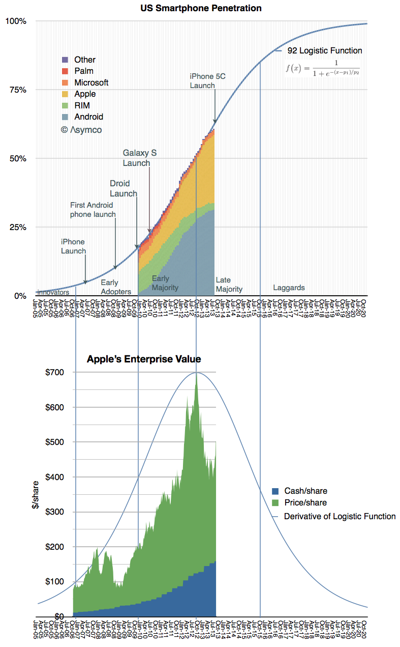
The analyses of adoption of smartphones in the US and EU5 are remarkably consistent with each other. They also turn out to be consistent with the valuation of Apple.
I show the stages of adoption overlaid with the derivative of the Logistic Function and Apple's enterprise value. The derivative of the Logistic Function shows the speed of adoption, peaking at the inflection point when adoption ceases to accelerate and begins to decelerate.
The peak in Apple's enterprise value happens to fall at the exact point of inflection in the adoption curve and hence maximum growth.
It could suggest that the market perceives the value of Apple to be entirely reflective of the US market.
But I can't imagine anyone would be so foolish as to believe it.
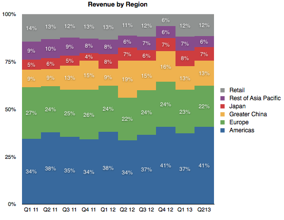
One can only conclude that it must be just a coincidence. (( Apple's revenues by region:


.jpg)