Asymco

Asymmetric Intelligence

Market

  1. How much do maps cost and what are they worth?

    Research · 66 comments

    How much does it cost to have the world's best maps?

    The answer may seem simple: $8.1 billion.

    That was the cost to Nokia in cash for buying Navteq in October 2007. It would seem that buying that asset (or another one like it) is a cut-and-dried solution to anyone needing a mapping "solution". But it's not an answer that is either complete or explanatory of how mapping solutions are valued.

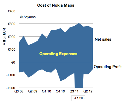
    Navteq was not priced as a database for an app. It was a business which was expected to create licensing revenues and profits[1]. The actual price for this business net of cash was $7.7 billion but the following graph shows the net sales and operating profits since Nokia began reporting its performance:
    Screen Shot 2012-12-18 at 12-18-3.13.12 PM

    The blue area represents the difference between sales and costs and hence the operating expenses--the payments needed to "keep the lights on".

    These total expenses over the 4.25 year time frame totals €6.5 billion. The total operating losses equal €2.6 billion. Therefore, as far as Nokia's shareholders are concerned, they paid $11 billion for Nokia maps, to date.

    What do they have to show for it?

    Nothing. The entire company is now worth only about $15 billion. It's hard to imagine maps being worth 73% of Nokia. What Nokia hoped to get for the product was some value in its devices. As other issues intruded, that value has not been realized. Nor has any external licensing revenue been realized. Net external licensing revenues are actually decreasing.

    The situation looks even even uglier when the maps asset can be seen as costing €1.5 billion every year. Why would anyone want to be in this business?

    I bring this up because, apparently, everyone wants to be in this business.

    Via Twitter I received a suggestion (rumor?) that Google spends about $1 billion every year for maintaining their maps. (Using a conversion from Euros to Dollars yields a Nokia maps burn rate of nearly $2 billion/yr.) Furthermore, there seems to be a burning desire for Apple to also burn this money.

    If so, then Apple might have to start spending $1 to $2 billion/yr to merely maintain a data set. That would be a minimum of an additional 7% in operating expenses.

    Why would they do that?

    If Apple cannot buy or license quality data, there may be no choice. Maps have become a hygiene factor for a platform. Not having them makes a platform repulsive but having them offers no attraction.

    Another way of looking at the maps asset is like a component in a phone. A vendor needs a certain class of processor, memory or screen or battery. Not having a minimum level of functionality makes the product uncompetitive but having it does not guarantee success.

    What's worse, the market may have been cornered—there may be no suppliers. Unlike hardware components, the maps component is not a commodity with a market of suppliers. The work needed to maintain the maps is a commodity but the aggregation and consolidation of the data is valuable and those who have gained control over the data and they are not likely to license it to any competitors for strategic (i.e. political) reasons.

    So we have a perverse situation of a very costly, unprofitable asset requiring duplication of maintenance effort by politically motivated actors imprisoned by their own strategic interests.

    If so then it fits perfectly with the mobile telecom industry. Like mobile networks, maps are very expensive and worth very little.

    ---

    Notes:

    1. The revenues that Navteq was obtaining during the 2008/2009 time frame included that from customers such as Verizon, Garmin, Advertising, Traffic services, Microsoft Windows Live services. For the six months ended on December 31, 2008, Europe accounted for 44% of NAVTEQ’s net sales, North America 43%, Middle East & Africa 8 %, Asia-Pacific 2 %, Latin America 2% and Greater China 1%.

    —

    If you want to learn more about how to analyze technology industries and the evolution of value chains, consider participating in Asymconf.
  2. Calibrating launch performance for the iPhone in China

    Research · 59 comments

    When the iPhone 5 launched Apple promised availability in 100 countries before the end of year. This was a very aggressive plan given the gradual release of previous products. Last year the iPhone 4S only arrived in China (along with 21 additional countries) on January 13th. This year it was almost a month earlier.

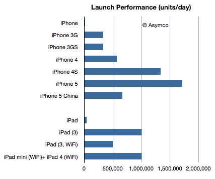
    Apple also announced for the first time this year first weekend sales for China: 2 million. This is, as far as I know, the first weekend sales data for a single market outside of the US. The time span was three days and therefore the daily sales rate was 2/3 million per day.

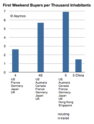
    The following chart compares the launch performance for the launches which Apple reported:

    Screen Shot 2012-12-17 at 12-17-2.44.04 PM

    If we normalize by population, the launch performance shows about 1.5 iPhones sold per 1000 inhabitants.

    Screen Shot 2012-12-17 at 12-17-2.47.07 PM

    It's a lot less than what we saw with the iPhone in the US and the first tranche of launch countries. But it's not far from the 2.6 achieved by the iPhone 4. The pricing and 3G penetration in China are far less favorable making this even more impressive.

    According to ISI's Brian Marshall, the iPhone achieved 1.5% penetration of the 3G subscriber base or 15 iPhones per 1000 3G subscribers. If we assumed the same basis (3G subs) that would make the iPhone 5 twice as popular on launch in China than in the US.

  3. Below the Surface

    Research · 83 comments

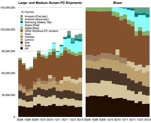
    Early data shows that the PC market has not experienced a "pop" from Windows 8. Market watchers have been anticipating this pop since every previous version of Windows has led to a surge in shipments. PC vendors have also been hoping for this to lift their volumes. Volumes have been stagnant for a while, as the following chart shows:

    Screen Shot 2012-12-13 at 12-13-3.45.58 PM

    If we combine the traditional PC and tablet markets—what I refer to as "large and medium screen PCs"— there has been growth. However the growth is all due to the tablets. When seen in a share split (blue tablets vs. brown Windows PC's) the shift toward tablet computing is clear.

    The question is whether Microsoft will be successful in shifting to this new computing model? Microsoft's problem is not that it has difficulty offering an operating system for tablets. The problem is that the economics of both systems and application software on tablets is destructive to its margins.

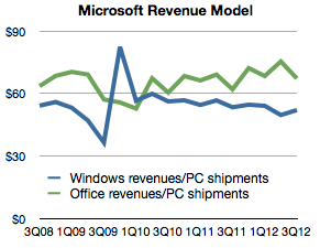
    A PC has for several decades been "taxed"[1] with a Windows and Office license. The exact figure is imprecise because of subscription accounting used by Microsoft, but we can take Microsoft revenues for Windows and Office and divide by PC shipments to get an average.

    Screen Shot 2012-12-13 at 12-13-3.47.14 PM

    This view shows how Windows revenues per PC have held steady for the last three years and Office have moved up slightly. In the latest quarter Windows "captured" $52 per PC shipment and Office "captured" $67.

    The problem for Microsoft is that pricing systems software at $50 and a suite of apps at $67 for a tablet that costs $200 to the end-user is prohibitive.

    Firstly because an OEM could not justify paying $50 to Microsoft while competing with another vendor whose (Android) software license costs nothing. It implies an increase in his bill of materials without the ability to charge more for the product and hence a reduction or elimination of margin.

    Secondly because consumers (or IT buyers) would have a hard time justifying $67 for an Office license for every tablet when most apps are either free or under $10. (Apple charges $9.99 each for iOS versions of Pages, Numbers and Keynote which can be installed on several devices.)

    The economics of tablets imply a "commoditization" of system and application software. So what's Microsoft to do?

    The answer is Surface where the software margin is captured in hardware. This explains the pricing of Surface. The price isn't significantly below what Apple charges because Microsoft wants to capture a comparable (30%+) margin. On a $500 product that amounts to $150. After subtracting hardware operating and distribution costs we can get pretty close to the $120 it currently obtains from a PC.

    This also explains the lack of appetite for "partnerships". OEMs which would normally compete on hardware would have to deal with zero margins (or less) after license fees and would be encouraged to cut corners and shave costs, compromising the experience and causing the platform to suffer.

    Microsoft does not like the phrase "post-PC" because it implies the end of its hegemony. They like to think of the PC becoming a new form factor in which they have the same role they've always had. However, looking beyond the form factor we see that mobility itself is disruptive in the implied modularity of the PC.

    Device economics offer the explanation for an otherwise perplexing Surface strategy. The question remains how many Surface units could Microsoft possibly sell to maintain its revenues.

    --

    1. A "tax" is implied only when purchases are mandatory.
  4. Does S stand for Spring?

    Podcast · 77 comments

    John Sculley:

    "I think they're going through a very significant change now in terms of product cycles," Sculley explains. "Traditionally Apple introduces products once a year; now it's really introducing products twice a year. The complexity of that from a supply chain is immense, and Apple seems to be doing it well. So, I think that people are underestimating just how well Apple is run, and just how successful the company can be when it gets to that twice-a-year product introduction cycle."

    Former Apple CEO John Sculley: Apple is well-run | TUAW - The Unofficial Apple Weblog

    Suggesting that Apple is moving to a semi-annual cycle is a very provocative thing to say, but it's something I've also speculated is happening during a Critical Path podcast.  Sculley's comments prompted me to weigh the possible evidence that this is happening:

    1. All of the major products which Apple sells have been updated in the Fall. This is unprecedented. Not only were product launches scheduled in the spring, historically they had been spread throughout the year. The odds that they happen to coincide by accident are nil. Not only that but the move of iPad and iPhone and iPod and MacBook and iMac to launch all within Fall (once a year) seems risky because it leaves a vast gap for competitors to fill six months hence. Indeed, given the iPhone's launch predictability, many (most?) competing products already target launching in the Spring.
    2. Launch ramp for iPhone steeper than ever. The number of countries and operators launching the product in the launch quarter is nearly the entire distribution list. This is also the first time this has happened. Not only does it imply a very steep ramp, it indicates no channel fill will be happening past Q1. There will not be incremental sales to unserved customers as the fiscal year wears on. 
    3. Consumer anticipation. This year saw two quarters where sales were soft due to "product transitions" as awareness among the mass market of new product rumors caused growth to dry up. Too many potential buyers are now conditioned to wait for fall to buy iPhones thus sapping demand for half the year. Apple ends up with an inability to meet demand for half the year and a sales lull for the other half. Clearly this is suboptimal.
    4. Hon Hai production has shifted to locations closer to the sources of labor. This may not seem to be relevant but we have to appreciate that Apple makes up nearly half of Hon Hai's sales volume and hence labor demands. Until this shift, Hon Hai's production has depended on migrant labor which is difficult to manage. Moving production so that the labor is local means a steadier workforce with better economies from learning curves. However it also requires a more stable order book. Production for Apple has tended to be "bursty" with breakneck round-the-clock crush followed by periods of idle time and re-tooling. This is not only inefficient but it also creates strain and stress and lowers morale.
    5. Capital Expenditures de-coupled from volumes. This is a weak signal at this time and needs confirmation, but capital expenditures seem to be outpacing production. The recent bursts in CapEx may be transient or may have to do with tooling-up Samsung's replacements but it may also imply a move to a more rapid product cycle. A transition to a new operating model would require significant over-spending in advance of the shift.
    6. Rumors of 5S products in pre-production. This is the least valuable piece of evidence but it might indicate that the "S" variant is targeting spring launch. I should point out that the "facelift" model change is common practice at many phone companies. At Nokia the convention was to launch an "i" variant to a model before a bigger update. Even at Apple, the iPod was going through a re-fresh during February with a "Valentine's Day" variant being released. Then there's the case of the white iPhone 4 which seemed to take forever to launch but finally did so into an April time frame. Finally we just saw the iPad retina product go through a six month cycle.

    Admittedly, these are circumstantial pieces of evidence but they do corroborate Sculley's claim of a six month product cycle.  Put another way, if Apple is not switching to a six month cycle then there seems to be a lot of stress for no benefit.

    I would also add that this change in cycle time is an enormous undertaking. Since Apple is an integrated company, not only production but marketing, design, hardware and software engineering must be re-configured. To put it in perspective, when Ford changed its operating mode from producing one model to a flexible mass production method pioneered by General Motors, the company had to shut down for production for six months.

    The operational aspects are daunting and would affect almost all employees in the company. Therefore if it is happening it's also possible that there is some knowledge of this change dissipating outside the company, perhaps explaining Sculley's confidence in the claim.

    --

    Looking for more information on the renaissance of production and its the effect on the technology industries? Then come to Asymconf and take part in the debate.

  5. The cost of selling Galaxies

    Research · 230 comments

    In the post "Google vs. Samsung" I compared the profits of Google and Samsung Electronics' mobile (aka Telecoms) division. It showed how Samsung has grown its mobile business to such a degree that, if sustained, could conceivably influence the way Android is controlled.

    However, we should not analyze Samsung's mobile group in isolation of the entire company. Samsung relies on internal transfer of technology and capacities of production which are quite unique for device vendors today. In other words, Samsung is a relatively integrated enterprise. Understanding the whole is necessary before understanding the part.

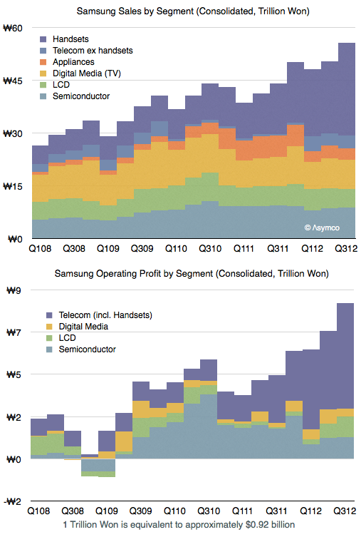
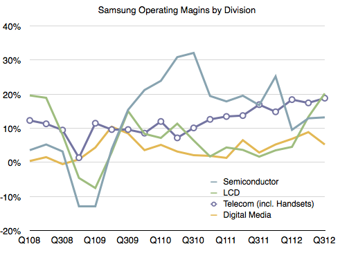
    The following graph shows the sales and operating profit for  Samsung Electronics as a composite of its divisions since early 2008.

    As one would expect, the mobile group (Telecom) is the source of both top and bottom line growth. The group has also been leading in terms of margins and increasing those margins steadily. 

    The margins averaged 11% during 2007 and 17% during the trailing four quarters. This 54% increase in margin has been matched by a 55% increase in average selling price (from $151 in 2007 to $234 in the latest quarter).

    One could argue however that a 17% operating margin from a group that is now leading in volume and price is still a bit weak. At its peak Nokia enjoyed a 25% operating margin, RIM 30% and HTC 27%. Apple's iPhone operating margin is around 45%.

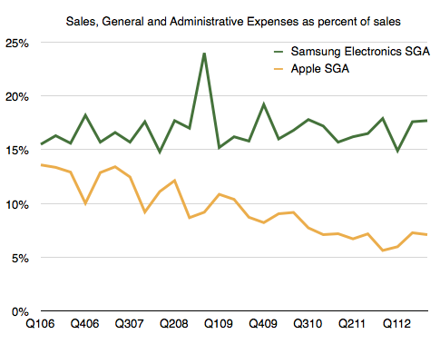
    I think a large part of the margin story is a relatively high level of spending on SG&A (Sales, General and Administrative) which includes advertising, sales promotion and commissions. In the case of Samsung Electronics, as sales has grown these expenses have grown in proportion. As a percent of sales SG&A have held relatively steady at around 17%.

    Note that as Apple's sales have grown its SG&A has grown less rapidly resulting in a smaller percent over time. We might see Apple's SG&A drop to 5% during the present quarter, an all-time low.

    So one of the more remarkable aspects of Samsung's success has been their willingness to increase promotional spending. Considering that their other divisions don't require as much "marketing expense" (semiconductors, LCD certainly, and TVs and Appliances to a lesser degree due to a smaller sales growth) we can imagine that the vast majority of this promotional spending has been in support of their mobile brands, Galaxy in particular.

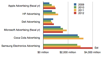
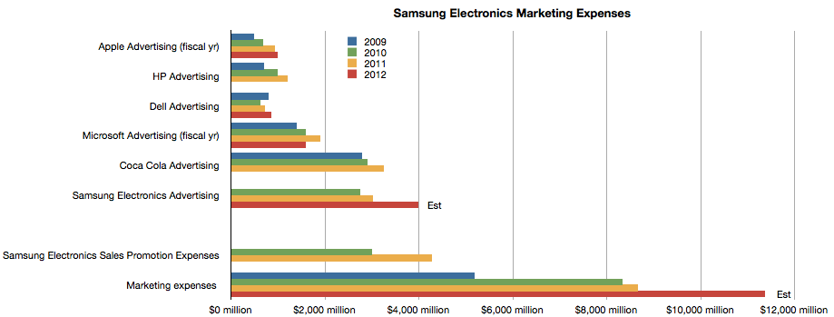
    In fact, we can obtain advertising spend data from annual reports.

    The chart above shows comparable ad spending from a cohort of technology companies as well as Coca Cola and Samsung Electronics.

    It might be surprising to note that Samsung spends considerably more than Apple and Microsoft. But it also spends more than Coca Cola, a company whose primary cost of sales is advertising.

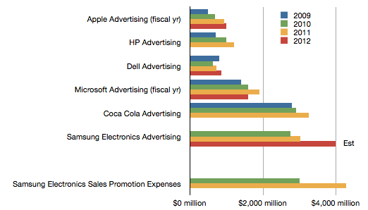
    However, advertising is not the only form of promotional spending. Samsung also pays commissions and "sales promotion". The following chart shows the value of these sales promotions relative to the ad spending budgets above.


    We don't have data on the current year since that is released after year's end, but it's interesting to note that promotions cost more than ads, which themselves are substantial relative to other companies.

    The company also reports "Marketing Expenses" every quarter[1]. These figures appear to be the sum of Ad spending, Sales Promotions, Public Relations and a portion of "other" expenses as a part of SG&A.

    When considering all marketing expenses, Samsung Electronics' sales efforts begin to look quite astonishing.

    ---

    Notes:

    1. The data used in the latter three charts are available as a Google spreadsheet here.
  6. Validating the Android engagement paradox

    Research · 52 comments

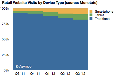
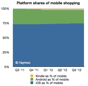
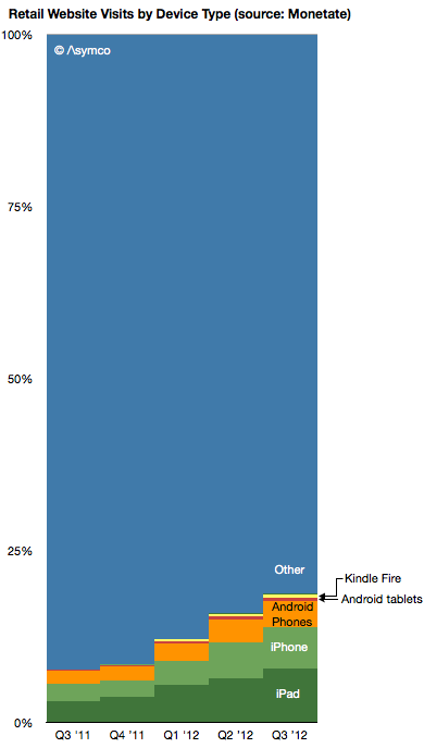
    Following yesterday's IBM data, Monetate released a new study showing similar data related to retail browsing but covering a period of dates from Q3 2011 to Q3 2012.

    This data also shows an acceleration of mobile shopping, from 7.7% of online in Q3 2011 to 18.8% in Q3 2012.

    It also shows tablets growing to take about half of mobile traffic in a very short time frame.

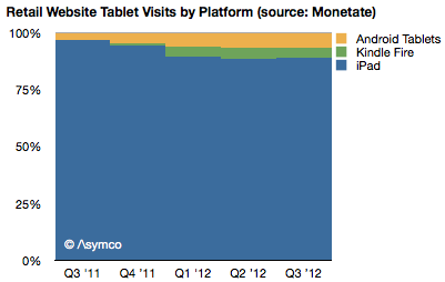
    The data also shows the iPad taking the vast bulk of traffic among tablets (88.9% vs. 88.3% from IBM).

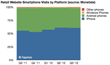
    The data also shows the iPhone taking 61% of phone traffic (67% from IBM) with the rest being Android.

    The data shows the share of iOS being 74% in Q3 while IBM reports 77% for Black Friday.

    The data also shows a very small participation from Kindle and Android tablets.

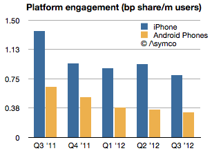
    Finally, by using the install base data from ComScore, the data shows an absolute and relative decline in Android engagement. Android phones went from 0.47 of iPhone engagement to 0.4 in one year.

    ---

    If you'd like to learn more about the Asymco method, come to Asymconf. The next Asymconf will be at the end of January near San Jose. Not only will you learn about how mobile is disrupting computing, you will also get to hobnob with the likes of Om Malik, Jean-Louis Gassée and Michael Lopp.
     

  7. The Android engagement paradox

    Research · 179 comments

    IBM's Digital Analytics Benchmark reported US Black Friday sales and the news is reasonably good. Overall online sales grew by 17.4% while mobile grew to make up 24% of traffic.

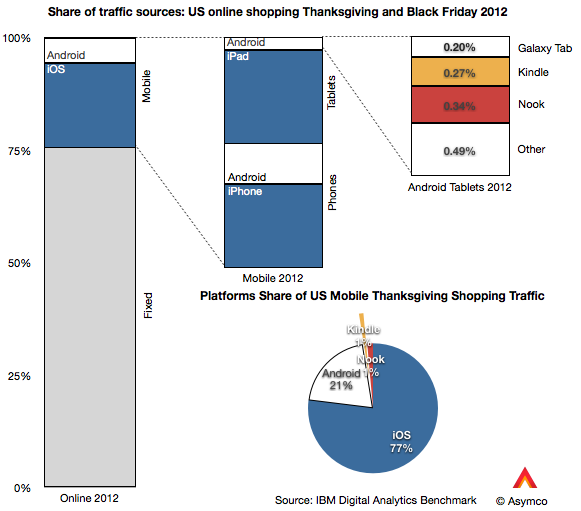
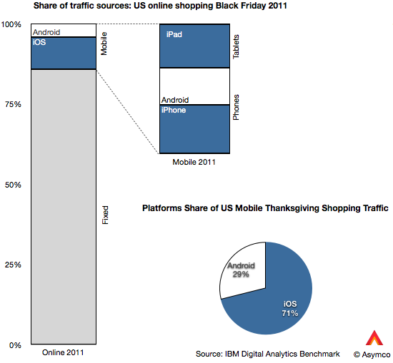
    The data goes further to show the split between device types. I illustrate this split with the following graphs:

    Of the 24% of traffic made up by mobile devices, phones contributed 13% and tablets 11% (or 54% and 46% of mobile respectively). Of the phone traffic, iOS devices were about two thirds of traffic and Android one third. Of tablet traffic, iPad was 88%, Kindle and Nook were 5.5% Galaxy Tab was 1.8% and other tablets were 4.4%.

    Overall, iOS was 77% generated mobile traffic and Android (excl. Kindle, Nook) was 23%.

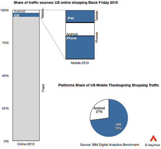
    That's an interesting snapshot of the consumption of mobile devices, but is there a pattern here? I also took a look at the same data from 2011 and 2010.

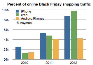
    Besides the pattern of significant mobile growth (from 5.2% to 24% of online in two years) there is the curious effect of iOS growth outpacing Android growth. Android went from 1.43% of Black Friday shopping traffic in 2010 to 4.92% in 2012. In same time iOS went from 3.85% to 18.46%. In other words, while Android is up by a factor of 3.4, iOS is up by a factor of 4.8.

    The reason is evident in the graphs above: the iPad is now the predominant mobile shopping device. You can observe the pattern in the following graph:

    Two years ago the iPad was trailing Android usage but this year it was more than twice Android usage. Curiously, the iPhone seems to also be pulling ahead of Android.

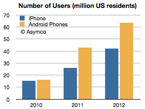
    Curiously because the number of Android users in the US has gone the other way. That data is available from ComScore, though only for phones. (ComScore data for periods ending November each year, Nov 2012 is my estimate):

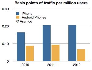
    Having the number of users and the traffic allows us to measure consumption per capita, so to speak. That is, the percent of traffic per device user:

    The ratio shown is basis points of usage (1/100 of 1% of shopping traffic) per million users of smartphones. iPhone users are about three times more engaged in shopping with their devices than Android users. Two years ago the ratio was two to one.

    Overall iPad is changing shopping habits, but it has a near monopoly in its form factor at this point. The bigger question is what is causing phone users to behave differently based on the devices they own. The phone market is more mature and has had several years of competition to be able to discern differences in platforms. The pattern is pretty clear with respect to Android: engagement is down as ownership is up. This pattern has not exhibited itself with iPhone, even though it has had a longer time in market.

    Of course, one would expect that later adopters would engage less, but I find it surprising that US Android users would behave so differently only two years after the platform began to be widely adopted. That pattern is not happening with iOS even after five years and certainly not with the iPad which is about as old as most Android brands.

    This I consider to be a paradox: Why is Android attracting late adopters (or at least late adopter behavior) when the market is still emergent? We've become accustomed to thinking that platforms that look similar are used in a similar fashion. But this is clearly not the case. The shopping data is only one proxy but there are others: developers and publishers have been reporting distinct differences in consumption on iOS vs. Android and, although anecdotal, the examples continue to pile up.

    And engagement is not a frivolous platform attribute. It is highly causal to success because it correlates with all cash flows associated with ecosystem value creation. Especially when a platform like Android depends more on engagement than "monetizing hardware."

    I'm not satisfied with the explanation that Android users are demographically different because the Android user pool is now so vast and because the most popular devices are not exactly cheap. There is something else at play. It might be explained by design considerations or by user experience flaws or integration but something is different.

    ---

    If you'd like to learn more about the Asymco method, come to Asymconf. The next Asymconf will be at the end of January near San Jose. Not only will you learn about how mobile is disrupting computing, you will also get to hobnob with the likes of Om Malik, Jean-Louis Gassée and Michael Lopp.
  8. The iPhone Addressable Market

    Research · 124 comments

    The iPhone is a severely constrained product. We're used to thinking that it's production constrained—and it is, but it's also distribution constrained. It has a business model that is almost completely dependent on operator subsidy. Few end users pay the $650 average price that Apple obtains and that price point has held for a remarkably long time. This price point is largely invisible to the user.

    In this regard it's very different from all the other products Apple sells. Historically, the company has preferred having its customers to also be its users and maintained a direct relationship with them, strengthening that relationship through its own retail channel for the last decade. Pricing is used by Apple as a signal to clearly illustrate value to the user and pricing is part of the communication about the product that Apple makes very explicit. This has been true for the iPod and Mac and is still true of the iPad. But this is not so for the iPhone. The entire marketing strategy for the iPhone (and hence the entire product concept itself) is "off message".

    Why is this?

    Before we get into causes, let's try to measure the distribution channel for the iPhone. Apple occasionally reports the total number of carriers it has relationships with. The last update was in the summer when Peter Oppenheimer, Apple CFO discussed the quarter ending June:

    We added several small regional carriers during the quarter and now have iPhone distribution through over 250 carriers in over 100 countries.…

    We added China Telecom as the second [Chinese] carrier in March…

    We also don’t expect to add any significant new country or carrier additions in the September quarter…

    In addition, Apple publishes the list of operators it sells through on its web site. The last time I counted I got 227 listed operators.

    If we contrast this with the total number of global operators (excluding MVNOs) there might be a way to measure distribution penetration. I compiled a list of all such operators based on information available in Wikipedia. You can browse the list here (Google Docs [1]).

    This global list includes 802 operators. The list is not current, being mostly based on 2009 data but it's pretty close. I've read that a more recent (non-public) estimate is 816.

    By this measure we can say that Apple has distribution through about 30% of the total operators. Consider also that RIM reports that it sells BlackBerry through 565 wireless carriers in over 175 countries. By this metric alone BlackBerry has twice the addressable market of the iPhone.

    But we can do better than counting operators. We should account for the fact that some operators have more subscribers than others.

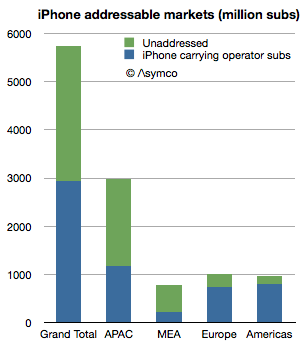
    Using the same database, I measured the subscriber count of iPhone distributing carriers vs. overall subscriber count. The ratio was about 50%.

    iPhone "addresses" about 2.8 billion connections whereas there are about 5.7 billion available connections. Note that this is not users but subscriptions—essentially SIM cards.

    The ratios vary by region:

    • Middle-east/Africa has 29%
    • Asia/Pacific is at 39%
    • Europe 73%
    • The Americas 83%


    We can take it a step further and identify which countries hold the highest opportunity for iPhone distribution. The top 5 are:

    1. India: 658 million
    2. China: 622 million
    3. Pakistan: 116 million
    4. Russia: 102 million
    5. Nigeria: 89 million

    But the opportunity is not only in emerging markets. Japan is a 69 million subs opportunity and even the US has 80 million subs without direct (i.e. subsidized) access to the iPhone.

    So we can now return to the question of why the iPhone is sold the way it is.

    First I should point out that the addressable market of Samsung or Android in general is larger than that of the iPhone. Samsung has relationships with far more operators, at least on the scale of RIM or Nokia, perhaps even more. It might be safe to assume that Android is completely unconstrained in distribution and therefore its addressable market is the entire subscriber space (meaning that Android has twice the addressable market of the iPhone.) For Apple to compete on the basis of volume or market share it would make sense to broaden this network. So what's holding it back?

    I think the answer is the other constraint mentioned: production. The company is still iterating the product on a yearly basis and needs to ramp production to reach all its carrier partners in a timely fashion. The carriers use the iPhone as differentiation and a way to uplift their core business. Therefore they want the latest version as quickly as possible. To satisfy this, Apple needs to manufacture the latest variant very quickly. But that's not easy. Peak production is one thing but getting there quickly is another. This is the problem which Apple's vast capital expenditures is trying to solve.

    So far the production capacity has been increasing at nearly 100% per annum. This is an astonishing achievement but it's still not enough. The product is supply constrained during much of the launch quarter. Therefore, to summarize, the entire business model for the iPhone revolves around this question:

    Can enough units be shipped in a sufficiently short time frame to allow a limited (but large) subset of operators to create competitive advantage which sustains a generous up-front subsidy.

    At this time the answer seems to be that the model can work for about 30% of operators serving 50% of subscribers. The crucial question for the business is how much higher can these numbers get?

    Note that this is not a debate about market share or consumer preference but about delivering a particular value proposition to network operators, (which sustains a premium price point.) The iPhone is built around this business model and to alter it would alter the very essence of what the product is. The addressable market is one piece of the product but it interconnects with the price, margin, design, production and breadth of offering. You cannot change one without changing the others. It's a product whose distribution model is part and parcel of its design.

    I believe that the particular way this product translates into a business is very rigid, which is why it has not changed much during the life of the product. This is in contrast to Apple's other products which exhibit more market flexibility. Inter-dependency is not a new concept for Apple products (e.g. iPod/iTunes, Mac/MacOS) but the iPhone shows a level of inter-dependency with distribution and production the likes of which has never been seen.

    This topic will be further discussed at Asymconf in January as the fourth quarter data will then be available and there will be an opportunity to debate it live with an august audience.

    ---

    Notes:

    1. The database is neither current nor complete. If you would like to help maintain the data based on local (public) information, please get in touch and I can grant access to edit it.
  9. Google vs. Samsung

    Research · 283 comments

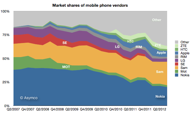
    Samsung's recent success in mobile phones has been spectacular. It overtook Nokia for the top spot in overall unit sales. 

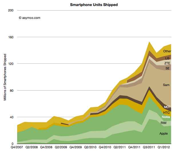
    It went from having almost no smartphone sales to selling over 50 million units per quarter in a matter of two years.

    It now accounts for nearly 40% of all industry profits.

    A key decision which made this success possible was to shift its portfolio to smartphones and to offer a large variety of such phones.

    In Q1 2010 only 3% of the phones Samsung sold were smartphones. In the latest quarter the ratio was 54%. 

    As a result the average selling price more than doubled, from $115 to $234.

    Profit margins also soared in proportion: from 12% to 21%.

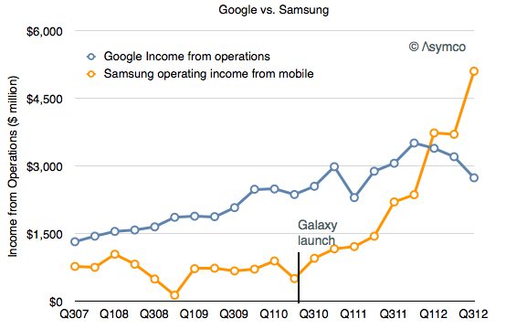
    All this plus an overall growth in volumes from 64 million to over 100 million per quarter has meant that the company is raking in enormous profits. Not only did it overtake Nokia, the market share leader for 14 years, but is making more profits than Nokia ever did.

    So much profit in fact that it has overtaken Google's decisively.

    The reason I point this out is that Samsung's success is dependent on having ridden on the back of Android. Samsung's ascent can be precisely timed to their adoption of Android. The groundbreaking Samsung Galaxy launch was the Galaxy S which shipped in June 2010.

    Meanwhile, indications are that "mobile" is causing a contraction in Google's margins.

    If nothing else, Android has created a very interesting industry. There are many questions of course: Is Samsung's trajectory sustainable? Why aren't there other vendors successful with Android? Why isn't Google successful with Android? Why isn't Google's Motorola successful with Android? What would happen if Samsung soaks up so much profit from mobile that it's in a position to acquire Google and control the trajectory of their enabling platform?

  10. The beloved hobbies of Google and Amazon

    Podcast · 40 comments

    Tim Cook speaking about the Apple TV product:

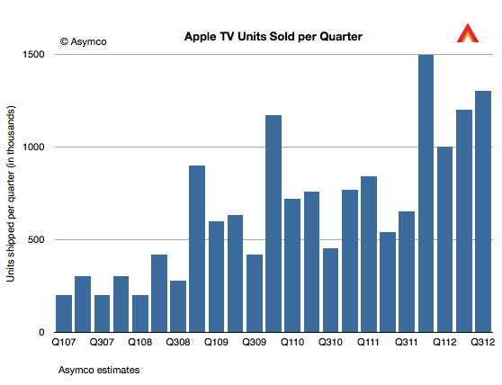
    For Q4 we sold 1.3 million. That is up over a 100% year-on-year. We sold more than 5 million Apple TVs during the fiscal year, which is almost double the previous year, when we sold 2.8 million. So the business continues to do very well, but if you look at the size of revenue of this business versus our other businesses, it’s quite small and so it still has the hobby label, however it’s a beloved hobby and we continue to focus on it and continue to believe there is something more there and continue to pull the string to see where it takes us.

    Five million Apple TVs per year is a half-billion dollar hobby. As such it quintupled from the first year (calendar 2007).

    The value for hardware is, of course, only a part of the story. It is accounted for as part of peripherals revenue and amounts to 18% of total peripherals revenues. Last May I estimated that the installed base of Apple TVs was 10 million. I'd estimate current total to be closer to 12 million. Assuming $10/month in content sales per Apple TV results in $1.4 billion of which 30% might be retained by Apple as revenue (agency fee).

    The yearly revenue thus could be as high as $900 million. Therefore it seems plausible that Apple TV is on the verge of being a billion dollar business.

    It may be a hobby to Apple but I've noted before on my podcast that Apple TV is a mirror image of the Kindle business model: Sell hardware at low margins and experiment with content sales as a profit model. The "hobby" moniker means that it's not a big business but how big is Kindle or Nexus 7 for their respective owners?

    Kindle may sell up to 10 million units at nearly break-even but is the average revenue per user much higher than Apple TV? What about the Nexus franchise? Is the loss on hardware leading to revenue to Google+OEMs above $10/month? I doubt it.

    I can't be precise or absolute about it since we don't have data from Amazon or Google about units or from any of the platforms' margins or attach rates for content, but I'm doubtful that they qualify for more than hobby status according to Apple's definition. At least in terms of profitability, Apple TV could be bigger than either Kindle or Nexus tablets.

  11. The iPhone and Apple's Margins

    Research · 17 comments

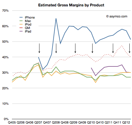
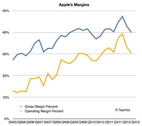
    As the following graph shows Apple gross margins and its operating margins have both been on a consistent upward slope since early 2006.

    The reason is that the company has moved to more mobile devices as a percent of products shipped. Whereas Macs have had decent margins by the standard of the PC industry, they are not as profitable on a unit basis as iPods, iPhones or iPads. As portable or mobile products grow rapidly, it would follow that margins would as well.

    However, the growth is not monotonic. There are occasional dips in gross margins. The cause is the launch of new device versions. On the following graph I show the launch times for the iPhone versions and the company's gross margin as well as my estimates for iPhone and other product line margins.

    The general pattern is clear: each new version of the iPhone causes a dip in gross margins. This is not surprising as the company forewarns of this (in a decidedly exaggerated manner.) But why does it happen?

    The iPhone is a profit monster, but when it launches there are many costs associated with it: components tend to be more expensive, there are more warranty returns, there are higher shipping costs are units are shipped in smaller lots to more points of sale. Tim Cook explains as "In terms of costs, with each new product we see learning curves associated with ramping production."

    Every launch causes an amplification of these learning effects. With each dip in margins however, comes another surge as the learning is complete and the volumes of the new generation product begin to dwarf the previous. And so the process continues.

    There is an asymptotic limit to margins as they cannot grow higher than whatever the iPhone yields but that's not yet in sight. The upper bound is probably in the 50% range.