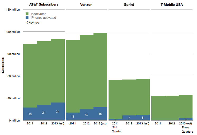
From the initial product launch until the end of 2012, AT&T has activated 72 million iPhones. Verizon began selling iPhones four years after AT&T and managed to activate 26 million since. Sprint began nine months after Verizon and has activated 8.5 million.
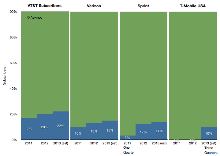
In proportion of their subscriber bases, the activations are shown in the following graph.
I identified the reported iPhone activations with blue areas while the sum of green and blue areas represent total subs at the end a the given year.
I also took the liberty of forecasting 2013 data in order to try to estimate T-Mobile's contribution.
The method used was to look at the percent of total subs that each operator has been activating. Accounting for the limited sales period for Sprint in 2011, the sales patterns are consistent across the carriers. The longer the product is available, the higher the activation rate.
Therefore I estimated that in 2013 T-Mobile USA will sell about 10% of its subs base an iPhone. That would make its contribution to iPhone sales about 3.4 million.
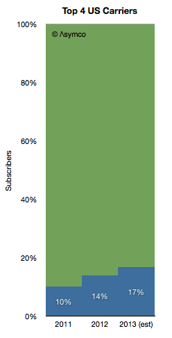
It would also imply US sales among the top operators of 53 million iPhones in 2013.
That itself is 17% of 320 million subs.
So perhaps it's time for Apple to celebrate. This year, after six years, Apple will have completed entry into its first major phone market. The rest of the world will not be as quick.
This interview took place on the eve of the launch of the Galaxy S4. Anouch Seydtaghia is Deputy Head of the Economic & Finance Section chez Le Temps Geneva, Switzerland.
---
Q: How can you explain that Samsung organizes such a huge event in NY for the S4?
A: The S4 is a very important product as it's probably the second most profitable mobile phone in the world. Samsung is trying to position it as a premium product and is using every means available to do so.
What are your thoughts about the huge marketing budget of Samsung?
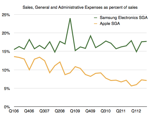
Samsung's marketing budget has been a constant percent of their sales (approximately). As sales have risen, the budget has risen. This is not considered a normal situation if sales grow very rapidly but Samsung seems to consider x% of sales to be appropriate spending level. Note that Apple's marketing has fallen as a percent of sales while its sales have grown dramatically.
If we read the media, we see a lot of speculation about the features of the future S4. Can we now compare that to the expectations before a new iPhone?
There are speculations about all phones, from Nokia to HTC and BlackBerry. I don't see the speculation to be different between all the major companies.
Can Apple regain the lead in the smartphone market? If yes, how?
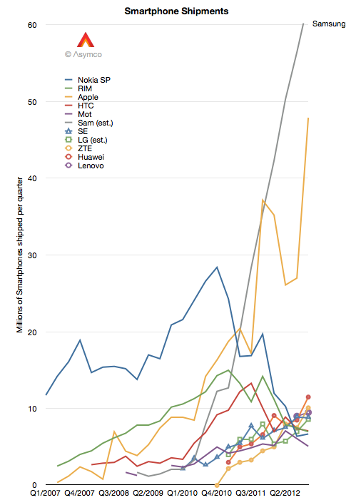
Apple had leadership in the phone market for two quarters (see graphic below.)
It's a myth to think that Apple was dominant for any extended period of time. The top spot is very difficult to obtain unless a company has a large portfolio of products which are sold in all markets. Apple has less than half the operator distribution of Samsung and keeps only one new product in the market each year.
Apple also has a very high price due to the distribution model it uses for the iPhone. The primary buyers are operators who made large volume purchase commitments a few years ago. The iPhone strategy can be summarized as "skimming" where they pick the most profitable customers rather than "penetration" where there is a focus on market share. It's therefore very surprising that Apple was able to ship as many phones as it did.
Is there a difference between what Samsung and Apple invest in R&D?
Of course, but we don't have details. Samsung Electronics has to develop semiconductor processes and build large fabrication plants. Apple has a vast software engineering operation. Apple has iTunes and web services while Samsung has appliances and TVs. The two R&D efforts are vastly different.
What could be the new features in the next smartphone?
The most important innovation in smartphones will be a product that is not a smartphone. The category will be eliminated through a disruptive approach just like all other technologies that have come before it. My expectation is that when it comes it won't be recognized as important or relevant.
As a follow-up:
- Thank you very much! So do you mean that for Apple, marketing is just 1% of sales?
It's difficult to compare the two exactly.
We don't have specific data on Apple's marketing. We have either Advertising or SG&A (which includes marketing.) Samsung reports “Marketing Expenses” every quarter but these figures appear to be the sum of Ad spending, Sales Promotions, Public Relations and a portion of “other” expenses as a part of SG&A.
What seems to be happening is that Samsung increases its spending in proportion to sales while Apple grows marketing a bit more slowly.
Basically, Samsung is treating SG&A as a "variable" expense which is tied to sales whereas Apple is managing it as organic growth.
The difference might be that Marketing at Apple is mostly an internal effort and thus depending on headcount while Samsung might be spending mostly externally. If costs are internal then it would be hard to pare them down if sales slow whereas if they are external then they can easily be made variable.
I've received comments suggesting that Samsung's approach is unorthodox and that the quality of marketing cannot be maintained if it grows as quickly as Samsung has grown it. This is a matter of speculation however.
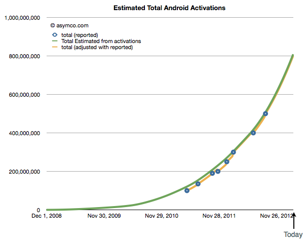
Two days after I posted a reminder that Google had not updated their Android activations for five months, Google updated their Android activations.
The new total is 750 million. My expectation (based on a rate of activation acceleration of 30,000 activations/day/week) was 800 million. Google did not update their download rate but it can be derived. Between September and March the average has been about 1.4 million/day. I had previously estimated that the rate of activation was 2 million/day.
This is a modest increase from the 1.3 million/day that was reported in September implying that activation acceleration has slowed.
After resetting the acceleration to 5,000 activations/day/week my new forecast for 1 billion activations moves to the end of August.
Coincident with this update on activations, Google reported that Andy Rubin has stepped aside as the head of Android and that Android and Chrome would be under the same management.
Putting aside the exit of the founder, the implications of the merger with Chrome will need significant contemplation.
Google occasionally reports data regarding Android. Very occasionally. The last time we had some data was in September 2012 when we learned that activations were running at 1.3 million per day and that a total of 500 million total activations had taken place.
As of today, being March 2013, the time between updates has reached five months. It's the longest gap so far. Benedict Evans also notes that it's been five months since the data regarding screen size stats has been updated on the Android developer site.
But we have to live with what we get and, in the absence of an update, the pattern of growth in Android, if sustained, looks like this:
It implies that 800 million Android activations have taken place to date and the rate is about 2 million per day. One billion activations could thus happen by June.
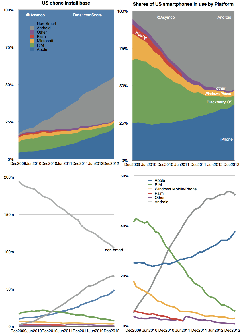
There is however another set of data regarding Android which is updated more frequently. The comScore mobiLens survey covers the US and provides updates on a monthly basis. That data shows that Android users in the US reached about 68 million as of the end of January. See the updated data below:
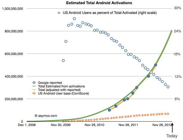
I included the install base and share of total users as reported. Combining the comScore data with Google's activations gives the following picture of US as a percent of global Android (orange circles represent US base and blue circles the precent of total activations that the US might represent)[1].
The data implies about 9% of Android usage is in the US. The more startling thing is the difference in growth: it implies that with a US growth rate of only about 13.3k/day, global growth is 150 times faster than US growth. In other words, that 0.6% of new users are in the US and that 99.4% of Android growth is outside the US.
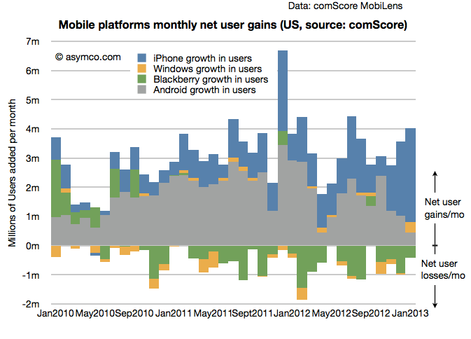
That's an interesting story. But it's even more interesting that this is not the case with the iPhone. The iPhone is growing considerably faster in the US than Android. One can see this more easily with a graph of the US mobile platform net user gain rate as shown below:
Looking at the the same contrast between global and US, from Apple's financial reports, in the fourth quarter the global "activation rate" (i.e. sales rate) for iPhone was 525k/day (nearly one quarter of the extrapolated Android rate). The comScore data suggests the US gains are running at 106k/day. Therefore we can calculate that about 20% of iPhone growth is in the US and 80% is outside the US.
Even accounting for some potential error in the Android estimates, the contrast is quite stunning: 1% vs. 20% share of growth suggests something is very different about the US with respect to the two platforms.
My suspicion is that it has something to do with the fact that the US is one of the few (but largest) market where the iPhone is available as a "low end" offering. At a minimum price of $0 (with a contract) many consumers are finding the iPhone attractive relative to a $0 (with a contract) Android phone. This price parity (illusory as it may be) allows iPhone to grow even faster than Android in this particular market.
One wonders what would happen if such price parity were present globally.
---
Notes:
Android activation data as reported by Google includes tablets but excludes many unofficial Android builds e.g. Amazon Kindle and many Chinese phones and tablets that don't register with Google services. comScore data includes only primary devices used by consumers and excludes corporate purchases and devices whose primary users are younger than 13 years.
In the latest quarterly report Apple changed how it reports product revenues. In previous quarters the iPhone and iPad were reported including accessory revenues while iPod accessories were reported under "Music" revenues.
"Under this new format revenue from iPhone, iPad, Mac and iPod sales is presented exclusive of related service and accessory revenue […] revenue from all Apple and third party accessory sales is presented as a single line item [Accessories.]"
Apple provided a document showing re-classified product summary data. By measuring the difference between original revenue and re-stated revenue per product we can determine how much service and accessory revenue was being attached to each product.
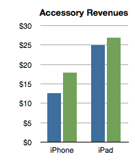
I did this for two quarters as a sample:
The analysis shows that the iPhone has been receiving about $15 of accessory attached value and the iPad about $25. Interesting trivia, but how is this insightful?
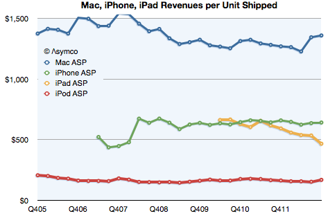
Consider the impact on this analysis of revenues/unit shipped:
The iPhone obtained about $642 revenue/unit (shown above as the last datum in the green line). That compares slightly lower with last year's $659/unit. However, the latest quarter is on the new basis and the data in the chart above shows old basis.
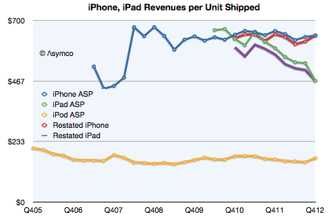
Here is the data with re-stated iPad and iPhone ASP:
On a re-stated basis, without the extra revenue from accessories, the iPhone "ASP" (Average Selling Price) from a year ago becomes $646 (which, again, is not what is reflected in the graph). This is almost exactly the same as the current quarter. The iPhone "ASP erosion" therefore goes from 2.6% to only 0.7%.
Similarly, the iPad shown at $467 in the latest quarter does not drop from $593 last year but from $568. Its ASP erosion becomes 18% rather than 21%.
Interesting resilience with the iPhone and slightly better support for the iPad price. What does it mean?
Pricing power is the most important indicator of differentiation and it implies an ability to create value in excess of cost. Not only that but it also indicates whether a product is being "commoditized" by over-serving the market and being substituted by lower priced alternatives.
In the case of the iPhone the tenacious retention of its ASP indicates that the point of over-service has not been reached. Buyers are not yet switching in significant numbers to the older, cheaper variants available from Apple. If they were we would see evidence in the price first due to the change in mix.
Contrast that with the iPad where there is a far more marked erosion. That's due to the introduction of the mini which is good enough to substitute for the larger version for many of the jobs it's hired to do. We can safely argue that the iPad is good enough in smaller form factors and addressing larger markets.
But why isn't this happening to the iPhone? Why isn't the iPhone n-1 "good enough"? Surely consumers can do almost the same tasks with an iPhone 4S as they can with the 5. Why are they still buying the new phone?
The clue comes from the fact that the consumer is not the only buyer. It's operators who buy and re-price the product. They are hiring the product to sell broadband and the newest variant is still the best hire to do that job. This observation is crucial to understanding the growth dynamics of the iPhone and consequently, of Apple itself.
I repeat what I've mentioned before: The iPhone is primarily hired as a premium network service salesman. It receives a "commission" for selling a premium service in the form of a premium price. Because it's so good at it, the premium is quite high. Also because it's so good, it gets bought in large batches which allow Apple to schedule production efficiently.
This understanding gives us a solid basis from which to evaluate its growth potential.
[Kaoru] Kato, president of NTT DoCoMo Inc., said that the firm would want to add the iPhone to its lineup of serviced smartphones if it could form a mutually beneficial contract with Apple, Inc.
Apple requires that carriers servicing its devices sell a fixed amount per year. Katō said that his company could handle such quotas if iPhones accounted for approximately 20%-30% of its overall smartphone sales.
When thinking about an iPhone launch, especially with a new operator, the crucial question is what is the minimum order quantity (MOQ). Some of the iPhone production is sold direct (as in the case of orders coming from Apple's online store) but the majority of units are sold via operator who order in batches.
This issue came to light when Sprint's order was leaked in late 2011. I discussed the order size at the time and put it in context. I concluded that Sprint MOQ was on average 7 million/yr., ramping with 4, 6, 9 and 12 million over a four year period. I concluded that this was not a particularly aggressive gamble.
Data published since then shows that Sprint actually sold 6.3 million during the first year, well ahead of my expected minimum order of 4 million and above even the expectations for the second year of sales. So far then Sprint and Apple gauged minimum demand quite accurately.
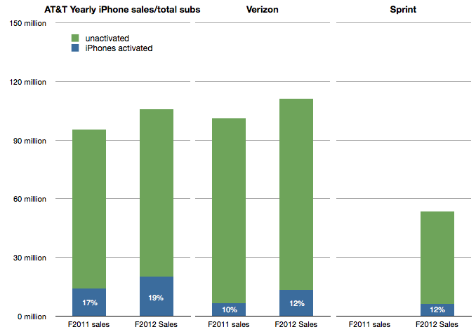
I also showed that the Sprint MOQ was probably indexed off their sub base. I suggested that, based on subs data at the time, Sprint was committing to roughly 13% of its subs buying an iPhone every year. This was indexed off the data showing that 17% of AT&T subs were buying iPhones every year and 10% for Verizon. (I also assumed that this run level would be ramped over time).
The updated totals for the 12 months ended October 2012 are 19% of AT&T subs purchased an iPhone, 12% for Verizon and 12% of Sprint. The performance is shown in the following graph:
Which leads us to think about how the MOQ for the iPhone is calculated. If we assume Sprint and Verizon performance is typical it would imply that an operator like DoCoMo would be required to purchase iPhones at the rate of about 10% to 12% of its sub base each year, modulated to some degree by a ramp.
NTT DoCoMo had 60.7 million subs in September 2012. 10% is about 6 million. Is Mr. Kato's quote above of 20%-30% of smartphone sales consistent with this?
In an earlier interview (in July) Mr. Katō also stated that the target for smartphone sales in the year to March 2013 was 13 million. 30% of that would be 4 million units.
This suggests that the iPhone MOQ for DoCoMo is only about 6% of subs. (4 million) Perhaps this is the basis of negotiation for an iPhone deal. Apple may have held out for 10% subs/yr. with Sprint on the basis of performance of the iPhone in the US but might be willing to settle for 6% subs/yr with DoCoMo, at least for the first year.
The MOQ figure as percent of subs for China Mobile would also be an interesting point of debate.
In 2011 Apple increased the availability of the iPhone by adding operators. In 2012 Apple increased availability by bringing the phone to operators more quickly. The question is: how much did iPhone 5 availability increase, exactly?
There is a way to find out. As an approximation, Apple periodically reports the availability of new iPhones by country. For example, Apple stated that they reached 100 countries for the iPhone 5 before 2012 ended. They also gave similar launch data for the iPhone 4S. Graham Spencer did a good job showing how country roll-outs changed over time.
However, country-level availability is not ideal because countries vary greatly in their ability to absorb iPhones. Announcing availability in Mauritius is not nearly as important as announcing Madagascar. A better measure would be to track the countries' populations being added, or, better still, the populations which subscribe to operators who have a distribution contract with Apple.
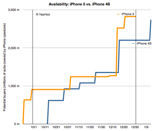
Which is what is shown in the following graph:
I plotted the "potential buyers" as the number of subs addressed by iPhone-carrying operators in the launch countries according to the time when the launches happened. I did so for the iPhone 4S in 2011 and the iPhone 5 in 2012[1].
Now we can address availability as the area under each of these lines.[2] The figure for the iPhone 4S adds up to be 100 billion "subscriber-days"[3] and for the iPhone 5 it's 130 billion subscriber-days during Q4 2011 and Q4 2012, respectively.
That's a handy measure: the iPhone 5 was 30% more available than the iPhone 4S. The big contribution was having China and Indonesia available during the fourth quarter rather than in January 2011.
There are a few observations which follow:
First, note that the increase in availability (area between the orange and blue lines) occurred both early and late in the quarter. The early period was mostly due to early launch in the US and the later period was due to earlier launch into China. China buying patterns are different than those in the US due to differing festive seasons so the bulk of Chinese buying may not happen during the fourth quarter.
However, delivery of product to China started earlier and there was a burst of buying (two million units in three days.)
Production should follow the availability schedule so it would be sensible to reduce production once the pipeline is full. Note that supplier cuts rumors surfaced right around the increased availability date of mid-December. Last year the rumors surfaced in November.
Increased availability does not always lead to increased sales but the iPhone 5 was constrained for longer than the iPhone 4S so it's possible that demand was therefore higher.
Increased distribution does not always mean increased production. However, Apple's investment in production tooling doubled year/year so there is a possibility that production did increase.
--
Notes:
Subscriber data is approximate. See addressable market discussion here.
The measurements are for the calendar quarter only, as bounded by the vertical lines.
A subscriber-day is a measure of availability where one subscriber has access to buy the product for one day.
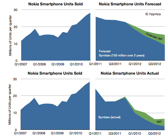
Nokia announced 4.4 million Lumia smartphones were shipped in Q4. That's about 14 million since the Lumia line was launched a year earlier. It isn't however nearly enough to replace the lost sales from Symbian. One year earlier Nokia shipped 19 million Symbian phones in the fourth quarter and the year before 28.3 million. The history of smartphone sales from Nokia is shown below:
I repeated the forecast I drew up in February 2011 when the platform switch was announced. That forecast was based on the company stating that 150 million Symbian phones would still be shipped. Symbian fell far more rapidly than I (and Nokia) expected and to date only 98 million have shipped. The last quarter's 2.2 million seems to be so low that it will be hard to imagine the platform lasting more than a few quarters.
My forecast for Windows Phone was 15 million (through Q4/2012) and the 14 million actually shipped is not far off. However, note that the sequential growth into the fourth quarter was lower than the same period last year. For the holiday quarter Nokia received almost no boost. If there is reason to be optimistic it's that there wasn't a decline in overall smartphones into Q4.
The overall result is that Nokia remains in an operating loss status and it's going to be very hard to recover. No phone vendor has successfully recovered to date. The company managed to book a €50 million one-time payment for IP rights (presumably from RIM) and is sustained by royalties and platform support payments from Microsoft. But even so it's barely breaking even.
The prospects for Windows Phone may be improving however. Operators in the US continue to talk about it. We don't have a split for AT&T's push this past quarter and estimates suggest that 80% of smartphone from AT&T were still iPhones but Verizon will also push the platform and there are suggestions it's doing well in Germany. HTC has also launched some WP flagship phones and may have had a good December as a result.
That translates into steady progress. But the growth of Android and iOS continue as well. Windows Phone needs to continue to persevere in adverse conditions for years to come. The Finns know a thing or two about that.
As it did yesterday, on occasion Apple reports the cumulative total downloads and payments to developers. Since this is done in variable time intervals, it makes analysis of the value of the app store difficult.
But not impossible.
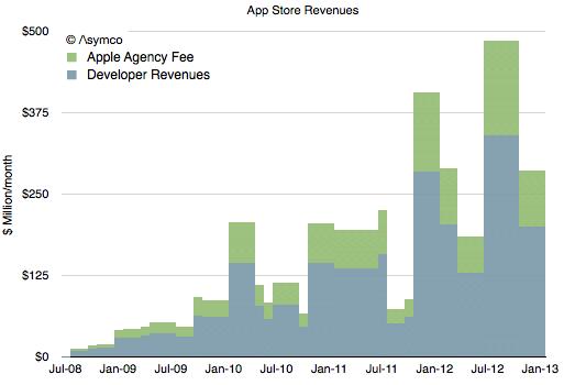
The provision of developer revenues means we can determine the pricing of apps. The pricing of apps and the download totals allows us to determine the revenue of the store. Using the time stamps of the reports allows us to determine these quantities over time.
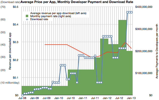
I've combined the data we have so far into the following graph.
It shows three quantities (on three separate scales) at a monthly resolution:
Download rate (in millions/day, interpolated from download totals)
Payment rate to developers (reported change in payment to developers/reported time interval)
Resulting revenue per download (in red, trailing average over a 10 month period)
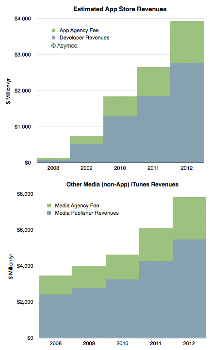
Having a price and quantity of app downloads allows for a complete picture of App Store revenues over time, shown below:
Note that I've separated the developer revenues from Apple's own revenues. The blue area should total cumulative developer payments (to a degree of error.)
The green area above is what Apple includes in its financial reports as part of "Music" revenues. If we annualize these App Store revenues we can strip them out and show them separately from "other media" revenues.
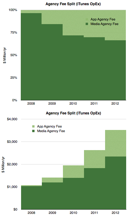
Concentrating on the green areas which represent what Apple "keeps" we see the following split:
Considering that Apple reports the iTunes store to being "slightly above break-even" then we can summarize the chart above as the operating expenses for the store.
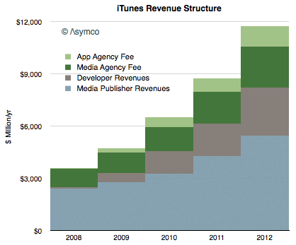
Finally, taking into account all the information above we can draw a complete picture of how revenues flow through the App Store:
Here are some conclusions:
The iTunes economy defined as gross revenues transacted through it is now about $12 billion/yr.
Over the last five years content owners (media and app) received a total of $24 billion while Apple spent about $10 billion to create those sales
Seen as a retail business, iTunes costs about $3.5 billion/yr to operate. This includes merchandising, payment processing and "shipping & handling".
Total revenues have risen steadily in a range of 32 to 38% compounded over the last 4 years.
Apps are now a third of all iTunes revenues, (about $4 billion/yr) having taken that share in only 4.5 years.
Non-app media still make up 2/3 of iTunes in terms of sales value but their growth is now 28% vs. about 50% for apps.
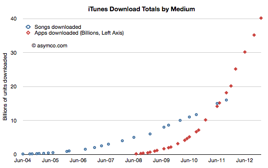
Apple reported over 2 billion unique app downloads (excluding re-downloads and updates) in December. The total downloads reached 40 billion, payments to developers reached $7 billion and the total iTunes accounts reached one half billion.
The total downloads is shown relative to total songs is shown in the following graph:
Although we have not received an update on song downloads for some time, it's probably safe to assume that twice as many apps have been downloaded as songs.
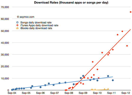
This data can be reduced to a download rate:
The apps daily download rate was about 65 million/day during the holiday period but may be averaging about 50 million/day on a yearly basis. Note however that the rate is increasing at approximately 1 million/day/month. That implies that the average rate will reach 100 million/day in 4 years and may spike to that level by 2015.
The revenues associated with that rate will be $14 million/day. More about that in the next post.
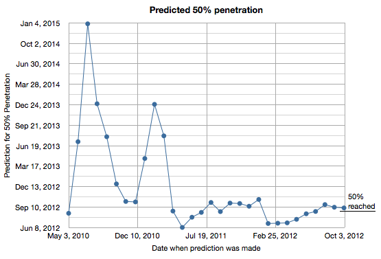
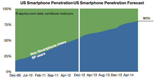
50% penetration for smartphones in the US turned out to be fairly predictable. I tracked my predictions based on comScore data and the results are shown in the following graph.
I began making predictions in May 2010 and updated the estimate every month since. As the chart shows, the prediction converged to early September 2012 by early 2011. The actual date was sometime in late August 2012.
The reason this prediction was relatively easy was because the rate of penetration growth was mostly linear throughout the period of 2009 to 2012 or from 17% to 50%.
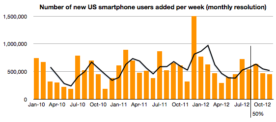
In fact, the consistency continues even above 50%. The following chart shows the weekly new smartphone users add rate. No slowing seems to be evident for the few months since 50% penetration was achieved.
So if we assume that this rate will be preserved or increase slightly, how soon can we expect smartphones will reach 80% penetration in the US?