Apple 2026 FQ3 Review: The Presentation — Asymco Office Hours, 31 July 2026
Office Hours #2026FQ3 #presentation #transcript
Apple's best quarter in years, albeit with a warning label.
July 31, 2026 Asymco One Office Hours, recorded day after Apple's Fiscal Q3 2026 earnings call, Tim Cook's last as CEO. Horace Dediu presents his analysis of the quarter and takes questions from Asymco One subscribers. Hosted by Horace Dediu and Farshad Nayeri.
Presentation Summary
Revenue +16%. EPS +29%. Mac +29%, double what most expected; guidance cut growth to 10%.
See inside:
- The 11-cent line item nobody modeled.
- Cook's concession
- 1.5 billion paid subscriptions, following ACTIVE model.
- R&D nearing 10% of sales, and where it's going.
- Three visits to 40x earnings. Three pullbacks.
- Apple Upgrade: every lease, priced to the penny.
Video Recording
Transcript, with Embedded Slide
Horace Dediu: This is the office hours that happens to be right after earnings for Apple, which came out at the end of trading yesterday. We had the conference call, and we've had a little less than a full day to digest. It's quite an interesting quarter. Let's dig in.
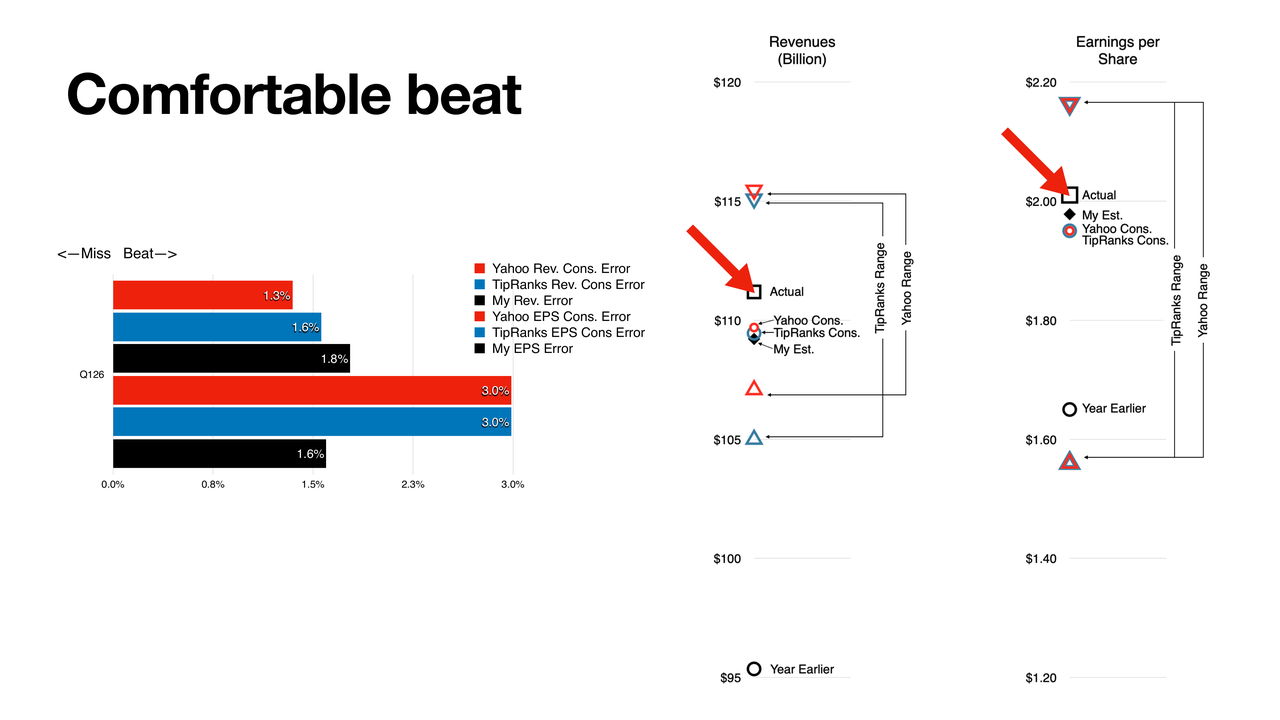
This is a new type of graph. I'm testing it — it's a little complicated, I admit, but I'm trying to put a lot of information in here. For the quarter, we have revenue on one graph and earnings on the other. But I also have the previous quarter, and the next quarter. In the middle, on the vertical, are all the estimates, including the actual results and the previous year, so that it gives us a growth picture.
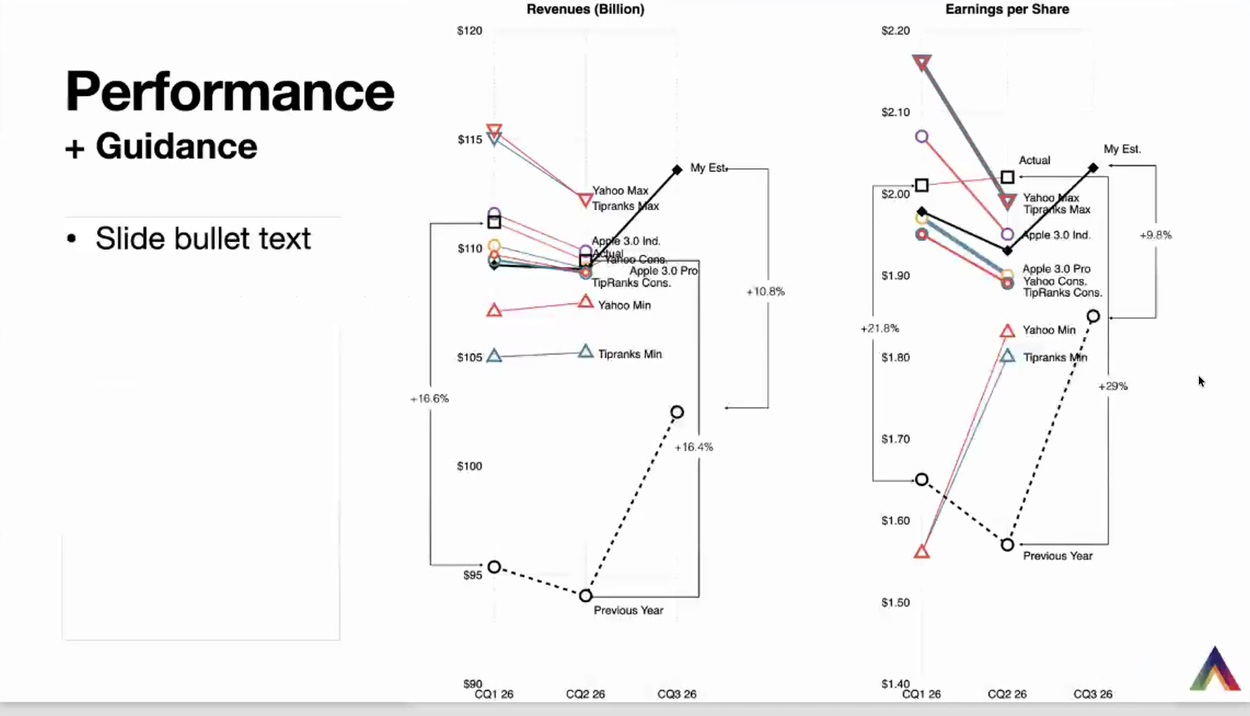
That middle line represents all the estimates: Yahoo, TipRanks, Philip Elmer-DeWitt's Apple 3.0 — both the professionals and the independents — and my number as well. The growth in the previous quarter was 16.6%, and we had 16.4% in the just-ended quarter. This is very consistent with guidance, so there wasn't a lot of surprise. In fact, you can see how many of the estimates were clustered around the very point where we ended up.
That's revenues. In terms of earnings, Apple really outdid itself. We ended up with 29% growth, versus 21.8% in the previous quarter. The reason a lot of this was outstanding is that about 11 cents of those earnings was tariff refunds. That was a surprise to everyone — no one factored it in, although there were hints of it from the previous quarter and the outperformance in that quarter as well. If those were removed, we would be much closer to the middle — about $1.91. My estimate was $1.93, consensus was about $1.90 ($1.88 even for some). So, in line or a slight beat on earnings, but a huge windfall from tariff recovery.
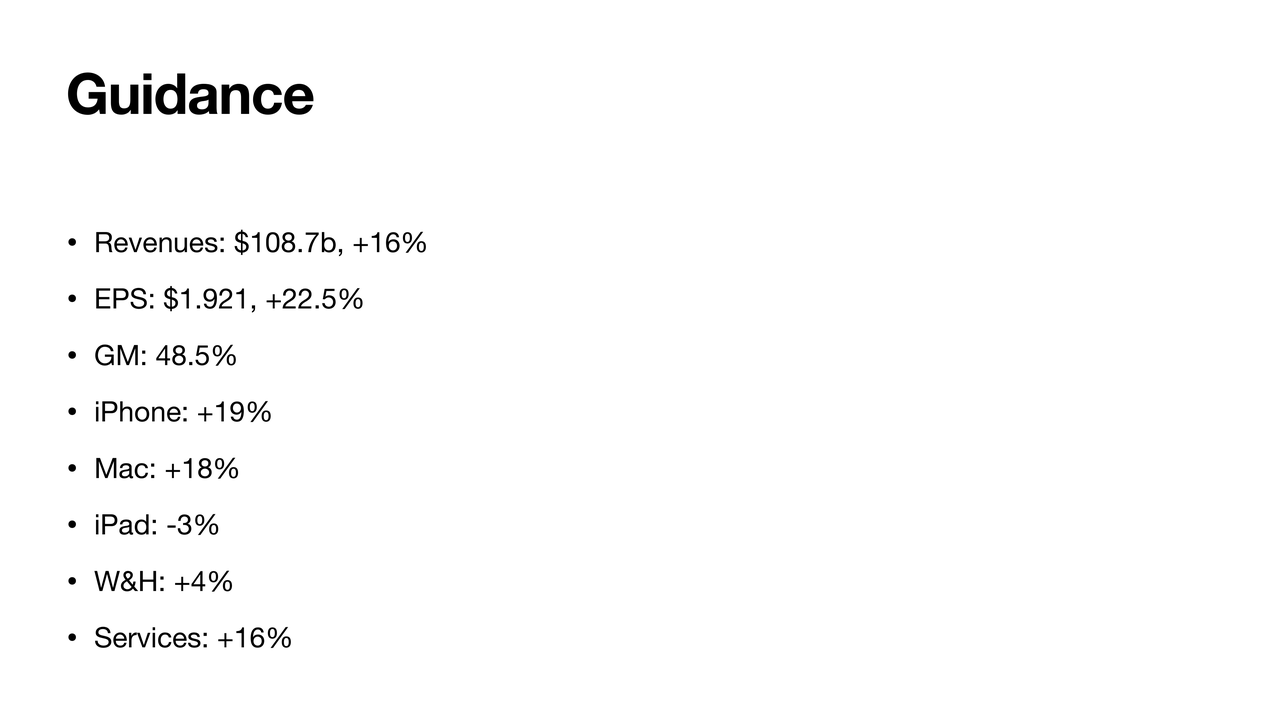
Now, the guidance is where the surprises came, and we'll get into why. The guidance indicates about 11% — they gave a range, and I'm putting in an 11% estimate on revenue growth and a 10% estimate on EPS growth. As you can see, this is a significant reduction: from about 30% to 10% on EPS, and 16% to 10-11% on revenue. A lot of that is because they're actually way too successful as a company. The demand is off the charts. In fact, the demand into the first and second quarter of this year was far higher than they estimated. Tim is on the record now saying: we made a mistake. We made a mistake in planning this year. We had certain expectations of growth, and they seem to have been double that. As a result, we didn't allocate enough resources on the supply side to meet this demand, especially on the semiconductor manufacturing side.
There are also some headwinds with foreign exchange, and I suspect those have a lot to do with Japan — we've seen the yen. So there's a lot of jitters in the market, a lot of surprised people saying: why is growth decelerating? Apple threw us a curveball with demand — actually, they were surprised as well. But overall, the growth is substantial. Even at 10%, it's healthy, and I think a lot of that demand is going to be delayed into next year, and we're going to end up with a surge, if not a super cycle, as it used to be called, because of this pent-up demand.
The Numbers
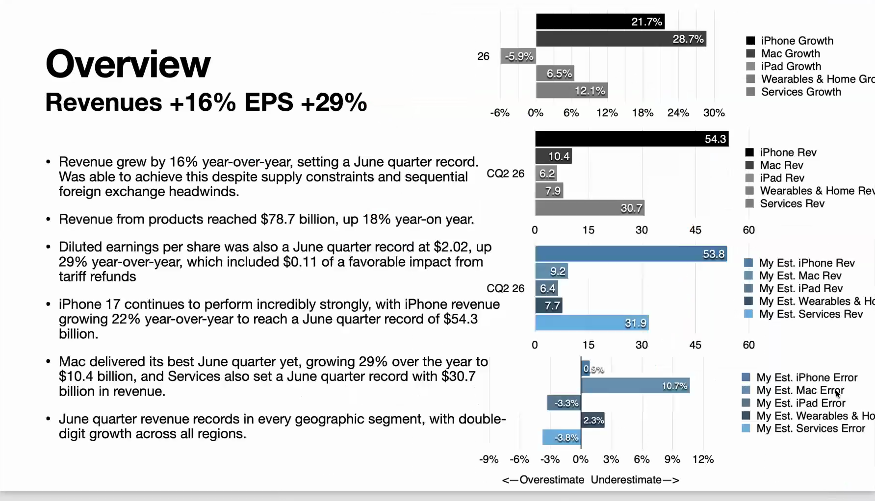
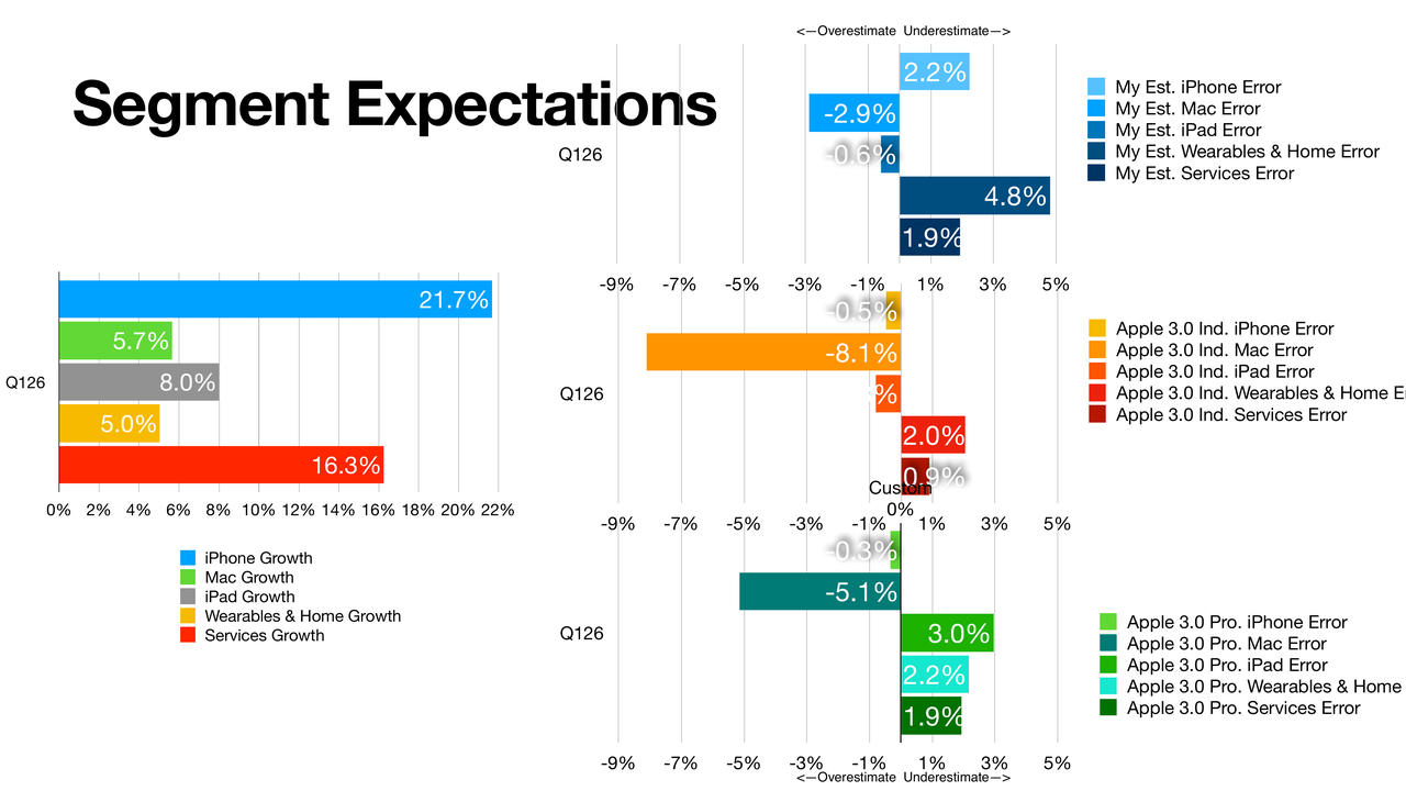
Revenue's up 16%, EPS 29%, as I said. Products up 18%, Services up 12% — a little heavier on products, and Services was a bit of a surprise; a lot of that was, again, foreign exchange. We had the 11-cent favorable impact from tariff refunds. The iPhone itself: $54.3 billion, very strong growth at 22%. A June quarter record — we're talking almost holiday-level sales right now. The Mac: 29%. Outstanding, extraordinary. We expected an outstanding quarter, but we got much more than that — probably double what most people thought. I really thought 15% would have been a very strong quarter.
When you look at my own estimates, my biggest error was on the Mac: I was off by a cool 10 points there. I had overestimated Services a little bit, again due to that foreign exchange issue. iPad, a small miss, but it was a tough comp — they warned us about the comp. It ended up the only category that's down, about 6% (5.9%). But Apple constantly repeats: revenue records in every geographic segment, double-digit growth across all regions, and so on. We don't have the absolute numbers, but a lot of records are being broken.
iPhone
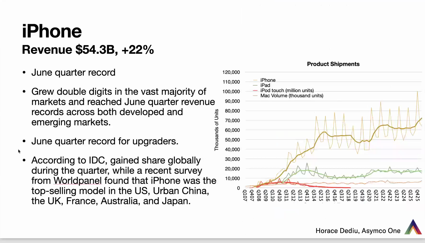
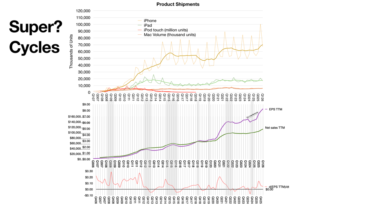
The top line is the smoothed version — a four-quarter average — of iPhone product shipments. This isn't what they report; they give us only revenue numbers, so I'm estimating this. When I talk about a surge, or a super cycle: we had this bump around 2015, then it looked like everybody said growth is over. Then another surge in 2022 — that's COVID — and then again a plateau. And now we're seeing another surge.
Is this due to the periodic nature of the iPhone — the fact that people tend to hold on to the product for a while and then come back to upgrade? Is there pull-forward demand because people anticipate price increases? Is there AI demand? (That wouldn't happen in advance.) To me, this is a cyclical thing that's very much built into the history of the product. So I don't read much more into that, but I do see a surge coming. What I'm surprised by is that Apple themselves were surprised by the surge — they hadn't planned for it, as Tim's comments said.
Mac
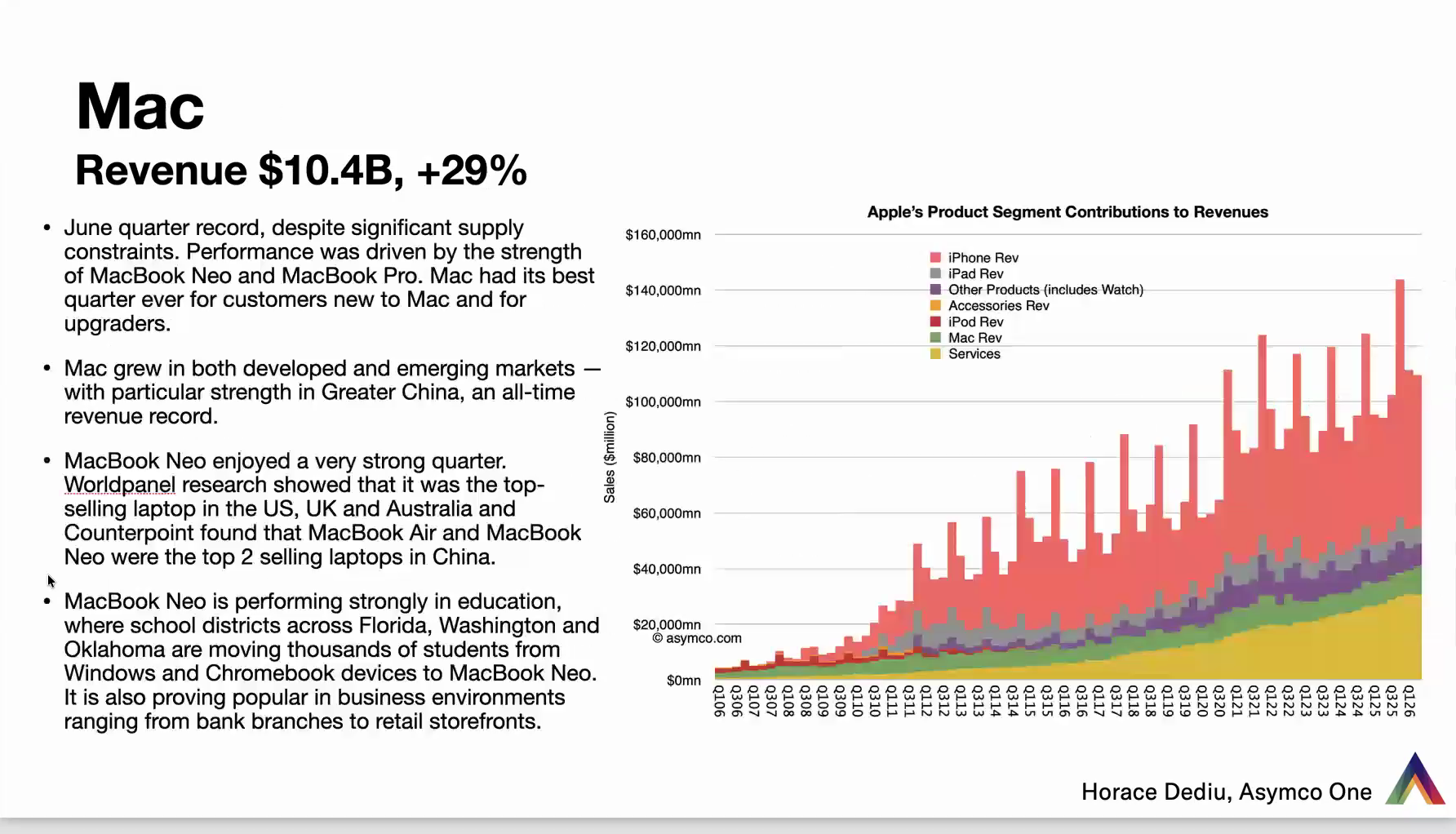
The Mac is hardly a ripple on this scale, but the Mac is also seeing an obvious secular surge right now. According to IDC — and not just IDC, many others are reporting the same thing — there are share gains around the world on all these products.
Back to the Mac: $10.4 billion, 29% growth. They repeat that the MacBook Neo was a big driver. A lot of skeptics would have said it's too cheap to make a dent, it's low margin, it's not available in large enough numbers. But clearly management has highlighted it as the driver, plus the MacBook Pro, and it's driving enormous growth: over $10 billion in a quarter that is not the holiday quarter. They also gave anecdotal evidence about the MacBook Neo being used in retail and in education, replacing Chromebooks and Windows. Nothing new there, but they are confirming a lot of the assumptions people had.
iPad & Wearables
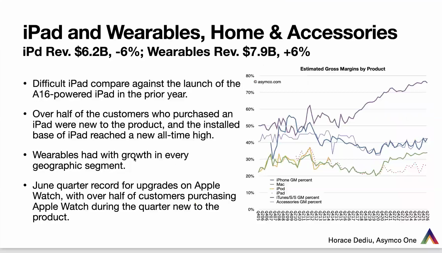
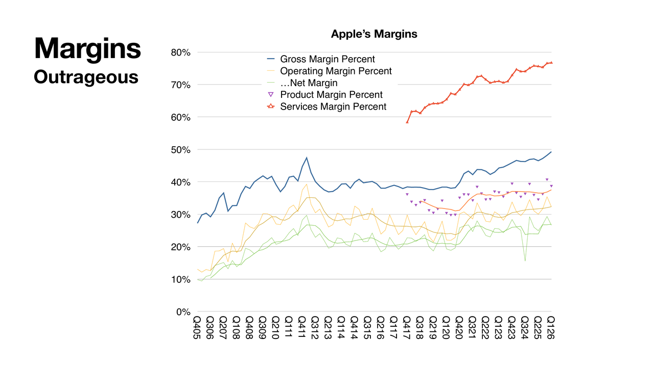
iPad revenue was down, as I mentioned: $6.2 billion, about −6%, on a tough compare. Wearables, Home & Accessories revenue was $7.9 billion, up 6% — a decent amount, actually; it hasn't been growing a lot lately. I also have gross margin estimates on an individual product level. From my deductions (Services margins are not a deduction — everything else is), the margins on the iPhone are holding around 40% and actually growing slightly on average. The Watch, apparently, is doing really well, growing with new customers as well.
Services
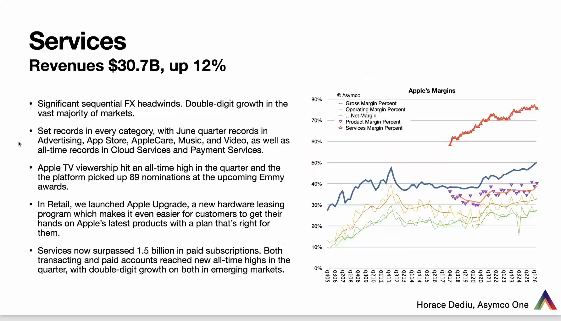
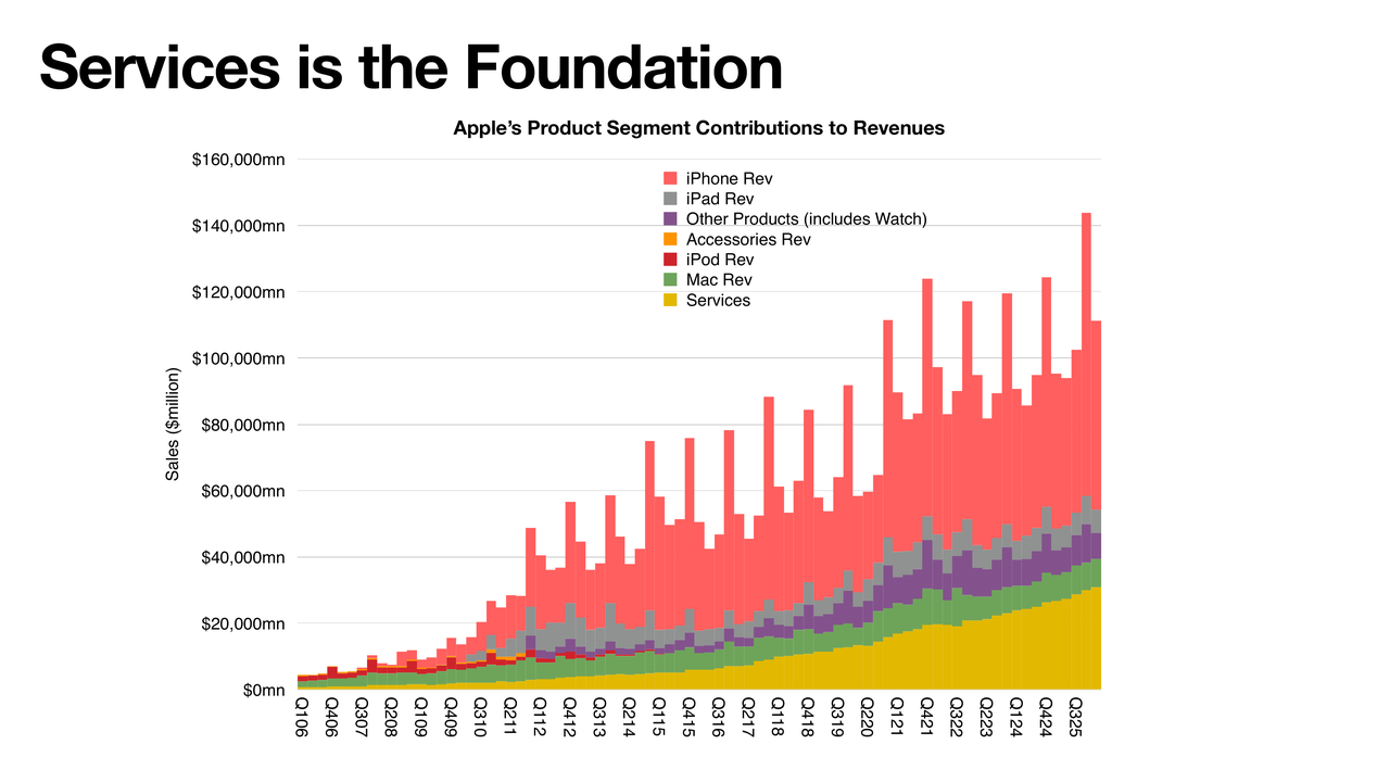
Services was $30.7 billion, up 12%. There were a lot of estimates above 15%. I think they guided pretty close to this, but they missed due to sequential foreign exchange headwinds. This seems like something you could hedge against, but apparently there was a missed anticipation there.
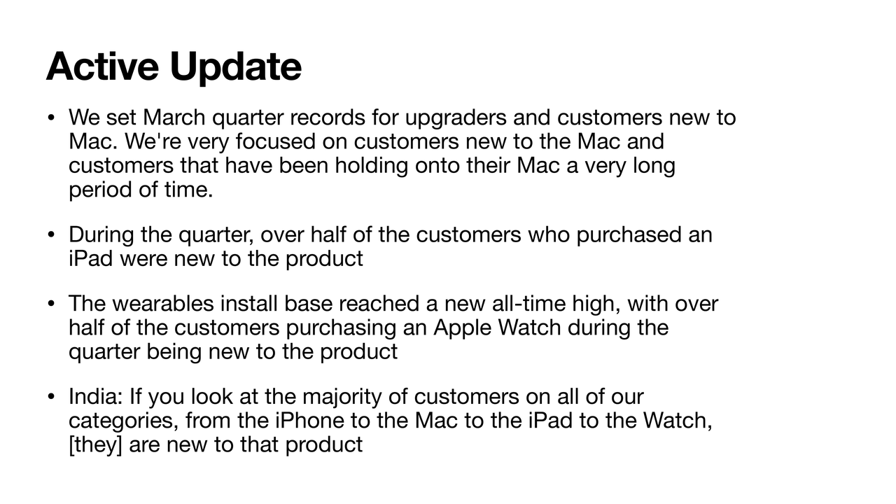
But the bombshell was that they reached 1.5 billion paid subscriptions. This was not a figure we've received an update on since they hit 1 billion, which was a couple of years ago. Everything since has been an estimate on the trajectory we had. 1.5 billion paid subscriptions — this includes Apple's own services, but also third-party services that Apple manages through the App Store. It's significant. It is possibly coming close to the number of users out there, which is probably 1.4 to 1.5 billion. And it's to be contrasted with the trajectory of growth in active devices, which since January has been at 2.5 billion.
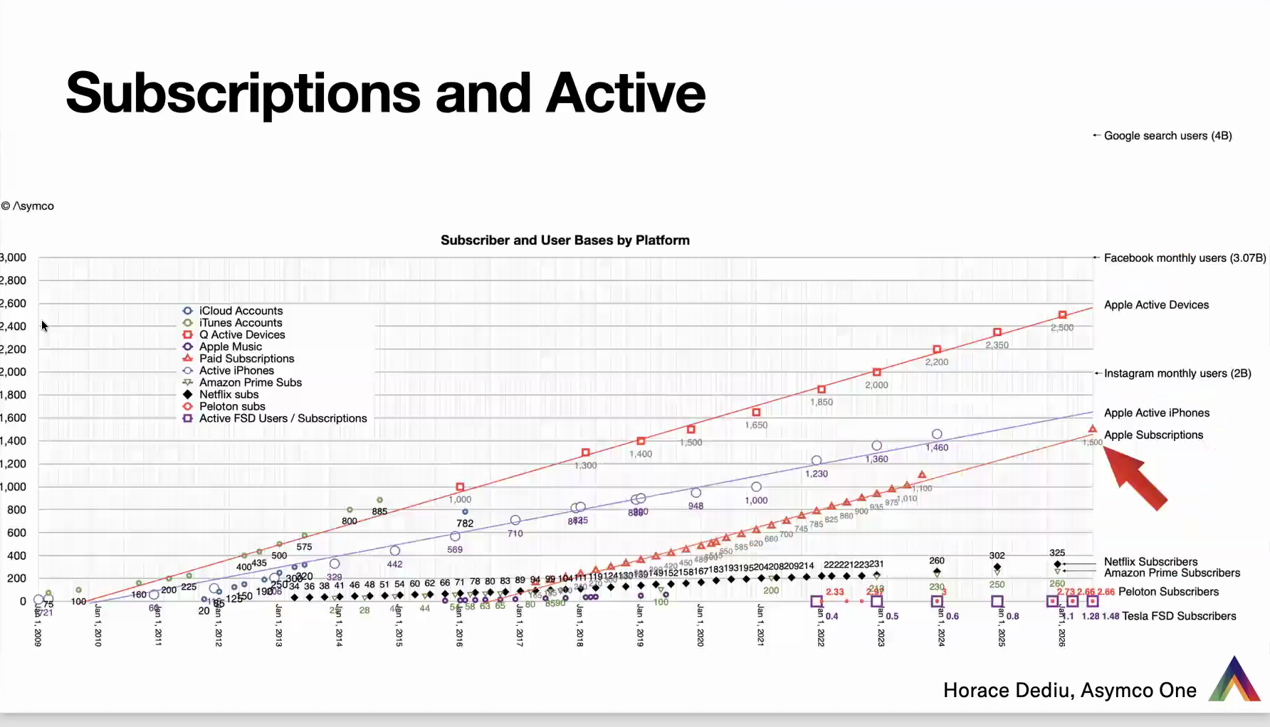
This is a famous graph in the sense that it's been maintained for many years — a decade even. It's every data point Apple ever shared about the number of users it has: everything from iCloud accounts to iTunes accounts, active devices, even Apple Music (some of these are no longer reported). I've also mixed in third parties: Amazon, Netflix, even Peloton, and — based on a suggestion I received — Tesla's FSD subscribers. I've also added, as data points, Google search users (about 4 billion) and Facebook monthly users across all properties (about 3 billion). Below the active devices trajectory crossing 2.5 billion, we have Instagram monthly users at 2 billion, then an estimate of the iPhone base, and below that, with the arrow, Apple subscriptions, just printed at 1.5 billion.
How does that fit the pattern? There's the line — and that line is pretty much dead on what we've had since the beginning of that data set. Compare that to Netflix and Amazon and we're talking about order-of-magnitude differences: latest data, Netflix subscriptions were 325 million and Amazon Prime 260 million. Peloton has not moved much at 2.6 million. And there's a lot of pride among Tesla fans that FSD has reached 1.48 million. That's one 1,000th of Apple subscriptions. I'm not saying it's a bad thing, but it's in a different category altogether. The big question, again: can we use this to project? Is this linearity going to continue? As far as I can tell, since starting this more than 10 years ago, it has been holding.
Supply Constraints
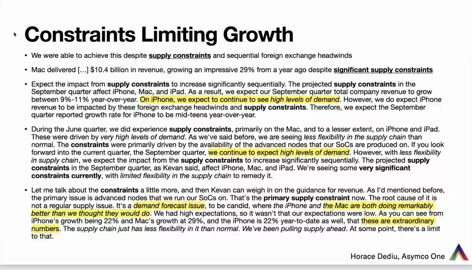
This is a very wordy slide because I picked up a lot of text from the conference call — direct quotes from Tim Cook and Kevan, the CFO. I've used bold to identify supply-constraint citations and highlights for the points about demand. Let me summarize: supply constraints are the primary reason they are unable to project growth similar to what they've had before. The reason for supply constraints is that there's excess demand.
As Tim Cook said in response to a question: we had high expectations. It wasn't that our expectations were low. But as you can see from iPhone growth of 22% and Mac growth of 29%, these were extraordinary numbers. The supply chain just couldn't cope. They've been pulling as much supply forward as they could, but at some point there's a limit. By the way, one of the places this shows up is in inventories, which have increased significantly — Apple has pulled a lot of inventory and pushed manufacturing as much as they could to take advantage of the imbalances that are present.
I encourage you to read through, or even search, the transcript for instances of "supply constraints" — this is not even the full set here. And on and on about high levels of demand: "We continue to see extremely high levels of demand. The Mac and iPhone are both doing remarkably better than we thought." The demand is there, and typically with Apple products, if the demand isn't fulfilled, it's delayed. We've had this situation before, especially at the beginning of the iPhone: it was very much constrained on production and supply, and the demand was persistent. It kept going.
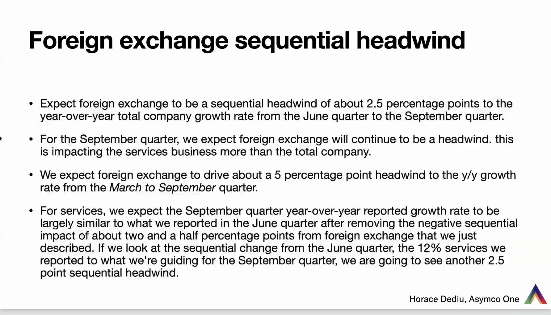
The other, more subtle thing is foreign exchange headwinds — a terrible, jargony phrase. It simply means that if people are paying in a foreign country for product or services, they're paying in local currency. If that currency dropped significantly against the dollar, Apple's getting paid less in dollars, and they report in dollars. From a European perspective, the euro hasn't weakened very much, but in Asia there's been a lot of turmoil — we've heard quite a bit about the yen. I haven't dug into all the currencies Apple is exposed to, but if they're feeling this much pain — two and a half points of so-called headwinds, especially against Services — this is something they felt they needed to highlight. And they have, rather cryptically, put forward that this will impact next quarter as well, to the extent of another 2.5%.
So those are the two primary excuses: first, we can't meet demand, especially on the SoC — the system on a chip, their main processor, which cuts across multiple products — and on Services, because of the foreign exchange headwind.
Capital Returns: Stronger Than Ever
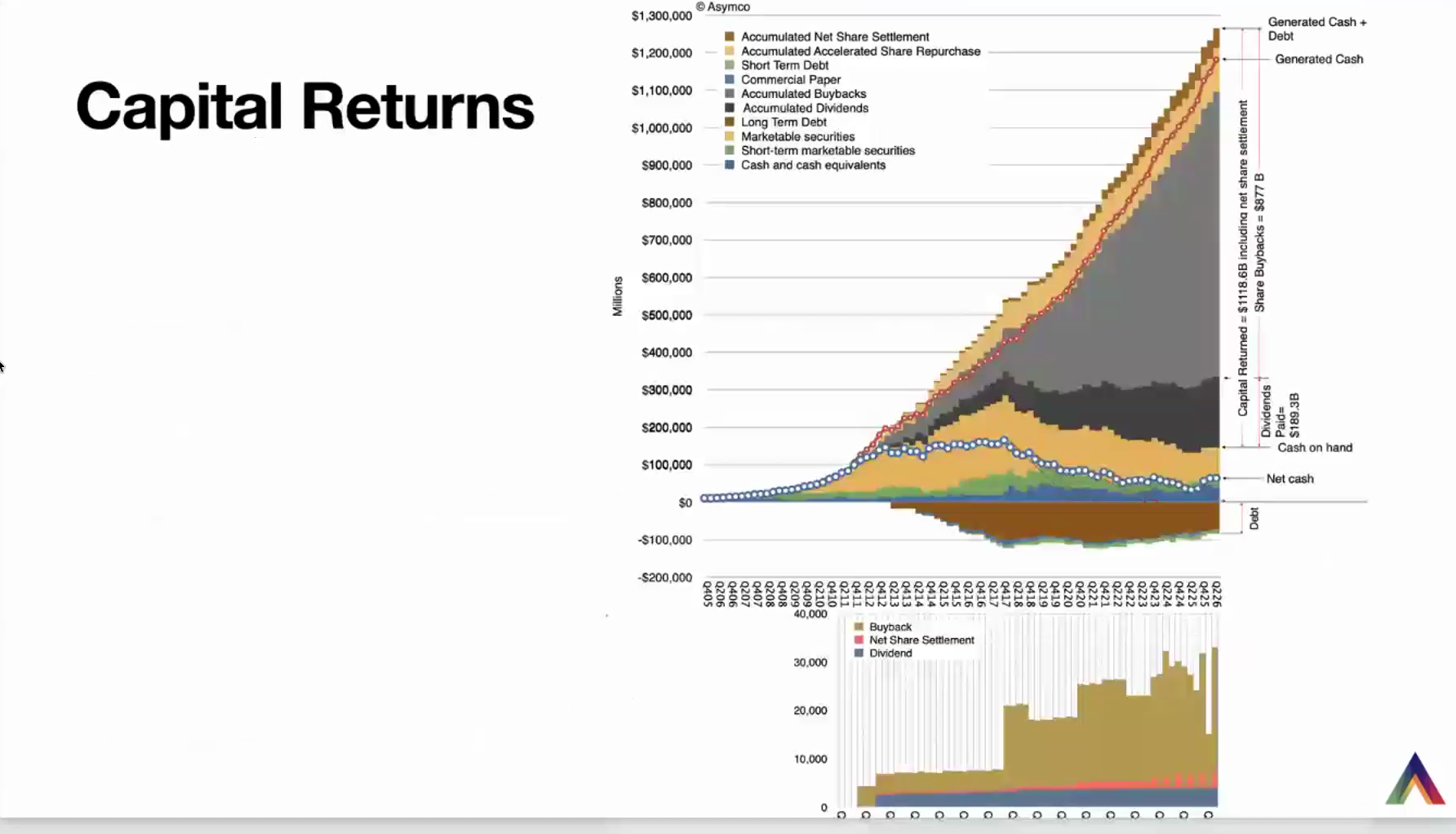
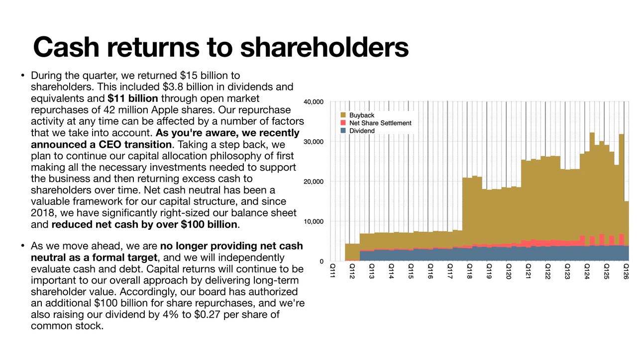
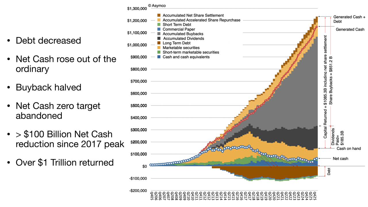
This incredible money mountain graph shows generated cash and capital returned (the gray sections): Apple has generated cash flow of $1.2 trillion for its shareholders and has returned $1.12 trillion of it. It holds a decreasing amount of debt — very low interest rate debt, and it seems they're not raising more as rates have changed; they seem to be paying it down. Net cash is holding flat. They said last quarter that they will no longer be targeting net cash zero. We only have two quarters of that to see what happens, but there's the trend.
Below that, a new graph: the split, for every quarter, of how capital is returned — buybacks in an olive color, net share settlement (a little obscure — it seems to have been constant, now a little more lumpy), and dividends, which have been growing as consistently as ever. As you can see, there was a period last quarter where there was a disturbance in the force, so to speak — the buybacks seemed very weak. But we're back to full blast, and I think the highest ever in that regard.
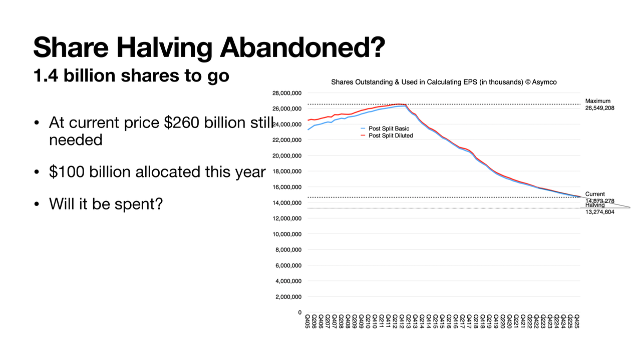
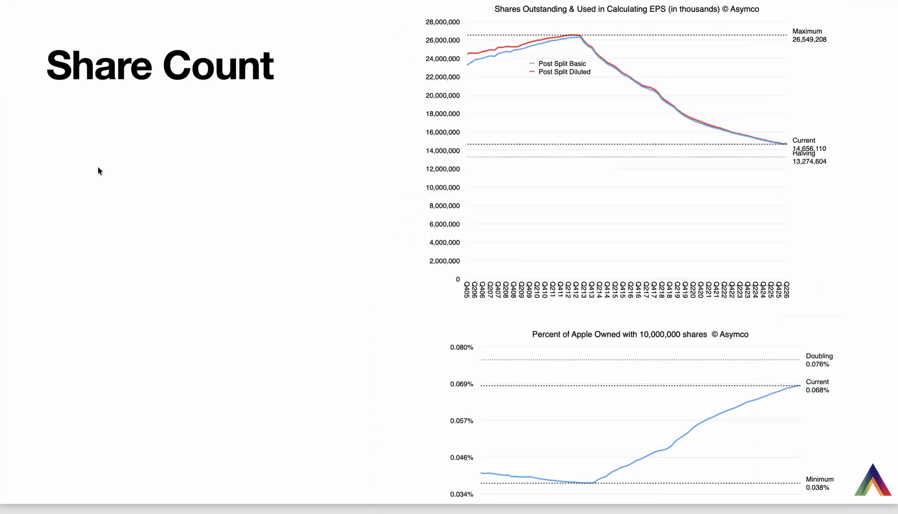
As a result, the number of shares outstanding is decreasing — less rapidly than it used to, which is mathematically understandable: as the shares increase in price, you cannot afford to buy as many as you used to. In the good times, when the market was oblivious, shares were cheap, and the steepness of the curve was far higher. But we're still heading towards what I call the halving point — targeting 13.27 billion shares, half the number since the beginning of this capital return program. And the graph below that shows your percentage as a shareholder — indexed to, say, 10 million shares — your concentration of wealth going up.
The Growth Scorecard
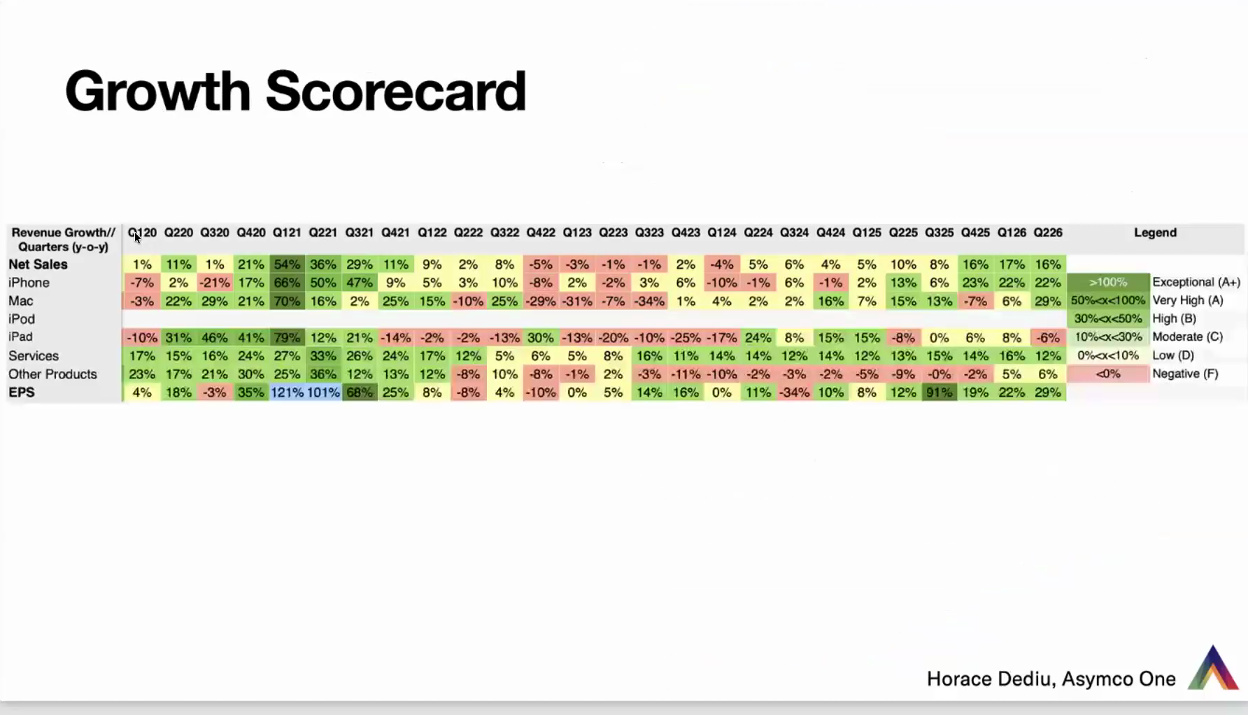
This is a table that is very long — this view goes back to 2020. Every quarter has green, yellow, and red indicators, from net sales at the top to EPS at the bottom and every category in between. We're looking to see green across the board. Dark green is super-fast growth — we saw those back in Q1 2021, in the middle of COVID, that whole area of green. The bottom line was even above green — above 100% turns blue in my algorithm. When you look at the latest, we actually had a better-looking quarter, I think, than the one before. The Mac turned from moderate to very high growth. Going forward, I think these are going to be closer to 10% than 20%, but I think it's green into the next quarter as well.
OpEx: The Cost of AI
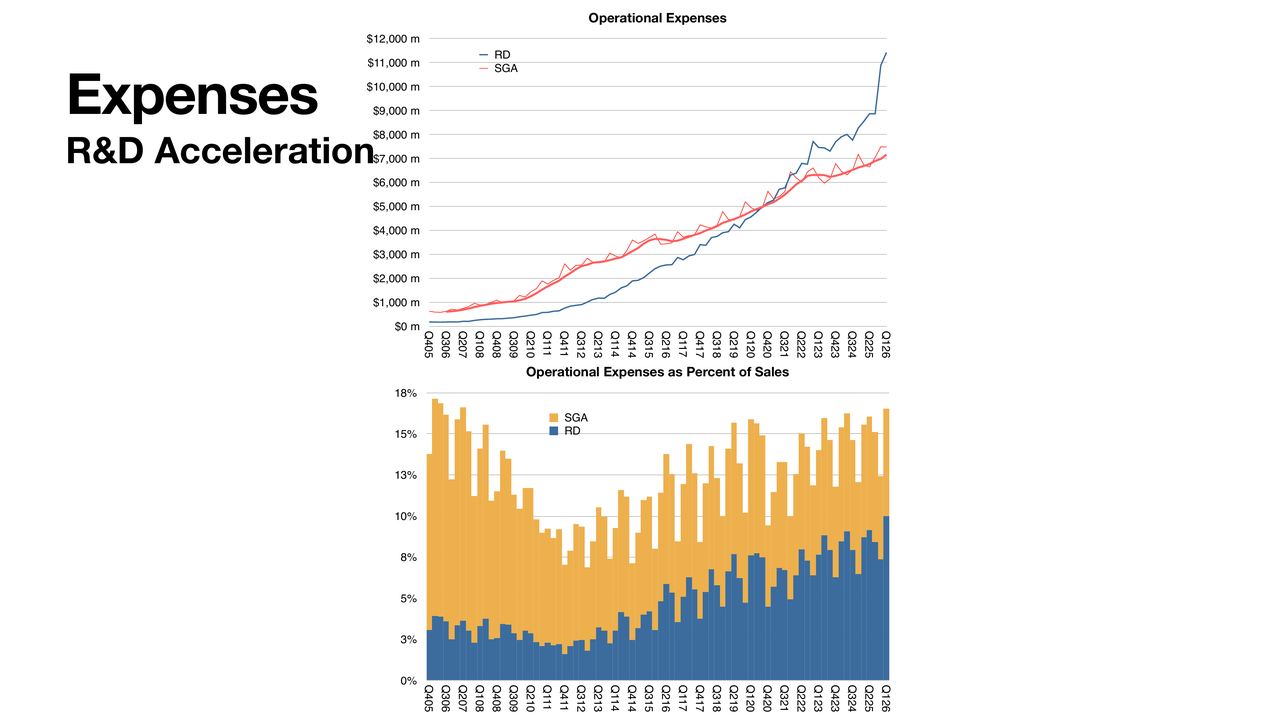
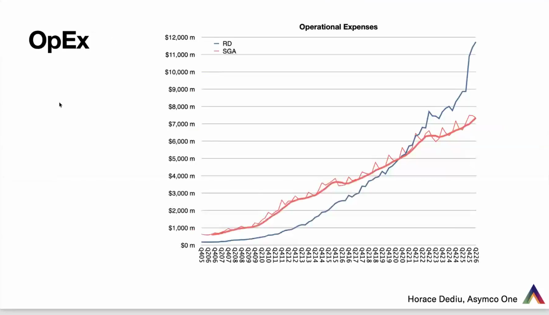
On the cost side: SG&A relative to R&D — together they make up OpEx. R&D has overtaken. Back in the days of Steve Jobs, R&D was far lower than SG&A. That flipped around 2020, and now what we're seeing is incredible growth. I think that's their allocation to AI. It's not just research — I think a lot of the costs baked into AI development are going into R&D for Apple. Since it's core to their business, they can book it as research and development — similar to Amazon putting almost all of their engineering into OpEx, because for them, all of that is not core to retail.
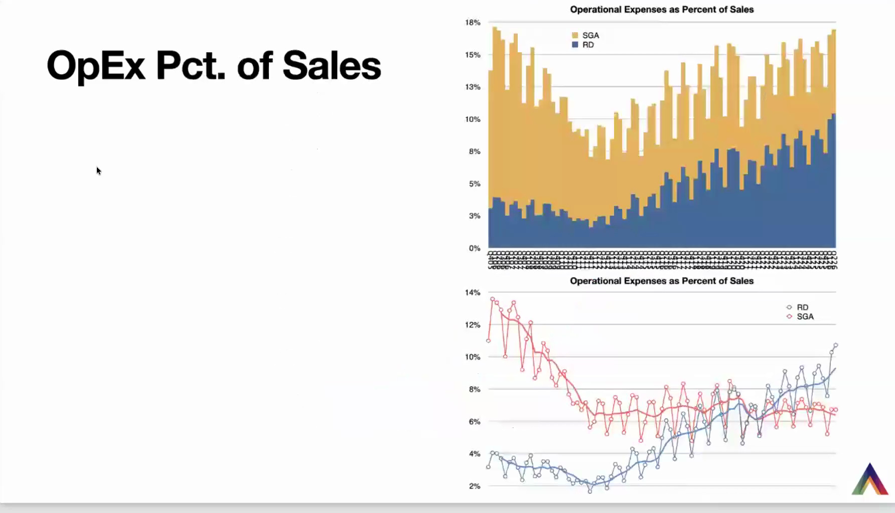
We are seeing the surge, but perhaps a slight tapering off on the rise. As a percent of sales, the two together are reaching higher and higher, closer to the all-time peak of 18% — again, back in the days of Steve Jobs. It's not outrageous, but it is something to keep an eye on. R&D alone reaching about 10% of sales I consider a little bit excessive, but it is the nature of the business today, especially with respect to the need to do more pure research on the hardware side, and on the software side with AI.
Valuation
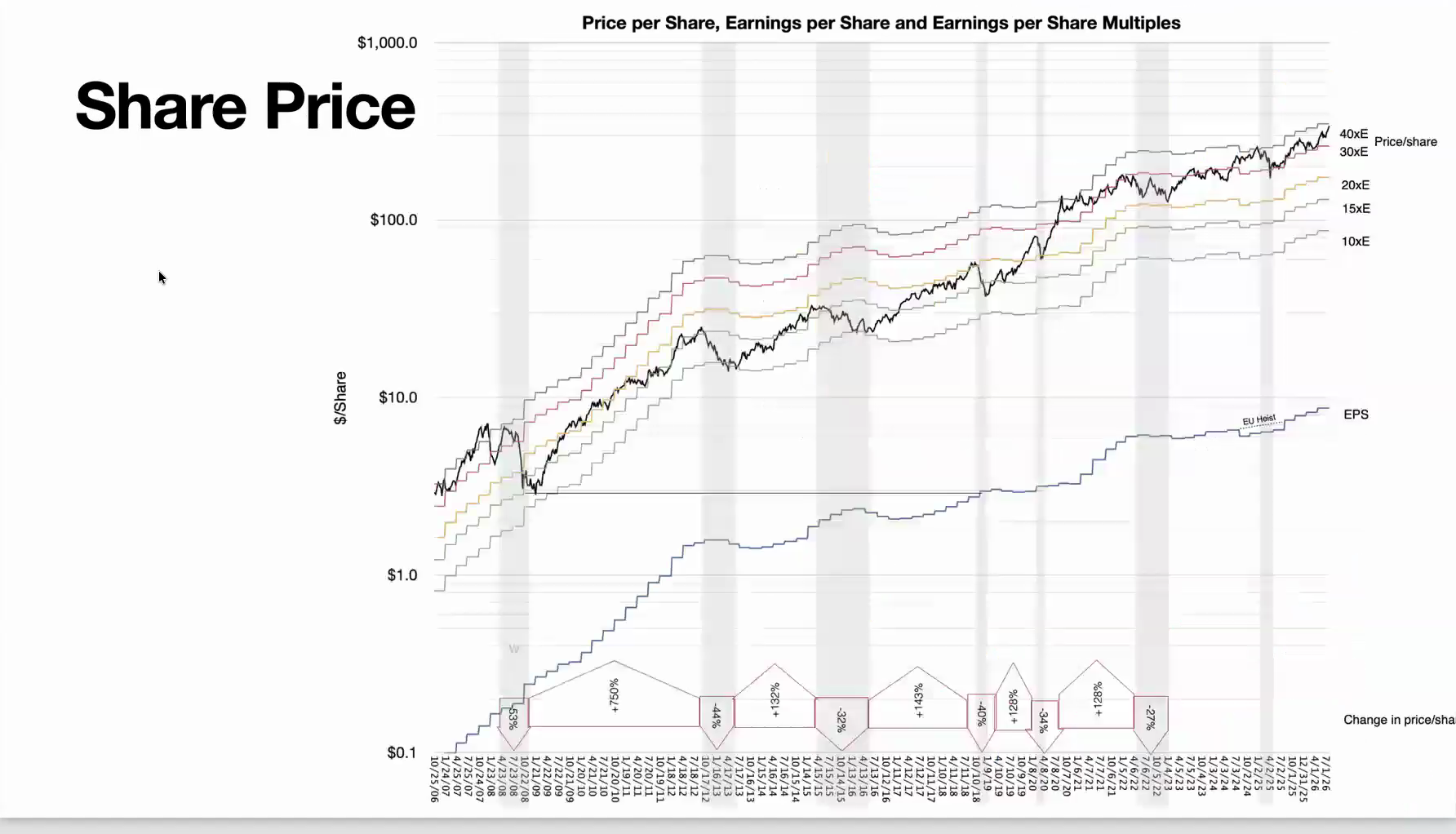
This is one of those graphs that's hard to process, but very rewarding. What we see here is EPS (trailing twelve months, now about $8.70) as the blue line, and multiples of that EPS as parallel curves above it — note that it's a log scale. The black graph is Apple's price per share. Apple touched 40 times earnings. As we speak — I checked a couple of hours ago — it seems to have come down to 34, because the share price fell, but also because earnings went up a bit.
Historically, it seems to bounce off these upper bounds. Around 2010, it was bounded by a P/E of only about 20 — hitting that and bouncing down. We've seen that migrate up to about 40 now, and we've had three episodes hitting P/E 40, with some pullback each time. I'm not here to predict what's going to happen, but it does seem it's a bit bound by a multiple. That's not to say it can't change — we can see euphoria, we can see faster growth rates justifying it. But we also have situations where companies growing very rapidly with very low P/Es slip dramatically in one day.
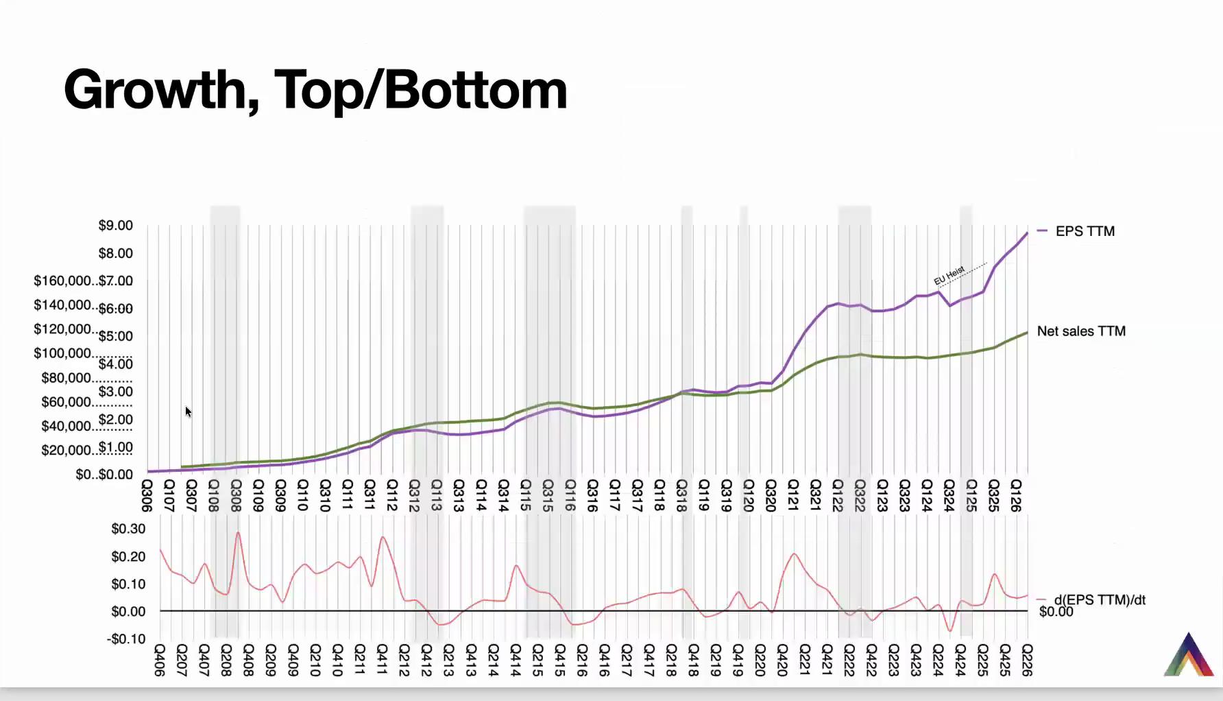
Same view with the drawdown bands carried over: plotting EPS and net sales on a TTM basis, we see the correlation, and the oscillation — product cycles in there. We have a drop due to what I call the EU heist; had that not been there, we would have seen a different picture. Nonetheless, TTM EPS is growing very, very robustly. And its change — the delta in TTM EPS — is the red line below it. You can make your own conclusions about whether it indicates or precedes the share-price sell-offs, but it is at least one indicator of how the company's doing.
Apple Upgrade: A Preview
I want to spend a few minutes on Apple Upgrade. I think this is going to deserve its own hour's worth of conversation. I had done this work prior to earnings and haven't published it yet, so I'll give you a preview and run through it fairly quickly. I think this is one of the most extraordinary and exciting developments with Apple.
They say that necessity is the mother of invention. But return on invested capital is the mother of innovation, is what I like to say. And in this case, what we're witnessing is innovation. This is nothing more, apparently, than packaging of an existing product with new ways of buying it, new ways of financing it. But boy, is this thing a great idea. It makes it so much simpler for people to make decisions on Apple products. Unless competitors are able to replicate this perfectly — and there are a lot of questions about that — I think Apple is going to make a tremendous impact with this. Of course, it needs to go global, it needs to scale, it needs to be well communicated. And it must not fail due to other factors — for example, rates of delinquency. I'm not an expert on this.
One of the things I've wondered for many decades was: why doesn't Apple do this? And I kept coming to the conclusion that it's very hard to do. This is hardware as a service. I don't want to buy a phone; I want to use a phone. As the old saying goes, people have a job to be done: I don't need a drill, I need a hole in the wall. What Apple was offering with the iPhone was: pay $1,000 upfront and you can get all these jobs done. But most people don't care about the product so much; they just want to get things done. And here is a way to package that proposition and say: for $33 a month, you can get it done.
The subscription makes perfect sense. A lot of people read too much into it as some sort of magical thing, or evil thing. It's just convenience. Tremendous convenience. The old way of calculating the cost per day was: you pay $1,000, and then maybe after two or three years you tire of the product, or you want to upgrade, and then you find a way to sell it — maybe Apple trades it in, maybe a third party, maybe you give it to a relation or a friend. All of these were possibilities, but you had to do a lot of calculation in your mind. Well, this is very plain and simple now.
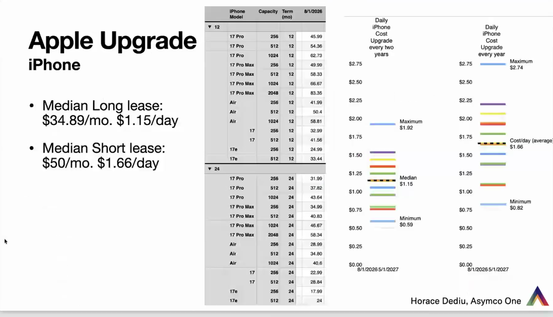
What I did is I went through the website and got every single configuration that has a price on it, and put it in a spreadsheet. This is just the iPhone, split into the 12-month lease and the 24-month — I call these the short and the long term. For each product, I took down the price, forwarded to August 1st. The thing to do is to track this and see whether it changes. We know that with the iPhone as it is, once they set that price in September, it doesn't change for the full year — they've never moved it. But here we're seeing the potential for Apple to tweak this on an ongoing basis.
Also notice that each price is down to the penny. This isn't $9.99, some feel-good price known to resonate. There are some in here that are essentially $18.01 per month — one cent. We see 67 cents, 35 cents, 56 cents, all over the place. These are very carefully chosen. These aren't chosen by a marketeer who says this is a feel-good price. These are chosen either because of the cost, or because of the knowledge of what the product can do.
To summarize: the median long lease for the iPhone is $34.89 per month, or $1.15 a day. The median short lease — only a year — is $50 a month, $1.66 a day. A very simple proposition: 34 or 50. On top of that comes the carrier plan, which is probably another similar amount. It makes a lot of sense to me, and I would love to do this, because if I commit to two years, then I know I'm going to get a new one after it's over. Nothing new, nothing special — it's just packaging and convenience.
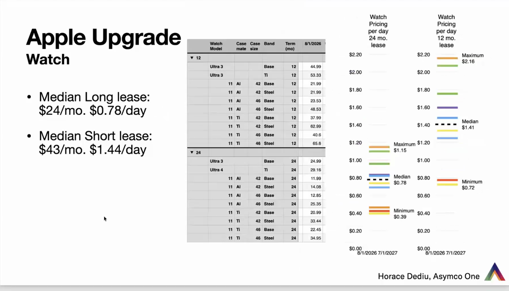
Jumping through the others quickly: the Watch is $24 a month, or 78 cents a day, on the long lease ($43 a month, $1.44 a day, on the short).
The iPad, it turns out, has a lot more configurations than the iPhone — it's the most complex, having to do with different displays, not just memory. The median for the iPad is $32 a month on the long lease, or $1.05 a day, and $36 a month, $1.18 a day, on the short. (By median I mean the price band halfway between the top and the bottom — half the prices above, half below. It's not the average; it shows where the midpoint is.) It comes out to about a dollar a day. The lease terms are slightly different for the iPad: 24 months is the short and 36 is the long, and the same with the Mac.
Mac prices surprised me — this is the first time I've done this exercise — but it's $44 a month median on a long lease ($1.45 a day) and $61 a month on the short. You could present this and say: if you want to get into a Mac, you can go as low as 82 cents a day. Or if you want to max out your system — some options cannot be put on a lease; they're purchase-only — a more or less fully loaded Mac Studio goes up to $5 a day.
I find these numbers extremely exciting, and most people, when they see them, cannot believe it. When I presented some of this on X, on Threads, and on Mastodon, people said: how do I sign up? How is it possible I can get a Mac for this little money? This is how people are going to react. Nobody believes it — they think it's a $5,000 product at the top end of the Mac scale.
I think this is very compelling. I think it's innovative because it makes it easy and convenient. Many critics said: if you do a lot of mental arithmetic, you'll probably realize you'd maybe save $15 going a different way; if you just want convenience, this is convenient. To which I'd respond: who's ever known anybody who cares about convenience? Obviously this is going to fail. Convenience is so important. People pay huge amounts of money for it — probably 20% of the economy is trying to deliver convenience to people. It's what credit cards do, it's what Apple Pay does. And it just is phenomenally resonant with consumers. It's not hiding anything. It's all transparent. You don't pay that much more — it's actually 0% financing in effect. You don't own the product, but who cares?
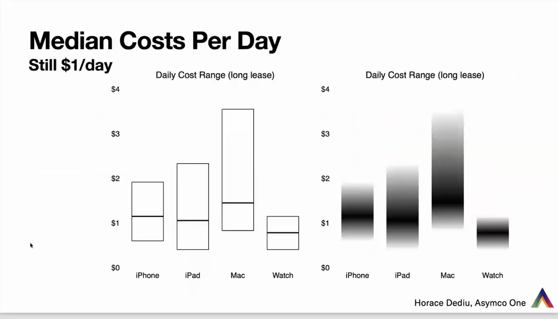
One summary slide on this. Across all these products — iPhone, iPad, Mac, and Watch — the median daily cost sits right around the $1 line. A little higher here ($1.10), $1.05 there, 78 cents for the Watch. Remarkably consistent. When I wrote this story about a dollar a day, maybe 15 years ago — prompted by Jean-Louis Gassée, by the way, who asked me one day over dinner: why don't you take the value of a Mac and divide it over its lifespan? — I did it for the iPhone, and lo and behold, it was a dollar a day. That would have been 2010, '11, '12. And it's still a dollar a day.
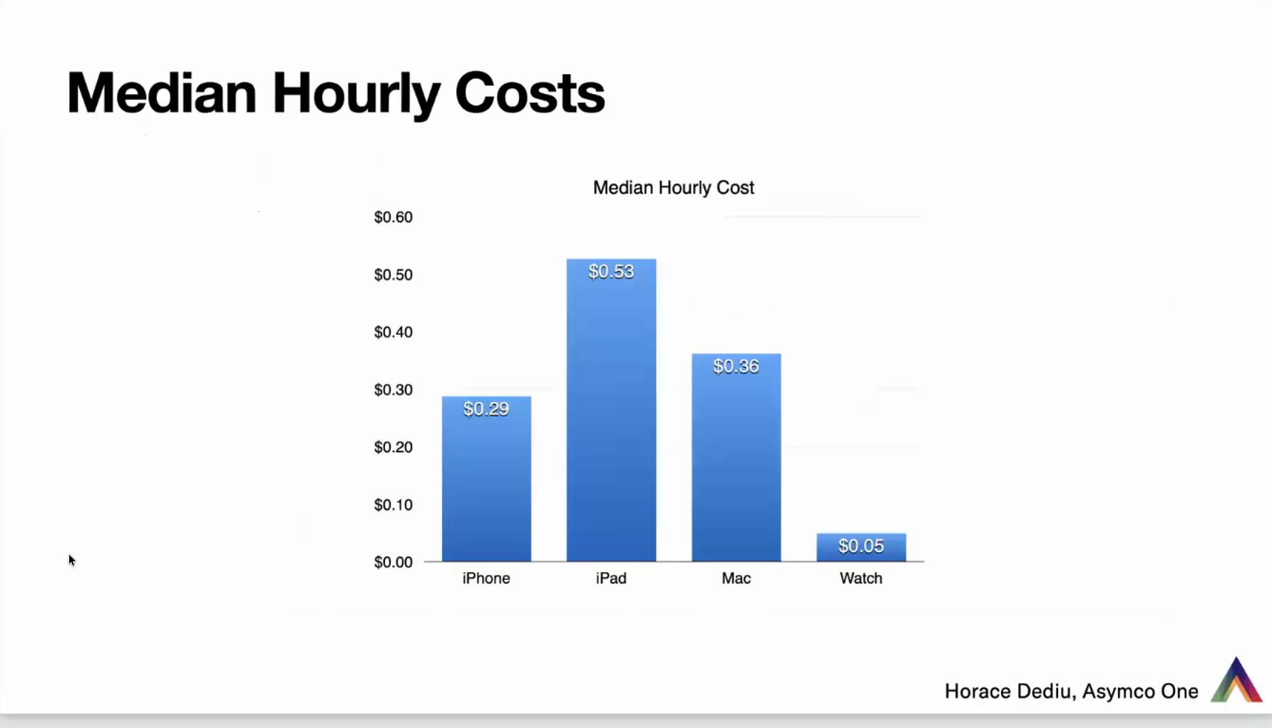
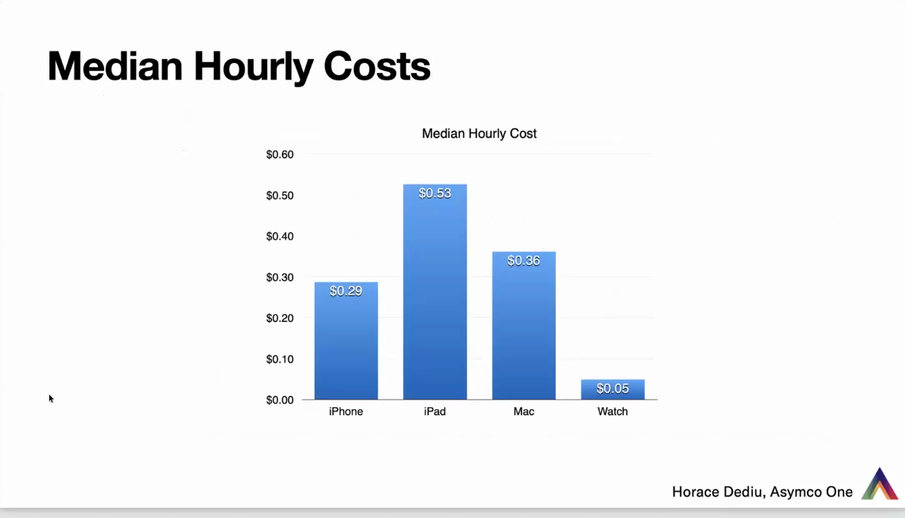
On top of that, you could ask: how many hours do you use this? That's one more graph — the cost per hour. The iPhone is used four hours a day; take that as an estimate. The average usage of an iPad is lower per day, therefore it's more expensive per hour. The Mac has a higher number of hours, but the product is more expensive. So we're looking at about $0.30 per hour, on average.
We could go a step further and ask: what about the number of times I use the product? It's hard to know how to measure the Mac, but in the case of the iPhone it's easy, because you can get it through your iPhone itself in Screen Time — it's called pickups: how many times you picked up the phone and turned it on. That number is about 100 on average. (It used to be 80; it's going up.) You can find out your own, take the amount you spend on a daily basis, and divide it yet again by the number of uses. The iPhone comes out to, if it's a dollar a day, about a penny per use. A penny each time it's unlocked.
And not only is this important from the consumer's point of view, it's a way to define the proposition of value for the whole company. Take every instance of use, multiply it by the number of people using it, multiply it by the number of days in a year, and you start to see how many transactions, how many interactions, and how many pennies add up to the value Apple creates. It's an absolutely phenomenal way of doing unit economics for the iPhone.
-- End of Presentation --
Editor's Note: This presentation is made available to non-subscribers for a limited time. Subscribe to Asymco One for full access to this and other content.