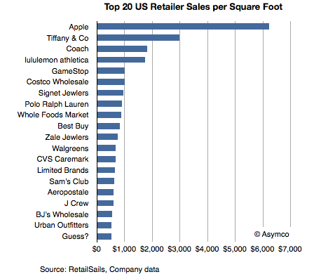
Thanks to RetailSails we have some data on retailers in the US which can be used to calibrate the performance of Apple retail. RetailSails compiled a table of the top 20 chains by sales per square foot (annual basis). The total sample was 160 American retailers (excluding restaurants) that publicly report results.
Sales per unit area is a standard and usually the primary measurement of store success. Here are some benchmark figures:
Annual store sales in the range of $300 per square foot is considered respectable in the US.
The US national average for regional malls is $341.
The average for specialty apparel retailers is $400 per square foot.
The average for jewelers is in the range of $600 per square foot.
The median for the best 20 US retailers is $787/sq. ft.
The data for the top 20 is shown in the following chart:
The data shows Apple leading by a significant margin. It's more than twice as efficient as the second place Tiffany and Co. It's also more than seven times the median of the top 20 and seventeen times better than the average mall retail space.
Note also that this data includes only physical retail and excludes e-commerce, catalog or services revenues. It should only be used to compare physical retail performance.
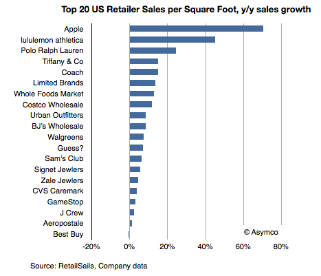
The achievement is also remarkable when measuring growth in overall sales.
Apple leads in absolute performance but also in growth.
Note also the performance of electronics retailers that might be comparable to Apple. Only Best Buy and GameStop are on the list, but their growth is among the poorest, with Best Buy going in the wrong direction (data was current as of August 2011).
We'll be getting an update on Apple retail at the next earnings call in a few days. To read more about Apple retail see:
Nokia currently estimates that Devices & Services net sales in the first quarter 2012 were EUR 4.2 billion, comprised of Mobile Phones net sales of EUR 2.3 billion (71 million units), Smart Devices net sales of EUR 1.7 billion (12 million units),
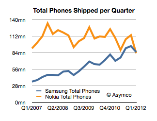
We don't have the total number of Samsung shipments, however estimates exist. They range between 41 and 44 million smartphones and 44 and 47 million feature phones. The low end of that range would imply Samsung shipped 85 million phones.
Nokia's press release indicates that it shipped 83 million.
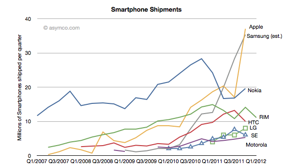
This would be the first quarter that Samsung beat Nokia in total phone shipments. It had already overtaken Nokia in sales volume and profitability last year but this is the most cited metric of market performance: being the biggest in volume. Here is the tale of the shipments:
How did this happen?
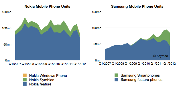
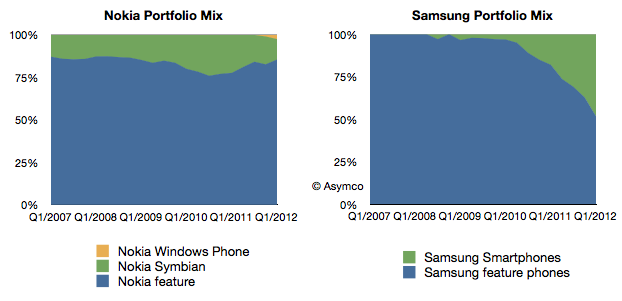
The answer should become visible when we look at at another set of data. If we split the smartphones from feature phones the charts look like this:
Looking at product mix, Samsung growth is shown to be almost entirely due to smartphones while Nokia's stagnant growth seems to be a failure to have any smartphone traction.
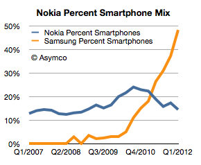
It's even more clear when showing the above mixes of devices as percents of total.
As a percent of total, Nokia has shrunk its smartphone business from a peak of 24% in Q3 2010 to 14% last quarter. In the same time frame Samsung's smartphone share of portfolio has exploded from 10% to nearly 50%.
Note that both companies have seen non-smart device volumes contracting. Samsung's level is approximately the same as it had in late 2007 and Nokia's is lower than at any point in the last six years (perhaps longer).
So the answer to the question of how Samsung beat Nokia is told in the following chart:
Samsung was able to convert its portfolio to smartphones while Nokia failed to do so. This is the sort of transition that can only come about from an explicit strategic intention on the part of management. Market demand can steer you in any number of directions, but a vision of a future should provide the compass for making the big bets.
The bet Nokia made many years ago was that there would be a continuing, substantial business in the "low end". And low end meant feature phones. This strategy was still in evidence last year under the moniker "the next billion" users. The decisions were not driven by whether the products would be hired for different jobs, but that they would hit different price points. In other words, segmentation of customers by their ability to pay for devices rather than categorization of the jobs they hired mobile devices to do.
Perhaps Samsung was no wiser, but they were more pragmatic. Being non-dogmatic meant being flexible. They ran with off-the-shelf technologies and managed a transition to smart devices faster than anyone expected. It may not be a perfect strategy but it beat a bad strategy.
In August 2007, during the HD format wars between HD-DVD and Blu-ray format, Toshiba offered Paramount and Dreamworks $150 million to produce HD versions of their movies exclusively as HD-DVD.[1]
This type of deal is equivalent to an "advance" offered to a book author. The DVD manufacturer pays studios up-front cash for the right to make its DVDs. From an accounting point of view this is treated as an advance that the manufacturer recovers by selling the DVDs back to the studio's video division in the same way a publisher earns back the advance it gives an author.
In this case, the payment was so large and the sales of HD-DVDs so small that Toshiba was unlikely to earn back the entire advance. The way the deal made any sense for Toshiba was that it was exclusive: the studios could not continue to release their movies in Blu-ray. The deal was done explicitly to hobble a competitor and create "critical mass" of content for its own format.
But then in March 2008, Toshiba threw in the towel and abandoned the HD-DVD format. The way the deal worked, the studios got to keep almost all of the $150 million. They then re-released all their movies in the Blu-ray format. The only "cost" to the $150 million windfall was that there was a nine month delay in the eventual release to Blu-ray--a small price to pay for an emergent format without a large install base.[2]
Platform owners go to great lengths to ensure "content" for their platform. They will, essentially, finance an ecosystem when there are barriers to entry or when competing ecosystems are far more lucrative.
This scenario for movies is being played again with Netflix, Hulu and other distributors who need to fill their pipelines. Netflix's content acquisition costs are exploding and putting the whole company's future in doubt.
But this scenario is also being played out with app developers. Most recently, news broke that developers are receiving payments from Microsoft for Windows Phone ports of popular apps. In mobile platforms, apps are the new content and developers are the new studios. It's also a practice that is not without precedent[3].
This is as it should be. The value of the platform lies mainly in what is built on top of it just like a foundation is not much use without a house on it. However, the practice of "priming the pump" with cash payments for porting is not ideal. Like spiffs, those who receive payments may become used to it and withhold development if there is no payment. Also, those who did not get payment offers may feel shunned and retaliate in kind. Those who receive payment may become cynical about it and may not put in the extra effort (or, more probably, outsource) to make the work spectacular.
Or, like Paramount, they may just take the money and run if/when the platform fails.
Paramount made $250 million more from three "replication output" deals: $50 million from Toshiba for agreeing to release Titanic on DVD in time for Christmas sales, $150 million from Panasonic for agreeing to allow them to take over video replication from Thompson, and $50 million from the law firm Ziffrin, Brittenham and Circuit City stores for agreeing to support the DIVX format. Paramount got to keep the money even though DIVX never launched.
Although it's never been reported that Apple pays developers for building iOS apps, some developers do benefit from promotional placement and visibility during launch events and from early access to devices or SDKs under development.
Canaccord Genuity analyst Mike Walkley writes in a note to clients today. “In fact, we believe iPhones are outselling all other smartphones combined at Sprint and AT&T and selling at roughly equal volume to all Android smartphones at Verizon.”
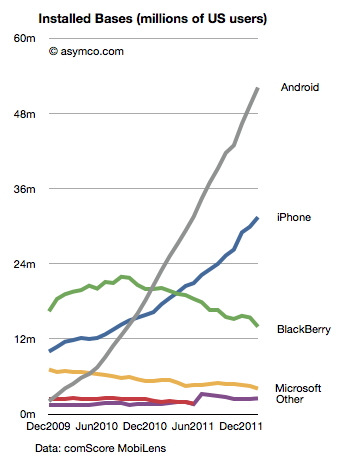
That's useful data. Mainly because we can use it in combination with comScore data that tracks a different market measure. comScore's MobiLens service tracks US mobile installed base. By measuring the difference between their stats one month to the next, one can measure the gain in a particular platform.
Comparing that gain with the sell-through rate in the same period can yield a figure for the number of units sold as upgrades vs. those sold to new users.
The latest comScore data (period ending February) shows that Android added 2.87 million users to its base while iPhone added 1.52 million. If we assume that Android sold a minimal number of replacements (due to the limited time in use of bulk of units) and round up to 3 million for February, and if we assume that Apple sells as many iPhones as Android (which is what Walkley suggests) then we can conclude that in the US roughly half the iPhones are bought as replacements for existing iPhones.
Extrapolating this to global markets may be risky but already we can begin to form a picture of how the iPhone franchise is becoming an annuity-based business.
Apple likes to point out that "half of Mac buyers are first time buyers." In the case of the iPhone perhaps they could also say "half of iPhone buyers are repeat customers." At this stage in the platform, that's a powerful statement. If the repeat customer rate is high then it suggests strong loyalty but it also may suggest poor competitive position vs. non-consumption or alternate platforms. If the repeat customer rate is very low it may suggest competition vs. non-consumption but it may also suggest low loyalty. It all depends on the overall growth in the market and size of installed base.
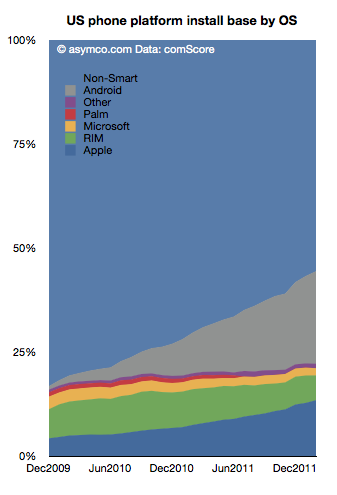
The following chart shows the overall market growth and the position of the various platforms within that growth.
Note the time scale is slightly more than two years. This suggests that the vast bulk of Android units in use (grey area) consists of first use units. New purchases are going to first time buyers. In contrast, the shrinking RIM total implies extremely low sales as the age of the base is far older than the time scale. iPhone base is both growing and being upgraded.
As we reach 50% penetration of smartphones, platform churn will become a significant component of market performance. The loyalty and "stickiness" of Android will begin to be tested. Current surveys show reasonably good satisfaction ratings for Android phones (around 60%) while iPhone's are even higher. But let's keep in mind that RIM's satisfaction and the loyalty of their customers was exceptionally high a few years ago. The rate of evaporation of goodwill toward the brand is breathtaking.
The longer term test of mobile platform performance will be in the recurring purchase rates. Loyalty must be earned and preserved. I.e. "You come for the product, you stay for the ecosystem."
So far, the iPhone seems to be getting a passing grade while Android has yet to face the test.
Charles Arthur, writing for The Guardian, has noted that court filings seem to be revealing Google's Android revenues. If this is the case, we have a significant breakthrough in understanding the economics of Android and the overall mobile platform strategy of Google.
The new data is a reference to a settlement offer Google made to Oracle of $2.8 million and 0.515% of Android revenues on an ongoing basis. The key assumption to make this data useful is that the $2.8 million offer represents 0.515% of revenues to date.
In other words, that revenues from 2008 to end of 2011 multiplied by 0.00515 results in $2.8 million. That implies that revenues from 2008 to 2011 were $544 million.
I think that's a fair assumption. I don't see why Google would offer a higher or lower royalty rate for years 2008 through 2011 than for years after 2011. The offer would seem to be 0.0515% in the future as well as retroactively in the past.
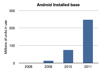
If we work with this assumption then the next question is how to distribute this $544 million over the four years 2008 through 2011? The installed base of Android has grown exponentially and it would seem logical to assume that revenues have followed in a similar pattern. Here is a chart of installed base given activation data supplied by Google.
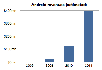
If we assume revenues were distributed the same way we would get something like this:
The sum of the bars in this chart equals $544 million and the ramp is approximately the same as the installed base. The relationship between the first graph and the second is a multiple equivalent to the revenue per device.
Therefore a second assumption is that revenue per device remained fairly constant. In this model the revenue comes out to be about $1.70 per device per year. It's possible that rev/dev/yr. is increasing as Google services are discovered by users. It's also possible that the rev/dev/yr. is decreasing as later adopters are less likely to engage as early users. I just don't know how to adjust this value so by leaving it at the average, I can avoid introducing more assumptions.
Now we can stop and look at this figure and do a test. Does $1.70 make sense as a device revenue for Android? Google had spoken about targeting $10/device/yr. but we have no indication that they are nearly at that level. If they did achieve that level, with an installed base of 300 million, Google could be collecting $3 billion a year in Android income. Are they getting it?
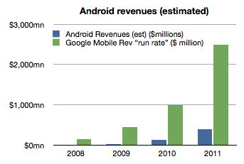
As of October, Google mentioned that it had a $2.5 billion "mobile run rate". But we know that this figure is not only from Android. Mobile includes all mobile devices and services including those running inside iOS, Symbian, BlackBerry, Windows Phone, etc. They could be counting ads on all mobile browsers as well as ads running inside all apps on all platforms. Furthermore, Google also testified that iOS accounts for two thirds of their mobile search revenues[1].
Adding run rate to the Android revenue chart results in the following:
So the step is to take the "run rate" figure of $2.5 billion and assume, as Charles Arthur did, that iOS income is what is left after taking out the Android part[2]. I also noted that Google previously mentioned a run rate of $1 billion and I will assign that run rate to 2010 and $2.5b to all of 2011. Since we know the number of iOS devices in use for years 2010 and 2011 we can calculate Google's revenues per iOS device in use.
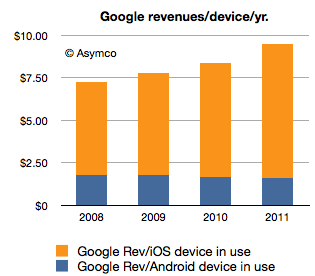
If we thus combine all the data we know (revenues derived from settlement offer, units in use, run rate and iOS installed base) we get the following revenue profile:
This shows a positive trend for Google: revenues per smartphone per year is increasing. However, the growth is coming from non-Android devices which means mostly iOS. Revenues per device for Android is probably declining.
The story for iOS revenues however is not all rosy for Google. Google has to pay for that revenue. The mechanism is a payment that Google makes to Apple for the prominent and default placement of Google search on Safari.
We don't know the terms of the arrangement but if we assume $2/device Google needs to shave $2 from the top of the chart above with that money going to Apple (attached as iPhone/iPad service revenues.)[3]
That still leaves a healthy $8.33 in 2011 as operating income from mobile with $1.70 or so coming from Android.
However, to make this operating income into bottom line profit, we have to extract the R&D and SG&A associated with mobile at Google. This would be, therefore, Andy Rubin's yearly budget.
Andy Rubin has stated in the past that Android is profitable. That is certainly believable. The budget would have to be about $400 million/year in 2011.
Charles Arthur concluded that Google obtains four times more revenue from iOS than from Android. My estimates indicate that in 2011 the revenue ratio was closer to 5 but if we subtract the cost of those sales in the form of payments to Apple then the ratio could well be four to one.
Many of these figures begin to "hang together" as we balance assumptions about costs, revenues and statements made in public. There is a consistency within a comfortable margin of error. If that is the case, then the economics of Android begins to take shape.
My take is that it's not a bad business. But it's also not a great one. As long as there is exponential growth in units, Android will improve its position inside Google relative to iOS. But from Google's perspective, iOS is today a bigger business. And iOS is not standing still. It's growing not only in terms of units but in revenue per unit.
Strategically, and historically Android was never one thing. P&L considerations were not the only (or even at all) factors in investment for Google. Having a hedge against hegemony of potential rivals, having a means to learn and develop new business and having a role in defining the post-PC computing paradigm are all probably bigger considerations than profitability.
So in terms of returns, Android is sustainable. However, in relative terms the value created leaves much to be desired. Whereas Android generates $1.70/device/year and thus an Android device with a two year life generates about $3.5 to Google over its life, Apple obtained $576.3 for each iOS device it sold in 2011[4]. The economics of Android are nothing like the economics of iOS.
---
Notes:
This figure is also not conclusive as search is not the only form of revenue on a mobile device but it does imply that Android is not the majority of Google's mobile revenues.
Clearly this is overstating iOS as the non-Android income is broken up between several platforms. We can only say that iOS is the vast majority of non-Android income.
Assuming a $2/device payment model means Google paid $312 million to Apple in 2011 and $171 million in 2010. This would go toward boosting Apple's revenue per iOS device. Naturally, if this distribution cost is higher or would be subject to re-negotiation then it could vary widely.
The iOS figure includes accessories and licensing of trademarks but excludes income from App Store, iTunes music, movies, TV shows, iBooks, greeting cards or textbooks.
RIM’s CEO, Thorsten Heins was quoted as saying, “We plan to refocus on the enterprise business and capitalize on our leading position in this segment. We believe that BlackBerry cannot succeed if we tried to be everybody’s darling and all things to all people. Therefore, we plan to build on our strength.”
RIM's latest quarterly results show a continuation of the decline in sales that began in Q1 2011.
Here are the highlights:
Smartphone units declined 26% y/y and 21% sequentially. Over a four year period the company still shows a positive growth of 20% compounded, though that is far below industry average
The smartphone revenues were down 29% y/y and 23% sequentially.
Including service revenues, the revenue per smartphone dropped to $346, a drop of 4%.
I estimate the phone operating margin to be less than 5%. The company swung to a net negative operating margin due to write-downs of tablet inventory but the phone business managed to break even.
Operating income from phone operations dropped to the lowest level in five years.
The company is still generating cash flow and has a cash reserve of over $2 billion.
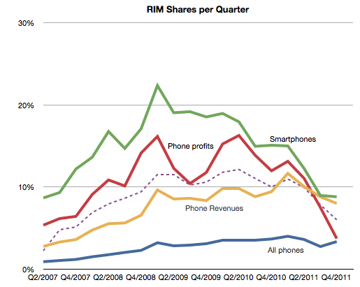
Seen in isolation, the company is clearly struggling but does not seem to be on its last legs. But no company should be seen in isolation. As part of a competitive market, the company is in far worse shape. The following chart shows the AMP index which measures relative performance through a blend of market shares.
This chart does not include the latest quarterly data but if it did it would be sure to show a continuing decline. The AMP index actually shows RIM peaking in Q1 2009, well before the volumes peaked.
It's within this context that we need to evaluate the new CEO's strategic shift. In the quote above we have the first significant strategic departure and split from the past. Should it inspire hope or despair?
The idea of focus has huge benefits. Focus and the art of saying no are keys to greatness. However, you only succeed if you focus on the right thing. "Enterprise" is not the right thing. It's not a valid target. Enterprise support is a feature, not a product. I don't mean that as opinion, but as a point of fact. Focus on a set of customers whose only characteristic is a job description is missing the whole point of focus.
Focus needs to be positioned on a job a brand needs to be hired to do. The idea should be to solve an open problem which is either too complex or too uneconomical for anyone else to solve. Corporate buyers have problems to solve but the BlackBerry no longer offers unique or defensible solutions. Furthermore, corporate buyers are themselves being dis-intermediated from the computing purchase decision. Sometimes this process is called "consumerization" but it is more plainly explained as "commoditization". The selection of tools for workers by a group that claims to understand their needs better than they do is an archaic concept.
This was true even in 2005 when RIM began targeting consumers. It was then that they saw the writing on the wall--that their enterprise business was being commoditized. All of RIM's growth since has been in consumer segments. By abandoning that trajectory RIM is effectively giving up on growth. And giving up on growth is simply giving up.
Apple's share price has increased rapidly in the last few weeks. The rise to $600 was swift and broke the pattern of slow growth the the stock was able to obtain over the past few years. The level, however, shouldn't have been a complete surprise.
I think Apple is going to $600...It's really not that complicated. Apple has a number of key drivers in its business model which have yet to be properly priced into the stock because I think it's very cheap at this level.
-Stephen Coleman, chief investment officer at Daedalus Capital
This prediction was made October 26, 2007. On that date Apple's share price closed at $184.7. It may have seemed like a bold bet, but as Coleman noted, the reason why it would reach $600 was easy to spot.
The real story on how I get to that valuation doesn't even involve the sale of (the Leopard operating system) or the growth in the Mac business. How I get there is through the iPhone itself.
What was not easy to tell was when it would reach $600. Back in October 2007 the stock had a P/E ratio of 48. It's PEG(trailing) was 0.65, and cash per share was $17. Sales were $6.6 billion for the quarter and earnings were 98c/share. If an analyst were to take those ratios and apply a forecast of sales five years hence, the $600 price would have been reached much sooner: Sales had tripled by 2010 and earnings had tripled by 2009. In contrast, the stock took until 2012 to triple.
The delay of one or two years is perhaps reflecting the risk involved in investing. Namely, you can predict outcomes but not their timing.
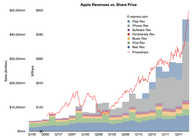
But still, we have to return to the question of why the stock has rallied in the past few weeks. There has been no new information about the company since it reported earnings and any product launches (e.g. new iPad) or increased distribution (China) are completely predictable. Curiously, the market did not react until late in the quarter. The following chart shows the phenomenon.
(Note the two scales on the left: inner is share price, outer is net sales)
It shows the share price as a line superimposed on the sales chart with stacked product revenues. The recent rise can be attributed to the rise in revenues/earnings from the fourth quarter. But why would a stock react in March to data from six months earlier (and published two months earlier).
Classical market theory suggests that markets anticipate and "discount" the future. Efficient markets supposedly react to all available information and do so instantly. If that was the case, the chart above would show the red line shifted significantly to the left.
What we are observing is market inefficiency.
Inefficiency implies that perception of reality is not the same as reality. It happens when people are reluctant to believe the truth. It's also implies that with $15 billion being "bet" on the share price every day, each one of those bets is misinformed!
The cause of this divergence between reality and perception is that disruptions are divergent from perceptions. A disruptive company always "leads" its valuation. There is cognitive delay for the vast bulk of observers. You can then argue that for those, like Mr. Coleman, that don't suffer this delay, there will be profit.
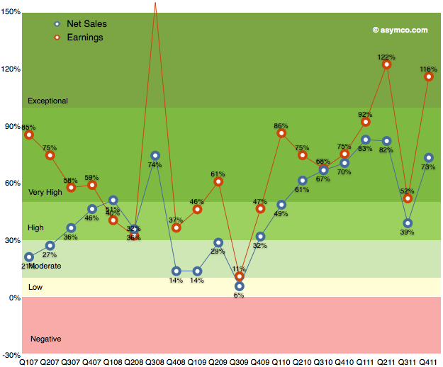
As the chart below shows, the last quarter (fourth calendar 2011, first fiscal 2012) was robust with 116% earnings growth and 73% net sales growth. I've heard many superlatives used to describe it. It is certainly exceptional but it was not as good as the second calendar quarter of 2011.
Sales grew faster both in CQ1 and CQ2 of 2011 and earnings grew faster in CQ2. It was in many ways a return to normality due to the iPhone returning to 133% revenue growth after the lull of the transitional third quarter.
Now it's time to consider the current quarter. It's already quite late in the quarter to make predictions, but I waited to hear some data about the iPad. The iPad remains a difficult product to forecast. Mainly because it is a new category and the pattern of growth takes a long time to establish. We've only had three quarters where y/y growth could be measured. Sales growth has been 180%, 146% and 99%. Unit growth has been 183%, 166% and 110%.
These rates have been higher than the average iPhone growth rates (average of which was 100% in units and 108% in revenues over the calendar 2011). Indeed, the average iPad growth rate so far seems to be 150%.
Is it sustainable?
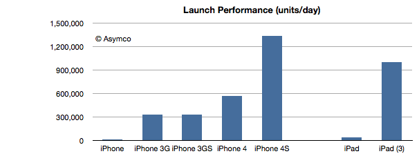
The answer from this latest launch seems to be yes. The following chart shows the launch performance of the various iOS devices whose launch performance has been announced.
The growth in launch performance between iPad 1 and iPad 3 is a factor of 28. iPad third generation had broader distribution but the volume boost from first generation is enormous. This implies a vastly improved production ramp. As the product remains supply constrained, the most important indicator of performance is production throughput.
So given this data on the iPad and the ongoing broadening of the iPhone distribution network, here are my first quarter estimates (with y/y growth in parentheses):
iPhone units: 37.3 million (100%)
Macs: 4.7 million (25%)
iPads: 12.2 million (160%)
iPods: 7 million (-22%)
Music (incl. app) rev. growth: 40%
Peripherals rev. growth: 25%
Software rev. growth: 10%
Total revenues: $42.7 billion (growth: 73%)
GM: 44.7%
EPS: $12.0 (88%)
This earnings value would imply a trailing twelve months’ EPS of about $40.7. At $600/share the P/E would be 14.7. Cash and equivalents will probably increase to $108 billion.
When cellular phones emerged in the 1980’s wireline phone service was excellent. Penetration was at 99 percent in the United States and prices had never been cheaper. The industry was deregulated and phone companies were competing fiercely over long distance calling plans. In contrast, the new cellular phones were not “good enough” on the basis of what was considered necessary for making critically important phone calls.
Sound quality was poor, coverage was spotty and battery life measured in minutes. But they allowed a whole new consumption model of communication to emerge. They allowed a caller to call a person not just a place. Over time, this simple value proposition caused a powerful profit formula to emerge. That formula led to extremely rapid improvement in the quality of the network and devices that connected to it.
It caused such a cataclysmic change that twenty years hence it became possible (even natural) for consumers to “cut the cord” and abandon wireline communications altogether. The “excellent quality” wireline industry was dead to be replaced by the "good enough" wireless industry.
One consequence of mobile telephony was increased consumption. Voice call minutes increased dramatically because calling could happen anytime from any place. While overall consumption increased, landline use decreased. Then came messaging of various types. Forms of communication enabled by cellular networks that simply did not exist before with landlines.
As a result there were vast pools of profits available to telcos that seemed to appear out of nowhere. SMS and data plan income was beyond anyone's ability to forecast in the 1980s.
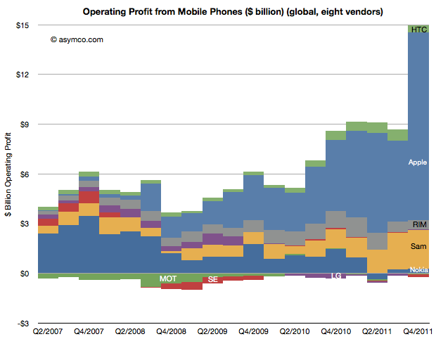
The same phenomenon is happening with smartphones. Consider a proxy measure: operating profits from mobile phones since the iPhone launched, illustrated below.
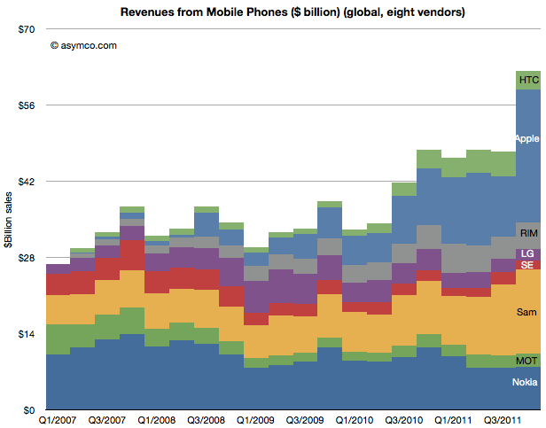
Although Apple went on to capture 75% of the profits, it did so from a vastly expanded profit pool. A similar picture emerges from an illustration of revenues:
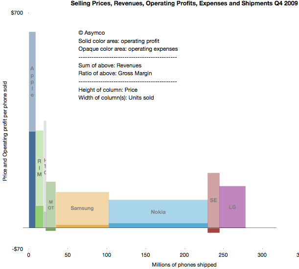
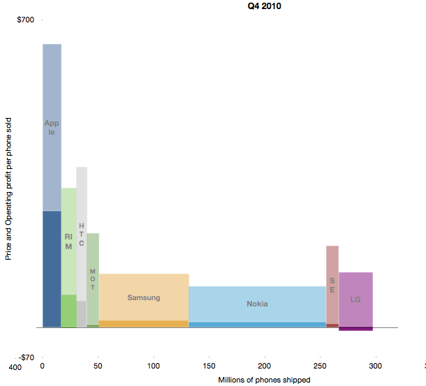
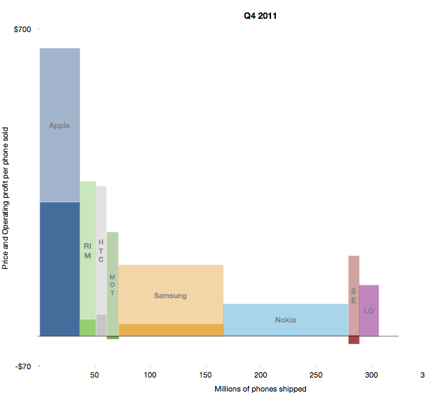
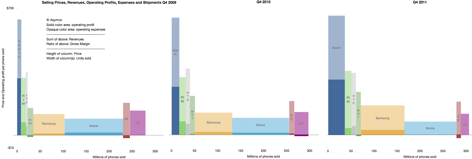
Another way to visualize the evolution of the market is to look at the combined price, profit margin and volume areas for the fourth quarters of 2009, 2010 and 2011.
Scanning from top to bottom, you can see how volumes grew, revenues grew and profits both grew and were re-allocated among participants (each colored pixel in the charts above is equal to about $1 million.)
These charts illustrate that there is no "law of conservation of profits" in any market as long as there is sufficient innovation. This is because the there is no "law of conservation of value created". If value is presented, buyers will gladly trade cash for it. Conversely, if there is no value-generating innovation, growth stops and competition reduces to a zero-sum game.
One of the most exciting aspects of disruptive growth is that although it tends to transfer profits from incumbents to entrants, it also grows the size of the overall market. Sometimes the growth is significant.
Last week I made an attempt to measure the iPhone's manufacturing cost given new data points from the Foxconn field trip. The post generated a great amount of new knowledge and the feedback was very valuable.
The main value to me came from stepping back and looking at the entire cost and value structure for the iPhone. Putting costs into perspective is as valuable as knowing what they are.
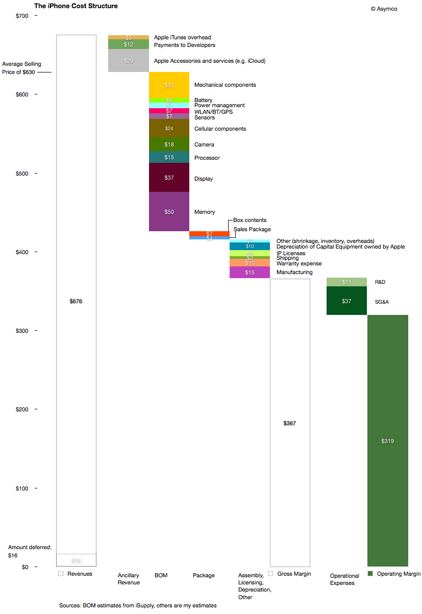
The following diagram shows my estimates for this cost structure for the fourth quarter given both bill of materials estimates and the other parts of the cost of goods sold and operational expenses and even ancillary sources of revenue.
There are several observations easily made from this view:
The manufacturing cost ($15 may be very generous i.e. high) but it still amounts to a tiny fraction of the device cost and hence value-add. The direct labor part of that cost is tinier still.
Depreciation on capital equipment (Apple owned) amounts to $10 per device, probably higher than the direct labor cost.
External developers as a group receive more app income than the salaries and costs associated with Apple's own developers working on the product.
The gross margin percent is 58%.
The operating margin is estimated at 51%
The high margin that the product generates is even more surprising given the industry average as seen in this summary view of the industry's performance over three years' fourth quarters.
The operating margin is the ratio of solid colors to the entire bar.
As someone pointed out on twitter: one of these is not like the others.
The question should be: How is this possible? What does this product have that gives it such a pricing advantage? Note the the ratio was preserved through the three years shown and has persisted for nearly five years.
The answer to this paradox is in data that is not visible in any of the diagrams above: The largest revenue attached to the iPhone comes into the mobile network operators. We don't have global averages but the revenue the iPhone generates over its lifetime is probably two to three times the revenues that Apple directly receives. The ARPU iPhones are attached to allows for a substantial subsidy, but more importantly, loyalty (or churn)
As seen in the small but clearly visible US market, being an operator having iPhone exclusivity generates above-average growth and being the only operator to be excluded from the product generates above average subscriber losses.
It quickly becomes obvious that ranging the iPhone has moved from being an advantage to not doing so becoming a serious disadvantage. The product and its high up-front costs are "hygiene factors" for operators. The sine qua non status means that it can still be priced with the extraordinary built-in margin shown above.
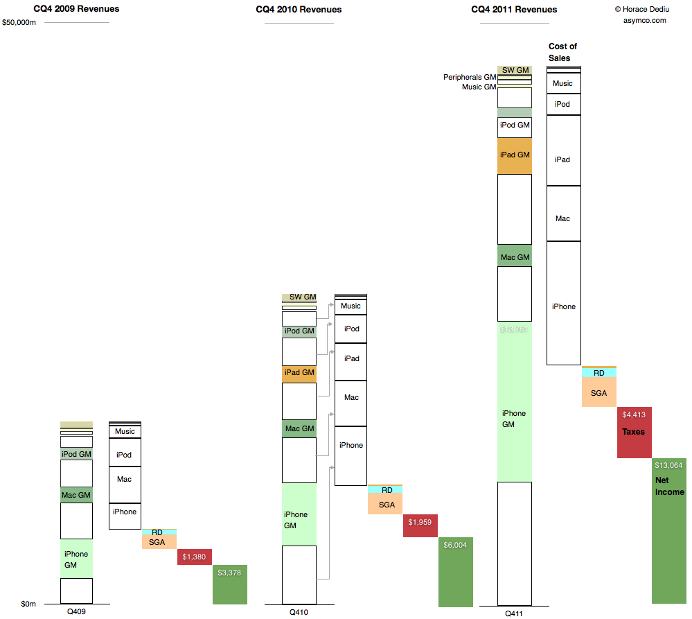
This is a summary view of Apple's income statement for the fourth quarter of 2009, 2010 and 2011. The full size is 999x893 pixels. Click on image below for full size bitmap.
The convention used is to show revenues in the first column, cost of sales in the second followed by operating expenses, taxes and net income in the last (dark green) column.
For the revenue column, individual products are shown stacked from highest to lowest revenues and further divided into variable costs and gross margin.
The costs are then drawn separately leaving net income (or profit). Ratios between various quantities can be visualized:
Gross Margin percentages are ratios between the empty boxes and their colored counterparts
Operating expenses as a percent of sales are the third column in relation to the first.
Tax rates are the fourth column as a percent of the fourth plus the fifth, etc.
Finally, the rate of year-on-year growth in all these quantities can be seen by looking through column sets left to right.
Given this perspective it's perhaps more obvious how much and from which business Apple has grown.