Asymco

Asymmetric Intelligence

revenue

  1. How much does it cost to manufacture an iPhone?

    Research · 103 comments

    An iPhone generates approximately $650 in revenue for Apple. This figure has remained fairly steady over time. Using deduction from overall margins, it's possible to estimate the gross margin on the product to be around 55%.

    That means that the cost of goods sold (COGS) for the iPhone is about $293. Is that a lot? Where does that money go? What else does it tell us about how the company operates?

    To find out we need to understand the cost structure of phone building.

    Typically there are four main categories of costs for a phone:

    1. Bill of materials (BOM). This represents the cost of the components that go into the device. These are paid to suppliers.
    2. Transportation/warehousing. This is the cost to transport and store the product before sale. This is paid to shipping companies and warehousing.
    3. Manufacturing cost (including labor). This is paid to contract manufacturers.
    4. Warranty expense. This is paid back to customers for returned product that can no longer be sold.

    We can estimate a device's BOM through a teardown analysis and there are firms that do this. Usually this offers enough competitive insight into the cost structure and hence gross margin because the other items are predictable in that they do not vary greatly from product to product.

    In the case of the iPhone the BOM has been fairly steady around $200 for a new model. That leaves quite a big gap to the overall COGS of $293.

    Could transportation, manufacturing and warranty costs really add up to $90 for an iPhone?

    The manufacturing costs are not usually discussed in detail openly because the processes used are secret. However, thanks to and ABC Nightline report,  some clues have emerged about how iPhones are built and, although incomplete, they offer some interesting bounds.

    One data point recently published is that the iPhone takes 24 hours to be built. Of that 6 to 8 hours is spent in "burn-in" to install and test the software and components automatically. This leaves about 17 hours unaccounted for in the throughput time. Could this time be spent in labor intensive operations? In the ABC report the wage of workers on the line is given as $1.78/hr[4]. 17 hours of labor input would imply $30 labor cost per iPhone. That seems a lot higher than the industry (i.e. iSupply's estimate is $8 for manufacturing cost.)  This is an upper bound. Obviously, those 17 hours could be spent in automated operations which were not shown or simply sitting idle, waiting for a process to begin.

    Is there another way we can check this?

    There is. The ABC report also mentioned that there were 141 (presumably labor) work steps in the production for an iPhone. If we knew the time each step took we could obtain another estimate. For example, if each step in the human assembly process took 3 minutes[2] then human hands will touch the iPhone for 423 minutes or about 7 hours. This would imply a labor cost for an iPhone of about $12.5. If each step was longer or shorter, the cost would vary accordingly.

    Unfortunately we can't be sure of the exact cost. However, these recent clues offer some interesting bounds and observations[3]:

    • Manufacturing costs for the iPhone are likely to be much higher than comparable devices. This is partly because of the design of the product and partly because of the quality testing needed.
    • Those costs are likely to range between $12.5 and $30 per unit.
    • The iPhone manufacturing costs are likely to be twice or three times the average.
    • Labor costs are still a small part of the overall cost structure at between 2% and 5% of sales price.
    • The high level (141 steps) of human interaction in the process could be automated however, the fact that it isn't implies that the cost of automation would be higher and the flexibility of the automated process would be lower. It's much more likely that the process is a mixture of labor and robot intensive sub-processes.
    • Even if we assume a $30 manufacturing cost, there is still $60 that needs to be allocated to transportation and warranty expense. These require sanity checks as well.

    ---

    Notes:

    1. Note that R&D (engineering and development) and Sales, General and Administrative (e.g. Marketing) costs are not part of this cost structure. They are considered fixed costs and are not allocated to individual units of production.
    2. Note that during the ABC video there was mention of automated instructions being broadcast to the line. This implies that each worker is working on a "clock cycle" and each work stage is timed to take an equal amount of time. This clock cycle time is crucial in understanding the cost structure. One further clue to this cycle time comes from the iPad output rate per worker. This was mentioned in the slide show to be up to 6,000 units per day. Assuming 10 hours of working time per day means 600 units per hour or 10 per minute. This seems extremely high as the worker would have to handle the product for only six seconds. [UPDATE: Apple clarified this point: "In manufacturing parlance this is called deburring. Her line processes 3,000 units per shift, with two shifts per day for a total of 6,000. A single operator at Ms. Zhou’s station would deburr 3,000 iPads in a shift"]
    3. As this post shows the amount of information that can be obtained from observing operations can be significant and lead to competitor advantage. It should be clear why this is not something done willingly.
    4. UPDATE: In a statement Foxconn clarified wages as "We have over 75 percent of the employees in the category of earning at least 2,200 RMB ($349/month) basic compensation standard. That means they are earning 13.75 RMB ($2.18) per hour".
  2. The opportunity cost of Windows Phone

    Research · 69 comments

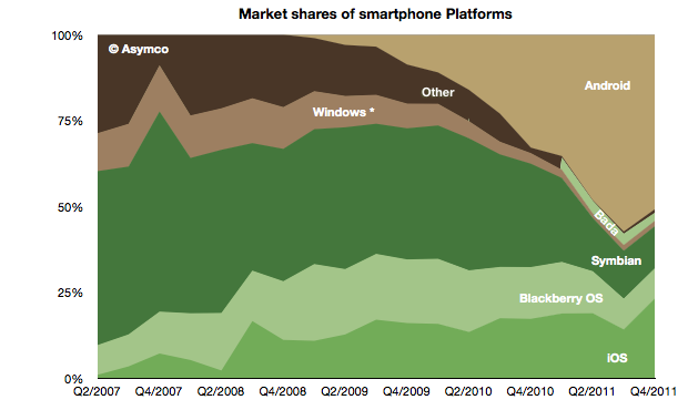
    The global mobile OS market shares for Q4 shows a continuing (but diminished) leading share.

    At the end of last year Android's unit share reached 51% which is down from about 57% during the third quarter. iOS reached 23%, followed by Symbian at 12%, RIM at 9%, Bada at 2.4%, Windows Phone at 1.6% and Other at 1%.

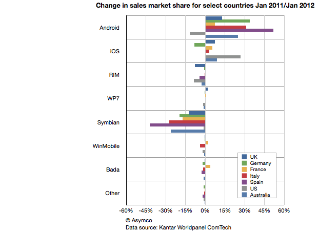
    When seen on a year/year basis Android gained 18 points of share in Q4 while Symbian lost 18 points. iOS gained 6 points of share and RIM lost 6 points. Bada gained 2.5 points and Windows lost 1.5 points.

    This symmetry can also be observed in another set of data. Published in The Guardian Kantar Worldpanel ComTech data shows the OS share changes for January on a year/year basis for a select set of countries.

    Android share gains do seem to be mirrored by Symbian share losses on a country-level.

    This should be most interesting to Nokia and Microsoft as both have a lot riding on Windows Phone replacing Symbian sales. If there should be a recovery in the fortunes of these companies, it would seem that their strategies should focus primarily on stemming and then reversing the losses to Android.

    Microsoft's strategy of increasing the cost structure for Android through IP licensing is certainly part of this picture but it's a slow process to turn that disincentive for Android into a large incentive for Windows Phone.

    Indeed, the speed with which Android handsets can be developed seems to be a key value of that operating system and one for which Microsoft does not have a good answer.  Nokia is now one year into its commitment to the Microsoft platform and it has a very limited portfolio to show for it (and limited sales as well.) As a result, Nokia's Symbian business evaporated very rapidly. More rapidly than the company anticipated.

    The dilemma for other vendors may well be how long will it take for them to develop a replacement for their Android portfolio in Windows Phone.

    The opportunity cost of this switch is subtle and insidious but may be the root of why we don't see a stampede toward Microsoft. Conversely, Android contract-free, implement-at-will availability may be its greatest selling point.


  3. App developers receive $12 for each iOS device sold

    Research · 38 comments

    One of the more interesting numbers reported by Tim Cook during the last earnings conference call was the total payment to developers during the fourth quarter. This is the first time that Apple reported a quarterly payout to developers.

    The figure was $700 million and it was mentioned in reference to the total payments to date of $4 billion. The $700 million is interesting at least because it gives an idea of what Apple obtained in total sales of Apps. As it retains 30% and pays 70% to developers then it follows that it retained $300 million and the total "gross" sales was $1 billion in Q4.[1]

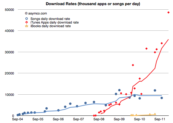
    The $700 million is interesting for another reason. The $1 billion in gross income can be tested against another set of data. As the countdown has already started, sometime in February Apple will report 25 billion total apps downloaded. The last such milestone was October 4th when it reported 18 billion downloads. Assuming that they will cross 25 billion by February 25th, then we can obtain an estimate for the download rate per day: about 48.6 million apps/day.

    That is a figure we can plot historically:

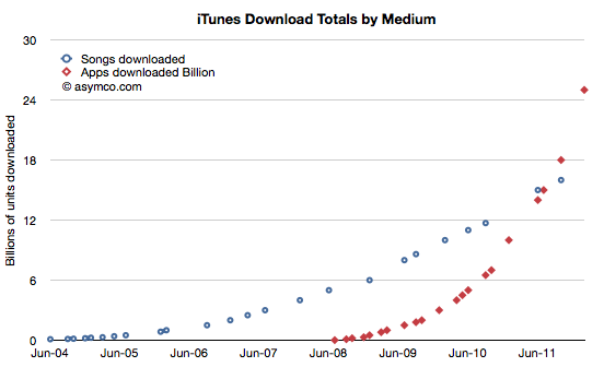
    I plotted it in relation to the songs download rates obtained through a similar method. Although we don't have an update on total songs downloaded, the rate is unlikely to have accelerated as much as apps did. The following charts also shows the reported total downloads by media:

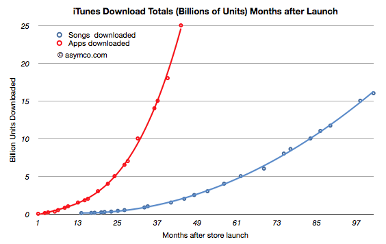
    Normalizing to the same starting date, the two media ramps are shown below:

    But back to the figure of $700 million paid to developers and the implied $1 billion in gross revenues. Taking that figure and dividing it by duration of the quarter yields a figure of $310 million per month gross app revenues. The 25 billion downloads to date paired with the $4 billion in payments to developers gives us an approximate revenue per download of 23c. Computing the monthly revenue from the 48.6 million/month rate we get about $316 million per month. Pretty close to the $301/mo that the quarterly payout implies. This therefore also confirms the 23c per download (it looks a bit high but not by much.)

    So the $700 million payout and the $4 billion payout to date and the 25 billion downloads all fit together as consistent pieces of a puzzle that give insight into the iTunes economy.

    1. Apple reported nearly $7 billion in iTunes stores revenue (though the apps were only counted for the 30% agency fee.) during 2011.
    2. If gross revenues were measured, the iTunes economy was about $10 billion in 2011.
    3. Payments to content publishers were in the vicinity of $7 billion of which $2.1bn was paid to developers.
    4. Operating costs for iTunes were therefore approximately $3 billion/yr.

    One other interesting result: Since iOS devices started shipping, there have been over 335 million units sold. As 25 billion apps have been downloaded into them then about 75 apps were downloaded for each unit sold. Since we know the average price (23c) and the payout ratio (70%) then all this boils down to the fact that each iOS device generates $17 of iTunes income from Apps alone. That also means that each iOS device sold results in a minimum payment of $12 to iOS developers.

    I've noted that Apple should be valued as a recurring payment from a satisfied customer base. A contributor made a comment that summarized it well: the payment schedule is approximately $1/day per computing unit (device or computer or tablet).

    Now it becomes clear that Apple should also be seen as a recurring ecosystem payment system. Given a 24 month lifecycle, the amount is approximately $0.5 per device per month.

    In other words, if you are an iOS developer you should note iOS device sales and use the rule of thumb that each one sold creates fifty cents of monthly income for you and your peers to share.

    ----

    Note:

    1. Apple reported its iTunes income (as the anachronistic "Music" line item in its Income Statement) as $2.027 billion in Q4.It would be tempting then to think that Apple got $1 billion from apps and $1 billion from songs and videos and iBooks. This is not the case however.
      Apple does not report all its app income (what I call gross income). Under the "agency" model of retail sales it reports only the part it retains, keeping the 70% paid to developers off its books. Therefore, of the $2 billion in iTunes income, only $300 million were actually booked from apps. That therefore implies that Apple's "everything-but-apps" iTunes revenue was $1.7 billion.
      Note however that the non-app income is mostly gross income and the payouts on that income will be significant (as much as 90% depending on many factors).
  4. The world's biggest startup

    Research · 34 comments

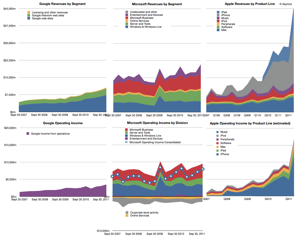
    Last year we began offering revenue and operating income comparisons between Apple and Microsoft. It was becoming evident that the iOS franchise was beginning to overtake both in revenue and profitability the Windows franchise. To offer more dimensions of comparison this time I am adding Google's top and bottom lines for comparison (click image for detail):

    Note that the graphs have the same scales when read horizontally. I've broken out the sub-divisions of revenues as the companies report them. Here are some observations:

    1. The time spanned is 4.5 years (September 2007 to December 2011)
    2. If we compare the fourth quarter 2007 to fourth quarter 2011 the ratio of Google : Microsoft : Apple went from 1: 3.39:2:16 to 1:1.97: 4.38. In other words, Microsoft was 3.4 times bigger than Google but today it's only about twice. Apple was twice and is now about 4.4 times bigger.
    3. In terms of operating income (i.e. before R&D, SG&A and OI&E) the ratios were 1:4.48:1.53 and are now 1:2.28:4.82. Microsoft's income gap to Google halved while Apple's more than tripled.
    4. Google and Microsoft have grown but not by adding new sources of revenue. Apple grew its base but, more importantly, added new businesses for spectacularly more growth.
    5. Compared to Microsoft and Apple, Google's revenue is distinctly single-source: advertising. Though divided between own sites and those of affiliates, advertising is today 96.1% of revenue and was 98.6% four years earlier.

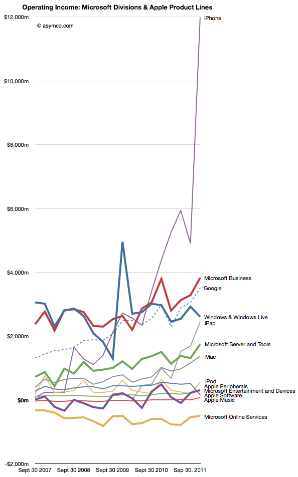
    If we compare the individual product/business operating incomes individually we see some interesting patterns:

    1. Google's advertising profits have overtaken Windows as has the iPhone and the iPad may do so quite soon.
    2. Microsoft's Business (Office) and Server businesses are growing more quickly than Windows
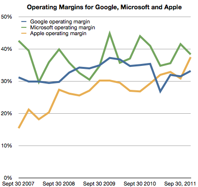
    3. The hardware oriented Apple' operating margin is now 37% and exceeds Google's 33% while being nearly equal to Microsoft's 38% (see chart below)

    I presented a subset of this material January 30th at a TechMeetups event titled "Apple - world's biggest startup." A presentation by Adam Lashinsky focused on the cultural and procedural aspects which highlight Apple's "startup" nature. My presentation showed, using these graphs, Apple's growth characterizes it as a "startup". The growth did not come from a broadening of its core products markets. It came from the creation of new product categories. Google, a much younger company does not exhibit this non-secular growth any more than Microsoft which is about as old as Apple is.
    The lesson is perhaps that rapid growth is not the right of small companies alone. Apple has used disruptive innovation to transform itself and offers a stunning contrast to two other companies which are also seen as innovative leaders.

  5. Apple retail growth data

    Research · 15 comments

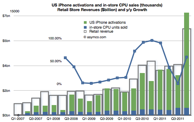
    Apple's retail stores increased sales by nearly 60% in Q4. This is a dramatic though not unprecedented change from Q3's 1% growth rate. The growth rate faithfully tracks iPhone releases as demonstrated in a post last quarter.

    When seen on a yearly basis some of the data begin to from a picture.

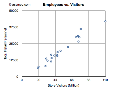
    • There were 332 million visitors in 2011, an increase of 29%. (This total is greater than the population of the United States.)
    • The average  revenue was nearly $50 million/store
    • 38 stores were opened, in-line with 2010's 40 openings
    • Total 2011 revenues were $16.4 billion
    • About 34,600 (full time equivalent) employees were employed on average
    • There were nearly 1 million visitors per store
    • There were an average of 100 employees assigned to each store
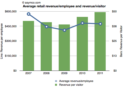
    • Average revenue/employee was $473,622
    • Average profit/employee was $120,289
    • There were about 9,600 visitors for each employee
    • Each visitor generated about $50 in revenue
    • The revenue per square foot was about $6,500 across all stores.

    Some of these metrics are shown in the following charts relative to prior years:

  6. Hollywood by the numbers

    Research · 75 comments

    It's perhaps fitting that an industry that produces illusions is in itself an illusion. The absence of public scrutiny of its finances and business model leads to a lot of myths or misconceptions. Some of these are discussed anecdotally in books and other works[1], but the absence of data makes the anecdotal evidence unsatisfying to an analyst.

    What if we could find patterns in data about the industry to confirm or deny these oral histories? Fortunately some data actually exists. There are collections of data about movies released and some of the attributes of these releases such as box office receipts, theaters opening, budgets (sparsely), and distributors. This data is typically used for marketing purposes to celebrate the "hits" and thus entice more people to see the movies.

    However, other information can also be obtained through analysis of the data. In fact, a rather compelling story can be told. That's the purpose of this post. Our story will be expanded over time but this first draft should be enough to allow a discussion to begin. The story is built in four sub-stories:

    1. Drama / Comedy vs. Adventure / Fantasy: Why the Ancient Greeks had it all wrong.
    2. The magic of summertime: Market access and school schedules
    3. The perpetual incumbency: What happens to Hollywood startups
    4. The Popcorn economy: The peculiar power of theaters in an age of television

    These stories were the result of observations in data alone. We have no first-hand knowledge of the industry and have only used basic software tools to seek out patterns in public data[1].

    The data set includes approximately 12,000 titles released between 1975 and present with various degree of completeness. Some of these years are not completely populated and some data is undoubtedly in error. However the large sample should offer enough substance for patterns to emerge in spite of this.

    Drama / Comedy vs. Adventure / Fantasy: Why the Ancient Greeks had it all wrong

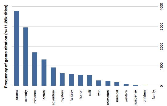
    Storytelling has not changed throughout history. The same types of stories affect audiences the same way since stories were first told. The earliest known "genres" were tragedy and comedy and they are still seen as the bedrock of theater today. The same is true for movies. The following bar chart shows the distribution of genres as cited by movies over our data set.

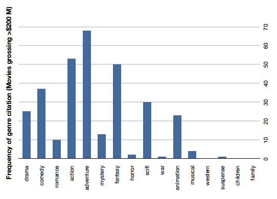
    Drama and comedy are about 50% of all movies made. If we add romance they are 60% of cited genres. This is understandable given the history of theater. However the profitability (or revenue potential) of those genres is not as strong as Action, Adventure and Fantasy. The following chart shows the same count of genre citation but only for movies grossing over $200 million (which we chose to call "blockbusters").

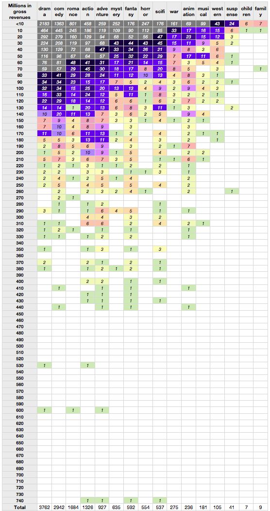
    Action, adventure and fantasy handily beat Comedy and even SciFi beats drama. Romance, musicals and and mystery genres typically associated with female audiences are very rarely successful as blockbusters. The overall data is shown in the following table. The rows represent gross revenues and the columns genres cited ranked in order of frequency. One can easily observe the density of low earning drama and comedy (grey colored) vs. the more lucrative instances of fantasy and adventure. These male-dominated genres have consistent success into middle, high and very high revenue tiers.

    The reason for this blockbuster attention to action and adventure is probably the prevailing theater-going audience demographic: adolescent males. The industry still produces the classic genres but less profitably than what the current targeted markets.

    Indeed, these genres were very uncommon in eras predating the late 1970s. More "adult-oriented" movies like romance (Gone with the Wind), musicals (The Sound of Music) and epic movies (Ben Hur, The Ten Comandments) were common in the "golden age" of Hollywood. As we'll see in the next section, the age of the audience is a now driving more than just genre selection.

    The magic of summertime: Market access and school schedules

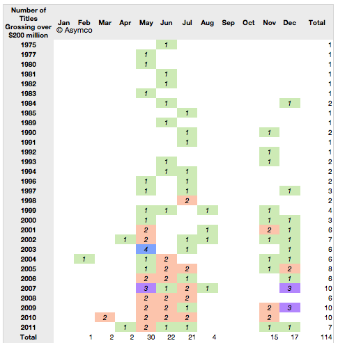
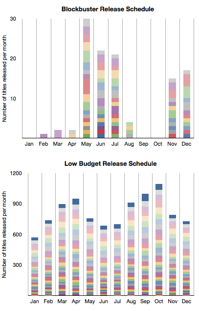
    Using the word "Summer" before "Blockbuster" has become almost redundant. What is less understood is that watching movies in the summer is rather a new idea. It started effectively with Jaws in 1975  and ever since major film studios have planned their annual marketing around a summer schedule. There is clear evidence for this in the data. Here is a table showing the blockbuster release months since 1975. (The number of titles grossing over $200 million and the months in which they were released).

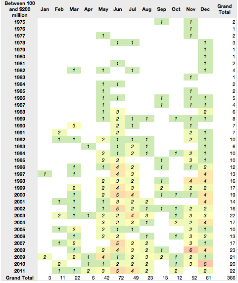
    The same pattern repeats for the next tier of highly successful movies--those grossing between $100 and $200 million.

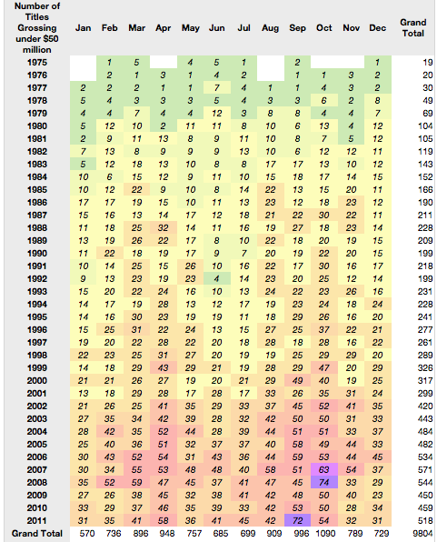
    But what about the less successful movies? Those earning less than $50 million actually show a counter-success pattern.

    To contrast this further, here is a stacked bar chart comparison between frequency of release by month for the most successful tier vs. the least successful tier (colors represent years with oldest at the bottom).

    It would seem that summer and success are in a causal relationship. There is a clear pattern with the only non-summer months having blockbuster releases being November and December.

    But there is more to this pattern.

    The blockbuster schedule happens to coincide with the school holiday schedule in the US. This again points to the "profitable" audience being school-age children, and mostly male.

    The perpetual incumbency: Where are the Hollywood startups?

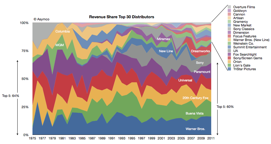
    The third observation has to do with the  major film studios. We took the box office revenues and allocated them to the studios over time. The following chart shows the share of those revenues for the top 30 studios.

    The top five were earning 64% of revenues in 1975 and the top five were earning 60% in 2011. One of the top five from 1975 is no longer in the running this year (MGM) and one new major was added (Buena Vista, owned by Disney).

    There has been one other notable change: Columbia was acquired by Sony but stayed out of the top 5. Beside Disney there is one new significant entrant in Dreamworks gaining share in the last decade.

    But the prevailing impression from the data is that the incumbents remained as such during the last four decades. There are many small studios but they have not "disrupted" the market by shifting significant revenues out of the hands of the majors. Indeed the typical strategy seems to be to start a studio with the hope of it being acquired by a major.

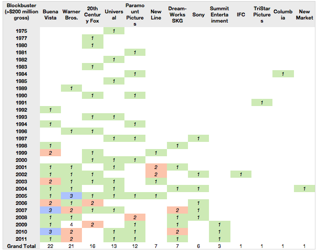
    Even the entrants are industry insiders: Disney and Dreamworks are not asymmetric in their business models in any way. In fact, when viewing the data by blockbuster creation, the majors feature prominently. There are only a handful of blockbusters from the smaller companies.

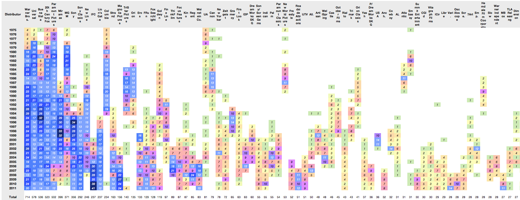
    When looking at overall production rates, again the majors (and their subsidiaries) dominate. Here are the top 75 distributors of movies showing nearly 9000 movies (click image for full-size):

    The conclusion from this data might be that Hollywood does not change all that much in terms of who makes the money. But that itself is a symptom of a deeper reality: that there is little that changes at all.

    We can even perhaps hypothesize that there is no business model innovation taking place. Any such innovation is usually manifested in a reversal of fortunes for incumbents.

    But technological change is happening. The following section describes how this appears in the data.

    The Popcorn economy: The peculiar power of theaters in an age of television

    The data we are sampling (box office gross revenues) is actually a small and shrinking subset of what movies generate. In addition, there are international revenues, media sales (DVD, video tape), TV rights, and merchandise to name a few. But theaters are still an important part of the picture.

    Although they make up less than 20% of gross, their importance is disproportionate due to the signal they send other markets about the popularity of a movie. In other words, a movie must first be proven in a US theater before its value is priced by the other channels.

    However, this essential theatrical release has changed in one fundamental way. Releases are now geared for larger initial scopes with shorter runs and less dependency on "word of mouth" to increase sales.

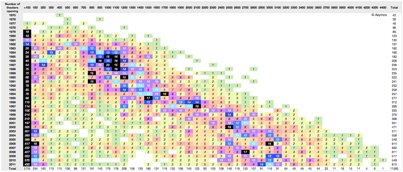
    Consider the following view of release breadth (how many theaters are in an opening) by openings over time. The columns represent the number of theaters used in the opening of a movie in increments of 100. The rows are years. The cells contain the number of movies opening with that size footprint.

    The pattern shows the number of theaters used in openings increasing steadily. the mean number of releases is shifting to the right. Part of the reason is that theaters shrank in size over time, but there is also the factor of needing to create a large audience at the outset of a release. The increase in "footprint" at launch (a factor of 10) is in excess of the slicing of theater sizes (a factor of two)

    This broadening of launch is coincident with a decrease in viewers. As a result the notion of how movies are marketed has changed. The idea that a movie could start small and gain a following gradually through word of mouth is obsolete. That low cost approach to marketing (called "earned media exposure" in marketing) is unreliable and completely discounted.

    Instead, studios manufacture an audience through paid advertising and promotion. This initial burst of viewers is essential not just for generating revenues. It's essential to driving long-term revenues.

    The reason is that technology now allows the movie to be "monetized" through multiple channels. Recorded media, broadcast rights and even in-flight entertainment are all there to milk a franchise. But there is a need to get that initial vote of confidence from one crucial audience. That happens to come only from theatrical release.

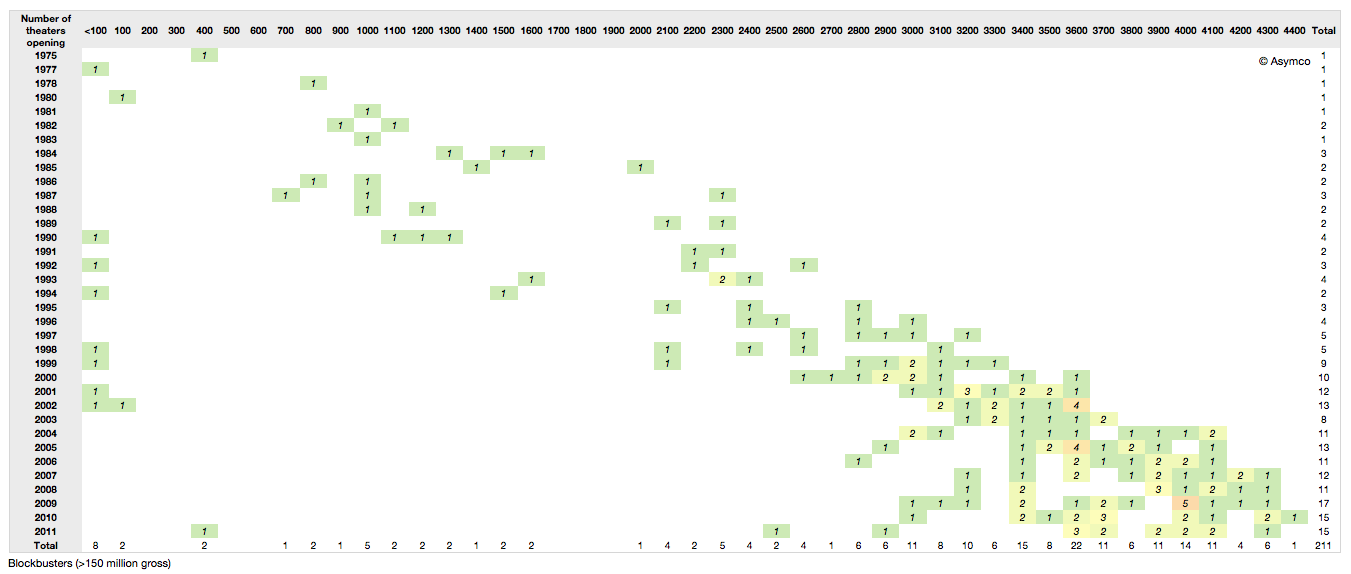
    So with the scheduling pressures, the narrow window of purchased release buzz, the onus is on a broad release as quickly as possible. This holds especially true if we filter out only the blockbusters. Note how the release has increased steadily as well and that since 2000 all blockbusters released to over 3000 theaters. Compare that to Star Wars in 1977 releasing to only 30 theaters.

      Notes:

    1. See Jay Epstien's The Hollywood Economist.
    2. Tools used include Excel, Numbers and our own App
    3. Data sources: Coolector, Imdb, BoxOfficeMojo, The-numbers.com
    4. Many thanks to David McCandless and the Information is Beautiful  folks (http://www.informationisbeautiful.net) for setting up the Hollywood Budgets Award that provided us with much motivation for researching this topic.
  7. First: Apple's rank in mobile phone profitability and revenues

    Research · 82 comments

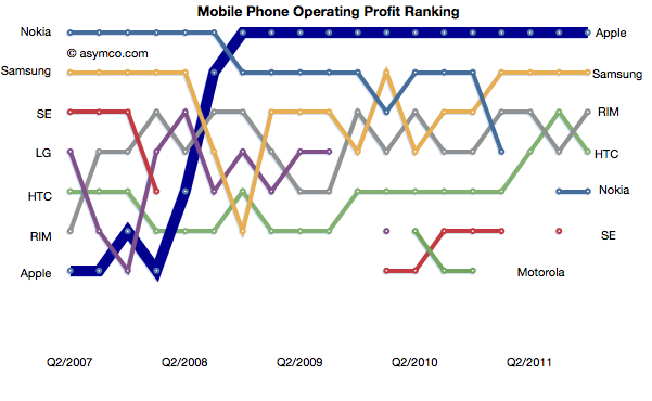
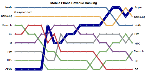
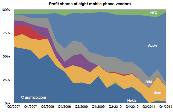
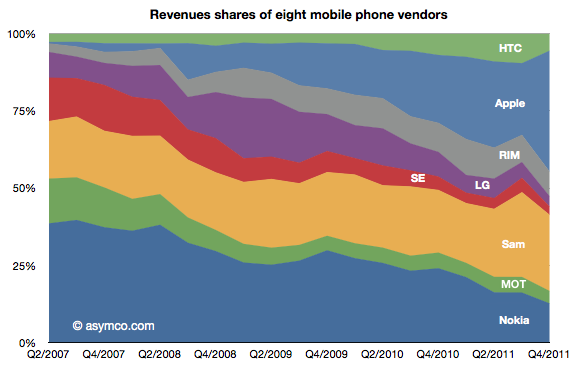
    Apple retained its top rank in profitability and regained the top spot in mobile phone revenues.

    The relative shares of revenues and profits are shown below:

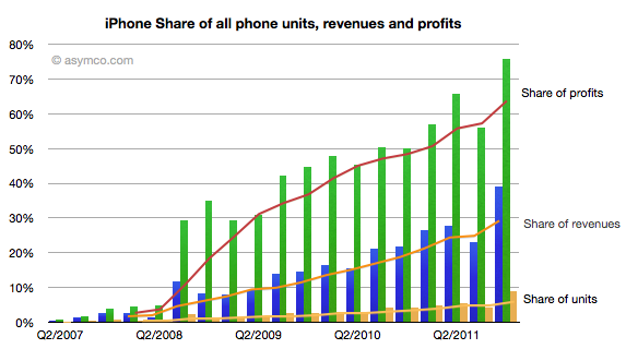
    Individually, Apple's share of units, revenues and profits is chronicled below:

    Apple reached 75% of profit share, nearly 40% of revenue share and 9% of units share.

    Apple and Samsung combined for about 91% of profits with RIM third at 3.7%, HTC fourth at 3.0% and Nokia last at 1.8% of a $15 billion total for the quarter.

    In terms of revenues, Apple had 39% to Samsung's 25%. Third was Nokia with 12.6% and fourth RIM at 8%. HTC only managed 5.5%, Motorola 4%, LG 3.3% and Sony Ericsson 2.7%.


  8. You cannot buy innovation

    Research · 58 comments

    In a previous series of articles we discussed the capital Apple expends on equipment, real estate, leasehold improvements and data centers. Cost structure analysis reveals subtle shifts in strategy and the CapEx analysis demonstrates Apple's increasing integration into its supplier network and integration into the distribution and service infrastructure that sustains its ecosystems.

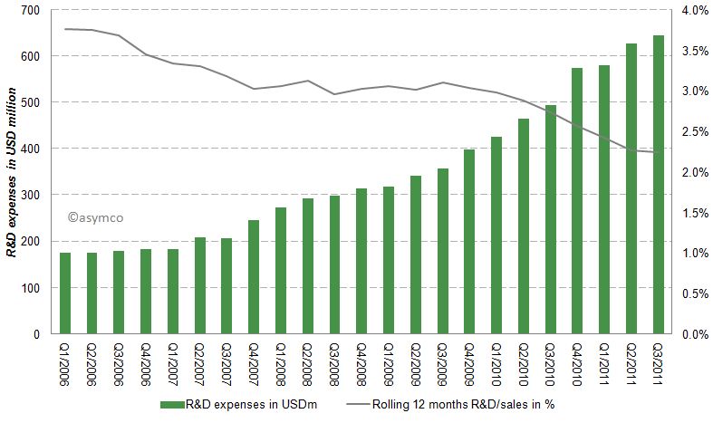
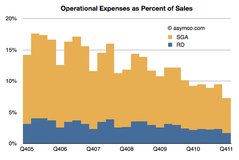
    Another form of investing (spending now, reaping benefits later) is the spending on research and development (R&D). Let’s have a look at Apple’s R&D expenses by quarter since Q1/2006.

    Apples R&D expenses as percentage of sales have been declining from almost 4% to close to 2% in the last six years as shown in the following chart:

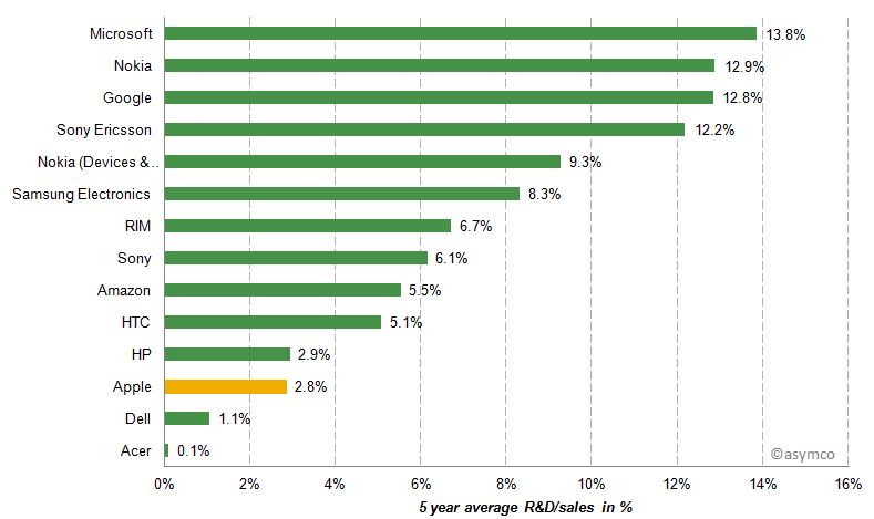
    While Apple's absolute R&D expenses have grown at an annual rate of 33% they have not kept up with the far higher sales growth rate. Apple's current rate of R&D expenditure is compared to a peer group [1] below.

    Apple's R&D/sales ratio is between Dell and HP, companies which do not develop their own software or hardware.

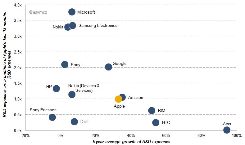
    Beside the absolute, relative to sales and relative to peers, another perspective is to measure relative growth. The following chart represents shows the 5 year average growth of R&D expenses and on the y-axis the size of last 12 months R&D expenses as a multiple of Apple's R&D costs [2].

    Acer's R&D expenses for example are almost non-existent compared to Apple, but have grown almost 100% per year while Microsoft’s last 12 months R&D expenses are almost 4x that of Apple's and have only grown slightly over the past five years. Google's R&D costs have grown at a similar rate compared to Apple, but remained double those of Apple’s throughout the last five years.

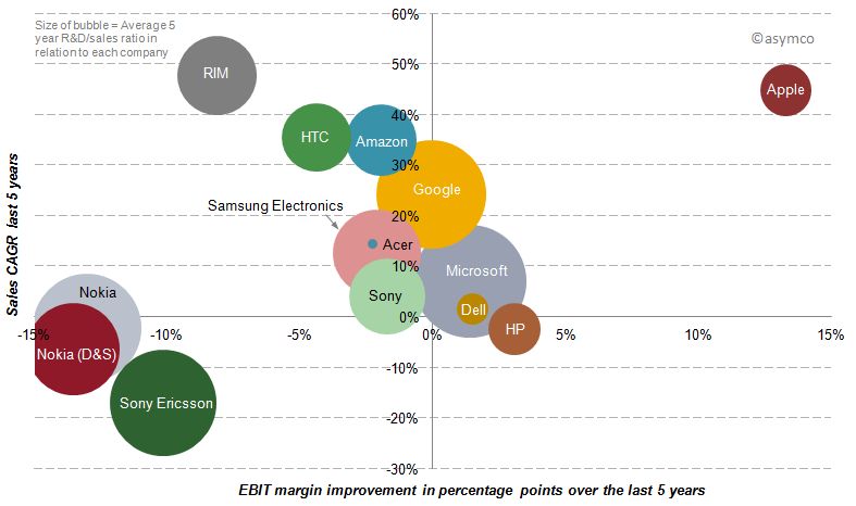
    Finally, we should look at the payoff from R&D spending over the last five years.  R&D growth should result in margin improvement, but does it? The following chart shows the relationship between spending (size of bubble), margin improvement (x-axis) and sales growth (y-axis).

    Of our sample, only three companies have achieved sales growth AND simultaneous margin improvement over the last five years. But while Microsoft and Dell have achieved sales growth and margin improvement slightly above zero, Apple has improved its bottom line by 13 percentage points and its top line by an average rate of 45%.

    In spite of Microsoft's, Google and Nokia's massive R&D growth, their returns from that investment have been meagre to negative in terms of margin and only Google showed appreciable sales growth.

    Discussion

    R&D expenditures on a stand-alone basis, in absolute or relative terms, do not correlate with disruptive growth. Essentially, you cannot buy innovation.

    In fact, sometimes it's nearly free. Most startups spend less on R&D than large companies do on stationery and yet the bulk of wealth creation has come from these tiny companies. The challenge is, in fact, that if you have resources you find ways of spending them (the quaint American cliche of 'cash burning a hole in your pocket'). The temptation is always there to fund a new initiative which bright people can always envision.

    Leadership in innovation is not the courage to spend but the courage to focus.

    “Focus is about saying 'No'. And the result of that focus is going to be some really great products where the total is much greater than the sum of the parts.”, Steve Jobs (1997)

    [1] Our set of peer companies as shown in previous posts but excluding LG, Lenovo and Motorola Mobility due to lack of data, but including Sony Ericsson and Nokia’s mobile phone division Devices & Services.

    [2] In this post “year” and “last 12 months” refers to the time frame from Q4/(year-1) year to Q3/year due to lack of published data regarding Q4/2011. Five year data runs from Q3/2006-Q3/2011.

    [3] A note on capitalized R&D: Most of the companies analyzed do not have capitalized R&D costs. Some have small capitalization, but so small that the inclusion would not change the decimal points of percentages. The only significant amount of capitalized R&D appeared in Amazon's earnings releases: capitalized R&D cost were USD 100 million in Q3/2011. The amortization of theses costs in included in Amazon's EBIT (Operating imcome).

  9. Apple's Fourth quarter 2011 Growth Scorecard

    Research · 53 comments

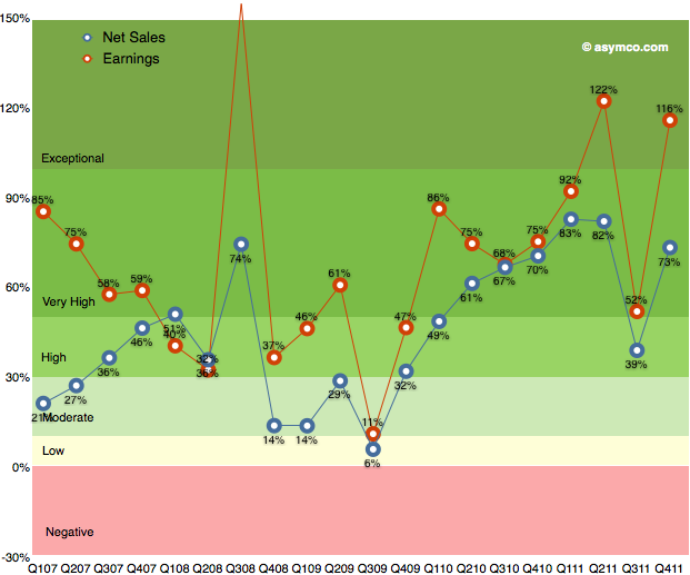
    After the transitional third quarter, Apple's earnings growth returned to an exceptional level. As the following chart shows, earnings growth has maintained above 50% growth since 2009.

    Q3 turned out to be a transitional quarter with 52% growth but Q4 proved to be  "exceptional" with growth above 100%.  This is the third highest rate of growth in the five year span shown. Sales growth was also very near the top of the range, coming in fourth historically.

    When looking at the components making up sales, we can see each product line's revenue growth in the following table: 

    The growth leaders were also the largest product lines in terms of revenue. iPhone and iPad had triple digit growth rates and that translated into the bottom line growth.

    Music related products and services which Includes revenue from sales from the iTunes Store, App Store, and iBookstore in addition to sales of iPod services and Apple-branded and third-party iPod accessories grew at 42%. This is the highest rate during the time frame shown.

    Peripherals which Includes revenue from sales of displays, networking products, and Apple TV was next with 29% revenue growth.

    The Mac line followed with 22% growth and Software which includes sales of Apple-branded and third-party Mac software, and services through the Mac App Store grew at 7%.

    The iPod line continued to shrink with -26% decline.

    I used color coding in the table to show the patterns of change and what I note is that the iPhone and iPad lines continue to be exceptionally fast growing businesses. The duration and amplitude of these streaks of growth should be a clear signal about the dynamics of these markets and Apple's role within. Too often, I find, these signals are ignored.

  10. The year of the iPad for the second year in a row

    Research · 57 comments

    The iPad and Mac businesses both grew well in the last quarter. Tim Cook said they are observing some cannibalization of Mac from the iPad but much more switching to iPad is coming from the Windows PC market.

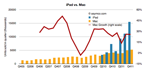
    The evidence is still hard to pin down directly but the fact that PC sales (excluding the Mac) are down gives credence to the claim. Mac growth, in contrast, is largely unaffected. The following chart shows the the iPad volumes vis-a-vis Mac volumes and the Mac growth through recent history.

    The iPad has out-sold the Mac since inception and is now about three times the volume. However, the growth rate in the Mac has not changed much.

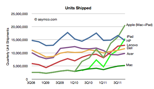
    The impact on the PC market has been discussed recently and the data in the following chart is an update given more precision on the units from Apple:

    The new data shows that the iPad alone would be the largest PC vendor and Apple with iPad and Mac combined is selling 5 million more units (or 30%) than the top PC vendor.

    The impact of the iPad is not specific to any single vendor (Apple included). It competes for time and purchase decisions across all computing alternatives and though many times it's additive, it is also substitutive and will become increasingly so.

    Tim Cook mentioned on the earnings conference call that Apple sees the iPad as addressing a market larger that the PC market:

    I truly believe, and many others in the company believe, that there will come a day that the tablet market in units is larger than the PC market. In fact, it's interesting to note that in the U.S., it's clear from the IDC's recent data on desktop PCs in the U.S., that tablets exceeded desktop PC sales last quarter in the U.S.


  11. Enter, Prise

    Research · 80 comments

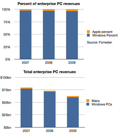
    Historically, Apple's sales to business and government buyers of personal computers have been, in a word, minuscule. To put a number on it, Forrester published data where the estimated value of those sales in 2007 were 2.8%. A figure lower than Apple's overall market share of PCs in that time frame.

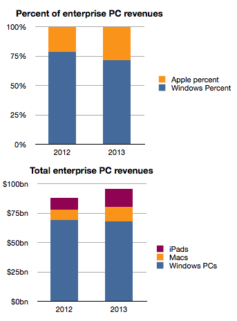
    Things did not improve much in the years following. The following chart shows the split between Windows and Mac OS X for the value of enterprise computers sold in 2007 through 2009.

    Apple's share of value went from 2.8% to 3.7%, an increase of 1 point of share, but one which in real terms was not very valuable because the overall market declined due to recession. Revenues for Apple were basically flat at around $2 billion each year as shown in the second chart.

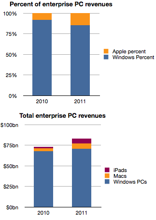
    However, the situation changed very rapidly in the last two years.

    Apple's share of enterprise revenues doubled from 3.7% to 7.8% in 2010 and nearly doubled again to 14.6% last year. A large part of that acceleration was due to the iPad which generated an estimated 6 billion in sales in 2011, triple what Macs were grossing in 2007.

    Forrester goes further and estimates the same data for the next two years.

    The estimate seems to be an extrapolation of the last two years which may or may not happen and we should treat it with caution.

    However, if the pattern emerges as an extension of the near past, Apple's position in the market at nearly 30% share next year would be a sea change. It may challenge for the top spot among all vendors to the sector.

    It's been said many times that "if only Apple put more emphasis" on Enterprise sales, imagine how much more growth they would obtain. However, I believe that this reversal of fortune did not come about from paying more attention but rather from paying less attention to Enterprise.

    Enterprise buyers are demanding customers. They have highly specific requirements and ask vendors to conform to multiple layers of dependencies. As a result, enterprise vendors (led by Microsoft) have done all they could to make their software and hardware conformable to these needs. For decades this was the modus operandi and, due to the early adopter nature of businesses in personal computing, the resulting product was passed on to consumers as the "standard". Consumers accepted it as it was better than having no computers at all.

    The problem is that customers, especially demanding ones, don't realize that a new basis of performance might be more beneficial. Apple and mobile devices in general presented this "low-end" alternative not in response to requirements from business but in response to requirements from consumers who had been much more eager in the last decade to adopt new technologies with fewer strings attached. All the security, conformability and legacy issues of the early business adopters turned them into late adopters as technology shifted.

    So a company focused on an asymmetric market led with new solutions to problems that enterprises did not think they had. Mobility was something few IT managers asked for and was granted begrudgingly to only those "most valuable" who needed it due to cost and security considerations. As Apple willfully ignored these Enterprise needs it, paradoxically, created exactly what they needed.

    It pried entry into the most difficult of markets by not even wanting to enter.

    In thinking about how this market will evolve, I hear about "consumerization" and cost reduction as benefits and justification of this shift. But fundamentally, what is happening is a classic low end disruption. Enterprises increased their demands beyond what the users in those enterprises could absorb. Instead of ultra-secure, locked-down and immobile computing, users were looking for flexibility, agility and mobility. That's what Apple was listening to.

    Apple's best strategy today would be to persist on this trajectory and listen to the under-served consumer rather than the over-served and over-demanding IT manager.