Apple is having difficulty meeting demand for the iPhone and the iPad. It is growing both businesses at more than 100% and they make up about 65% of revenues, and 71% of profits. The Mac business is also growing at 2x to 3x the PC industry.
Being supply constrained makes it therefore a great challenge to forecast future growth for the company. Supply issues and ramp rates are needful of an operational expertise few possess outside of the industry. But many take up this challenge, myself included. We put up our numbers every quarter and get scrutinized and challenged for our failures.
So it's always exciting to see how others are looking at the big picture. Sadly, with the growth data being what it is, there seems to be a great deal of pessimism around the company's prospects. The P/E ratio has remained at despondent levels for over two years, barely tracking with the P/E of the S&P 500 and not reflecting the company's historic or current growth.
The logical explanation is that pricing reflects a consensus that growth will fall off a cliff. Indeed this can be confirmed. Bloomberg surveyed analysts and they say:
Apple’s sales may climb 54 percent to $100.3 billion this fiscal year, which ends in September, the average prediction of analysts surveyed by Bloomberg. Growth may slow to 18 percent the following year.
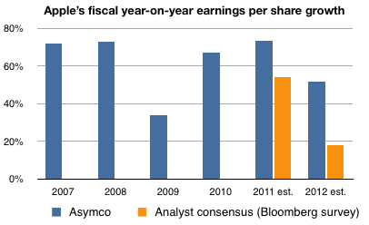
Fifty percent growth this year and 18 percent next year is indeed catastrophic. Consider the company's recent history as shown in the following chart:
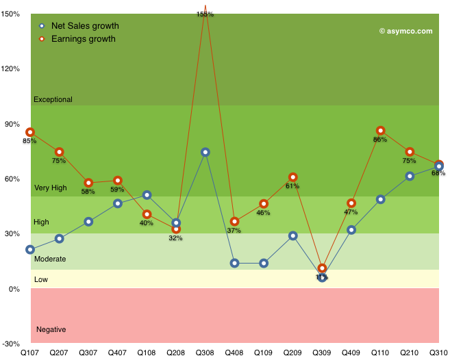
The company has been growing earnings around 70% a year since 2007 at least. The exception being 2009 when in the middle of the worst recession for a century the growth dropped to 34%.
I took the liberty of adding the estimates cited above to the chart (in orange) while putting forward my estimates for the same time frame.
I am, I believe, conservative in my estimates (for example, my estimates do not take into account any new product categories Apple may launch). But the prospect of 18% growth for the fiscal year beginning this October is quite hard to justify knowing what I know about the markets Apple competes in. As I've amply described in this blog, the mobile computing (aka post-PC) shift is underway and Apple is leading the charge. The prospect of billions of unserved customers beckons and Apple is crushed with demand.
But let's not quibble about billions of desperately underserved consumers. The thing that sticks out from the chart is that analysts are forecasting growth about half of what Apple was able to achieve in 2009--a time when consumer spending practically stopped world-wide and there was talk of another depression.
Either they're in agreement that we're in for something resembling a global plague starting in six months or they believe Apple is singularly positioned to drop the ball.
I would love to hear some these scenarios defended because I see no evidence for either.
As shown in the Apple growth scorecard, the company's earnings growth is continuing at 75% with the top line increasing at the annual rate of 70%.
The $59 billion of cash on the balance sheet has reached the equivalent of $64 per share yielding an enterprise value of $263 per share based on closing price of January 21st.
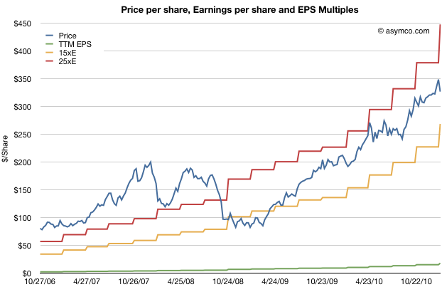
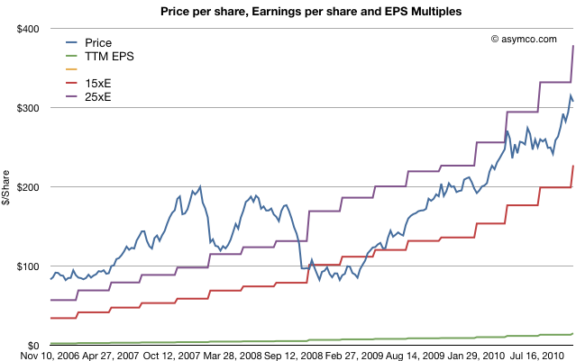
The stock price has been rising but not outside a narrow P/E band. The following chart shows the stock price and the 15 P/E and 25 P/E bands that have bounded it for nearly three years.
As previously observed, this overall share appreciation is not accounting for the growth in earnings.
The trailing twelve months' earnings were $17.91 per share. Therefore the P/E ratio is now 18.2. Excluding cash, the P/E is at 14.7. However, that's based on 2010 levels of earnings. Those earnings are increasing very quickly.
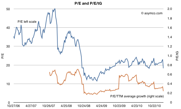
To account for earnings and their growth, I developed the following chart which shows the P/E and P/E/trailing-Growth for the stock.
The P/E is fluctuating on either side of 20 but when considering trailing growth, comparable companies, the macroeconomic conditions and guidance the value of the company is reaching new lows.
P/E/tG nearing recession lows
Earnings were 75% higher in 2010 than the year before. So based on the growth, the rule-of-thumb ratio P/E/trailing Growth (P/E/tG) is 0.24. This ratio (where 1.0 is seen as "fair value") is the lowest since July 2009, during the first months of recession recovery. The trend for this ratio is down (see the burnt orange line in the chart above). It's not far from hitting the lowest point during the recession at 0.17.
Now I'd like to reminisce a bit about that point in time. The stock had bottomed at $78/share[1]. It was trading at barely 3x cash and a P/E of 11 but growing 3x that level (32% in the slowest recession quarter but averaging much higher).
So today we are at a similar point in valuation. The cash is at $64/share, shares are priced 5x that amount and the growth is 4x P/E[2]. Although analyst targets are less comical, there is still the sense of extreme despondency when looking at the valuation ratios.
Guidance, Comparables and Macroeconomics
Unlike two years ago there aren't the same dark clouds on the macro horizon. The company is also not as cautious on its guidance (guiding 63% EPS growth must be a new record for a post-holiday quarter) and there is talk of bubble in valuation for comparable companies. Netflix, Amazon, and ARM have eye-watering valuations relative to growth.
A discount to the S&P 500
And to round out the tragic tale, Apple's P/E is, once again, at a discount to the S&P 500 P/E (14.7 vs. 16.57 respectively).
Given the new low in valuation contrasted with optimism on behalf of many (including management), on some forums there is discussion about Apple becoming the target for a take-over.
There is some perverse merit to this logic. With $64 in cash, $25/yr in earnings and 75% growth it's so cheap that if credit were available, it would make a tempting candidate. Private equity could take it private and use the gigantic cash flow to pay off debt (in about four years). In bygone days, this would have been an easy pitch.
Alas, the capital markets may not have liquidity for the size of the market cap Apple holds and I don't see any competitors able to get the leverage for an acquisition either. Or can they?
---
Notes:
In early summer 2009 some analysts put 12 month targets for the stock at $70, so their predictions were within $6/share to today's book value.
A buyer of shares two years ago would only have to wait two years to have 80% of their investment sitting in retained earnings. An investor who read the data from Apple and knew that the iPhone existed could not fail but be amazed.
We expect revenue to be about $22 billion, compared to $13.5 billion in the March quarter last year. We expect gross margins to be about 38.5%, reflecting approximately $50 million related to stock-based compensation expense. We expect OpEx to be about $2.35 billion, including about $250 million related to stock-based compensation. We expect OI&E to be about $50 million, and we expect the tax rate to be about 25.5%. We are targeting EPS of about $4.90.
This is a particularly aggressive revenue growth forecast of 63% (note again that Apple's P/E has dropped to 18 and 14 ex cash and 10 on a forward basis) . Since Apple always guides very conservatively, the likely figures for the top and bottom lines are likely to be higher.
How much higher? Here are my estimates (growth in parentheses is year over year).
iPhone units: 18.4 million (110%)
Macs: 3.62 million (23%)
iPads: 6 million
iPods: 10.1 million (-7%)
Music (incl. app) rev. growth: 25%
Peripherals rev. growth: 23%
Software rev. growth: 23%
Total sales: $24.5 billion (82%)
GM: 38.8%
EPS: $5.89 (77%)
Looking a bit further ahead, earnings suggest the company is now trading at a forward P/E of about 9.5.
But in this forum I've been critical of their strategy. Though I'll be the first to admit that such criticism is not founded on data but on intuition, strategy is always made in a vacuum of data. It is just an unfortunate fact of life that we don't have data about the future.
But what data we do have is about the past and it shows the contrast between Apple and Google.
As a sample, let's look at the performance in the last quarter:
[nohang]
Growth
Google
Apple
Revenue
26%
70%
Earnings
29%
75%
P/E
24.13
18.57
[/nohang] Apple grew about 2.5x faster. The companies are in very different businesses, but the money they make is the same color. The investors have been paying attention:
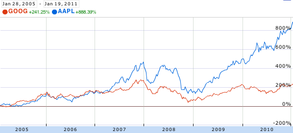
In 2005 and 2006, Apple and Google were neck-and-neck in terms of returns to shareholders. However, with the iPhone's arrival in 2007 the stocks diverged. Google gained 38% since January 2007 while Apple gained 300%.
However, going forward, the market is kinder to Google than to Apple, punishing Apple's 75% growth with a P/E of 18 (ex-cash 15) and rewarding Google's 29% growth with a P/E of 24 (22.5 ex-cash) . Although Google's P/E is proportionate relative to its growth, Apple's P/E implies deep pessimism.
But does Google's performance suggest management failure? Certainly not. It's been a great performance. Google is arguably at the top of its game. Market share of search has never been better.
Cracks in strategy are hard to spot. One hint is that most of Google's R&D efforts are defensive. Building browsers and mobile operating systems are methods to ensure they have distribution of search to as many screens as possible. These are expensive means to ensure channels are available for distribution. Expensive not only in terms of engineering costs but also in terms of relationships and opportunity costs.
But even a defensive posture is not sufficient for management change. What I think is the most serious failure is that for the past five years Google has not addressed the possibility of search itself becoming commoditized. Social media and app economies are asymmetric to search. They make money in different ways and appear to be less efficient or effective means to reach users, but they are growing. Facebook has overtaken Google in terms of page views and apps are a new interaction model for cloud-based content that does away with the indexing model Google champions.
The real condemnation of the leadership at Google is that there has been a failure to create entirely new disruptions. As the stock chart above confirms, Android and Chrome are, if successful, sustaining technologies for Google. That's not going to be enough.
In a recent but recurring lament I asked why Apple shareholders are not being rewarded for the company's growth. I pointed out that there is no fundamental reason why the company should receive such a low P/E multiple (about 18 ex-cash trailing and 10x forward while maintaining 70% earnings growth for over a year).
There were many objections in the comments. Most of them dealt with recent reasons why doubts might have arisen among investors: Android hegemony or some perceived lack of competitiveness leading to margin compression or some macro hangover from the recession.
In this article I argue that none of these objections hold water. My argument hinges on the fact that there is a precise date when Apple ceased being seen as an exceptionally valuable company and that date precedes any of the causes being suggested.
The day of disillusionment was almost exactly three years ago: January 14th, 2008.
How to pin down the date of disillusionment
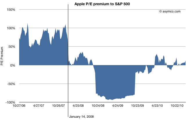
Consider the following chart.
The blue area represents either a premium (above 0) or a deficit (below 0) of Apple's P/E (ex-cash) relative to the S&P 500 P/E. This is a re-imaging of a chart, first introduced in June 2010 when I first pointed out that Apple was being discounted relative to the S&P 500.
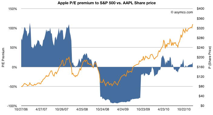
By measuring P/E I am focusing not on the stock price, which has grown nicely, but the ratio of the price relative to earnings, which hasn't (see the next chart below). P/E is a fundamental measure of potential (its reciprocal is the stock's earnings yield.) It is usually highly correlated to the company's growth. If that P/E is uncorrelated to past growth, there is some significant discounting of future growth. It's the most significant (and simplest) measure of "faith" in a company.
By measuring the company's P/E relative to an index of other large companies (S&P 500 P/E) we can assess whether the company's potential is being valued as extraordinary or whether it's being valued as ordinary. In other words we are measuring whether a company is "special".
The chart shows that until January 14th, 2008 the company was valued at a significant earnings premium--a P/E consistently 50% higher than the norm.[1]
Following the collapse (about 40% drop in share price but 100% drop in P/E premium), there was a small recovery followed by a huge trough in valuation. During the recession quarters Q308 to Q309 S&P earnings fell to zero or below. As a result of S&P earnings collapse the S&P P/E shot up astronomically (as E approaches zero, P/E approaches infinity). Apple's earnings dropped as well but remained positive throughout that period bottoming at 37% growth(!) in Q408. As a consequence Apple's P/E fell as low as 11 while the market's went well above 100 (122.41 peak). The P/E deficit for Apple went 80%: Apple was valued as basically worthless (3x cash).
After the earnings recession, the S&P P/E recovered close to historic levels but Apple's P/E did not. It's in-line with the S&P but does not obtain the 50% premium preceding the recession.
So we can establish that the day that Apple's potential was discounted was nearly six months before the onset of recession.
What other discounting factors can we discard?
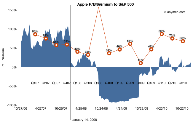
How about earnings growth itself? Did the collapse foretell an earnings collapse?
The chart above shows the P/E premium vs. earnings growth (in red). Although earnings growth began to slow soon after the 14th (earnings for CQ407 were not yet announced at that point), growth recovered six months later after the launch of the iPhone 3G[2]. Growth continued throughout 2009 and 2010 reaching new heights last year of 86%.
Still, the company received no premium to the S&P 500 P/E. Companies in the index averaged, at best, a quarter of Apple's growth in earnings.
What about Android? The first Android device did not ship until October 2008 (HTC Dream or T-Mobile G1). There were no appreciable Android volumes until 2009, one year after the drop in relative value and no talk of a threat until 18 months later.
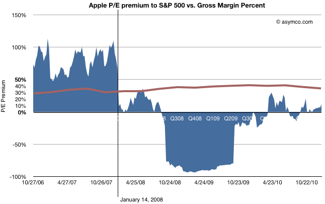
The last objection to be put aside is that of margin compression.
This last chart shows how margins (in brown) behaved during the same time period. They went up. The only slight decline took place during the last few quarters, after the launch of the iPad, long after the collapse.
Regardless of the adjustments with product launches, Apple's GM is the envy of the world and is not at all correlated with the loss of faith in the company.
So What happened on January 14, 2008?
Having led you this far in the story, I'm afraid I'm going to let you down at the end: The cause for the loss of faith is a mystery to me.
There is only one noteworthy event that took place on that date: Macworld 2008 (January 14-18). During the keynote, Steve Jobs introduced the Macbook Air (and Time Capsule and Leopard and pre-announced the iPhone SDK which, six months later led to the app supernova). I remember that day and I remember that the stock began selling off exactly at the point when the Air was mentioned. It has never been the same since.
Obviously, correlation is not causation. The Macbook Air need not be the cause for the loss of faith in Apple as an investment. Or can it? I'm hoping someone can explain this because to me it makes no sense. The product was not a home run but it did not do badly either and its current incarnation seems to be a hit. Whatever sins the original Air may have had have surely been expurgated by now.
Regardless the cause, the bottom line is that, in the eyes of investors, Apple stopped being "special" that day. Its valuation dropped to in-line the S&P and, given its growth, well below what a large growth company should be worth. The company's shares went into the bargain bin and are still there today.
---
[1] I should point out that the P/E ratio is based on post 2009 re-stated earnings. The restatement changed the P/E as the "E" changed. This was based on the abolition of subscription accounting for the iPhone. Although it may seem unfair to hold the market to this standard, restatement did not actually change cash flows which were transparent and visible to all, even to amateurs such as myself and the other unaffiliated analysts that published throughout this period. Earnings may be an opinion but cash flow is a fact. Valuation on the basis of cash flow should have yielded the same results as shown above.
[2] That quarter showed a y/y growth of 150% while the stock was in freefall. In fact, it was during that earnings day that Steve Jobs came on the conference call and pointed out the astronomic iPhone cash flow to an audience of analysts more concerned about their own jobs.
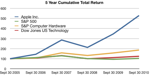
The following graph shows a five−year comparison of cumulative total shareholder return, calculated on a dividend reinvested basis, for the Company, the S&P 500 Composite Index, the S&P Computer Hardware Index, and the Dow Jones U.S. Technology Index. The graph assumes $100 was invested in each of the [securities].
In other words, if you had invested $100 in the S&P 500 in September 2005, you would have $103 now. If you invested $100 in Apple in September 2005, you would have $529 now.
Apple investors should rejoice!
However, in terms of reward for earnings, consider the following graph:
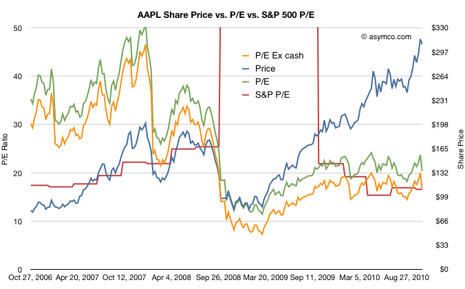
The red line represents the S&P 500 P/E ratio and the green and orange lines represent Apple's P/E ratios depending on whether you include cash in the price.
The reward to investors Apple does not seem so appealing anymore.
Although Apple received a premium valuation to the S&P prior to October 2008, it has traded at a discount or in-line with the S&P since then.
Another way of putting it is that the P/E ratio for large companies has returned to pre-recession levels. The P/E ratio for Apple has not.
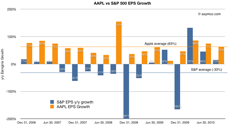
For a final point, a comparison of earnings growth (which should correlate to the P/Es) above shows that while the S&P is given a similar valuation to Apple, growth has been decidedly less spectacular.
Apple's average growth over the period shown was 63% (shown as the orange line) while the S&P has grown at an average of -33%. Nevertheless the market has chosen to reward the two assets with the same multiples valuing their future growth in earnings roughly the same.
At least they are equivalent. For much of 2009 and early 2010, Apple was considered to have a far less promising future than the average large American company.
In the previous article discussing the growth scorecard, I left open the question of how Apple's growth is reflected in its share price.
The approach to answering this question is to show how the share price correlates to that growth. The challenge for analysts has been that the company switched from subscription to current accounting for the iPhone (the largest component in its income statement). As they re-stated income and thus earnings, any historic review of P/E or other multiples of Earnings have to also be re-computed.
So this is what I've done:
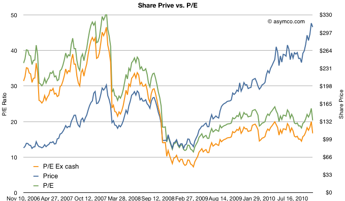
The first chart shows Apple's price per share (blue) vs. its trailing twelve months earnings (green) and multiples of those earnings (15x and 25x).
The chart shows how Apple was priced well above 25 P/E before October 2008 and has remained within the 15 to 25 multiple bands since the winter of 2008/2009. This seems fairly reasonable and the stock's rise is a cause of celebration for many, but a cause for concern for some. Is this rise in price matching a rise in value?
To answer, we need a way to look at the valuation of Apple. One way is to plot the P/E ratio over time. That would show how the market perceives the value of the company (i.e. how many years' worth of earnings is built into the price) The chart below does that.
I took the additional steps of plotting the P/E excluding cash from the price to show "P/E Ex cash" in the orange colored line and I also copied the Share price line from the first chart on this one for contrast.
What the P/E analysis shows is that as the stock rose, it's P/E ratio fell. This means that the "valuation" of the company is quite a bit lower now than it was in 2006 and 2007. In fact, as a multiple of profitability, Apple's stock is nearly half as valuable now as before the recession.
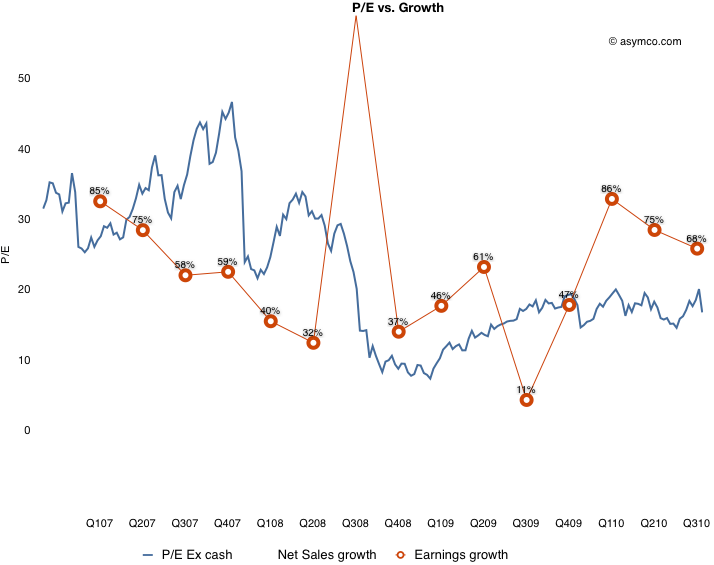
Since valuation is usually correlated with growth, (P/E is often compared in a ratio with Growth) we need to see whether the P/E in the chart above matches the actual growth of earnings. Fortunately we have just measured growth with the scorecard. Here are the two charts together:
What this shows is that while earnings growth did slow down in the lead-up to recession (with the hugely anomalous 3G launch spiking growth to 155% in Q308 causing the year-later plunge to 11%), growth picked up again in the depths of recession and has moved back to pre-recession levels. The only difference is that the multiple assigned to the stock has remained near recession lows. This is visualized by the blue line being mostly above the red line pre-crash and usually under it post-crash.
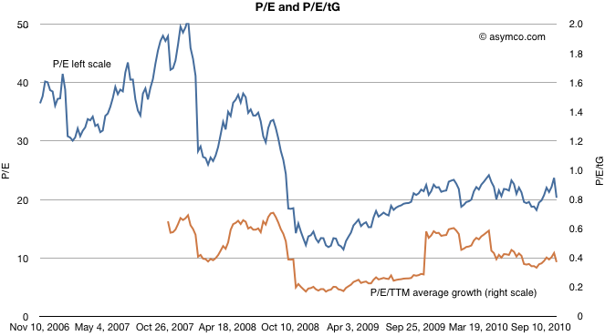
To put a finer point on this, I plot the ratio of P/E and trailing growth (P/E/tG) in the brown line below:
It shows that as a measure of valuation with respect to growth, Apple is trending down. A P/E/tG ratio of 0.4 and closer to 0.2 if we exclude cash shows very weak confidence.
The only conclusion I can draw is that the market does not believe that Apple has significant growth opportunities. A P/E of 20 with consistent 70% growth is, to be blunt, damnation. For comparison, Amazon just reported 16% growth in earnings and was rewarded with a P/E of 68.
Amazon notwithstanding, is Apple an anomaly? Is the disconnect between earnings growth and the stock price unique to Apple or does it apply to most other equities? Is pessimism about Apple a symptom of pessimism in general? I will suggest a way to answer this in a future article.
Every quarter I try to score growth by top, bottom and product lines. As unforeseen growth is the only driver creating shareholder value, it's of paramount importance to measuring a company's performance.
For Apple, the analysis is fairly straight-forward. There are relatively few product lines (seven including the iPad). I measure y/y sales growth and try to form a picture that is easy on the eyes and mind.
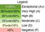
The method I'm using now is color coding growth for each line according to the legend to the left.
The table that follows shows each product plus the Net Sales and Earnings lines according to this color coding. I also added an average column for reference.
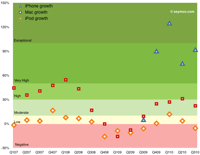
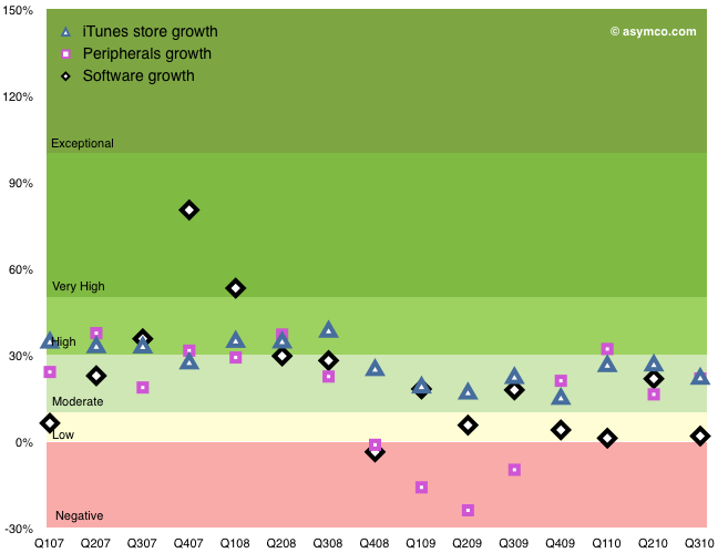
The following graphs show the same data with color coding for the rates as they change over time. I broke the data into three charts: Top/Bottom lines, Hardware Products, Other Products.
Discussion
Hopefully this representation describes the company's growth without requiring too much explanation. Earnings growth, which determines ultimate value created is near all-time highs, well into the "Very High" (A) growth band. Apple have recovered from the Moderate-to-High (B/C) bands during the recession and are near the levels of 2007 when the company was trading at a P/E of 50 (today's P/E for Apple is 20). Sales growth broadly followed earnings growth.
Within the products, the iPhone again shows exceptional performance. The growth during the first five quarters was (literally) off the scale (above 150%--see table for actuals). The average quarterly y/y growth has been 234%! Last quarter's 92% growth is very near the 100% threshold for exponential growth. This after three years in the market.
The Mac growth is Moderate (B) and that may be because it was not a launch quarter for portables. The Mac underwent Very High (grade of A) growth for a period of 2008. The iPod shows weakness. The product has been in a Low-to-Negative (D to F) band of growth since the iPhone launched. Clearly a mature product line but one which has been largely subsumed into the iPhone and iPad. The iPod touch is increasingly a large proportion of the iPod line.
The non-hardware product lines are Low-to-Moderate growth products. The Peripherals business tracks very closely to the Mac business and dipped negative during the recession.
Overall, the growth scorecard is in the "Very High" category, or a grade of "A", mostly driven by the iPhone and iPad. Whether this growth will be reflected in the share price is a question reserved for a future discussion.
Following earnings growth of 68%, after hours trading of AAPL at $300/share shows a P/E of 19.8. The company added over $5 billion in cash for a total of $51 billion or $52.9/share.
Excluding cash from the price of $300 leads to an enterprise value of $249 and a trailing twelve months earnings of $15.15. The ex-cash P/E is therefore 16.44.
P/E/trailing Growth is 0.29.
My guess is that this is keeping AAPL cheaper than the S&P 500 on both P/E and P/E/G.
In the last article on the P/E ratio vs. Growth for some of the largest companies, the question of PEG came up. PEG is the P/E over Growth and it's a good way to index valuation relative to growth. Usually Growth is measured as the forward twelve months consensus and a PEG of 1 is, as a rule of thumb, considered "fair value". However, forward growth is based on possibly inaccurate analyst consensus. If we instead look at historic growth, we have some actual performance to evaluate. Let's call this PEhG for P/E over historic Growth.
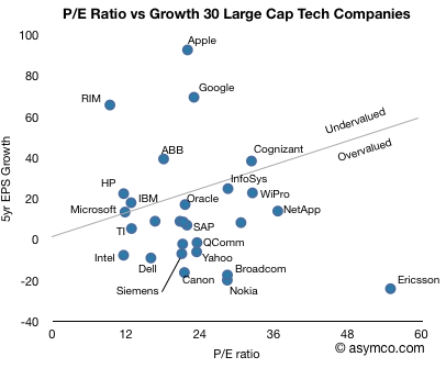
The following chart shows 30 large cap technology companies[1] and their five-year compound EPS growth vs. their current P/E multiples. If we draw a line at the PEhG of 1, i.e. when the P/E ratio is equal to the historic growth rate and split the pack into PEhG > 1 (overvalued)[2] and PehG < 1 (undervalued), we have the following split:
The chart makes for an interesting point of view over what the best positioned companies in the sector are doing and how business model innovation shows up as investment opportunity[2].
Apple, RIM, Google stand out for their business model innovation. Ericsson, Nokia, Yahoo and Dell show poor value for their lack of innovation. Microsoft, IBM, HP, TI and Oracle show in-line value for in-line or sustaining innovation.
[1] I omitted Baidu from the chart as it's off the scale: Growth is 151, P/E is 108. It would classify as undervalued. These are also not a complete set of all large caps. It's meant to be indicative. [2] Notions of value are completely subjective. This does not constitute financial advice.
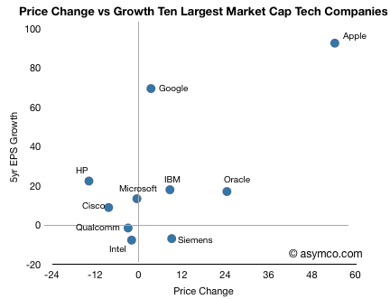
In the last article I described growth vs. P/E and price change for the largest "ultra-large cap" companies, of which Apple features prominent.
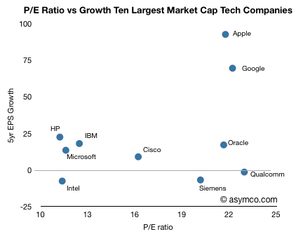
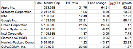
In this article I take the same analysis to the top ten largest technology companies (by market cap, see table at bottom).
In this comparison, Apple no longer has the largest P/E ratio. Qualcomm, Google and Oracle are all at similar levels of valuation relative to earnings, however Apple's growth outstrips them, only with Google in the same quadrant.
Note the "Wintel" cohort consisting of Intel, Microsoft, HP clustered around the Low growth, low valuation quadrant in the lower left (coincidentally co-located with IBM). Oracle, Qualcomm and Siemens show high valuation with low long-term EPS growth. Cisco is somewhat on the fence.
When comparing how the market has rewarded growth through share price appreciation, the correlation to growth is much better. Google seems under-rewarded.